

Good luck ignoring the alligator
In trying to win in todays market, many brands focus their time and energy trying to create better products or deliver deeper functional benefits or more meaningful emotional experiences.

In 1933 a German psychiatrist named Hedwig von Restorff did a study.
She presented human subjects with a list of categorically similar items, with one distinctive, isolated item on the list.
When their memory was tested about the list of items, the memory of the distinctive item as always better than the rest.
The phenomenon became known as the “Von Restorff effect”.
For example, if you have a list where one item stands out against the others, for example: desk, chair, lamp, table, rug, bed, alligator, couch, dresser, armchair.
“Alligator” will be remembered the most.
It also turned out that the effect happens when you alter things like size, shape, color, spacing, fonts and underlining.
In this case, let’s say you have a shopping list with 20 items on it including: eggs, milk, bread, apples, chicken, lettuce, onions and cheese, etc. Then you color the word “apples” with a yellow highlighter.
Almost everyone who reads the list will remember that the list had apples on it.
In trying to win in todays market, many brands focus their time and energy trying to create better products or deliver deeper functional benefits or more meaningful emotional experiences.
But the fact is - that in the war for consumer attention, the most powerful method of establishing brand recall is to be different.
Just somehow noticeably - different.
We are now all doing business in an “Attention Economy”.
So, if you can just stand out in a sea of sameness…
You win.
Wish You Were Here
So if you - or your clients - are getting some rough reviews or less than glowing comments on your content, products or services, take heart:
There are many, many more people who loved it than will ever make the time to write about how happy it made them.

Our national parks are a treasure. They are some of the most beautiful and awe inspiring places in our country.
Yosemite, Yellowstone, Zion, Grand Canyon, Arches, Sequoia, Grand Teton. The names alone spark visions of splendor in almost everyone who has visited one.
Almost everyone.
With more and more people’s travel limited by Covid - our national parks are experiencing massive surges in visitor volume.
Now, if I know one thing about marketing, it’s that people write more product reviews when they hated something than when they loved it.
When people love something, the last thing they usually think about doing is going back and a writing a glowing review. They’re too busy being happy.
But, when people didn’t have such a great experience, the chances are pretty good they will look for a way to vent their displeasure.
Here are some reviews from our national park websites:
Sequoia National Park: “Terrible. There are bugs - and they will bite you on the face.”
Grand Teton National Park: “All I saw was a lake, some mountains and some trees. That’s it.”
Yosemite: “Trees block the view and there are too many rocks.”
…and my personal favorite:
Grand Canyon National Park: “A hole. A very, very large hole.”
So if you - or your clients - are getting some rough reviews or less than glowing comments on your content, products or services, take heart:
There are many, many more people who loved it than will ever make the time to write about how happy it made them.

Shedding Some Light
As marketers and creatives we do this stuff all the time.
We produce creative work, content, media, share valuable information. Then we post it out there in cyberspace.

There’s a star at the very tip of the handle of The Little Dipper.
Its astronomical name is Polaris. But, we call it The North Star.
The North Star sheds a lot of light. In fact, it’s 4000 times brighter than our sun.
The really cool thing is that when you look at it, the light you are seeing was actually generated in 1587.
Its light has traveled for 434 years to reach us.
To fill us with wonder and to help travelers navigate.
When I was reading about the North Star I was reminded of a video I did 4 years ago called “9 Things Your Brand Design Must Have”.
When I shared that video on YouTube I didn’t really know what would happen.
I just posted it and hoped it would help someone.
Time passed...
Then someone watched it. Then another and another.
Now, 4 years later it has 382,000 views. And it still gets about 7,000 views a month.
That video sheds light on a topic that has helped a lot of people navigate brand design.
As marketers and creatives we do this stuff all the time.
We produce creative work, content, media, share valuable information. Then we post it out there in cyberspace.
We don’t know who it’s going to help. Or when it will reach them.
But we have to remember that providing value takes time.
And that it will continue to shed light for years to come.

The Wrong Ingredients
Building a successful brand is like building something out of concrete.
You need to use the right recipe.
You need a solid brand strategy, a stunning brand design and to create an impeccable brand experience

There is a marina in Lahaina, a small town on the western coast of Maui, Hawaii and it's home to one of the best scuba diving sites on the island, Mala Wharf.
Mala Wharf is a collapsed pier that extends hundreds of feet into the marina. The submerged slabs and pillars of concrete create an artificial reef teeming with tropical fish, eels, rays, lobster and octopus.
The wharf didn’t collapse with age. It didn’t collapse because of a hurricane or some natural disaster. The wharf’s demise was the result of a bad recipe.
You see, when you make concrete with fresh water the material essentially becomes stone and will last for decades.
But when you cut corners and use salt water instead, the concrete seems OK for a few years, but then it begins to crumble.
Unfortunately, they used the salt water recipe for Mala Wharf.
After the wharf collapsed it was going to be far too expensive to clean it up. So they just left it there - and let the marine life take over.
Building a successful brand is like building something out of concrete.
You need to use the right recipe.
You need a solid brand strategy, a stunning brand design and to create an impeccable brand experience.
If you cut corners, before you know it things will start to crumble and cleaning up the mess gets expensive fast.
But if you use the right ingredients and a proven recipe, that brand will last for decades.

Create Your Wonder Wall
Fast forwarding to today. Many of us are creating content to communicate, to build authority, to make our presence known.
We need to take a lesson from these Amazonians.

A couple years ago they made an amazing discovery in the Colombian Amazon. They call it Serranía La Lindosa.
It’s an 8-mile-long rock wall. A “canvas” completely covered with ice age drawings of mastodons, giant sloths, geometric designs, human figures in hunting scenes and nurturing plants and trees.
The ochre pigment has lasted for over 12,000 years telling the story of the indigenous people who painted it.
Now let’s be clear...
These people didn’t paint an 8-mile mural in a day.
It started with a single drawing. Then the first tiny scene. Then, over hundreds of years it became a vast panorama of images crowded together, mile after mile.
But what if they’d decided after the first mile that it was enough. That it had all been said. The wall was already so crowded. Who would see their pictures? Why bother adding to it?
We’re glad now that they resisted that impulse.
The stories they used to document, to educate and even possibly to entertain, are still informing us now.
Fast forwarding to today. Many of us are creating content to communicate, to build authority, to make our presence known.
We need to take a lesson from these Amazonians.
Don’t be intimidated by the vast crowded canvas of the internet.
Don’t think that your story is just adding to the noise.
Make your mark. Build upon it. Invest time, effort and intellectual capital.
Build a body of work that speaks for you. That works to tell your story.

14 Trends in Graphic Design for 2021
I want to share with you 14 trends that I've seen in graphic design moving into 2021 that are exhibiting themselves in the marketplace.
I want to share with you 14 trends that I've seen in graphic design moving into 2021 that are exhibiting themselves in the marketplace.
The thing you want to remember about trends is that trends aren't seeing into the future, they're not some sort of crystal ball. They are movements in design that have gained enough traction and enough usage to actually be recognized as something that is “trending”.
Trends aren't always brand new, in fact, very little has never been done before. I recommend you use trends to stay inspired, take them and make them your own. Take them to a different place in your creative work, or you can consciously react completely against them if that's what you choose to do. But knowing what is trending is critical either way.
#1: A.I. Design
Everything you're going to see on this slide was actually designed by a computer. This is machine learning. This is artificial intelligence designed, created by computers. Now it's not great design, but it's important because even though it's clunky and it's primitive, so was Microsoft Paint back in the day, so were the first Macintosh's right. It will only get better. It will only get more sophisticated over time. Yes, these look kind of surreal and deconstructivist, but they are something that you have to pay attention to.

#2 Electric Fade
Electric Fade has been around for a while, but it just keeps getting deeper. Electric Fade is characterized by electric turquoise and cyans and purples and magentas, being used in curvilinear blends. It's being used in tech and in sportswear and in print and in environments, it's even being used in political ads. Two of the graphics on the right side of this slide are from the Biden-Harris campaign. It used to be really cutting edge, but now in many ways it's going much more mainstream. This is a classic definition of a trend. It is something that's been around for a little while and gaining momentum and used to be a little low on guard, but now it's definitely getting mass usage.

#3 Environ-mental
This is topography that's being used in physical environments. It's used in wayfinding and interior design, art installations, retail stores, and museum display. These are single letters or blocks of text or numbers that are much like a trend that's going to come later in this presentation called singularity. It's stacked topography, it's often in all caps. Often it's wrapping around three-dimensional objects or surfaces or around corners. And it uses elements of force perspective, that's optical illusions that are making elements feel closer or farther away than they are now.

#4 Figure isolation
These are human figures where the background has been removed and they've been placed on open, airy, or blank environments. This creates a juxtaposition between the 3D of the figure and the flatness of the design element's colors and texts that surround them. There are graphic elements, texts, shapes wrapping around through and over the figures. This gives it the design of focal point or an anchor to these more abstract elements. The figure kind of grounds in the abstract composition in reality, and it gives the eye a place to rest and orient itself in terms of the picture plane.

#5 Redline
Red line is characterized by red, black, and white compositions. Red, black, and white are one of the most striking color combinations. It's an emotional spectrum. Color red is angry and powerful environment. In fact, when psychiatric patients are given colors to work with in art therapy, red and black always run out first. This color combination is often used with black and white photography, and it shows up in outdoor advertising, active wear apparel, print, packaging, transportation, and even retail. There's almost no way to go wrong with black, white, and red.

#6 Sliver of Light
Sliver of light isn't as much of a trend as it is a graphic technique to draw the eye into a composition. It's mainly used in illustration and text layouts where the illustration is the primary storytelling device. It's characterized by a Ray of light that acts as a visual pathway to pull the eye into the composition. It's often used with a human figure as the focal point of that light. It's used in things like movie posters and book covers and editorial illustration, and it really creates an intense sense of drama and mystery in the composition.

#7 Architext
This trend is characterized by text blocks that are used as the main design elements. They're used as whimsical shapes, circles, curves, asymmetrical building blocks. These can be paired with photography and illustration, but generally text is the primary focus. Headlines and subheads can sometimes be put at right angles to each other. In this trend, the legibility or the ability to navigate the reading order of these paragraphs is of very little importance. This trend is arty, it's pretentious, and in it topography becomes the main design element in and of itself.

#8 Decontextualize
This trend is characterized by topography in a state of mid destruction. It's traditional elements of designs, topography, graphics, photos, shapes, and elements that are put into a kind of a visual blender. The result is abstract design, design for design's sake. It's used in design publications, in the music industry, in print and magazine work, and in event announcement posters. It's reminiscent of David Carson and Raygun magazine. It breaks all of the rules of design, graphic design that skirts the edges of fine art. Communication in this trend is of very little importance at all.

#9 Bright Geo
This trend is very similar to the Geo Max trend of last year, except the difference lies in the icon and the block shapes. It's characterized by Tetris-like building block shapes that are bisected and quartered circles, simple color palettes of reds, blues, oranges, and greens, also muted tones of gray, and they're all grounded in black or dark navy. Bright Geo is used in brand ID systems and web icons and editorial. It's even used in Google's G Suite icons. It's usually used in flat color compositions only, but it can be used in combination with photography and natural textural elements.

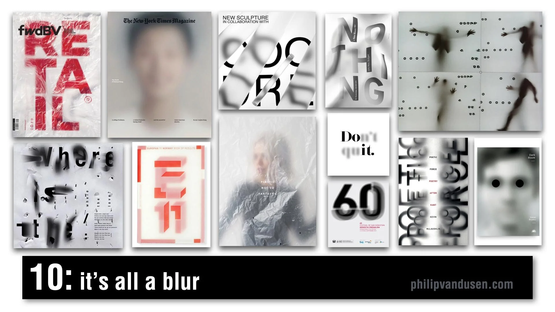
#10 It's All a Blur
One of my favorite trends for 2021, It's All a Blur is a very popular trend and it's characterized by kind of an overlaid scrim of plastic or Mylar or just elements that are plain out of focus. We're seeing it everywhere, it's in video media, in animation, in signage, in editorial, in print. It's being used with figurative elements, typography, numerals, photography, and it creates a depth, a sense of mystery. It sparks curiosity and creates a level of visual movement that brings a real level of interest to a flat graphic picture plane.
#11 Chiseled Type
Chiseled Type is retro typography that's really historically anchored in the sign painting industry. It's a subset of the Sign Painters trend from my 2020 Graphic Design Trend video on YouTube. It's been adopted by art, graffiti, street culture, tattoo culture, and modern sign painters. This trend is characterized by fonts that are crafted to look 3D, as if they were carved out of or into stone or wood. Type designers have really adopted this style and are putting really interesting new twists on it. Single letter forms take on a monolithic life of their own and really become sculptures in their own right.

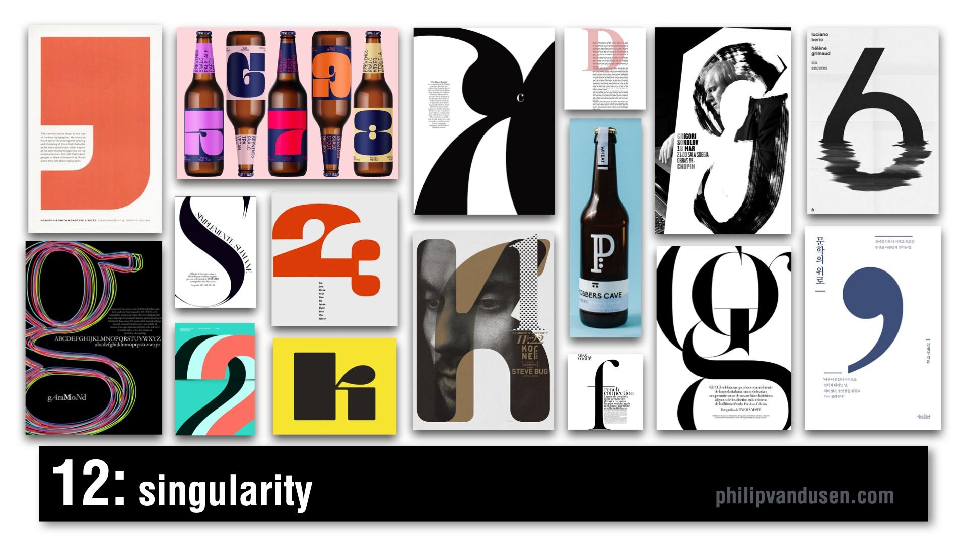
#12 Singularity
Singularity is characterized by composition that uses a single letter or number or a symbol as the main abstract anchor of the composition. It's a celebration of the abstract beauty of a single letter or number and its forms and shapes. It's often dramatically cropped and often used as an abstract element to wrap text around or intertwined with other forms, or it can be treated texturally in brushstrokes or in patterns. It's being used everywhere from editorial print to packaging, to illustration, and promotional posters.
#13 Wavy Gravy
Wavy Gravy is an offshoot of a trend from my 2019 Graphic Design Trend video on YouTube that I called Warp Speed. In this trend, topography is warped to create a wave shape. Sometimes they're regular waves, like an optical illusion to impede legibility of the text. Sometimes it's visually faithful to the text, but it's printed like it's on a waving fabric, like a flag or a banner. It's often used in black and white, but not exclusively. It's used mainly in print, and animation, and posters.

#14 Bee Yellow
Pantone announced its Colors for 2021. The colors are Illuminating Yellow and Ultimate Gray. This is not a graphic design trend in and of itself, it's really more like a dominant color story trend of yellow, black, white, and an injection of gray. I feel it's a psychological reaction against the difficult year that we've had in 2020 with the political upheaval and the Covid-19 pandemic, all of our financial struggles and the negativity overall in the world. It's kind of forecasting or encouraging a brighter outlook for 2021 and it's already being heavily adopted and used everywhere. It's showing up in product design and web design, sports apparel, editorial, print, the financial industry, promotional marketing, travel, and even entertainment.

How Can We Help Your Business Succeed?
Is your brand rockin' like nobody elses? Or is it a little tired? Maybe it's just being born. You want to do it right. That's where we come in.
We create new brands from scratch. We fix broken ones. We have all the brainpower, creative chops and marketing magic you’ll ever need and a ton of loyal clients to prove it.
You want nimble? We're the new agency paradigm. We scale up and down depending on your needs so you never pay for resources you aren’t using.
We’ll put the power of brand strategy, design and the most contemporary marketing techniques to work for you. Let’s talk.

We Have Lift-off
Things might not go as planned. We might not get into orbit on the first try.

It was 1960 and we were in a race with the Russians to put a man into orbit.
Project Mercury was the name of our program that was eventually going to do it.
The operative word here is “eventually”.
The first Altas-type rocket exploded. So NASA switched to the Redstone rocket that had taken our first satellite into orbit.
The test flight of the new spacecraft and its recovery systems was scheduled. They wheeled the rocket onto the launch pad...3, 2, 1. Ignition!
There was an incredible roar, the rocket disappeared behind a huge plume of smoke. The technicians thought the rocket had accelerated so quickly they didn’t even see it go.
That’s because it didn’t go.
It lifted off a full 4 inches and then dropped back down on the platform. Thankfully, still upright.
But then the escape rocket did take off. It shot up 4000 feet then fell to earth. Then the re-entry parachutes deployed and fluttered down beside the fizzling rocket.
It was a comical failure. But it was a start.
As marketers, entrepreneurs and business partners, whenever we have out-sized dreams fueled by a desire to surpass strong competition, we have to start. We have to pick the best rocket we have and begin testing.
Things might not go as planned. We might not get into orbit on the first try.
But a four inch flight is better than standing still.
Because eventually we’ll accelerate so quickly they won’t even see us go.

Become a Great Public Speaker With These Quick Tips
If you want to reach the next level of your career, you can’t gloss over your public speaking skills. Successful designers, entrepreneurs, and creative professionals must present their ideas effectively and defend their work convincingly to an audience.

If you want to reach the next level of your career, you can’t gloss over your public speaking skills. Successful designers, entrepreneurs, and creative professionals must present their ideas effectively and defend their work convincingly to an audience.
Honing your public speaking skills exponentially increases your chances of success in your career.
The opportunity to directly influence an audience is invaluable and is certainly worth the effort to improve.
If you are afraid of public speaking, you are not alone. 25% of people in the world rank public speaking as their number one fear. As Psychology Today explains it, there are myriad physiological reactions, negative thoughts and false beliefs that instantaneously paralyze you with fear when you take the stage.
Even if you’re not paralyzed with fear, you’re bound to get a little nervous before you present. You need to accept the fear. Quietly acknowledge, “I’m feeling nervous.” If you try to fight it, it will make it worse.
Use these tips to feel more confident about your preparation, presentation, and follow-up.
Preparation
Watch and Learn: Watching great speakers and deconstructing their presentations will help you understand the important components of an outstanding speech. TED has some amazing videos from some of the best speakers in the world. Watch as many as you can and ask yourself:
How do they start their talk?
How do they engage the audience?
How do they tell a story?
How do they walk and move?
How do they present the slides that are behind them?
What's the cadence of their speech?
Do they tell jokes or are they serious?
Are they quiet or loud?
Here’s a list of the 25 Most Popular TED Talks Of All Time to get you started. If you want to go even deeper, this video from Chris Anderson, TED Curator, explains the one secret ingredient of all great TED talks.
Rehearse: Knowing your material is the most important preparation step.
Write diligent speaker notes and know your slides cold. Memorize everything until your presentation is mistake-free. Many people find mnemonics are very helpful with memorization.
Mnemonics are based on pictorial memory, so if you are a visual person, it may be the right solution for you. This video from Mike Michalowicz, author of the business cult classic, The Toilet Paper Entrepreneur, teaches you the basics of mnemonics memorization.
Assess: Observe yourself, either in a mirror or on video, to perfect your presentation. Notice and correct any distracting habits like:
Using filler words like "um," "ah," “like,” and “so.”
Long pauses or a very slow speech cadence. This will make it difficult for the audience to stay with you.
No pauses or rushing your words. This will make it difficult for the audience to absorb what you have to say.
Using your hands too much.
It’s easy to lose perspective when you are watching yourself, so get constructive criticism. Invite your friends and family to watch your presentation. Ask them for their impressions and tell them not to hold back. They will tell you what you can’t see.
When You're In The Room
Always Be Early. Ensure that you have a few quiet moments before everyone arrives. When you first get to the room, take a moment to collect your thoughts and breathe. Relax and release any feelings of being rushed.
Next, make sure everything works. Gather your visuals, laptop, projector, and anything else you’ll need during the presentation. Make sure your laptop is charged and has the right plugs for the projector. Laptops have been known to crash the second you're about to start your presentation, so make sure you have a backup presentation and note cards or printouts so you can present without slides.
Preparing for a disaster is very important.
When I was presenting to Disney years ago, I brought my laptop that had my presentation on it in my backpack. When my colleagues and I arrived, the Disney executives gave us bottles of water. I took a sip, then put it in my backpack and went on a tour of the corporate offices.
When I got to the presentation room and opened my backpack, it was filled with 3 inches of water. My laptop was literally dripping as I pulled it out. It was soaked and destroyed. Luckily, I had a backup of the presentation on a thumb drive and was able to use someone else's laptop.
Stuff happens. Have backup.
Setting The Stage: As speaker, you set the tone and mood of the presentation.
Here’s a home-spun proven formula to start a speech and keep audiences engaged:
1. Tell ’em what you’re going to tell ’em
2. Tell ’em
3. Then, tell ’em what you told ’em.
Set your speech up with a very clear introduction about what you're presenting and why.
This creates anticipation for the audience. After that brief intro, launch into your presentation. At the end, briefly review the key points in a concise conclusion. This structure grounds people in the beginning, the middle, and the end of a presentation.
Own the room: This is the one time in your life where you want to be the center of attention. To do that, begin by asking the audience a question and then get them to respond by raising their hands. Some speakers even have people stand up, or tell them to clap or shout, “hell yeah!” They're taking control by forcing people to do something. That control makes them the de facto director of everything that’s happening in the room.
Avoid “Death By Powerpoint:” Keep your slides simple. Too much text, also known as "death by PowerPoint," makes it tempting for the speaker to just sit there and read through it, which will bore the audience to death. It also takes your face away from the audience which means you can’t control the room.
Keep your slides super simple with minimal text so you aren't drawn to try to read them.
Once Upon A Time: Stories are incredibly engaging. Tell a story or use a metaphor to make a point. Stories help people remember and internalize what it is that you're talking about.
Where’s Waldo: Be animated and lively when you are presenting. Walk around - don't pace frantically, but periodically move across the space. This keeps eyes on you and attention on what you are saying.
Make ‘em laugh: Have fun with your presentation and others will too. Don’t be afraid to tell a joke or put a funny or quirky slide in your presentation. I like to show a slide that is a red herring or doesn't fit in with the rest of the deck because it wakes people up.
Having fun with your material is a great way to make sure the audience won’t be working on their phones or reading through their laptop during your presentation.
As You Are: Be human. Be vulnerable. People identify with the person who's presenting to them. They will, more often than not, give you some leeway to make mistakes or to say something that doesn't make sense.
After The Presentation
Leave the last 5 to 10 minutes of your presentation for conversation and questions. This is where things really happen because you are interacting and connecting with the audience in a more genuine way. Speaking off the cuff forges a deeper connection; your audience can get a better sense of who you are with just a few minutes of candid discussion.
If things don't go well - and it happens, don't make excuses but don’t get down on yourself either. Know you did the best job you could and move on. Don't admit that it didn’t go well when you're in the room. Always thank the audience for their time and attention and leave with your head held high.
Perfecting your public speaking skills requires practice and patience. If you’re like most people, you’ll want to get better at it quickly, but be patient. Get practice by speaking regularly, either in an informal group of friends with public speaking goals, or through a formal organization like Toastmasters International. If you are ready for the next level, this article from Inc.com will get you started with apps that can improve your public speaking skills.
When we can all gather in person, someday soon hopefully, I hope to see you presenting at the next industry conference!

7 Ways To Get More Brand Awareness Right Now
When your brand is recognized it means you’ve done a great job of creating a shortcut in people’s brains That shortcut is called brand awareness, and it’s what drives clients right to your door when they have a problem you can solve.

Building a brand has three important stages: being recognized, remembered, and revered. This article is going to cover the first of the three stages.
When your brand is recognized it means you’ve done a great job of creating a shortcut in people’s brains That shortcut is called brand awareness, and it’s what drives clients right to your door when they have a problem you can solve.
Brand awareness side-steps the need to explain your brand values or mission; your branding is so effective that people are already familiar with you and how you stand apart from your competitors. Potential clients know what you do and how you can help as soon as they see your logo, hear your company name, or see your brand colors.
Brand awareness can always be increased with a few simple yet effective strategies. Here are my 7 trusted methods for building brand awareness:
Number 1: Partner with Other Brands. It's beneficial to establish partnerships with other brands, especially when you're starting out. It’s mutually beneficial to expose your audiences to each other’s work, and you're both growing your audience.
Mature brands partner too, and for the same reason: it adds value to customers’ lives. Some examples of this are Red Bull and GoPro, Apple and Mastercard, Pottery Barn and Williams Sonoma, and Spotify and Starbucks.
“Partnerships are definitely very important,” says Adidas Originals’ global director of digital and retail marketing, Swave Szymczyk. “As long as they are not only strategic but also reflect who we are as a brand and what we believe in, it really drives authenticity.
“You can talk about who you are as a brand all day long but having those partnerships to authenticate that message is really critical for every brand.” ‘(marketingweek.com)
You can partner with other like-minded brands to co-publish blog posts or articles, create videos or do podcast interviews. Share space in a trade show booth, or at a special event to add value to each others’ audience. Great partnerships add rocket fuel to your brand recognition and create terrific allies for your growth.
Number 2: Guest Post. While most people think big and want to pen an article for Huffington post right away, that probably won’t happen. But if you start small and build credibility over time, you will get the chance to write for larger and larger publications. Start by researching brands that have similar audiences and then create some outlines for original, juicy content you know the publication’s audience will love.
Pitch your content via email - your pitches will go easily if you’ve done your research well. Include a sample headline of the type of content you would write or links to previous content that you've written for other brands or for your blog. Keep your pitch brief and be very clear. Because editors get dozens of pitch emails a day and make decisions in a matter of seconds, you need to put your best foot forward.
Number 3: Social Heft. Create brand recognition like a social media ninja. This is done by frequently developing shareable content like:
Graphics
Infographics(see #4)
Quotes
Memes
Videos
Guides
Lists
According to vennage.com, original graphics are far more engaging than stock photos, memes, videos, and charts, so create your own visuals as often as you can.
Focus on hot topics in the industry and always ask people to share your content - they won't share unless you ask. There are other well-known triggers to getting people to share your content, and you should explore them all to see which works best for your brand.
“See” your audience and engage with them. Once you’ve got the hot content, links, and shares, you have to engage by answering comments, asking questions, celebrating their good news, and giving advice if needed.
Number 4: Infographics. They are so powerful, I had to reserve a spot only for them. Everyone loves infographics. They are easy to digest and you don’t need to be an expert in the field to get value from them. 90% of the information that's transmitted to the human brain is transmitted visually, and we process images 60,000 times faster than we process text (news.mit.edu). Visual representations of information are easier and faster to internalize. The added plus is, they’re also entertaining.
You can repurpose articles, blogs, statistics, processes, strategies, and plans into infographics. Anyone can do it. Free services that make it easy to create infographics are Visme, Venngage, Canva, and Piktochart.
Your infographics should promote the type of work that you do, showcase your innovative ideas and display the resources and data that would be helpful to your potential customers. Push it out to the category of business that you help.
Be sure to brand all your infographics. A common mistake is to omit your branding, which means you won’t get credit for your brilliant content. Include your logo, URL and contact information to increase brand awareness.
Number 5: Publish or Perish. Publishing content is probably one of the best ways to increase brand awareness because it's shareable and evergreen. Be sure that you get the most out of your hard work and repurpose your content across a range of platforms. For example, by writing an article and turning it into a podcast or a video, you can leverage the different ways people prefer to consume content
Publishing also increases your credibility, establishes you as a thought leader, and promotes your industry expertise. Publishing gives you a platform to champion trends and innovations, and allows you to easily share valuable resources like apps, services, and tutorials.
Number 6: Leverage Friend Referrals. People are much more apt to follow recommendations from a friend than they would from any kind of brand advertising. My good friend and founder of Youpreneur.com, Chris Ducker, calls this P2P, or people-to-people marketing.
There's a geometric progression of growth in asking for friend referrals. For instance, if you have a tribe of 10 people and you ask them to share the good word about your work with four of their friends, suddenly, you've turned that into 40 brand impressions. That’s a fantastic way to land very trusting, yet inexpensive leads.
P2P marketing needs to be done in a very open and honest way that makes it easy for people to refer you. Create valuable content like a “How-To” guide or “Top 5 Features of Top-Performing Websites,” for your friends to share with their friends and colleagues.
Dropbox used P2P when they were starting out. They offered free disk space to anybody who recommended them to a friend. They gave 500 megabytes of disk space, capping it at 16 gigabytes. While that’s a huge giveaway, their referrals grew by 60% and they doubled their users every three months for some time.
Some irresistible incentives you can try include:
Downloadable resource lists
Checklist
Guides
Common mistake list (don’t forget the fixes!)
You can even use your lead magnet as an incentive.
When asking for referrals, be brave and go beyond close friends. Ask your audience to share your incentive with a network connection and see how much exponential growth you can create for your brand awareness. A bold move here could pay off handsomely.
Number 7: Use consistent visual and verbal branding. Consistency is probably the most important thing you can do to increase brand awareness. Logo, colors, fonts, imagery, layout, photography style, and thumbnails need to be aligned. It helps you with the 3 R’s: being recognized, remembered and revered.
Brand equity is achieved in steps and it all begins with awareness. You must be recognized before you can be remembered. Once you're remembered, and you deliver real value with your brand over time you're on your way to being revered. And being revered is the gold standard of any brand.

14 Trends in Graphic Design for 2020
Trends are to be defined as movements in design that have gained wide enough usage that they can actually be recognized as a "trend".
Let’s look at some trends for 2020.
But first let’s set some ground rules.
Trends are to be defined as movements in design that have gained wide enough usage that they can actually be recognized as a "trend". They're not necessarily always brand new or the newest thing out there. In fact, very little has never been done before. Some styles go back decades, some go back hundreds of years, but styles are always morphing, they're always being revisited. There's always new "takes" on them, new variations on them. So graphic designers, I encourage you to be inspired by these trends, not necessarily to copy them directly. It's important that you know what they are because you can choose to be inspired by them or you can choose to consciously react against them.
Or if you choose, you can completely ignore them and focus on your own vision or your own ideas. But knowing what they are is critical. And for entrepreneurs and small business people, being aware of trends is assuring that your brand stays contemporary, it stays relevant and that's important to brand perception.
And with that, let's jump right into it and look at some trends.
#1 Betamax
Betamax is to be recognized by rainbow ribbons of color. It references late seventies early eighties video cassette boxes and California surf apparel like the Ocean Pacific brand. It's clean, it's bright, it's has a level of positivity to it and also is reminiscent of Morris Louis, the 1950s American abstract painter who painted color field paintings. It also has references to sixties and seventies home furnishings, a really fun, bright and interesting trend.

#2 1890's Ornate
This trend is to be recognized by deeply detailed, ornate type, borders, frames, ornaments, fluid flourishes of shapes, gilding and gold leafing. The kind of thing that you'd see in pubs and bars and the windows of restaurants. It was revived by Stranger and Stranger, a packaging design firm that's done a whole lot of work in the spirits category and it was also been revived and seen a lot in tattoo culture. It's a reaction against minimalist design. In itself, it's kind of "maximalism". It's linked to the resurgence of premium handcrafted products, craftsmanship, leather goods, IPA beers, woodworking. It's a high-touch, high-attention to detail design style. It's seen also in chalkboard culture where it's like a dichotomy of ideas: super labor-intensive work versus the impermanence of a chalkboard.

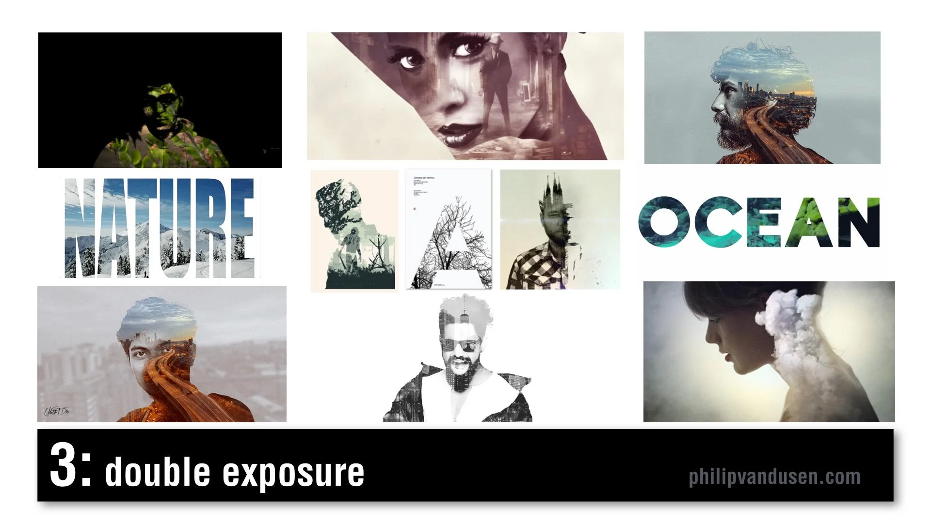
#3 Double Exposure
Double Exposure is seen frequently in motion design. It's recognized by combining imagery: using imagery as masks, masking imagery with imagery. It creates feelings of mystery and romanticism and poeticism. It's used in video and motion, but it's also used in static design. Typography can also be used in masking video. There's increased usage of this style because design applications have made it simpler and easier to produce this effect and it was popularized a few years ago in an HBO special called True Detective in that series trailer.
#4 Electric Gradient
This can be recognized by hyper bright, high-chroma illuminated gradients of color, multiple smooth gradients overtaking the entire image area. It's a reaction against material design and flatness and simplicity. It's being used in illustration and design layout, framing, and typographic treatments. It can be used as a major idea or just as a small element in a larger design. In brand identity, there's a resurgence of complexity and the use of gradients. Historically, gradients had been very hard to produce in print, in physical print, but now that everything is digital, there are no barriers to using gradients. Nothing is holding us back from using them anymore.

#5 Fruitopia
Fruitopia is recognized by fruit being a major visual design element. Fruit being used as a symbolic reference to something else. It can be a great vehicle to leverage color and shape and a design can be linked to a product or just as humor. Fruit is fun. It's sensual. Taste is a key physical sense. It can be used as a complex design tool, as it operates on multiple levels, visual, color, with psychological links to taste memory. It adds a level of humor and whimsy to a design or layout.

#6 Paper Cut
Paper Cut is recognized by hand cut paper or torn paper using realistic shadows to create physical 3D space. Again, it leverages that handcrafted trend, a level of high-touch labor-intensiveness. Again, this is an act of physical creation. It's being used everywhere, in books and posters and illustration and typography. It can be used as abstract shapes or realistic depictions of something sculptural but made out of paper. It can be clean cut or it can have torn edges. It's a very, very versatile trend. It commands a longer and a second look due to its complexity. It's an intention grabber.

#7 Sign Painter
Sign Painter can be recognized by vintage sign painter fonts and hand-brushed hand stroked letter forms, cursives paired with sans-serif block letters. Again, it's a reaction against clean modernism and computer generated design. It embraces the handcrafted design traditions brought into a modern context. This sort of sign painter design requires skill and training because not just anyone can do it and in a way it gives homage and reference to a simpler time when design was not commoditized or computerized.

#8 Geo Max
Geo Max is recognized by super clean, simple geometric abstract shapes, tubes, circles, bright colors. It's a continuation of Neo Geo, a trend from 2019, but it's even simpler. It references Peter Max's illustrations from the 1970s or yellow submarine, the Beatles cartoon movie done by artist Heinz Edelman, who was considered to be the German Peter Max. It's emotionally fun. It's modernistic, it's clean. You can use abstract figures and human forms that have been radically simplified. It appears in posters and food packaging and web design. Some of these images are from the Bloomberg financial report, which shows that even some super conservative companies are using it.

#9 Tactile Type
Tactile Type is recognized by using unusual materials to create typographic designs. Things like cocoa and cheese and plastic tubes, rolled paper, toast, even rusted hardware. Again, it's more of that high-touch, handcrafted time intensive design. Again, a reaction against computer generated design. It commands attention. It's visually complex. It's visually intense. It's used on book covers and posters and editorial illustration, events and promotions. It bridges the gap between sculpture and design.

#10 Stacked & Packed
Stacked & Packed is to be recognized by all type layouts, jigsawed arrangements of typography, interlocking shapes. It can be hand drawn or it can be computer aided design. There's a long thread of historical design references here from vaudeville posters to music posters to boxing match promotional design of the early 20th century. It's used in motivational posters and greeting cards, fine art editorial illustration. Again, this is high-touch, high-concept, time-intensive to create, which seems to be a recurring theme for 2020.

#11 Isometronic
Isometronic is a mashup of the words isometric and animatronic. Isometric projection is a method of visually representing three dimensional objects in two dimensions in technical or engineering drawings. It first made its appearance in gaming apps from the 1980's QBert, Marble Madness, Sega's Zaxxon. It's recognized by non-vanishing point illustration. It's been popularized in mobile phone gaming apps, adventure apps, strategy, building apps. It's not particularly new, but the moving GIF animated versions of isometrics are trending. They're used in websites and email newsletters and digital editorial illustration. They're being used heavily in business categories and business categories are historically slow to take up trends.

#12 Essentialism
Essentialism is another mashup of existentialism and essentials. It's recognized by hyper minimalistic black and whites sans-serif type in broken layouts with truncated letter forms, creative cropping, creating abstract shapes. It's being used in pharma and beauty and health and beauty aid categories. It's also being used in books and in literature and in poster design. It's the exact opposite of handcrafted. It's cold, it's distant, it's non humanistic. It feels computer generated.

#13 Bad Flyer
Bad Flyer is characterized by what looks like a colored paper Xerox with distressed type textures, haphazard collage layout, unusual amateurish font pairing choices. The history comes from band posters and rock 'zine culture and has roots in Ray Gun magazine and David Carson. It's been used in club and music posters, editorial layout, new 'zine culture, design magazines and educated design resources like the AIGA. It's fun, it's inventive, it's gutsy, it feels anti-design establishment. It's kind of the "bad is good" design aesthetic concept. It's handcrafted design but with basic tools, things like colored paper and scissors and glue and a bad Xerox machine.

#14 Throwback Pixels
Throwback Pixels is characterized by bright garish, high chroma color, heavily pixelated, like bad computer painting app, like MacPaint or MS Paint back in the day. It's like a computerized version of the bad flyer trend. It's visually violent, in a way it almost hurts the eyes. Abstract collages of random images and random shapes and random cropping. It's eye catching and it's attention grabbing. Again, it's this "bad is good" design culture. It's computer generated to the extreme in patterns and in texture. It's being used in design magazines and editorial illustration and that image in the lower left is actually from the New York Times special section on streaming, so even news outlets are using it.

After last year's video, people kept asking me, "Philip, how do I create the things that are in this video?"
Well, let me introduce you to Daniel Scott of Bring Your Own Laptop.
I met Daniel when he was a guest on my Brand•Muse interview series on YouTube. Dan's a certified Adobe trainer and a regular speaker at the Adobe Max conference and he has some of the best video training programs out there to learn design applications like Photoshop and Illustrator and InDesign. And if you use my affiliate link you can support my work here on YouTube and I'd really appreciate it. I get a small percentage for sending you to his site. He works on a subscription basis, a very low subscription fee and I tell you it's absolutely worth it. He has incredible training programs.


5 Biggest Mistakes Startups Make and How to Fix Them
Being an entrepreneur takes a lot of guts, grit and business savvy. The “mental game” can be hard, and the odds are stacked against them.

Being an entrepreneur takes a lot of guts, grit and business savvy. The “mental game” can be hard, and the odds are stacked against them. According to the U.S. Bureau of Labor Statistics, nearly half of all startups fail after five years. That is a daunting statistic, and my goal is to help change these odds, one entrepreneur at a time.
I’ve worked closely with many startups and seen them make the same mistakes over and over. By preventing some critical business errors, startups have a greater chance of making the change they wish to see in the world.
Entrepreneurs can go farther by not stepping in theses potholes:
Big Mistake # 1: All product and no brand. Tech companies especially can get blinded by what their app or product does, making them completely forget about the brand. They get stuck in the quicksand of its features.
The functionality of the product is important, but without a solid brand strategy, you can’t clearly define the problem you are solving and who will use your product. This is painfully felt when you are ready to market.
Without a brand strategy, many companies are chasing customers rather than attracting customers.
Without a brand design, you are not instantly recognizable (which means you are instantly forgettable), and there is no way for customers to understand who you are and how you relate to their lives.
Larry Alton, of Entrepreneur.com explains, “Without that core identity, your company is virtually indistinguishable from your competitors, and even with a solid business model, it’s unlikely that your customer acquisition and retention programs will succeed.”
Big Mistake Fix #1: Evolve your brand and product in tandem. When the brand strategy is thoughtful and clear, it naturally leads to smart brand design, which leads to memorable naming for the brand and products, leading to breakthrough marketing.
These “seeds” of a strong brand make it successful. In my mini-ebook, 9 Design Elements Your Brand Absolutely, Positively Needs, I explain how to create these seeds. As you go through this book, don’t be afraid to be bold.
Yes, you may create brand concepts that “suck” at first. Don’t be discouraged.
It will get better. Express your brand authenticity. Stand out and keep iterating.
Big Mistake #2: Be the perfect brand. Building a solid brand takes time. Famous brands took years, if not decades of iteration to become the icons we know today.
In this article, Business2Community reviews some iconic brands and how they have changed over time to adapt to the needs of their customers.
Not one brand I know started out perfectly.
It’s got to evolve.
Big Mistake Fix #2: Take the phrase “building a brand” literally. The keyword is “build.” Don’t waste time thinking it's going to be perfect right out of the gate. Going for the unattainable will delay your progress.
Instead, have your partners agree on a cohesive brand idea that's good enough; a minimum viable brand. The software industry creates excellent minimally viable products (MVPs), and you can take a cue from them. They get the MVP out in the world and see how consumers respond. They observe what customers like and don't like, then alter the product as they go along.
Startups have to do this with their brands. Develop a MVB (minimum viable brand). Iterate and evolve it over time.
You can't hesitate, wait, or be frozen by the fact that you don't have the perfect brand right out of the gate.
Big Mistake #3: Keeping your head down. Entrepreneurs running startups are notorious for tunnel vision, which can be an asset. However, when it comes to knowing your competitors, you have to pay close attention.
“While obsessing over the competition is not healthy, ignoring them was also a recipe for failure in 19% of the startup failures,” reports CBInsights.com. You must know your market and all the players.
You would not believe how many brands and companies have a discovery call with me and can't name their top three competitors. If you don’t know your competitors, you can’t possibly know how to compete with them or where there is an opportunity in the market. You need to know how people will perceive your brand in relation to the others in your arena.
Big Mistake Fix #3: Marketplace audit. You have to be aware of your competitors in order to be different and better. I recorded an information-packed video on how to differentiate your brand and created a downloadable audit worksheet to help you gather all the important information you need.
In addition to the competitive audit, make sure your brand has a role model.
Find three or four aspirational brands; brands that you want your company to be like when it grows up. They can be in or out of your category, it doesn’t matter. The key is that they exemplify the type of behavior, look, and success that you want to emulate.
Aspirational brands will help you define where you are going, which will help you drive your brand to success.
Big Mistake #4: Chasing the wrong channels. One of the best and worst things about marketing is the number of channels available to market your brand.
It can be easy to get hung up on a channel without thoughtfully assessing them all and choosing the best one for your brand.
There will probably be more than one channel that is right for your brand. How do you pick?
Big Mistake Fix #4: Your Target Audience Has The Answer. Two simple questions will lead you to the most profitable channel for your brand:
Who are your customers?
Where is the best place to get their attention?
This is why the brand strategy is so important. Once you define your customer avatar (Mistake Fix #1) you can determine where they “hang out” (e.g., social media, sporting events, trade shows, charity balls, etc.). This will inform you of where you need to show up - in other words, your channel.
Here’s how to get started in marketing channels:
Spend a minimum amount of money on several different channels, and check your analytics over time. See where you're getting the most engagement and the most traffic, and grow your presence in those. Once you find one or two channels that work, leverage them.
Showing up really well in just a couple channels is always better than showing up half-assed in a dozen of them.
You don't want to be everywhere. It takes too much time and money. Start out small and build from there. Focus on what works for you.
Here is a short article from Hubspot that will help you start thinking about the channels that may work for your brand. You can also look at your competition. Be informed by what they are doing, but don’t copy them.
Big Mistake #5: “Et Voila” Thinking. We all love the stories of VC-funded startups with a hapless founder who sketches out some brilliantly simple app, and then months later cashes out for millions of dollars.
The truth is that this rarely happens.
Building a brand takes a lot of time, courage, and tenacity. There is no recipe to follow. You don’t add a little of this, a dash of that, pop it in the oven, “et voila! Success!“
It takes time to see the return on your investment. It doesn't happen overnight.
Big Mistake #5 Fix: Don’t let ideas of overnight success rent space in your head. Instead, focus on evolving. Understand that it takes sweat equity. Remind yourself that success is a long game. Ultimately, there are two things a startup must do to be successful:
1) Start
2) Don’t stop
Your entrepreneurial success depends on so many factors, both internal and external. My advice and encouragement to most entrepreneurs is to be bold, start simple, iterate over time and learn from the mistakes of others. Let’s make our world just a little bit better. One startup at a time.

Your Atomic Reaction
There’s a fine line between brilliant and crazy, between innovative and stupid - and between engaging and dangerous.

Alfred Gilbert made some pretty cool toys. His company focused on those that nurtured children’s interest in science and engineering. Gilbert was the man responsible for one of the most popular toys of all time, the “Erector Set”.
Science experiment toys were very popular in the 1950’s. So, Alfred capitalized on societies arrival into the nuclear age with the “Gilbert U-238 Atomic Energy Laboratory”. A set capable of over 150 “magic show” experiments kids could do for their parents.
And it came with something special: 4 vials of actual radioactive samples.
Oh, and a Geiger counter...you know, just to be safe.
In 2002, Radar Magazine published a list of “The 10 Most Dangerous Toys of All Time”. The U-238 Atomic Energy Laboratory ranked number two. Just after Lawn Darts.
There’s a fine line between brilliant and crazy, between innovative and stupid - and between engaging and dangerous.
In marketing and design, have all have to walk that line. Trying new things. Taking chances. Experimenting to see what works. What doesn’t.
What if we try IGTV? TikTok? How about paid LinkedIn ads? A lead magnet on a pop-up? That new Photoshop filter? That kind-of-out-there font?
Because, if you don’t take the risk of making your own “U-238 Atomic Energy Lab” - then ultimately, you’ll never end up creating your “Erector Set”, either.

That's Genius Stupid
Some things are incredibly stupid, they're genius.

I’m trying to drink more water.
I have a tendency to sip coffee, Diet Pepsi, Red Bull, all sorts of terrible-for-you, caffeinated things all day long. Because unless you are in a sweat from exercising or something, water is...boring.
So I found a new product to help me, Mio. It’s a water “flavor enhancer” that makes your water more tasty - so you’ll want to drink more of it. I love the stuff (which means it is probably also bad for me in some way, but I digress...).
There are times in a marketers life when you come across something so incredibly stupid, it’s genius. That happened when I got an email from Petsmart the other day.
Petsmart is launching a new product, Nulo. Which is....a flavor enhancer for your dogs water. I literally laughed out loud. Stupid, no....genius!
It comes in assorted flavors: Lamb, Rotisserie Chicken, Beef Brisket. It’s got vitamins, electrolytes and amino acids. Undoubtedly more good stuff than my Mio has.
Everyone knows we pet owners anthropomorphize our companions. But Petsmart’s innovation team took it to the next level.
When I run brainstorming sessions with clients, I have one rule: “No poo-pooing”.
Meaning no editing, shooting down, or poo-pooing ideas. EVERY idea is a good idea when brainstorming. The editing and rationalization comes later.
Because you never want to throw out ideas too soon. Ideas that on the surface seem totally stupid.
But in the end, turn out to be genius.

The Sunny Side
So, ask yourself two questions: What do people really need to help their businesses - right now? And...Can I provide it to them?

What Do You Need?
I used to work near Union Square in San Francisco.
Within a couple blocks of the square are a half dozen large tourist hotels. The Marriott, The Westin, The Grand Hyatt. On my way into the office, I used to watch the tourists emerge from their hotels in shorts and t-shirts looking forward to the warm weather they expect in California.
The only problem is that half the year San Francisco is freezing. The fog rolls in and let’s just say it’s not shorts and t-shirt weather.
So the first thing thousands of tourists do is desperately search for where they can buy a sweatshirt.
They don’t have to look very far.
Almost every store around Union Square has warm apparel for sale. CVS has a whole hoodie section right by the front door. So does Walgreens. Even Starbucks has sweatshirts.
Why? It’s because they know it’s good business to give people what they really need - right now. You can make good money selling hoodies even if that’s not what you usually sell.
Maybe you design logos. Maybe you’re a videographer or a 3D animator. And maybe business is a little thin right now because of CoVid-19.
So, ask yourself two questions: What do people really need to help their businesses - right now? And...Can I provide it to them?
Do they need a Facebook ad campaign? Some new blog posts to boost their SEO? A fresh email template for outreach to prospects?
Because you can make good money selling this things. Even if it’s not what you usually sell.

Put This On Your Radar
Sometimes the universe throws you a curve ball. Something completely out of context. Instead of reacting in a knee-jerk way, how can you approach it from a totally different angle?

In December 1955, a marketer at Sears had an idea. They thought…”Let’s run an ad with a Santa hotline!”
That’s when it happened. They made a typo in the ad and listed the wrong number.
So who’s phone number did they actually print? NORAD, that’s who. As in strategic-air-command-nuclear-missile-button NORAD.
Oh, and not just any NORAD number. They printed the number for that red phone. You know, the one that connects directly to the Pentagon.
Oops.
So when kids started calling with their Christmas wishes, they were greeted with a soldier yelling “Is this some kinda fucking joke buddy?”
After discovering this response usually made the child on the other end of the line start crying, the hard-as-nails Air Force guys shifted their approach. They started sharing reports of mysterious flying objects on their radar that were shaped like a sleigh. Or updates on cities where reindeer had been spotted in the skies.
When radio stations heard about it, they started calling to get sleigh updates to share on the air. And so, this is how the “Santa Tracker” tradition got started. With a typo.
But more importantly, from a reaction to a typo.
Sometimes the universe throws you a curve ball. Something completely out of context. Instead of reacting in a knee-jerk way, how can you approach it from a totally different angle? How can you bring to it a dose of humor, a bit of personality, a level of humanity?
Because we’re all just people after all.
People with a wish we want to come true.

Are You a Deer in the Headlights?
Who says we have to limit ourselves? Who says we can’t go to where the customer landscape is a little different?

I live in the suburbs about 2 miles from a 2000 acre park. It’s very wild, mostly woods and trials…and animals. Raccoons, groundhogs, turkeys, opossums, and lots and lots of deer.
The other night, my wife and I were driving home. Suddenly, frozen in the middle of the road in front of us was a 300 lb. buck with an 8 point rack of antlers.
We thought, “You nut! Why are you so far from the park?”
Then I attended a lecture on “Urban Wildlife” at our local animal rescue and learned that animals don’t see any difference between “city” and “country”. They just see “the world”.
To deer, there is “world with bumpy grass ground, trees and tasty shrubs”.
And there is “world with smooth rock ground, big wood boxes and tasty shrubs”.
It’s all the same to them. No boundaries.
In business, we make decisions about what customers to pursue, what industries to focus on. We set artificial limits and boundaries on where we will “feed”. But what if we saw the business landscape with no barriers? No big companies vs. small companies? No B2B vs. B2C?
Who says we have to limit ourselves? Who says we can’t go to where the customer landscape is a little different?
Because maybe there are some tasty shrubs there, too.

Are You Adrift?
When we build a business, we set off expecting fair winds to guide us to lands of plenty. But the sea of competition is cruel. Brands can break, strategies can wear thin. Marketing holes need to be plugged, opportunities can pass us by.

I’ve read Adrift, by Steven Callahan six times. In 1981, Callahan survived 76 days alone at sea in a six foot inflatable raft after his 21’ sloop was struck by a whale and sank in the middle of the Atlantic.
Before it sank, Steven was able to retrieve a few survival supplies including a small spear gun and a second-hand solar still that produced fresh water from condensation.
But in the brutal sun the solar still deteriorated to bits. The spear gun broke. He accidentally punctured his raft and spent days rigging a plug to keep it inflated. Nine ships passed him by, oblivious to his flares and signals.
I think what lead me to read Adrift six times is Steve’s persistence. When he was hit with a problem, he got busy. Failure was truly not an option. He survived because he just would not give up.
When we build a business, we set off expecting fair winds to guide us to lands of plenty. But the sea of competition is cruel. Brands can break, strategies can wear thin. Marketing holes need to be plugged, opportunities can pass us by.
But we must be persistent. Determined to survive. When adversity strikes, get busy. Because giving up is not an option.

Top 5 Reasons To Join A Mastermind Group
The only way to know is to join a mastermind and find out. I am certain you will feel the compounding effect of having 4 or more brains working on your business, more meaningful professional connections, and accountability. Don’t wait another minute.

Masterminds are an incredibly powerful business accelerator tool. I’ve been a member of several masterminds during the last four years and am constantly amazed by how much they have helped my business grow. I’ve gone from zero to a thriving branding consultancy with an international roster of clients across a range of categories including healthcare, medical technology, health and beauty, fashion, architecture and lifestyle startups.
The upward trajectory I’ve experienced as a result of a mastermind is not unique to me. Historic icons like Franklin Roosevelt, Benjamin Franklin and Thomas Edison each had mastermind groups helping them achieve their goals, and many modern-day CEOs and entrepreneurs are using them too. In the age of growth hacking and business incubators, mastermind groups are among the best tools for business advancement.
What is a mastermind group?
Simply put, a mastermind is a group of people who help one another sharpen their business and personal skills. These peer-to-peer groups are a forum for members who solve their business challenges by:
Brainstorming
Sharing personal experience and resources
Educating each other
The members support each other in reaching their business goals by:
Creating a system of accountability
Inspiring and challenging each other to push their limits
Cultivating networking opportunities

Napoleon Hill, known as the father of masterminds, wrote, “No mind is complete by itself. It needs contact and association with other minds to grow and expand.” That growth and expansion are exactly what most entrepreneurs and designers need to achieve exponential results. Meeting with a mastermind group helps you consistently tap into this power.
How Do Mastermind Groups Accelerate Business Growth?
Hill, who wrote the famous Think And Grow Rich, introduced the idea of masterminds in his Master Keys To Success principles. In the 1960’s Master Keys To Success became a multi-part television series. In this episode, he explains:
“[In a mastermind] you may borrow and use the education, the experience, the influence, and perhaps the capital of other people in carrying out your own plans in life. It is the principle through which you can accomplish in one year more than you could accomplish without it in a lifetime if you depended entirely on your own efforts for success.” (excerpt from The Success Alliance)
This is very true. Using or “borrowing” the education and experience of the others in your group is the “secret sauce” of a mastermind. Getting the perspectives, opinions and input from everyone in the group gives you the extra confidence and courage to make decisions faster, see results sooner, and achieve your goals more quickly.
It has been true for me; I have accomplished more with my mastermind groups than I could have on my own. I started a YouTube channel that now has over 180k subscribers, publish an industry-leading newsletter to 15k subscribers and I’ve appeared as a featured guest on 30+ podcasts and virtual conferences. I could not have done even half that without my mastermind groups.

The 5 Benefits of Mastermind Groups for Entrepreneurs and Designers
Here are some of the benefits I’ve experienced from my mastermind groups:
Community: One of the hard parts of being an entrepreneur is the “mental load” of being the chief decision-maker. The group helps lessen that weight. It takes the edge off of the isolation most entrepreneurs experience.
Accelerated learning: You learn from others’ knowledge and experience. The mastermind is a confidential space that allows you to ask questions, experiment, and discuss challenges specific to your business.
Building a network of business partners: Develop trusted relationships and increase your connections across a broad range of industries.
Inspiration and motivation: Hearing what others are doing will push you to do more in your business. Learning about the wins and even failures of others will spur you on. You’ll share in their successes because you’ll have offered them advice, held them accountable and cheered them on. Being a part of others’ success boosts your confidence; something that takes a beating as an entrepreneur.
Goals & Accountability: Goals setting on steroids. You’ll see how others set and accomplish goals. Share goals with each other and hold each other accountable so everyone gets more important work done. Studies have shown that people perform better when others are watching (Johns Hopkins University, 2018). A small audience, such as a mastermind, may be just the thing to kick your business growth into high gear.
I created a video called “The 5 Powers of Mastermind Groups,” where I discuss these benefits in more detail.
Where will the power of the group take you?
The only way to know is to join a mastermind and find out. I am certain you will feel the compounding effect of having 4 or more brains working on your business, more meaningful professional connections, and accountability. Don’t wait another minute.

The Un-Instagrammable
When you are creating a brand, you look for the iconic. The memorable. The indelible. The unique. The un-Instagrammable.

I went on a short trip to a place called Neahtawanta near Traverse City, Michigan last week. It’s a small private enclave of cottages that dates back to the 1890’s. I spent summers there when I was growing up. It holds a lot of fond memories for me.
In “Neah” there is a wooden pavilion on the beach where families gather to cook out, have cocktails and watch the sunset. For over 50 years there was a scrawny evergreen tree that grew at the edge of the water. It had a distinct asymmetrical shape. Like a larger version of Charlie Brown’s Christmas tree. Not your Instagrammable type of a tree.
But it stood out from thousands of other trees in its character, its shape, its sheer tenacity to weather the brutal Michigan winters on the shore of the lake over the decades.
This year, one of the association members decided to design a logo for Neah that she could print and embroider on T-shirts and hats for the other cottage owners and she needed an icon.
This one little tree said “Neah” better than anything else.
When you are creating a brand, you look for the iconic. The memorable. The indelible. The unique.
The un-Instagrammable.

Your Mind, Blown
Have you ever had an experience with a product that made you reevaluate the very conception you’ve always had of particular thing?

My friend Adam got a Tesla. An $80,000 Tesla, to be exact. He ordered every bell and whistle. He said, “I went down the list of options and just checked every box”.
After we had dinner Saturday, Adam asked if I wanted to drive it. I can’t say I was dying to. But O.K., let's see your new toy.
Out on the street, Adam pulled out his phone, hit a button and the car drove itself over to us. Then I stepped into and literally drove the future.
Tooling down the road at 40mph Adam says, “Take your hands off the wheel and foot off the pedal”. It was freaky. Not only can it drive itself, it can pass cars and change lanes completely on its own.
When you read that a car goes from 0 to 60 in 3.5 seconds that’s impressive. But then it also goes from 20 to 60 in 2 seconds. Two. Until you press a pedal and feel a car do that, you can never truly understand. I mean - Holy. Shit.
Have you ever had an experience with a product that made you reevaluate the very conception you’ve always had of particular thing? This Tesla did that.
How can you Tesla-ize what you do?