
15 Graphic Design Trends for 2024

Let’s dive into 15 trends in design that I've recognized in the market that will influence the creative industry in 2024.
But first a little context: I was in the fashion industry for 15 years and travelled the globe shopping for trend 4 times a year, Tokyo, London, Milan, Berlin, Paris, etc. Trend hunting was my job. I’ve worked with a host of the major trend houses like WGSN, Stylus, JWT, Pantone.
The one thing I’ve learned over the years is that trends are never limited to specific periods of time and are very fluid in how they appear.
Trends are revisited, altered, revised, new perspectives are added, they disappear and then they come back over and over - particularly in the fashion industry. The design aesthetic called Russian Constructivism is over 100 years old and it never really seems to go away!
Some trends may take a few years to grab hold and become recognizable as popular.
Some of you reading, who see and recognize trends early - may have mentally registered them long before seasoned folks do, so these trends may seem ‘old’ to you already. But to many, who have no formal training in design history these trends are totally new.
What I recommend is using trends to stay inspired, possibly use as a jumping off point in your work and then making that design your own.
Or, you can choose to consciously react against these trends. It's totally up to you, but knowing what the trend is is critical to informing your work one way or the other and to keeping your clients informed as well.
Now let's look at some trends!
Trend 1: Heatmapping

Trend number one is called “Heatmapping”. This trend is characterized by blends of color often depicted as a rainbow of colors emanating from a source object or creating some kind of abstract shape. These colors suggest the kind of heat map that you would see if you used infrared imaging to look at or scan an object or a scene.
It also suggests the result of eye tracking evaluation software that's often used in consumer research. The subject matter can be figurative, or an abstract shape, or something organic, like a flower, as in the packaging on the upper left.
This technique is being used in a wide range of places, from apparel, to home furnishings, app design, print media and web design.
Trend 2: Activist
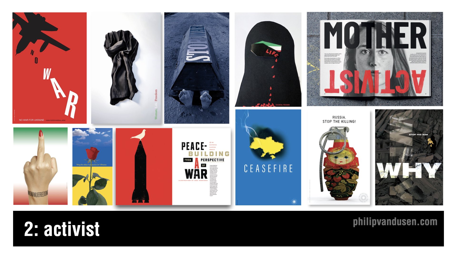
Trend number two is called “Activist”. The geopolitical landscape has been particularly intense in the last year and will continue to be unfortunately through 2024.
Now, I want you to understand I'm not trivializing violent conflicts by calling them a ‘design trend’. They aren't and they shouldn't be.
But what we need to recognize is that throughout history, designers have led the way when it comes to highlighting injustice in the world and inspiring action and change.
And when it comes to having both the imagination and the creative means to communicate in a motivating way, we designers are perfectly suited to the task.
Let's celebrate the amazing work of thousands of designers who will be flexing their superpower of visual communication in 2024 and continue to be a global voice for good.
Trend 3: Anarchist

Trend number three is called “Anarchist”. This trend is reminiscent of the two trends that have frequently been called ‘maximalism’ and ‘glitch’, that have been combined in a visual mashup.
This trend is characterized by a complete visual anarchy in imagery, color, and typography, hence the name. There also seems to be a sense of nihilism in this visual style.
Very little true design communication is intended or achieved. Instead, the intention is to create complete visual chaos. This technique can take the form of digital static or complex photographic collage or compositing.
And this trend relies almost entirely on imagery, although it often incorporates a Deconstructivist use of typography as well.
Trend 4: Botanica
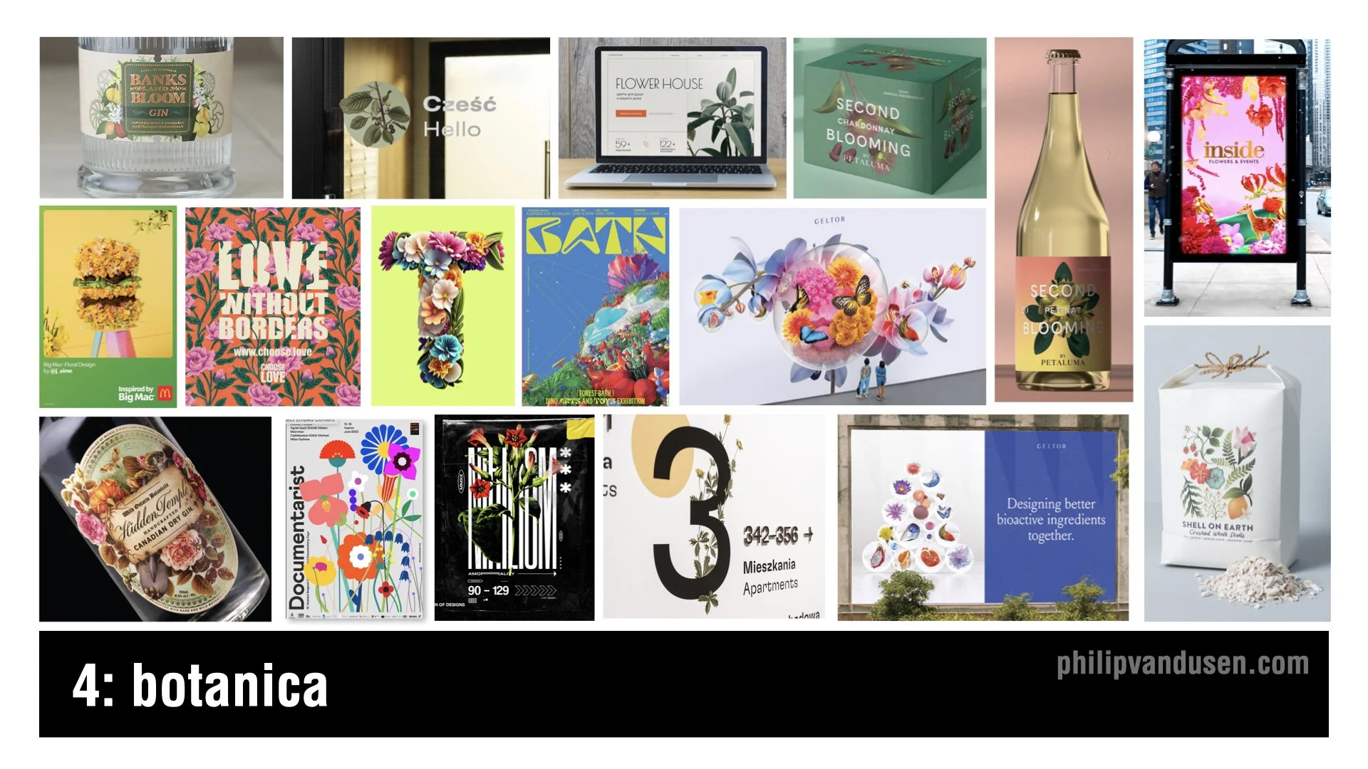
Trend number four is called “Botanica”. In stark contrast to the pervasive visual design trends that are heavily based in digital technology, the Botanica trend brings us back to physical reality, plant life in particular.
I think this trend is a reaction to the political and cultural strife in the world today and is trying to create a sense of peace and calm in the viewer and the consumer.
There's a timeless beauty in these natural forms and colors that are a real delight to the senses. The color and imagery can be realistic and true to life. Or, conversely, it can be hyper real and futuristic, taking the form of AI generated, alien plant life forms that have no basis in reality.
Botanica will be used heavily in product packaging, spirits, print, advertising, and can even be found in way-finding.
Trend 5: Scrapbooking
Trend number five is called “Scrapbooking”, and is essentially a modern twist on collage, with the update being that the colors that are used are often brighter and more cheerful.
In this trend, we're seeing a vibrant and eclectic mix of imagery, the range of textures that often juxtapose radically disparate sources and time periods.
This trend nods to the historical art of collage, dating back to the early 20th century, and used by the Dadaists and Russian Constructivists to challenge the traditional perspectives and create layered meanings.
Brands that are looking to convey modernity with a touch of nostalgia can leverage this trend to create memorable designs and resonate on multiple levels.
Scrapbooking's uses include traditional print media, magazines and posters, web design, editorial illustration, and advertising.

Trend 5: Digital Deconstructivist
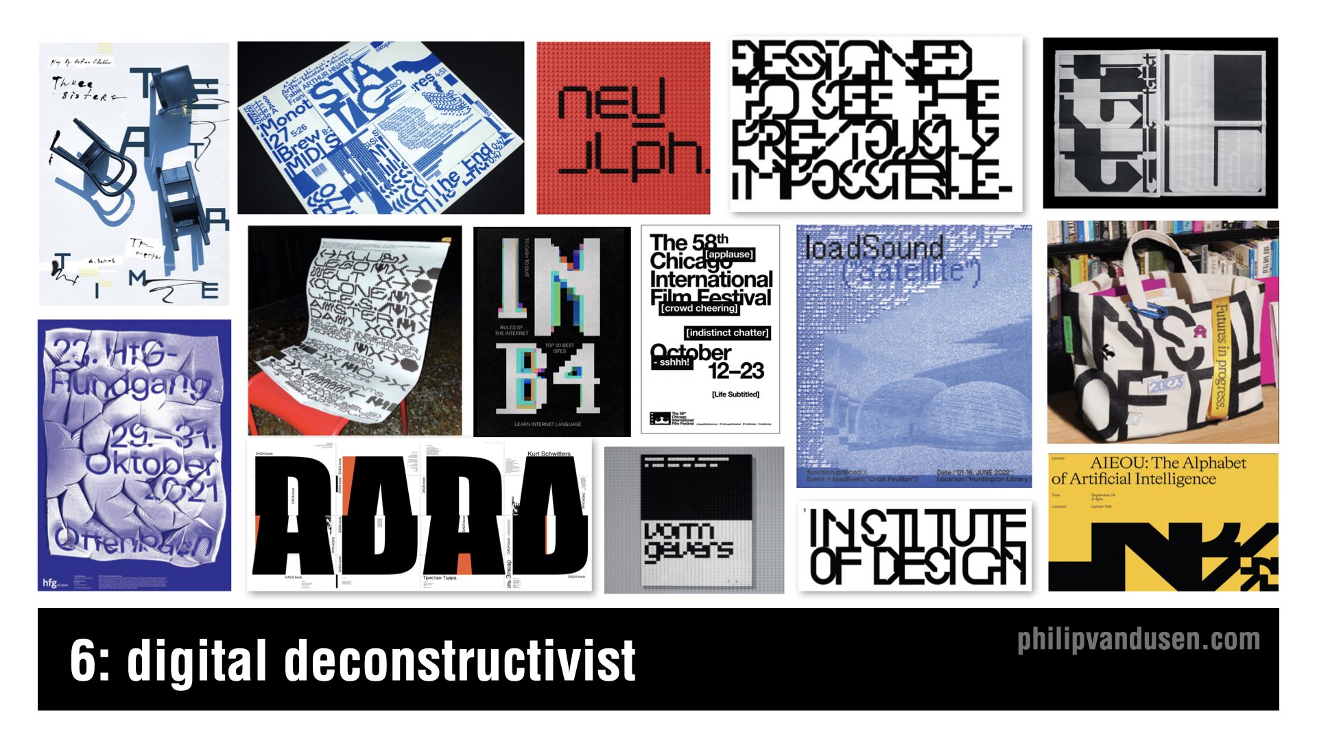
Trend number six is called “Digital Deconstructivist”. This trend is a digital homage to the Deconstructivism movement, which fragmented and manipulated ideas of structure and form.
Mirroring the architectural rebelling of the late 20th century, the Digital Deconstructivist trend shakes up graphic design with layered complexity and unexpected juxtapositions of forms and layers, often relying on slice or pixelated typography.
Text elements are overlaid and reassembled. They challenge readability while pushing the boundaries of conservative design conventions.
It creates a visual language that speaks to the tech savvy and the avantgarde, and it's perfect for interactive media and motion graphics and brands that want to communicate cutting edge thinking.
Trend 7: Environmental Typography

Trend number seven, “Environmental Typography”, is about breaking out of our digital confines and embracing the physical world. It's a blend of graphic design and architecture, where typography becomes an integral part of the environment on a human scale.
This trend harkens back to the days of sign painting, but with a modern approach using bold, towering letters and numbers to create an engaging experience.
Its applications include way-finding in corporate buildings to immersive brand experiences in retail spaces. or bringing an exhibition to life.
Think of it as functional art that not only informs, but also transforms our physical spaces. As brands vie for attention, environmental typography offers an impactful way to communicate messages, whether it's a colossal headline wrapping around a building or a scrolling message that guides you through a space.
Trend 8: Geometrica
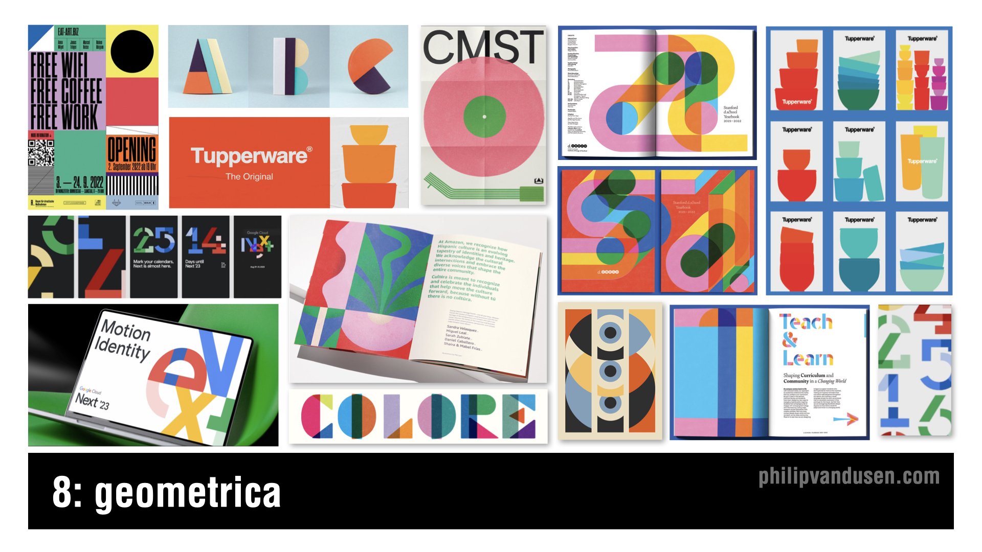
Trend number eight, ‘Geometrica’, celebrates the simplicity and harmony of geometric forms.
With roots in the Bauhaus movement and Swiss style, which both emphasize the beauty of clear, precise geometric shapes, this trend brings those principles into the digital age.
This trend is characterized by bold, youthful colors and shapes interacting in a way that's both playful and meticulously organized. It's a balance of form and function, where the clean lines of geometry meet the limitless possibilities of digital design.
Because design trends can sometimes reflect the extremes of the aesthetic spectrum, this trend is a noticeable reaction against the design chaos that we see in the ‘Anarchist’ and the ‘Digital Deconstructivist’ trends.
Applications for this trend would include mobile app interfaces, web design, print, packaging, and editorial layout, among others.
Bring Your Own Laptop: Adobe Training with Daniel Scott
I want to take a moment and mention that I often get comments on my blog posts and trend videos asking how to achieve the aesthetics in the trends that I'm featuring. So I want to share with you a not-so-secret secret.
Daniel Scott, who in my opinion is one of the best Adobe app trainers out there, has an Adobe training site called Bring Your Own Laptop. The site's subscription based and it's an insane value at only $12 per month, or $84 per year, for access to all the training on the site.
Daniel sometimes even uses the trends that I feature in my YouTube trend videos as examples in his trainings.
So if you want to get better using your favorite Adobe apps, or learn a new one, I suggest that you head over to https://byol.me/philip and check out everything that he has to offer. I hope that you'll use this affiliate link if you want to support my continuing trend-hunting work here, as well as on my YouTube channel.
Now, let's get back to the trends.
Trend 9: Golden Era

Trend number nine is called “Golden Era”. Golden Era is a trend that exudes luxury and sophistication, reminiscent of the Gilded Age and Art Deco's opulence.
Gold has always symbolized wealth and exclusivity, but one of the key intentions of using gold in this way is to differentiate from the heavy use of silver, chrome, and brushed titanium that's so common in digital graphic design and technology design.
This trend is perfect for brands that want to convey a sense of premium quality and timelessness. From packaging to branding, it carries the weight of tradition and can set a product or service apart in a saturated market.
Whether it's a minimalist design that uses flat gold color, or a full blown shiny foil spectacle, Golden Era has applications in print, packaging, fashion, digital media, and environmental design, among others.
Trend 10: Kiddieland

Trend number 10, ‘Kiddieland’, is a playful trend that taps into the joy and uninhibited creativity of childhood.
With all the cultural strife and seriousness in the world, it offers a bit of refuge in its bright colors and whimsical illustrations, and fun typefaces that make the designs feel approachable, and fun.
Kiddieland uses a fusion of simple shapes and bold primary colors that evoke a sense of nostalgia and play, and actually really relates to the ‘Geometrica’ trend that I mentioned previously.
While it's obviously appropriate for companies targeting the kids market, it's also perfect for brands that are young at heart or aiming to communicate simplicity and fun in their messaging.
This style is particularly effective in consumer packaging, education materials, and interactive design. It can also bring a light hearted touch to marketing campaigns and inject energy and life into social media content.
Trend 11: Better Red

Trend number 11, ‘Better Red’, captures the power and intensity of red, a color that's always made a strong statement in design. It's bold, energetic, and typically paired with black and white, so if you want to command attention, use red.
In this trend, the color red is used to create impact and focus. It can be an uninterrupted color backdrop for a minimalist design, as a way to make content shine, or as a part of a more complex pattern that energizes an entire composition.
Better Red is ideal for brands looking to take a powerful stance, whether it's through a website, a poster, or product packaging. This trend can be particularly effective in print, where you want to grab attention quickly, and in packaging where it can also communicate luxury and prestige.
Trend 12: Elasto-type

Trend number 12, ‘Elasto-type’, is a dynamic trend where typography isn't just read, it's felt.
It's characterized by taking fonts and extending them beyond their usual limits, adding a sense of motion to the static page. This technique gives words a visual rhythm that can be seen as a standalone graphic element in their own right and is often used that way.
It's a style that works well for brands looking to convey innovation and can be particularly impactful in digital uses like web design, to animate a static layout or guiding the eye's movement and engaging viewers.
It's also effective in print, offering a fresh perspective on posters, book covers, and any medium where you want the typography to make a really bold statement.
Trend 13: Flaired Fonts
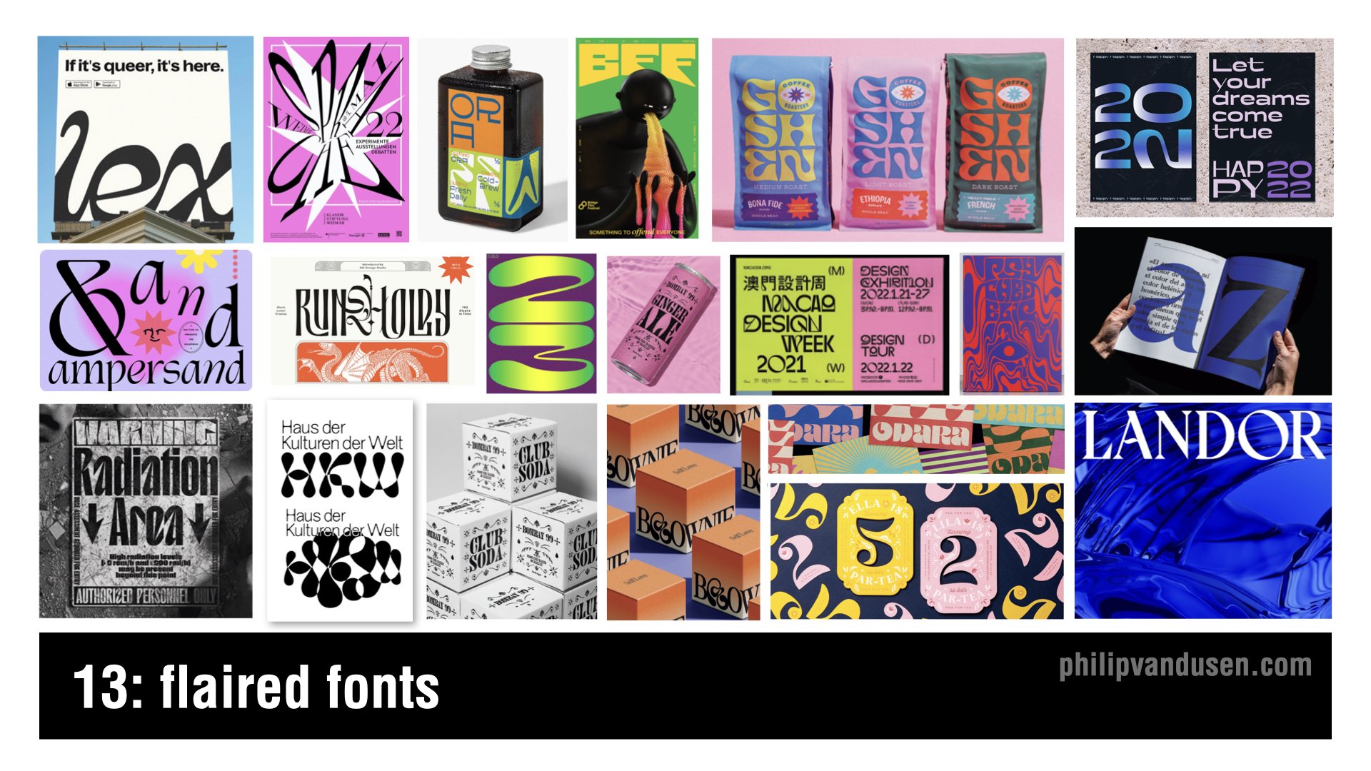
Trend number 13 is ‘Flaired Fonts’, a trend that brings a dose of whimsy and character to typography.
Fonts take on a life of their own with curves and embellishments and a tangible sense of movement. They're a modern take on the days of Art Nouveau's ornamental stylings.
It's almost like they're sans serif fonts, who are trying their hardest on the dance floor to become serifed!
They're versatile enough for creative poster designs, editorial headlines that need to sing, and are perfect for brands that want a unique voice and a personal touch.
In digital applications, where they achieve a level of visual animation, they're a great choice for brands that are looking to express individuality, and as the name says, ‘flair’!
Trend 14: Vintage Americana

Trend number 14 is ‘Vintage Americana’. Vintage Americana is serving, this time, as a rejection of the modern. That is, all-things-AI, technology or anything digital.
It's a feel good, nostalgic nod to a classically American design aesthetic, reminiscent of the mid 20th century. This timeless style uses retro fonts and warm color palettes, imagery, layouts, that conjure up the good old days.
The Vintage Americana trend is perfect for brands that want to establish a perception of heritage and tradition - and those looking to evoke a sense of comfort and reliability.
It works really well virtually anywhere, from print to digital, apparel, spirits, out of home, just to name a few. It can be particularly impactful in packaging, where it can evoke a sense of quality and craftsmanship of bygone eras.
Trend 15: AI Assimilation
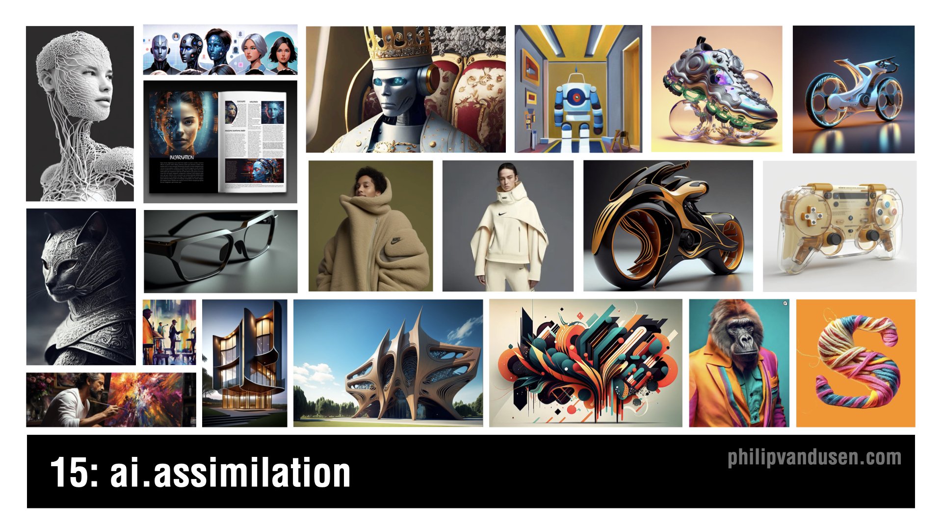
Trend number 15, ‘AI Assimilation’ marks the evolution of artificial intelligence from the novelty it's been in 2023 to a fundamental aspect of creative design in 2024.
It's no longer just about producing fantastical images to share with your friends, it's now a crucial tool that can be used in designing tangible products, items that we interact with every day in our lives.
This trend shows AI's power as an ever expanding reality that's reshaping entire industries as we speak, enabling the creation of objects and spaces that were once impossible to conceive or to visualize.
The aesthetic of AI Assimilation is characterized by its mind bending detail and precision and its ability to radically push the limits of form and function.
Applications include the fine arts, industrial design, product design, transportation, architecture, fashion, accessories, packaging, layout, animation, and that list is just growing longer every single day.
I hope you were inspired by these 15 trends and design for 2024, and if you were, please take a moment and subscribe to my newsletter, Brand•Muse, so you can stay up to date on all the news, trends, resources that make the creative world go ‘round!
As always, I'd also really appreciate it if you'd forward this post, or the associated YouTube Video to a friend or a colleague so others can be inspired too.
Stay creative and bye for now.
How Can We Can Help Your Business?
Is your brand rockin' like nobody elses? Or is it a little tired? Maybe it's just being born. You want to do it right. That's where we come in.
We create new brands from scratch. We fix broken ones. We have all the brainpower, creative chops and marketing magic you’ll ever need and a ton of loyal clients to prove it.
You want nimble? We're the new agency paradigm. We scale up and down depending on your needs so you never pay for resources you aren’t using.
We’ll put the power of brand strategy, design and the most contemporary marketing techniques to work for you. Let’s talk.

15 Trends in Graphic Design for 2023
I often get asked:
"Phil, how do you come up with these trends?"
As far as my trend hunting CV goes, I was VP of Graphic Design and Trend at Old Navy for 11 years and traveled the globe shopping for trend 3x a year, Paris, Tokyo, London, Milan, Berlin etc. I’ve worked with major trend houses like WGSN, Stylus, JWT and Pantone. Trend hunting was my job. Since those formative years, I've been a trend watcher for Fortune 100 clients in the agency world for another 15 - so now 26+ years in, it's kind-of in my blood.
Lots of people get all bent out of shape that they have seen these before. That they feel "old". But what is a "trend" is not a crystal ball. Trends are really about the past - a style or technique that has gained frequent enough usage that it is recognizable as a 'movement' of sorts.
Some people expect trends to be the newest thing - but in reality they are currently POPULAR things - whether they have been around a short or (in some cases) a very long time.
The one thing I’ve learned is that trends are never limited to specific periods of time and are very fluid in how they appear. Trends are revisited, altered, revised - new perspectives are added - they disappear and then they come back over and over (particularly in the fashion industry) Russian Constructivism is 100 years old and it never really seems to go away. Some trends take a few years to grab hold and become recognizable as popular.
TLDR: The short answer is: I observe and collect.
I keep my eyes open for patterns of usage and gaining mass usage. Then I gather, collect images and at the end of the year I categorize them into themes and name them (like I did in my fashion industry days). The names aren't what the whole world is calling them. Often they haven't been 'named' yet by the wider design community or public - so I have to call them something.
I suggest you take a look, just keep yourself informed. You can choose to emulate or propagate these trends, OR you can consciously act/design against them.
It's up to you.
One way or the other I hope I've provided just a little fodder for inspiration in 2023.
Trend #1: Systematic
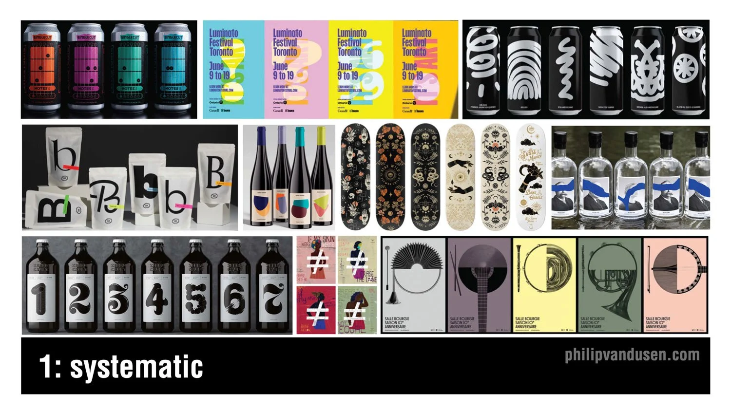
I don't know any designer who doesn't love working in series. Creating multiple variations on a design theme offers really unique challenges as well as exciting opportunities to expand on an idea in a really visually compelling way. Working in series or in systems are particularly well-suited to the food and beverage category as you can see here, but opportunities also exist in apparel, in hard goods, in posters, promotional materials among others. The idea is to maintain an aesthetic thread between the range of items through things like illustration or photography style, color, or typography while maintaining enough consistency for the system to hold together as a group.
Trend #2: Midjourney and AI
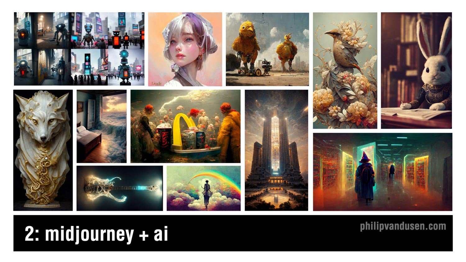
Artificial intelligence has been taking the design and the illustration worlds by storm this year, and it will certainly continue and expand as we move into 2023. Mid journey, the AI illustration tool has been garnering a ton of attention with the quality of work that it produces. Now, while it has deep strengths in imagery that's more fantastical or has a science fiction or a fantasy leaning to it, it can also create work that has fascinatingly inventive when it comes to static objects like the wolf statue on the left or the electric guitar just to the right of the wolf.
Trend #3: Collage

Collage has been around for decades and it finds its roots in Russian constructivism and the data movement at the beginning of the last century. With the invention of digital tools, it became incredibly easy to create collage, but what's harder is how to make it hold together aesthetically and thematically so that it serves the strategic communication required of the design that it's being used in. Collage can be surrealistic, but it can also be used to communicate complex topics in an inventive and multifaceted way, for example, the Netflix History 101 image on the center left or the Adobe Creative Cloud promotional image on the upper right or the Cougar Paper 50th anniversary promotional image on the upper left.
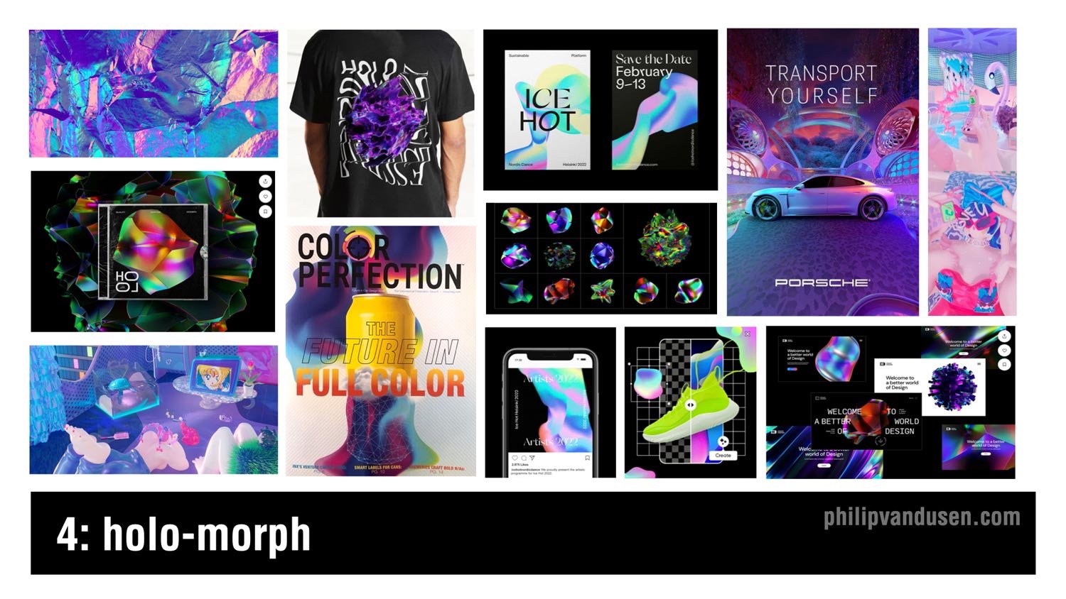
Trend #4: Holo-morph
Holographic imagery requires complex blends of iridescent electric colors rooted in cyan and magenta and green and turquoise. This design trend creates a sense of movement and ongoing evolution as something morphs into being. It communicates a futuristic and a high tech aesthetic that's being used in everything from app design to advertising, poster design, even apparel and packaging. The shapes use dare often amorphic, undulating on a dark ground to accentuate the electric glow of the color blends, and also advances in metallic printing techniques have made it easier to reproduce this look on physical materials and products, which is succeeding in keeping it in the trending category.
Trend #5: Military Inspired
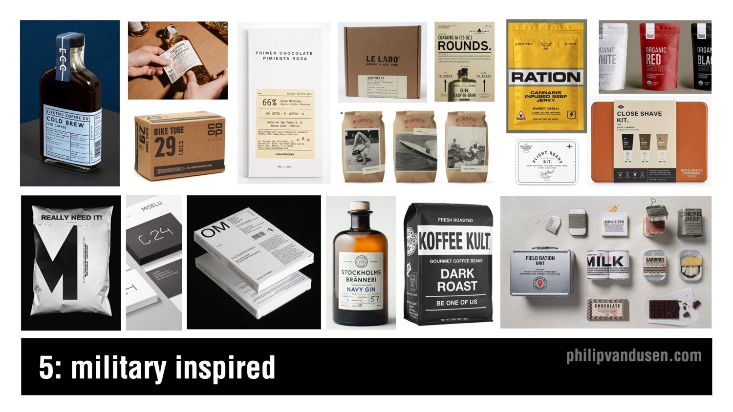
Trend number five is military inspired. Now, the design used in military materials and in generic utilitarian packaging has always held a special allure to designers. The simplicity of these typography driven layouts are made possible by the use of san sera fonts, simple linear dividing lines and strokes, abbreviations, numbers, and technical information. Imagery, photography or illustration are really rarely used and tended detract from the ability to achieve the aesthetic. White open space is really important to maintain as well as severely restricting the use of color and relying mainly on black and white to achieve the look. This design trend is being used heavily in the spirits and food and beverage category, but also in men's accessories and products because this design style has historically been really attractive to male consumers.
Trend #6: Dark Mode Typography

Probably the biggest trend in color in typography that we've been observing is a usage of white text on a black ground, particularly on websites and on mobile. Now historically, designers have been discouraged from using reversed text on black because it can be notoriously difficult to read, particularly if used in large blocks of copy. But as computer monitors have increased in resolution combined with the trend of having significantly less copy on websites, it's made this aesthetic practice more realistic to use. Also, dark mode has infiltrated the preference settings on a lot of computer operating systems as well as web browsers making this typography treatment increasingly acceptable. It also has the added benefit of creating a mysterious and dramatic mood in the designs that it's used on, as well as carrying the perception of premium that people instinctually associate with black and dark rich colors.
Trend #7: Neu-Brutalism

Brutalism refers to the brutalist architecture movement in Western Europe that lasted between the 1950s to the 1970s. It featured raw concrete and was really devoid of paint or decoration. In graphic design, it has roots in the earliest web designs when the internet was only basic HTML and decoration was often clunky and ugly. What I call neu-brutalism vacillates between the unadorned black and white simplicity of the early internet, like the Soft Pillows webpage on the upper left to the intentionally ugly, crowded, and often glitchy functionality of early websites as in the California College of the Arts Career Expo catalog in the upper right. The neu-brutalist design aesthetic is unapologetically aggressive and visually striking, and it's surprising in its simplicity. It's great for use in digital media and apps and websites when you want to stand out from the pack.
Trend #8: 70s Typography

Increasingly, fun is returning to typography and graphic design. More and more designers are using vintage '70s style fonts and type treatments in their design work. We're seeing it in print and packaging and mobile apps, marketing, and even animations. The fonts being used can be bubble like balloon fonts or bold, rounded sera fonts once popular in the golden age of magazine advertising, or they can be trippy swoopy sera fonts that feel simultaneously liquid and psychedelic, ala the '70s illustrator Peter Max.
Trend #9: Lensa-tion

Well, unless you've been living under a rock, you've probably heard about Lensa in recent weeks. Lensa is a design AI app that digests 10 or so pictures of you and then spits out remarkably polished, and in some cases totally gorgeous illustrative portraits of you. It's amazingly fun to play with, and I expect to see this kind of illustration showing up everywhere in personal brand websites, the music industry, entertainment, and of course social media profiles.
Trend #10: Geo-simplicity

The simplicity of basic geometry is the mama that the design community always runs home to when things get too crazy with technology and visual complexity in the design industry. That's what's happening now with geo-simplicity, rooted in the use of bright, often primary colors, super simple geometric shapes of circles, squares, hexagons, and rounded cornered rectangles. This trend has been gaining steam over the last couple years, and as popular culture and society becomes more complex and difficult to navigate, we welcome the simplicity and the cleanliness and the restfulness of this design style. Geo-simplicity is being used in everything from an environmental design and wayfinding to print, packaging, food and beverage, spirits, you name it.
Trend #11: Cyber Wave

Cyber Wave is simultaneously an illustration style and also a design layout style. The combination of heavily manipulated and colorized imagery, photography or illustrations combined with high tech fonts, digital interface and control panel design elements. With nods to techno punk and steampunk and game character design, this trend is heavily used in the music industry, particularly in the Asia-Pacific countries, also in professional gaming culture and cosplay subcultures.
Now, the sportswear industry is embracing this trend heavily because it aligns with the high tech functionality of their products and their shoes, as well as speaking directly to their younger street-wear loving customer demographic.
Trend #12: The Blob
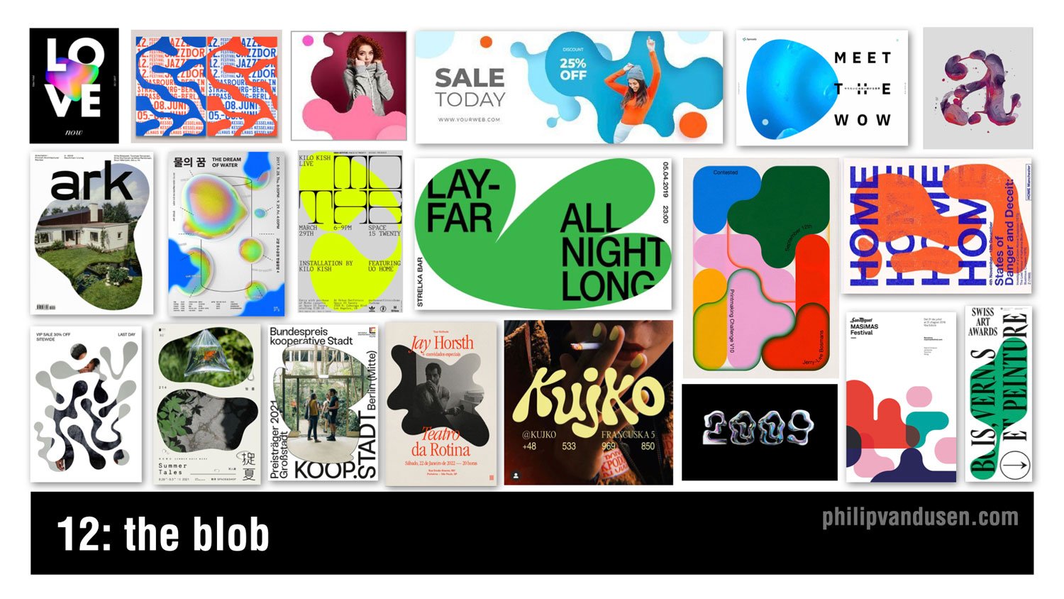
The blob is recognized by the use of amorphic puddle-like shapes as the main visual design element in a layout. The shape can be used as a simple striking vehicle for a field of color, or it can be used to mask illustrations or photography in a visually interesting way. The shapes can be simple or they can be longer and more convoluted. They can also become really inventive type treatments. They can be hand generated, or they can be obviously computer generated. The range is really broad. This design style is a great way to offset simple typographical layouts and inject a level of fun and lightheartedness into a composition trend.
Trend #13: Vaporwave 3.0

I know, I know. Not vaporwave again! But that's why I'm calling it vaporwave 3.0. It's a design trend that is just not going away, so I have to mention it. Look no further than the "new" Twitter blue logo that was released just last week on the left side in the middle. Sure, it's not bleeding in its design anymore, and it's making its way into larger usage, but actually that is the definition of something that's trending. Characterized by the '80s Miami vice type and technicolor sunsets and palm trees, it leverages magenta and cyan heavily to achieve the design aesthetic. It's also showing up in social media, sports wear, gaming, and now even into the realm of fine art and gallery settings as in the image on the top center.
Trend #14: Global Voice

Please understand, I am not trivializing the war in Ukraine by calling it a design trend, because it's not and it shouldn't be. But what I am doing is celebrating and showcasing the amazing work of thousands of designers who've used their superpower to be a global voice for good. Throughout history, designers have led the way when it comes to giving voice to the oppressed and speaking out against injustice in the world. And when it comes to having both the imagination and the creative means to communicate in a really motivating way to the world and speaking truth to power, designers are perfectly suited to the task, and we have to own that responsibility. The war in Ukraine has sadly given the design community another opportunity to showcase that strength, and they've done it in amazing form, shining a global light on a tragic conflict.
Trend #15: Viva Magenta

This is not actually a graphic design trend per se, but a color story trend. But color is an incredibly important part of graphic design. Pantone's Color of the Year in 2023 is called Viva Magenta. It's a bright red with a slightly magenta cast. Last year in 2022, Pantone named “Very Peri”, a periwinkle, as the Color of the Year, which was definitely softer and more muted. But the zeitgeist of popular culture has moved to embracing colors that are more vibrant, leading to this year's Pantone choice. This color trend is already being heavily adopted in the beauty and fashion categories, as well as sporting goods and advertising.
I hope you were inspired by these 15 trends in graphic design for 2023! If you were, make sure head over to my YouTube channel and subscribe for more videos and content on branding, marketing and graphic design.
You also might want to subscribe to my newsletter, “brand•muse” where I share all the latest news, trends, resources and must-read content. Subscribe Here. As always, I'd really appreciate it if you'd share this post a friend or colleague or link to it on social media so others can get inspired too. Thanks for reading, stay creative!
Want to learn how to create the techniques used in these trends?
Check out: Bring Your Own Laptop – with Daniel Scott
I often get comments on my videos asking how to achieve the aesthetics that are in these trends. So I want to share with you a ‘not so secret’ secret with you. Daniel Scott, in my humble opinion, is the best certified Adobe trainer out there, and he has an Adobe app video training website called Bring Your Own Laptop. The site is subscription-based and it is an absolutely insane value at only $12 a month for access to every training he has on his site. Daniel even sometimes uses the trends that I feature in my annual videos as examples in his training videos. So, if you want to get better at using your favorite Adobe apps or even learn a new one, I suggest you head over to:
https://byol.me/philip
(use this affiliate link to support my work, thanks!)

How Can We Can Help Your Business?
Is your brand rockin' like nobody elses? Or is it a little tired? Maybe it's just being born. You want to do it right. That's where we come in.
We create new brands from scratch. We fix broken ones. We have all the brainpower, creative chops and marketing magic you’ll ever need and a ton of loyal clients to prove it.
You want nimble? We're the new agency paradigm. We scale up and down depending on your needs so you never pay for resources you aren’t using.
We’ll put the power of brand strategy, design and the most contemporary marketing techniques to work for you. Let’s talk.

The Numbers Game
Creating masterpieces is a numbers game.
Before I was a branding guy, I was a fine artist.
I actually have a masters degree in painting - not graphic design. Graphic design I picked up along the way. But that’s a story for another day.
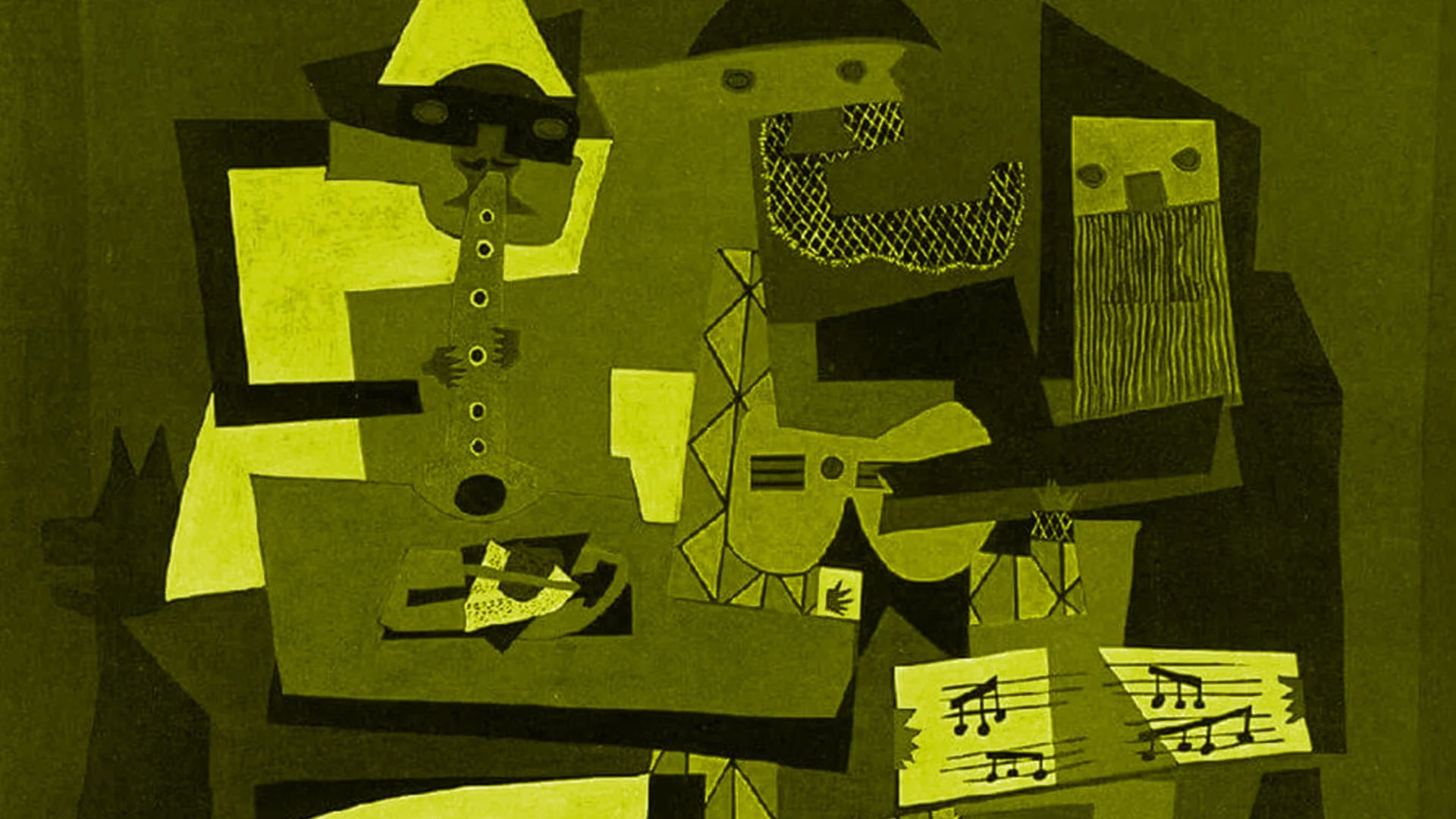
What I really want to tell you about is one of my favorite artists of all time, Pablo Picasso.
In his lifetime Picasso created over 150,000 works of art. Drawings, sculptures, prints, engravings, murals, ceramic sand paintings.
It could be argued that he was one of the most prolific artists in history.
He banged stuff out right and left. Boom, there’s another drawing.
His studio was literally littered with...well, Picasso’s.
Boom, here’s another one...
He didn’t get caught up in perfection.
Now, let me ask you a question:
How many of these 150k works of art are considered to be masterpieces today?
Probably less than 100.
I know there is some curator out there turning red in the face right now thinking...”But every Picasso is a masterpiece!”
The fact is, less than .5% of the artistic content he produced ever mattered in the long run.
So if you’re creatively stuck and are being a perfectionist about that one piece of content you have had on your marketing ‘to do’ list for weeks...
Bang it out.
Because creating masterpieces is a numbers game.
You just have to start.

12 Trends in Graphic Design for 2022

Let's look at 12 Trends in Graphic Design for 2022!
Trends are movements in design that have gained wide enough usage that they can actually be recognized as a trend. They aren't necessarily brand new. In fact, very little is. Very few things have actually never, ever been done before.
I recommend using trends to stay inspired. You can either follow them or you can consciously react against them. But knowing what is trending is critical to informing your work and to informing your clients.
Trend #1: Diversity + Inclusivity
Design has always been instrumental in facilitating changes in society. Large, fortune 500 companies are now responding to societal changes in areas of diversity and inclusivity and bringing it into the mainstream.
Ethnic diversity, mixed-race couples and families have been depicted in design for years now, but diversity in gender, sexual orientation, and physical ability are becoming much more prevalent and visible.
We're seeing it grow considerably in traditional advertising media, in VR, in illustration, iconography, and stock imagery. Expect this trend to magnify in 2022, as acceptance continues to grow domestically in the U.S. as well as internationally

Trend #2: Metaverse
Mark Zuckerberg has made dramatic pronouncements about Meta's intention to making avatar-inhabited virtual environments a priority for the company.
It's unclear exactly what this world is going to look like or what you'll be able to do or accomplish there, but it's not stopping designers, gaming platforms, illustrators, and animators from starting to visually predict and to depict it.
Any design that can happen in real life, billboards, products, ads, branded environments, t-shirts, branded products will undoubtedly come to life in the Metaverse, probably things we haven't even imagined yet.
Designers are going to be on bleeding edge of finding ways to leverage this new virtual ecosystem to their advantage for both themselves and for their clients

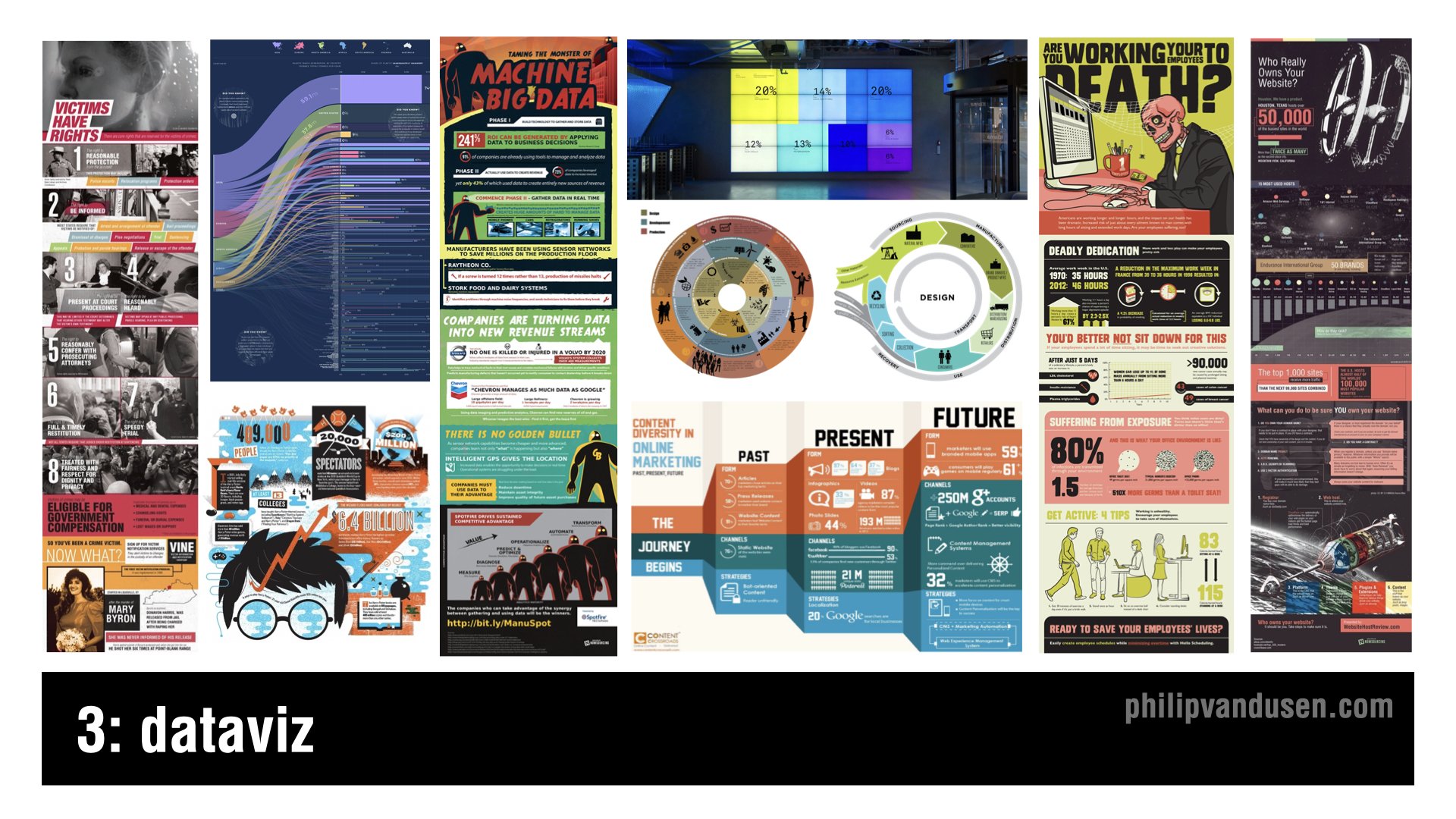
Trend #3: DataViz
We live in a data-rich, and some may say, absolutely saturated world these days. Infographics have been around for years now, but there's a new trend on how the format is being explored.
But typical infographics have lost their appeal and their thumb scroll stopping power so more radical layouts, more inventive imagery, not just the same old icons and stock characters are being used.
It's being done in order to cut through the infographic noise. Infographics are becoming much more creative, inventive, playful, and original illustration-driven designs.
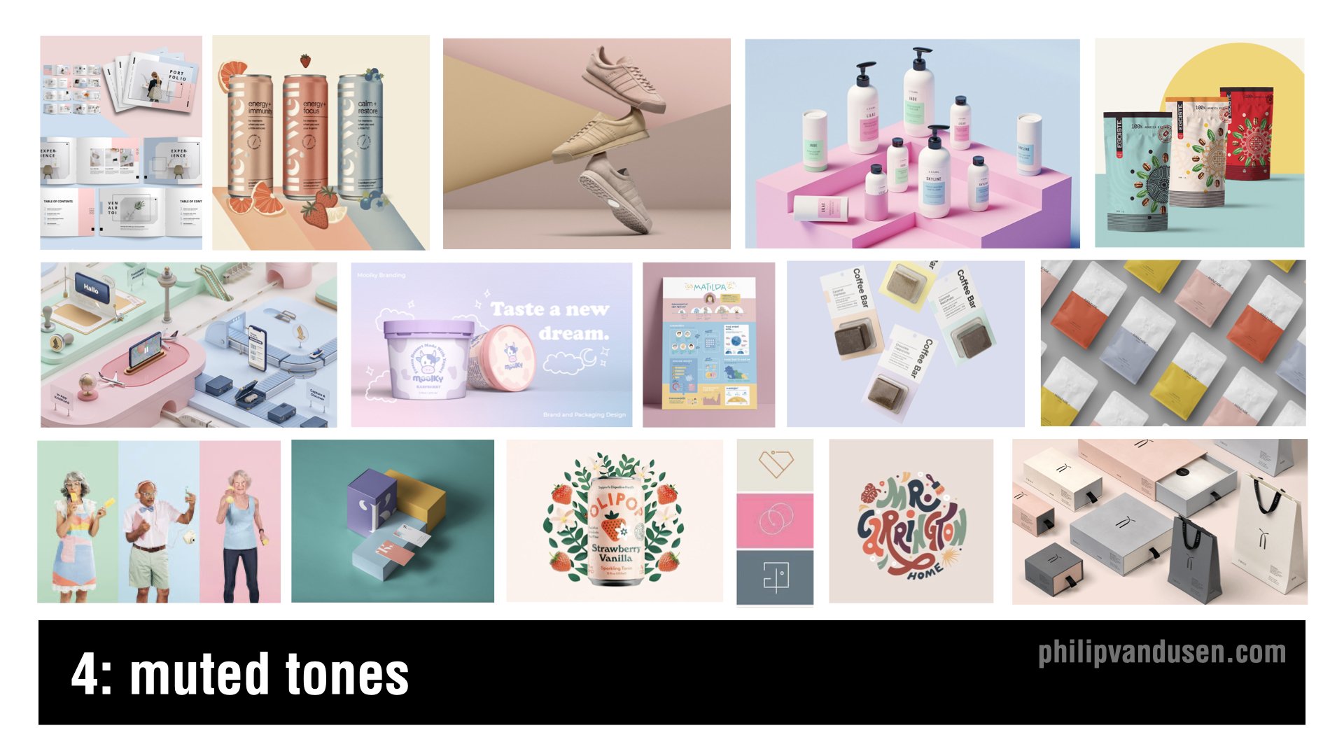
Trend #4: Muted Tones
This is a trend that's emerging where colors that are being used are much more muted, softer, they're less jarring.
It is a reaction against the intense colors that were being used in last year's 2021 trends like “Electric Fade” and “Bright Geo”. Trends frequently emerge that are reactions against other trends and muted tones is definitely one of those.
You'll see that this trend bears out Pantone's Color of the Year choice that I'm going to feature later in this video. The colors used are soft pastels and cosmetic pinks, taupes, and blues.
This trend shows up in consumer package goods, stock photography, fashion, and apparel.
Trend #5: Vintage Apothecary
Vintage Apothecary celebrates vintage typography, flowing, elongated serifs, and ornate borders. 18th-century black and white etching illustrations are also prominently featured in this design style.
This trend shows up in beverages, in food packaging, health and beauty aids, t-shirt design, candles, and the gift industry. It references the Steampunk Movement and is recognized by overlaying detailed layouts and vintage illustration styles.
Vintage Apothecary hearkens back to a simpler time when things weren't mass-produced by the millions, but instead in small, handcrafted batches with real care and real quality.

Trend #6: Eco Everything
Global warming isn't a debate anymore, it's happening much faster than anyone ever thought possible.
The eco-movement, focusing on sustainability and reducing the human carbon footprint in virtually everything we do, make, or use just continues to grow. It's no longer fringe, it's almost a requirement for companies to stake a claim with their consumers about where they stand on the environment.
The days of “greenwashing”, that is giving lip service to sustainability, are long gone. Designers are leading the charge in finding ever more impactful and engaging ways to communicate and market products and services in the green economy.
You can see this trend in hard, good products, in packaging, physical environments, illustration, books, and in color palettes.

Trend #7: Iridescence
Iridescence is somewhat of a continuation of last year's trend that I called “Electric Fade”, it's also related to the Vaporwave trend of a few years ago. But Iridescence is made possible by new, innovative print substrate materials that have reflective and light amplifying properties.
This trend is being seen in technology marketing, in the sportswear industry, in iconography systems and print, AR and VR. It's also beginning to show up in interface design.
I wouldn't be surprised if it actually finds its way into the Metaverse too.
The shapes associated with it can be curve linear and flowing like neon tubing, or they can be sharp and defined and angular in geometric cubes, in geological crystal shapes.

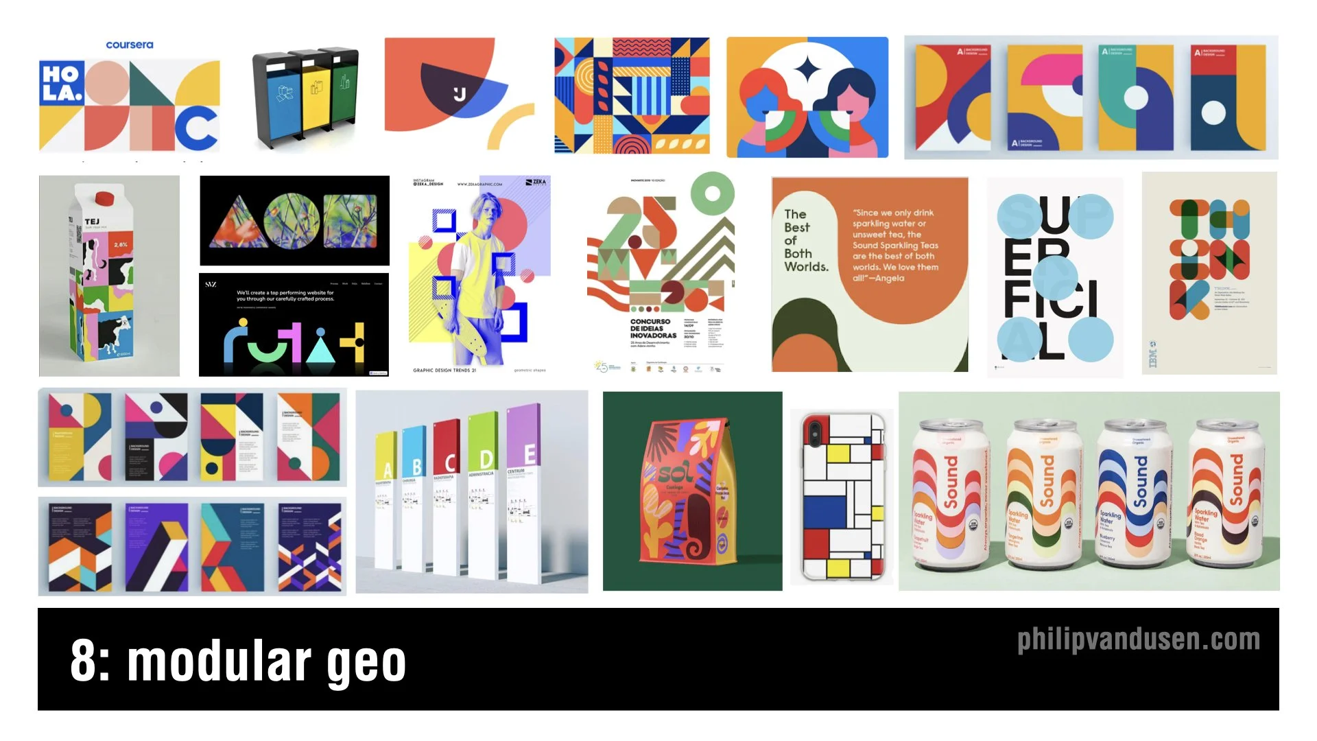
Trend #8: Modular Geo
Modular Geo is an evolution of the “Bright Geo” trend that I featured in my 2021 trend video.
The color used as flat and unmodulated, many times a primary palette is used of bright reds, blues, and yellows. The shapes used in this trend are circles and squares, triangles, parallelograms, and trapezoids.
The aesthetics of the Modular Geo trend have hints of the work of fine artists like Mondrian and Matisse, as well as the work of early Bauhaus design. This trend is being used in print and poster design, packaging, environmental wayfinding, and editorial illustration.
Trend #9: Trippy Type
Sometimes trend happen in pairs, with two diametrically opposed aesthetics that are polar opposites of each other. This is the case with trippy type, it's the polar opposite of the sharp lines and misstructured, rigid compositions that you find in Modular Geo.
This trend is signified by 60s and early 70s, psychedelic typography. Often it's hand-illustrated in shapes with that type and shape itself becoming the primary element or the main focus of the design.
You'll find this trend in new font design, in printed books, illustration, consumer goods, food packaging, fashion, and even motion graphics.

Trend #10: Moving Marks
It's not like animated logos have never been seen before, but it's the extent at which we're seeing them that has really changed.
Animated logo gifs are showing up on corporate email blasts, on website headers, and in apps on a regular basis now. It's the true definition of a trend, a more fringe movement and experimental one that's gained a lot of popular usage that it can now be considered trending.
What's remarkable is the enterprise-size companies that are starting to use these logos ‘on the regular’, as opposed to only periodically in ads on traditional broadcast media.
It's just another indication that “everything is going to video”, even the simple, static company logo can't be counted on anymore to stand still!

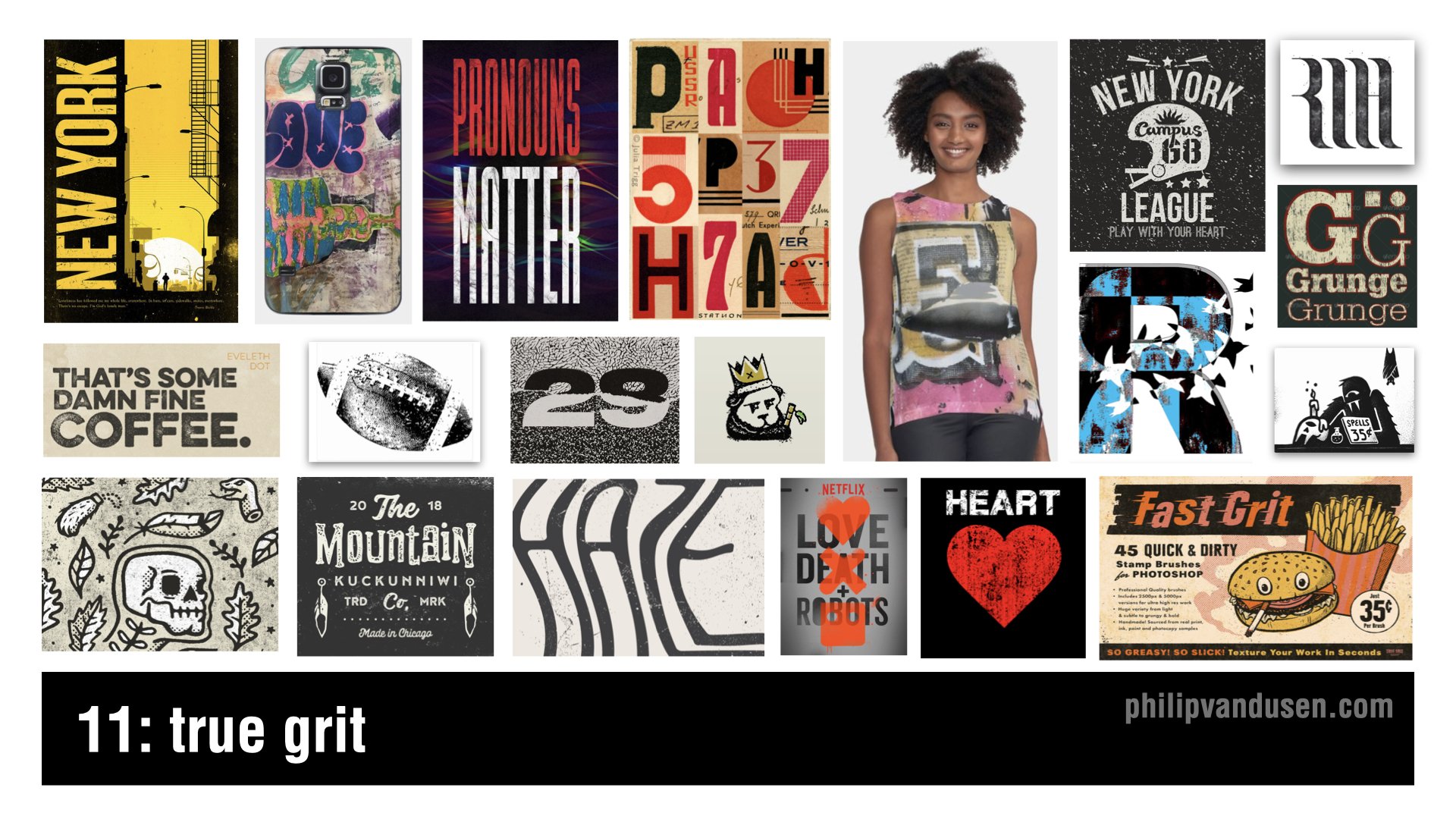
Trend #11: True Grit
True Grit isn't so much of a design style per se as it is a treatment. This trend is recognized by the usage of rough, distressed textures and textural overlays that make images and text look like it's weathered or partially destroyed. It's a reaction against the clean type and stripe design of modular geo or Bauhaus or Swiss Design.
This trend shows up across a broad range of design genres and it's used to add a level of visual interest to a design by aging it, by giving it provenance or history, by adding character.
True Grit shows up in t-shirt design, print and posters, in the music industry, in motion graphics, and also in broadcast entertainment.
Trend #12: Very Peri
Pantone's color of the year for 2022 is called Very Peri, it's basically the color periwinkle. It's not a graphic design trend in and of itself, it's a color story trend. Last year in 2021, Pantone named “Illuminating Yellow” and”Ultimate Gray” as the colors of the year.
But the popular zeitgeist in society has moved towards embracing colors that are more calming and muted like trend #4, Muted Tones, featured above.
Because of the ongoing collective psychological stress of the COVID pandemic, Pantone is forecasting and encouraging a more comforting look for 2022.
This color trend is already being heavily adopted, and you can see it being used everywhere in product design, website design, sports apparel, editorial print, promotional marketing, travel, entertainment, even the financial industry.

I hope you liked this article and the linked YouTube video “12 Trends in Graphic Design for 2022”.
If you were somehow inspired by this trend review, do me a favor and forward it to a colleague or share it on social media! Share the inspiration! I'd really appreciate it and your colleagues will too.
How Can We Can Help Your Business?
Is your brand rockin' like nobody elses? Or is it a little tired? Maybe it's just being born. You want to do it right. That's where we come in.
We create new brands from scratch. We fix broken ones. We have all the brainpower, creative chops and marketing magic you’ll ever need and a ton of loyal clients to prove it.
You want nimble? We're the new agency paradigm. We scale up and down depending on your needs so you never pay for resources you aren’t using.
We’ll put the power of brand strategy, design and the most contemporary marketing techniques to work for you. Let’s talk.

You Think it’s a Mistake but it’s Actually Perfect
We should all remember Wabi-sabi when we go about our marketing work, design work, project work, our conversations with clients.
Because perfection isn’t the goal, it’s the enemy.

At the beginning of my entrepreneurial journey perfection was my goal.
I wanted to create perfect logos and websites. Upload perfect videos. Publish perfect blog posts. Send perfect emails.
But it was paralyzing.
And because of that, nothing was getting done.
Five years ago this month, when my finger was finally hovering over the “send” button for the very first issue of this newsletter, I was sweating.
What if I made some grammatical error? What if one of the links goes to the wrong page?
What if something is inaccurate and makes someone, somewhere, somehow irritated at me?
But it turns out I had it wrong all.
Since the 16th century, the Japanese have practiced an aesthetic concept that they call “Wabi-sabi”. It celebrates the slightly flawed, the not-quite symmetrical, the unrefined.
It can be seen in pottery with rough uneven edges or intentional chips, in architecture with off-center roofs, in the patchwork robes worn by Buddhist monks.
It embraces the idea is that imperfections are where the beauty lies.
That the true value resides in the flaws.
We should all remember Wabi-sabi when we go about our marketing work, design work, project work, our conversations with clients.
Because perfection isn’t the goal, it’s the enemy.
It’s the imperfections that make us relatable, interesting and authentic.
And they also help us get things done.

Shedding Some Light
As marketers and creatives we do this stuff all the time.
We produce creative work, content, media, share valuable information. Then we post it out there in cyberspace.

There’s a star at the very tip of the handle of The Little Dipper.
Its astronomical name is Polaris. But, we call it The North Star.
The North Star sheds a lot of light. In fact, it’s 4000 times brighter than our sun.
The really cool thing is that when you look at it, the light you are seeing was actually generated in 1587.
Its light has traveled for 434 years to reach us.
To fill us with wonder and to help travelers navigate.
When I was reading about the North Star I was reminded of a video I did 4 years ago called “9 Things Your Brand Design Must Have”.
When I shared that video on YouTube I didn’t really know what would happen.
I just posted it and hoped it would help someone.
Time passed...
Then someone watched it. Then another and another.
Now, 4 years later it has 382,000 views. And it still gets about 7,000 views a month.
That video sheds light on a topic that has helped a lot of people navigate brand design.
As marketers and creatives we do this stuff all the time.
We produce creative work, content, media, share valuable information. Then we post it out there in cyberspace.
We don’t know who it’s going to help. Or when it will reach them.
But we have to remember that providing value takes time.
And that it will continue to shed light for years to come.

Become a Great Public Speaker With These Quick Tips
If you want to reach the next level of your career, you can’t gloss over your public speaking skills. Successful designers, entrepreneurs, and creative professionals must present their ideas effectively and defend their work convincingly to an audience.

If you want to reach the next level of your career, you can’t gloss over your public speaking skills. Successful designers, entrepreneurs, and creative professionals must present their ideas effectively and defend their work convincingly to an audience.
Honing your public speaking skills exponentially increases your chances of success in your career.
The opportunity to directly influence an audience is invaluable and is certainly worth the effort to improve.
If you are afraid of public speaking, you are not alone. 25% of people in the world rank public speaking as their number one fear. As Psychology Today explains it, there are myriad physiological reactions, negative thoughts and false beliefs that instantaneously paralyze you with fear when you take the stage.
Even if you’re not paralyzed with fear, you’re bound to get a little nervous before you present. You need to accept the fear. Quietly acknowledge, “I’m feeling nervous.” If you try to fight it, it will make it worse.
Use these tips to feel more confident about your preparation, presentation, and follow-up.
Preparation
Watch and Learn: Watching great speakers and deconstructing their presentations will help you understand the important components of an outstanding speech. TED has some amazing videos from some of the best speakers in the world. Watch as many as you can and ask yourself:
How do they start their talk?
How do they engage the audience?
How do they tell a story?
How do they walk and move?
How do they present the slides that are behind them?
What's the cadence of their speech?
Do they tell jokes or are they serious?
Are they quiet or loud?
Here’s a list of the 25 Most Popular TED Talks Of All Time to get you started. If you want to go even deeper, this video from Chris Anderson, TED Curator, explains the one secret ingredient of all great TED talks.
Rehearse: Knowing your material is the most important preparation step.
Write diligent speaker notes and know your slides cold. Memorize everything until your presentation is mistake-free. Many people find mnemonics are very helpful with memorization.
Mnemonics are based on pictorial memory, so if you are a visual person, it may be the right solution for you. This video from Mike Michalowicz, author of the business cult classic, The Toilet Paper Entrepreneur, teaches you the basics of mnemonics memorization.
Assess: Observe yourself, either in a mirror or on video, to perfect your presentation. Notice and correct any distracting habits like:
Using filler words like "um," "ah," “like,” and “so.”
Long pauses or a very slow speech cadence. This will make it difficult for the audience to stay with you.
No pauses or rushing your words. This will make it difficult for the audience to absorb what you have to say.
Using your hands too much.
It’s easy to lose perspective when you are watching yourself, so get constructive criticism. Invite your friends and family to watch your presentation. Ask them for their impressions and tell them not to hold back. They will tell you what you can’t see.
When You're In The Room
Always Be Early. Ensure that you have a few quiet moments before everyone arrives. When you first get to the room, take a moment to collect your thoughts and breathe. Relax and release any feelings of being rushed.
Next, make sure everything works. Gather your visuals, laptop, projector, and anything else you’ll need during the presentation. Make sure your laptop is charged and has the right plugs for the projector. Laptops have been known to crash the second you're about to start your presentation, so make sure you have a backup presentation and note cards or printouts so you can present without slides.
Preparing for a disaster is very important.
When I was presenting to Disney years ago, I brought my laptop that had my presentation on it in my backpack. When my colleagues and I arrived, the Disney executives gave us bottles of water. I took a sip, then put it in my backpack and went on a tour of the corporate offices.
When I got to the presentation room and opened my backpack, it was filled with 3 inches of water. My laptop was literally dripping as I pulled it out. It was soaked and destroyed. Luckily, I had a backup of the presentation on a thumb drive and was able to use someone else's laptop.
Stuff happens. Have backup.
Setting The Stage: As speaker, you set the tone and mood of the presentation.
Here’s a home-spun proven formula to start a speech and keep audiences engaged:
1. Tell ’em what you’re going to tell ’em
2. Tell ’em
3. Then, tell ’em what you told ’em.
Set your speech up with a very clear introduction about what you're presenting and why.
This creates anticipation for the audience. After that brief intro, launch into your presentation. At the end, briefly review the key points in a concise conclusion. This structure grounds people in the beginning, the middle, and the end of a presentation.
Own the room: This is the one time in your life where you want to be the center of attention. To do that, begin by asking the audience a question and then get them to respond by raising their hands. Some speakers even have people stand up, or tell them to clap or shout, “hell yeah!” They're taking control by forcing people to do something. That control makes them the de facto director of everything that’s happening in the room.
Avoid “Death By Powerpoint:” Keep your slides simple. Too much text, also known as "death by PowerPoint," makes it tempting for the speaker to just sit there and read through it, which will bore the audience to death. It also takes your face away from the audience which means you can’t control the room.
Keep your slides super simple with minimal text so you aren't drawn to try to read them.
Once Upon A Time: Stories are incredibly engaging. Tell a story or use a metaphor to make a point. Stories help people remember and internalize what it is that you're talking about.
Where’s Waldo: Be animated and lively when you are presenting. Walk around - don't pace frantically, but periodically move across the space. This keeps eyes on you and attention on what you are saying.
Make ‘em laugh: Have fun with your presentation and others will too. Don’t be afraid to tell a joke or put a funny or quirky slide in your presentation. I like to show a slide that is a red herring or doesn't fit in with the rest of the deck because it wakes people up.
Having fun with your material is a great way to make sure the audience won’t be working on their phones or reading through their laptop during your presentation.
As You Are: Be human. Be vulnerable. People identify with the person who's presenting to them. They will, more often than not, give you some leeway to make mistakes or to say something that doesn't make sense.
After The Presentation
Leave the last 5 to 10 minutes of your presentation for conversation and questions. This is where things really happen because you are interacting and connecting with the audience in a more genuine way. Speaking off the cuff forges a deeper connection; your audience can get a better sense of who you are with just a few minutes of candid discussion.
If things don't go well - and it happens, don't make excuses but don’t get down on yourself either. Know you did the best job you could and move on. Don't admit that it didn’t go well when you're in the room. Always thank the audience for their time and attention and leave with your head held high.
Perfecting your public speaking skills requires practice and patience. If you’re like most people, you’ll want to get better at it quickly, but be patient. Get practice by speaking regularly, either in an informal group of friends with public speaking goals, or through a formal organization like Toastmasters International. If you are ready for the next level, this article from Inc.com will get you started with apps that can improve your public speaking skills.
When we can all gather in person, someday soon hopefully, I hope to see you presenting at the next industry conference!

7 Ways To Get More Brand Awareness Right Now
When your brand is recognized it means you’ve done a great job of creating a shortcut in people’s brains That shortcut is called brand awareness, and it’s what drives clients right to your door when they have a problem you can solve.

Building a brand has three important stages: being recognized, remembered, and revered. This article is going to cover the first of the three stages.
When your brand is recognized it means you’ve done a great job of creating a shortcut in people’s brains That shortcut is called brand awareness, and it’s what drives clients right to your door when they have a problem you can solve.
Brand awareness side-steps the need to explain your brand values or mission; your branding is so effective that people are already familiar with you and how you stand apart from your competitors. Potential clients know what you do and how you can help as soon as they see your logo, hear your company name, or see your brand colors.
Brand awareness can always be increased with a few simple yet effective strategies. Here are my 7 trusted methods for building brand awareness:
Number 1: Partner with Other Brands. It's beneficial to establish partnerships with other brands, especially when you're starting out. It’s mutually beneficial to expose your audiences to each other’s work, and you're both growing your audience.
Mature brands partner too, and for the same reason: it adds value to customers’ lives. Some examples of this are Red Bull and GoPro, Apple and Mastercard, Pottery Barn and Williams Sonoma, and Spotify and Starbucks.
“Partnerships are definitely very important,” says Adidas Originals’ global director of digital and retail marketing, Swave Szymczyk. “As long as they are not only strategic but also reflect who we are as a brand and what we believe in, it really drives authenticity.
“You can talk about who you are as a brand all day long but having those partnerships to authenticate that message is really critical for every brand.” ‘(marketingweek.com)
You can partner with other like-minded brands to co-publish blog posts or articles, create videos or do podcast interviews. Share space in a trade show booth, or at a special event to add value to each others’ audience. Great partnerships add rocket fuel to your brand recognition and create terrific allies for your growth.
Number 2: Guest Post. While most people think big and want to pen an article for Huffington post right away, that probably won’t happen. But if you start small and build credibility over time, you will get the chance to write for larger and larger publications. Start by researching brands that have similar audiences and then create some outlines for original, juicy content you know the publication’s audience will love.
Pitch your content via email - your pitches will go easily if you’ve done your research well. Include a sample headline of the type of content you would write or links to previous content that you've written for other brands or for your blog. Keep your pitch brief and be very clear. Because editors get dozens of pitch emails a day and make decisions in a matter of seconds, you need to put your best foot forward.
Number 3: Social Heft. Create brand recognition like a social media ninja. This is done by frequently developing shareable content like:
Graphics
Infographics(see #4)
Quotes
Memes
Videos
Guides
Lists
According to vennage.com, original graphics are far more engaging than stock photos, memes, videos, and charts, so create your own visuals as often as you can.
Focus on hot topics in the industry and always ask people to share your content - they won't share unless you ask. There are other well-known triggers to getting people to share your content, and you should explore them all to see which works best for your brand.
“See” your audience and engage with them. Once you’ve got the hot content, links, and shares, you have to engage by answering comments, asking questions, celebrating their good news, and giving advice if needed.
Number 4: Infographics. They are so powerful, I had to reserve a spot only for them. Everyone loves infographics. They are easy to digest and you don’t need to be an expert in the field to get value from them. 90% of the information that's transmitted to the human brain is transmitted visually, and we process images 60,000 times faster than we process text (news.mit.edu). Visual representations of information are easier and faster to internalize. The added plus is, they’re also entertaining.
You can repurpose articles, blogs, statistics, processes, strategies, and plans into infographics. Anyone can do it. Free services that make it easy to create infographics are Visme, Venngage, Canva, and Piktochart.
Your infographics should promote the type of work that you do, showcase your innovative ideas and display the resources and data that would be helpful to your potential customers. Push it out to the category of business that you help.
Be sure to brand all your infographics. A common mistake is to omit your branding, which means you won’t get credit for your brilliant content. Include your logo, URL and contact information to increase brand awareness.
Number 5: Publish or Perish. Publishing content is probably one of the best ways to increase brand awareness because it's shareable and evergreen. Be sure that you get the most out of your hard work and repurpose your content across a range of platforms. For example, by writing an article and turning it into a podcast or a video, you can leverage the different ways people prefer to consume content
Publishing also increases your credibility, establishes you as a thought leader, and promotes your industry expertise. Publishing gives you a platform to champion trends and innovations, and allows you to easily share valuable resources like apps, services, and tutorials.
Number 6: Leverage Friend Referrals. People are much more apt to follow recommendations from a friend than they would from any kind of brand advertising. My good friend and founder of Youpreneur.com, Chris Ducker, calls this P2P, or people-to-people marketing.
There's a geometric progression of growth in asking for friend referrals. For instance, if you have a tribe of 10 people and you ask them to share the good word about your work with four of their friends, suddenly, you've turned that into 40 brand impressions. That’s a fantastic way to land very trusting, yet inexpensive leads.
P2P marketing needs to be done in a very open and honest way that makes it easy for people to refer you. Create valuable content like a “How-To” guide or “Top 5 Features of Top-Performing Websites,” for your friends to share with their friends and colleagues.
Dropbox used P2P when they were starting out. They offered free disk space to anybody who recommended them to a friend. They gave 500 megabytes of disk space, capping it at 16 gigabytes. While that’s a huge giveaway, their referrals grew by 60% and they doubled their users every three months for some time.
Some irresistible incentives you can try include:
Downloadable resource lists
Checklist
Guides
Common mistake list (don’t forget the fixes!)
You can even use your lead magnet as an incentive.
When asking for referrals, be brave and go beyond close friends. Ask your audience to share your incentive with a network connection and see how much exponential growth you can create for your brand awareness. A bold move here could pay off handsomely.
Number 7: Use consistent visual and verbal branding. Consistency is probably the most important thing you can do to increase brand awareness. Logo, colors, fonts, imagery, layout, photography style, and thumbnails need to be aligned. It helps you with the 3 R’s: being recognized, remembered and revered.
Brand equity is achieved in steps and it all begins with awareness. You must be recognized before you can be remembered. Once you're remembered, and you deliver real value with your brand over time you're on your way to being revered. And being revered is the gold standard of any brand.

14 Trends in Graphic Design for 2020
Trends are to be defined as movements in design that have gained wide enough usage that they can actually be recognized as a "trend".
Let’s look at some trends for 2020.
But first let’s set some ground rules.
Trends are to be defined as movements in design that have gained wide enough usage that they can actually be recognized as a "trend". They're not necessarily always brand new or the newest thing out there. In fact, very little has never been done before. Some styles go back decades, some go back hundreds of years, but styles are always morphing, they're always being revisited. There's always new "takes" on them, new variations on them. So graphic designers, I encourage you to be inspired by these trends, not necessarily to copy them directly. It's important that you know what they are because you can choose to be inspired by them or you can choose to consciously react against them.
Or if you choose, you can completely ignore them and focus on your own vision or your own ideas. But knowing what they are is critical. And for entrepreneurs and small business people, being aware of trends is assuring that your brand stays contemporary, it stays relevant and that's important to brand perception.
And with that, let's jump right into it and look at some trends.
#1 Betamax
Betamax is to be recognized by rainbow ribbons of color. It references late seventies early eighties video cassette boxes and California surf apparel like the Ocean Pacific brand. It's clean, it's bright, it's has a level of positivity to it and also is reminiscent of Morris Louis, the 1950s American abstract painter who painted color field paintings. It also has references to sixties and seventies home furnishings, a really fun, bright and interesting trend.

#2 1890's Ornate
This trend is to be recognized by deeply detailed, ornate type, borders, frames, ornaments, fluid flourishes of shapes, gilding and gold leafing. The kind of thing that you'd see in pubs and bars and the windows of restaurants. It was revived by Stranger and Stranger, a packaging design firm that's done a whole lot of work in the spirits category and it was also been revived and seen a lot in tattoo culture. It's a reaction against minimalist design. In itself, it's kind of "maximalism". It's linked to the resurgence of premium handcrafted products, craftsmanship, leather goods, IPA beers, woodworking. It's a high-touch, high-attention to detail design style. It's seen also in chalkboard culture where it's like a dichotomy of ideas: super labor-intensive work versus the impermanence of a chalkboard.

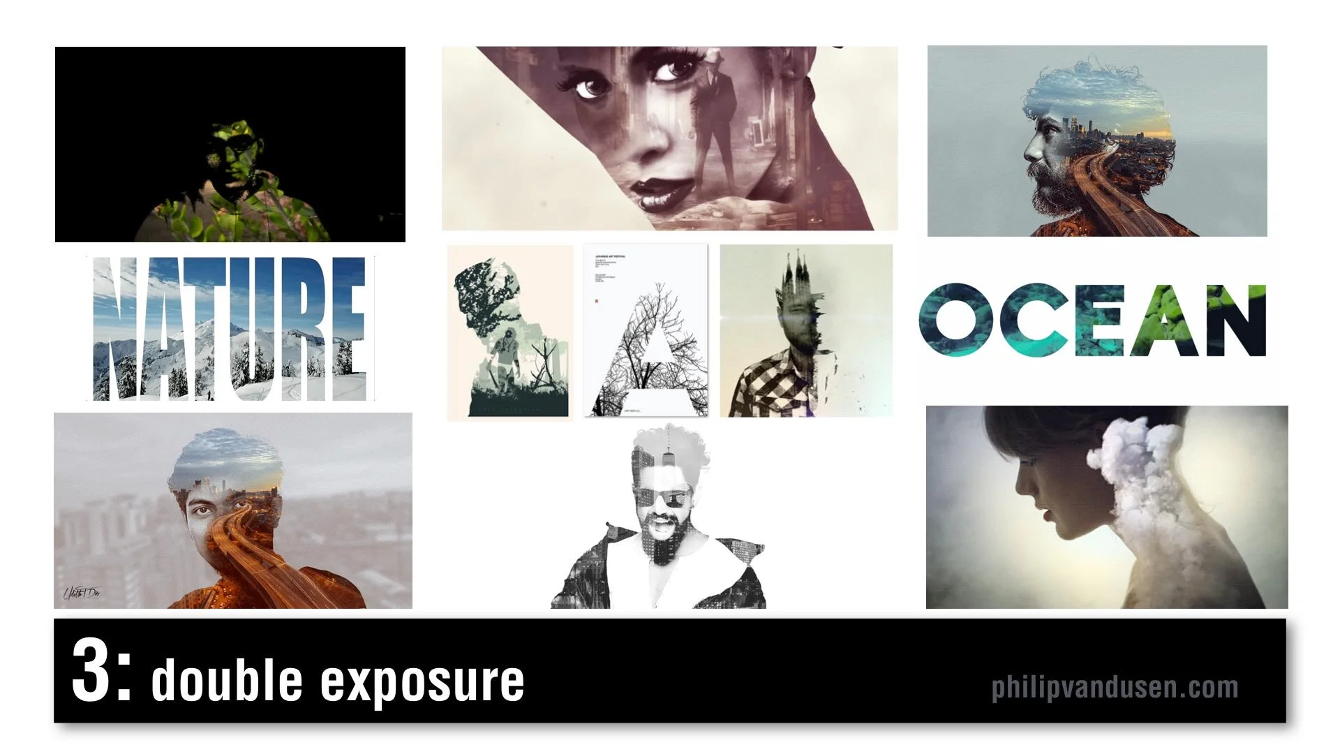
#3 Double Exposure
Double Exposure is seen frequently in motion design. It's recognized by combining imagery: using imagery as masks, masking imagery with imagery. It creates feelings of mystery and romanticism and poeticism. It's used in video and motion, but it's also used in static design. Typography can also be used in masking video. There's increased usage of this style because design applications have made it simpler and easier to produce this effect and it was popularized a few years ago in an HBO special called True Detective in that series trailer.
#4 Electric Gradient
This can be recognized by hyper bright, high-chroma illuminated gradients of color, multiple smooth gradients overtaking the entire image area. It's a reaction against material design and flatness and simplicity. It's being used in illustration and design layout, framing, and typographic treatments. It can be used as a major idea or just as a small element in a larger design. In brand identity, there's a resurgence of complexity and the use of gradients. Historically, gradients had been very hard to produce in print, in physical print, but now that everything is digital, there are no barriers to using gradients. Nothing is holding us back from using them anymore.

#5 Fruitopia
Fruitopia is recognized by fruit being a major visual design element. Fruit being used as a symbolic reference to something else. It can be a great vehicle to leverage color and shape and a design can be linked to a product or just as humor. Fruit is fun. It's sensual. Taste is a key physical sense. It can be used as a complex design tool, as it operates on multiple levels, visual, color, with psychological links to taste memory. It adds a level of humor and whimsy to a design or layout.

#6 Paper Cut
Paper Cut is recognized by hand cut paper or torn paper using realistic shadows to create physical 3D space. Again, it leverages that handcrafted trend, a level of high-touch labor-intensiveness. Again, this is an act of physical creation. It's being used everywhere, in books and posters and illustration and typography. It can be used as abstract shapes or realistic depictions of something sculptural but made out of paper. It can be clean cut or it can have torn edges. It's a very, very versatile trend. It commands a longer and a second look due to its complexity. It's an intention grabber.

#7 Sign Painter
Sign Painter can be recognized by vintage sign painter fonts and hand-brushed hand stroked letter forms, cursives paired with sans-serif block letters. Again, it's a reaction against clean modernism and computer generated design. It embraces the handcrafted design traditions brought into a modern context. This sort of sign painter design requires skill and training because not just anyone can do it and in a way it gives homage and reference to a simpler time when design was not commoditized or computerized.

#8 Geo Max
Geo Max is recognized by super clean, simple geometric abstract shapes, tubes, circles, bright colors. It's a continuation of Neo Geo, a trend from 2019, but it's even simpler. It references Peter Max's illustrations from the 1970s or yellow submarine, the Beatles cartoon movie done by artist Heinz Edelman, who was considered to be the German Peter Max. It's emotionally fun. It's modernistic, it's clean. You can use abstract figures and human forms that have been radically simplified. It appears in posters and food packaging and web design. Some of these images are from the Bloomberg financial report, which shows that even some super conservative companies are using it.

#9 Tactile Type
Tactile Type is recognized by using unusual materials to create typographic designs. Things like cocoa and cheese and plastic tubes, rolled paper, toast, even rusted hardware. Again, it's more of that high-touch, handcrafted time intensive design. Again, a reaction against computer generated design. It commands attention. It's visually complex. It's visually intense. It's used on book covers and posters and editorial illustration, events and promotions. It bridges the gap between sculpture and design.

#10 Stacked & Packed
Stacked & Packed is to be recognized by all type layouts, jigsawed arrangements of typography, interlocking shapes. It can be hand drawn or it can be computer aided design. There's a long thread of historical design references here from vaudeville posters to music posters to boxing match promotional design of the early 20th century. It's used in motivational posters and greeting cards, fine art editorial illustration. Again, this is high-touch, high-concept, time-intensive to create, which seems to be a recurring theme for 2020.

#11 Isometronic
Isometronic is a mashup of the words isometric and animatronic. Isometric projection is a method of visually representing three dimensional objects in two dimensions in technical or engineering drawings. It first made its appearance in gaming apps from the 1980's QBert, Marble Madness, Sega's Zaxxon. It's recognized by non-vanishing point illustration. It's been popularized in mobile phone gaming apps, adventure apps, strategy, building apps. It's not particularly new, but the moving GIF animated versions of isometrics are trending. They're used in websites and email newsletters and digital editorial illustration. They're being used heavily in business categories and business categories are historically slow to take up trends.

#12 Essentialism
Essentialism is another mashup of existentialism and essentials. It's recognized by hyper minimalistic black and whites sans-serif type in broken layouts with truncated letter forms, creative cropping, creating abstract shapes. It's being used in pharma and beauty and health and beauty aid categories. It's also being used in books and in literature and in poster design. It's the exact opposite of handcrafted. It's cold, it's distant, it's non humanistic. It feels computer generated.

#13 Bad Flyer
Bad Flyer is characterized by what looks like a colored paper Xerox with distressed type textures, haphazard collage layout, unusual amateurish font pairing choices. The history comes from band posters and rock 'zine culture and has roots in Ray Gun magazine and David Carson. It's been used in club and music posters, editorial layout, new 'zine culture, design magazines and educated design resources like the AIGA. It's fun, it's inventive, it's gutsy, it feels anti-design establishment. It's kind of the "bad is good" design aesthetic concept. It's handcrafted design but with basic tools, things like colored paper and scissors and glue and a bad Xerox machine.

#14 Throwback Pixels
Throwback Pixels is characterized by bright garish, high chroma color, heavily pixelated, like bad computer painting app, like MacPaint or MS Paint back in the day. It's like a computerized version of the bad flyer trend. It's visually violent, in a way it almost hurts the eyes. Abstract collages of random images and random shapes and random cropping. It's eye catching and it's attention grabbing. Again, it's this "bad is good" design culture. It's computer generated to the extreme in patterns and in texture. It's being used in design magazines and editorial illustration and that image in the lower left is actually from the New York Times special section on streaming, so even news outlets are using it.

After last year's video, people kept asking me, "Philip, how do I create the things that are in this video?"
Well, let me introduce you to Daniel Scott of Bring Your Own Laptop.
I met Daniel when he was a guest on my Brand•Muse interview series on YouTube. Dan's a certified Adobe trainer and a regular speaker at the Adobe Max conference and he has some of the best video training programs out there to learn design applications like Photoshop and Illustrator and InDesign. And if you use my affiliate link you can support my work here on YouTube and I'd really appreciate it. I get a small percentage for sending you to his site. He works on a subscription basis, a very low subscription fee and I tell you it's absolutely worth it. He has incredible training programs.


Your Atomic Reaction
There’s a fine line between brilliant and crazy, between innovative and stupid - and between engaging and dangerous.

Alfred Gilbert made some pretty cool toys. His company focused on those that nurtured children’s interest in science and engineering. Gilbert was the man responsible for one of the most popular toys of all time, the “Erector Set”.
Science experiment toys were very popular in the 1950’s. So, Alfred capitalized on societies arrival into the nuclear age with the “Gilbert U-238 Atomic Energy Laboratory”. A set capable of over 150 “magic show” experiments kids could do for their parents.
And it came with something special: 4 vials of actual radioactive samples.
Oh, and a Geiger counter...you know, just to be safe.
In 2002, Radar Magazine published a list of “The 10 Most Dangerous Toys of All Time”. The U-238 Atomic Energy Laboratory ranked number two. Just after Lawn Darts.
There’s a fine line between brilliant and crazy, between innovative and stupid - and between engaging and dangerous.
In marketing and design, have all have to walk that line. Trying new things. Taking chances. Experimenting to see what works. What doesn’t.
What if we try IGTV? TikTok? How about paid LinkedIn ads? A lead magnet on a pop-up? That new Photoshop filter? That kind-of-out-there font?
Because, if you don’t take the risk of making your own “U-238 Atomic Energy Lab” - then ultimately, you’ll never end up creating your “Erector Set”, either.

That's Genius Stupid
Some things are incredibly stupid, they're genius.

I’m trying to drink more water.
I have a tendency to sip coffee, Diet Pepsi, Red Bull, all sorts of terrible-for-you, caffeinated things all day long. Because unless you are in a sweat from exercising or something, water is...boring.
So I found a new product to help me, Mio. It’s a water “flavor enhancer” that makes your water more tasty - so you’ll want to drink more of it. I love the stuff (which means it is probably also bad for me in some way, but I digress...).
There are times in a marketers life when you come across something so incredibly stupid, it’s genius. That happened when I got an email from Petsmart the other day.
Petsmart is launching a new product, Nulo. Which is....a flavor enhancer for your dogs water. I literally laughed out loud. Stupid, no....genius!
It comes in assorted flavors: Lamb, Rotisserie Chicken, Beef Brisket. It’s got vitamins, electrolytes and amino acids. Undoubtedly more good stuff than my Mio has.
Everyone knows we pet owners anthropomorphize our companions. But Petsmart’s innovation team took it to the next level.
When I run brainstorming sessions with clients, I have one rule: “No poo-pooing”.
Meaning no editing, shooting down, or poo-pooing ideas. EVERY idea is a good idea when brainstorming. The editing and rationalization comes later.
Because you never want to throw out ideas too soon. Ideas that on the surface seem totally stupid.
But in the end, turn out to be genius.

The Sunny Side
So, ask yourself two questions: What do people really need to help their businesses - right now? And...Can I provide it to them?

What Do You Need?
I used to work near Union Square in San Francisco.
Within a couple blocks of the square are a half dozen large tourist hotels. The Marriott, The Westin, The Grand Hyatt. On my way into the office, I used to watch the tourists emerge from their hotels in shorts and t-shirts looking forward to the warm weather they expect in California.
The only problem is that half the year San Francisco is freezing. The fog rolls in and let’s just say it’s not shorts and t-shirt weather.
So the first thing thousands of tourists do is desperately search for where they can buy a sweatshirt.
They don’t have to look very far.
Almost every store around Union Square has warm apparel for sale. CVS has a whole hoodie section right by the front door. So does Walgreens. Even Starbucks has sweatshirts.
Why? It’s because they know it’s good business to give people what they really need - right now. You can make good money selling hoodies even if that’s not what you usually sell.
Maybe you design logos. Maybe you’re a videographer or a 3D animator. And maybe business is a little thin right now because of CoVid-19.
So, ask yourself two questions: What do people really need to help their businesses - right now? And...Can I provide it to them?
Do they need a Facebook ad campaign? Some new blog posts to boost their SEO? A fresh email template for outreach to prospects?
Because you can make good money selling this things. Even if it’s not what you usually sell.

A New Playlist for You
Before the corona virus when we left the house we used to put on classical music for the dogs to keep them company.

The corona virus has everyone stressed out. Now, in week 4 of the lockdown everyone is getting a little stir crazy.
Everyone except our dogs that is.
That’s mainly because they’ve been jammin’ to a new Pandora playlist.
Let me explain.
Before the corona virus when we left the house we used to put on classical music for the dogs to keep them company.
That’s because we’d read that past studies showed dogs were more relaxed when they listened to classical music.
But the folks at the Scottish ASPCA observed by day 7 their stressed shelter dogs got habituated to classical and returned to restlessness. Just like us, they get bored.
So they did their own study. They wanted to know what genre of music dogs actually like best. So they used a playlist featuring 5 genres of music including classical, Motown, soft rock, pop and reggae.
Then they recorded the dogs heart rates, cortisol levels and behaviors that measure stress levels, like barking, panting, yawning or lying down.
It turns out dogs like...reggae. Bob Marley in particular.
When you have been operating under the same assumptions for a while. Serving up the same products, the same strategies and processes - talking about them in the same way. Your message might be falling on deaf ears.
You might want to switch things up. Try a new message, a new look.
Try jammin’ with a new marketing playlist.
What's It Sound Like?
When those associations are repeated thousands of times, eventually hearing, seeing, smelling one thing makes you think of something entirely different.
One of the problems with electric cars is that they are almost silent. You don’t get much auditory feedback. When you press on the accelerator you don’t really hear anything. You just start moving. You don’t get that satisfying “Mrrrrr” sound like in a gas-powered car.
BMW calls this “a gap in the emotionality of the driving experience”.
I call it an opportunity. An insanely cool branding opportunity.
So BMW has hired some sound designers to create a series of sounds to integrate into its electric cars.
If BWM is smart, these designers won’t be limited to approximating car sounds. They should be allowed to consider any sound.
Now, what would an electric BMW accelerating sound like?
A growling panther? Gene Simmons of KISS hitting a E note on his bass? A steel saber hitting armor? Thunder? An avalanche? A galloping stallion?
The possibilities kind-of boggle the mind.
But that’s what we do as branding people and designers. We assign things. We create associations.
When those associations are repeated thousands of times, eventually hearing, seeing, smelling one thing makes you think of something entirely different.
Red and white means Coca-Cola. Brushed aluminum means Apple. Gold arches means McDonalds. The aroma of butter and cinnamon means Cinnabon.
And maybe one day, the sound of Gene Simmons hitting an E note might mean BWM.
One can only hope.

Are You Adrift?
When we build a business, we set off expecting fair winds to guide us to lands of plenty. But the sea of competition is cruel. Brands can break, strategies can wear thin. Marketing holes need to be plugged, opportunities can pass us by.

I’ve read Adrift, by Steven Callahan six times. In 1981, Callahan survived 76 days alone at sea in a six foot inflatable raft after his 21’ sloop was struck by a whale and sank in the middle of the Atlantic.
Before it sank, Steven was able to retrieve a few survival supplies including a small spear gun and a second-hand solar still that produced fresh water from condensation.
But in the brutal sun the solar still deteriorated to bits. The spear gun broke. He accidentally punctured his raft and spent days rigging a plug to keep it inflated. Nine ships passed him by, oblivious to his flares and signals.
I think what lead me to read Adrift six times is Steve’s persistence. When he was hit with a problem, he got busy. Failure was truly not an option. He survived because he just would not give up.
When we build a business, we set off expecting fair winds to guide us to lands of plenty. But the sea of competition is cruel. Brands can break, strategies can wear thin. Marketing holes need to be plugged, opportunities can pass us by.
But we must be persistent. Determined to survive. When adversity strikes, get busy. Because giving up is not an option.

The Un-Instagrammable
When you are creating a brand, you look for the iconic. The memorable. The indelible. The unique. The un-Instagrammable.

I went on a short trip to a place called Neahtawanta near Traverse City, Michigan last week. It’s a small private enclave of cottages that dates back to the 1890’s. I spent summers there when I was growing up. It holds a lot of fond memories for me.
In “Neah” there is a wooden pavilion on the beach where families gather to cook out, have cocktails and watch the sunset. For over 50 years there was a scrawny evergreen tree that grew at the edge of the water. It had a distinct asymmetrical shape. Like a larger version of Charlie Brown’s Christmas tree. Not your Instagrammable type of a tree.
But it stood out from thousands of other trees in its character, its shape, its sheer tenacity to weather the brutal Michigan winters on the shore of the lake over the decades.
This year, one of the association members decided to design a logo for Neah that she could print and embroider on T-shirts and hats for the other cottage owners and she needed an icon.
This one little tree said “Neah” better than anything else.
When you are creating a brand, you look for the iconic. The memorable. The indelible. The unique.
The un-Instagrammable.

Set It On Fire
Unless you live on a tiny atoll in the Pacific, chances are there are a lot of competitors around who do what you do.

It was 1967 and there were a hell of a lot of great guitar players in London. John Lennon, Jeff Beck, Brian Jones, Eric Clapton, Jimmy Page, were all playing the clubs. If you were a guitar player too, it was hard to get noticed.
But there was this one skinny guy named Jimi Hendrix from America. He was a good guitarist. Better than most. He dressed weird, but everyone was dressing weird. He used a lot of distortion, but everyone did that, too. One typical night, his band The Experience was playing the London Astoria. At the end of their 45 minute set Jimi kneeled, laid his guitar down on the stage and…set it on fire.
The audience loved it. The music press couldn’t stop writing about it. They started calling him “The Black Elvis”. Soon it was standing room only. He was that guy who torched his guitar.
Unless you live on a tiny atoll in the Pacific, chances are there are a lot of competitors around who do what you do. You may do it better. Better than most. But how can you be really different? What can you do to set it on fire?

Your Success is Real: 10 Ways to Conquer Impostor Syndrome
Here’s a phrase that sends chills: “ You don’t know what you’re doing, do you?” Executives worldwide agree that their number one fear is being found incompetent.

Here’s a phrase that sends chills: “ You don’t know what you’re doing, do you?”
Executives worldwide agree that their number one fear is being found incompetent (Harvard Business Review 2015). It’s probably a safe bet that the same fear applies to entrepreneurs and creative professionals as well. Psychologists call this fear of being “found out” impostor syndrome, a term coined in the 1970’s by researchers Pauline Clance, Ph.D., and Suzanne Imes, Ph.D. to describe the behavior that Clance observed in some of her graduate students.
So if you’re feeling like an impostor at work, take heart. Chances are that others feel the exact same way. Studies show that 70% of the population feels inferior at least once in their lives.
Impostor syndrome is defined as a collection of feelings of inadequacy that persist despite evident success. It’s a general feeling of unworthiness that manifests itself in:
Being scared to try new things
Being afraid to be ambitious
Not pursuing your dreams or goals
Not pursuing growth opportunities, like a promotion
Feeling like you don't deserve success and recognition, or diminishing your success affects creative people and entrepreneurs disproportionately to the general public, possibly because they are often more sensitive than other professionals. They also tend to be more egotistical, which paradoxically can be a precursor to the syndrome (see #2 below).
The very nature of having a business requires you to stand out, it requires you to stick your head above the pack and say “look at me, look at what I can do”. While this is a necessary appeal for attention and approval it can also make us feel unsafe and judged. This feeling of uncertainty is the root cause of impostor syndrome (refreshedminds.com).
It's important to overcome the feelings of unworthiness. Left unchecked, these thoughts and feelings can become more deeply ingrained in your psyche. It’s best to address these thoughts and feelings as soon as they come up.
Here are ten ways to combat impostor syndrome:
#1 Feelings Aren't Facts.
Impostor syndrome is a feeling. It doesn't manifest itself in reality. It's simply your emotional reaction to something you perceive on the outside world. Emotions don’t always tell us the truth; so don’t treat them as reliable indicators of reality.
#2 Accept the hard work.
It may seem illogical, but impostor syndrome is actually based on an unrealized feeling of superiority. Scientists theorize that children who are told they are superior (more intelligent, artistically gifted, etc.) and praised for their effortless success expect life to be full of easy wins. As adults, they mistrust praise and are convinced of their “failure” because they had to work hard for the result. To them, hard work means they are losing their edge and it’s not praiseworthy. Know that hard work is all a part of the equation for success.
#3 Don’t keep it a secret.
Secrets fester, and your quiet feelings of inferiority can be self-perpetuating if they are not addressed. Talk about it with your friends, your spouse, or your co-workers. Take twenty seconds of courage to put it out there and be vulnerable. You'd be surprised by the support that you get, the number of people who will identify with you and the reality check that ensues. Let your secret out.
#4 Define your own success.
Don't compare yourself to Steve Jobs or Bill Gates. Compare yourself to yourself. Other definitions of success don't matter. You can define your own life and your own level of success. That sentence is without a doubt the most important career guidance I have ever shared, the hardest to achieve and the most rewarding when you do.
#5 It's not about you.
Impostor syndrome traps you in a self-centered mindset. You become consumed with thoughts about yourself; I’m worthless, I’m scared, I’m a loser. You can overcome this hyper-focus on the self by helping other people. Look for ways to serve other people and help them succeed. Check in with your co-workers and clients to see what help you can offer. By making it about others you feel better about yourself.
#6 Be vulnerable.
It's counterintuitive, but being vulnerable makes you stronger. Exposing yourself makes you more YOU and dissolves the impostor feelings. Statements like “I don’t know,” or “I’m sorry,” can lead to open, candid conversation. Try sharing your tender side and see what happens.
#7 Collect testimonials.
This is a way of “stacking the positives” with facts about your performance, rather than relying on your own opinion of how the world sees you. A great way to start is by asking your LinkedIn connections to write you a recommendation. Most likely people will be happy to publish a sentence or two of praise about you. You can post these on your website or put them on your social media, or just keep them in a “love file” on your computer. Collecting kudos about yourself is a great way to boost your self-esteem and to overcome impostor syndrome.
#8 Put Blinders On.
Don't compare yourself to other millionaires, other entrepreneurs, or other designers. Put blinders on and run your own race. Don’t keep a scorecard. If you must keep track of something, keep track of how much you have learned during a project or job, not how you are performing.Think about how far you've come, what you've accomplished, and how much more you know. That will give you fuel to go further.
# 9 No one else knows what they're doing either.
Impostor syndrome makes you feel like everybody else has life figured out. They have all the answers, and they do it all better than you do. The truth? They don't. We're all human, and by humanizing people and realizing that we're all progressing and struggling together, it takes the pressure off you. As Tina Fey says, “Seriously, I've just realized that almost everyone is a fraud, so I try not to feel too bad about it.”
# 10 You're Never Finished.
You are a work in progress. You're not done until you're dead. Period. So when those impostor feelings creep in, fight them off by reminding yourself that you are not “done for” or defeated. Keep moving forward, knowing that you will always be learning and growing. You're in a constant state of becoming. Always.
Putting an end to impostor syndrome is an act of self-love. Being able to fully convince yourself that you are praiseworthy and talented will help your career and your creativity thrive. If you can simply stall the thoughts for a bit by using some of all of these techniques, you’ll get much further than you can imagine.
"Our deepest fear is not that we are inadequate. Our deepest fear is that we are powerful beyond measure. It is our light, not our darkness that most frightens us." – Marianne Williamson

Last One Standing
Defining the emotional essence of a brand is critical. Why? Because people don’t buy using their heads, they buy with their hearts.

Hurricane Michael was called a once-in-a-100-years storm. One of the towns that Michael knocked square in the nose was Mexico Beach, which was virtually flattened. It wiped out most of the structures, but also severed the deep emotional connection of it’s residents.
But one house made it through virtually unscathed.
Russell King and his nephew build their home on 40 foot pilings driven deep into the sand, constructing it out of re-enforced concrete that far exceeded all of Florida’s famously stringent building codes. They called it the Sand Palace. Their family’s emotional connection to Mexico Beach weathered the storm because they had built a solid foundation.
Verhaal will be leading a brand strategy workshop next week were we will be building a “brand pyramid” with our client. Brand pyramids are strategic tools constructed in five layers, much like Maslow's Hierarchy of Needs, with the brands functional benefits on the bottom building upwards to the emotional essence at the peak.
Defining the emotional essence of a brand is critical. Why? Because people don’t buy using their heads, they buy with their hearts. They buy based on a deeper emotional connection. And you architect that connection by building from a solid strategic foundation.
Would your brand survive a 100-year storm?

To Win Big, Think Small
A staggering 80% of social media viewing is done on mobile devices. How do people choose what to consume?

“Alice in Wonderland-like” syndrome is a disorder of the brain. The symptoms are named after Lewis Carroll’s protagonist Alice, who went down a rabbit hole and found herself shrinking or expanding depending on her circumstances. People who are afflicted by it misperceive the size and distance of objects, seeing them as larger or smaller than their natural state.
In a white paper, comScore has reported that a staggering 80% of social media viewing is done on mobile devices. How do people choose what to consume? They click on thumbnails that jump out at them. So not only are viewers encountering content at a tiny scale, they are choosing what to click from even tinier thumbnail images.
When designing artwork for social media, for Facebook, for YouTube, you have to zoom way out. When people view your post, your thumbnail may be as small as 3/4 of an inch wide. If your designs have lots of copy, small font sizes or detailed imagery, people are going to get frustrated and scroll right past them. Opportunity lost.
But when people click your thumbnail, you get traffic. When you get traffic, you win. To win big, you have to start by thinking small.