
15 Graphic Design Trends for 2024

Let’s dive into 15 trends in design that I've recognized in the market that will influence the creative industry in 2024.
But first a little context: I was in the fashion industry for 15 years and travelled the globe shopping for trend 4 times a year, Tokyo, London, Milan, Berlin, Paris, etc. Trend hunting was my job. I’ve worked with a host of the major trend houses like WGSN, Stylus, JWT, Pantone.
The one thing I’ve learned over the years is that trends are never limited to specific periods of time and are very fluid in how they appear.
Trends are revisited, altered, revised, new perspectives are added, they disappear and then they come back over and over - particularly in the fashion industry. The design aesthetic called Russian Constructivism is over 100 years old and it never really seems to go away!
Some trends may take a few years to grab hold and become recognizable as popular.
Some of you reading, who see and recognize trends early - may have mentally registered them long before seasoned folks do, so these trends may seem ‘old’ to you already. But to many, who have no formal training in design history these trends are totally new.
What I recommend is using trends to stay inspired, possibly use as a jumping off point in your work and then making that design your own.
Or, you can choose to consciously react against these trends. It's totally up to you, but knowing what the trend is is critical to informing your work one way or the other and to keeping your clients informed as well.
Now let's look at some trends!
Trend 1: Heatmapping

Trend number one is called “Heatmapping”. This trend is characterized by blends of color often depicted as a rainbow of colors emanating from a source object or creating some kind of abstract shape. These colors suggest the kind of heat map that you would see if you used infrared imaging to look at or scan an object or a scene.
It also suggests the result of eye tracking evaluation software that's often used in consumer research. The subject matter can be figurative, or an abstract shape, or something organic, like a flower, as in the packaging on the upper left.
This technique is being used in a wide range of places, from apparel, to home furnishings, app design, print media and web design.
Trend 2: Activist
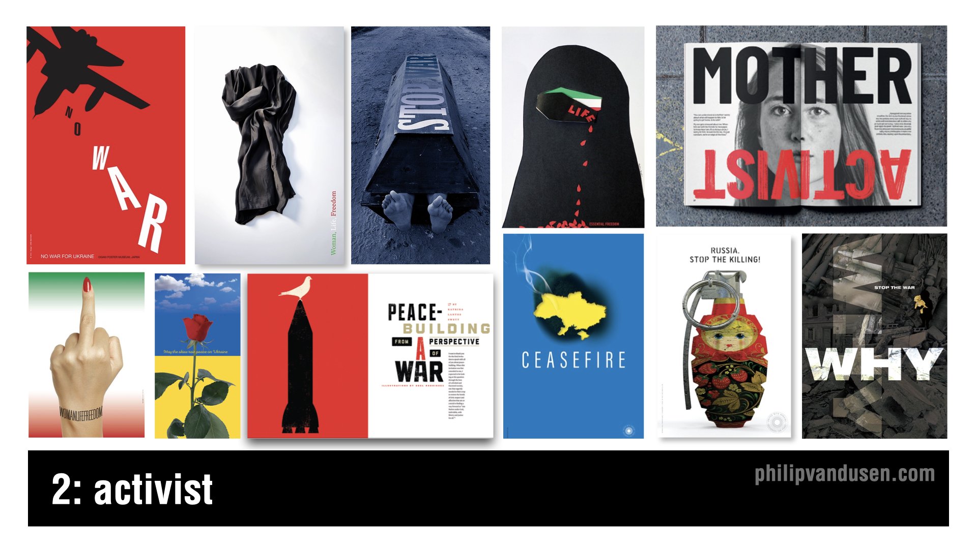
Trend number two is called “Activist”. The geopolitical landscape has been particularly intense in the last year and will continue to be unfortunately through 2024.
Now, I want you to understand I'm not trivializing violent conflicts by calling them a ‘design trend’. They aren't and they shouldn't be.
But what we need to recognize is that throughout history, designers have led the way when it comes to highlighting injustice in the world and inspiring action and change.
And when it comes to having both the imagination and the creative means to communicate in a motivating way, we designers are perfectly suited to the task.
Let's celebrate the amazing work of thousands of designers who will be flexing their superpower of visual communication in 2024 and continue to be a global voice for good.
Trend 3: Anarchist

Trend number three is called “Anarchist”. This trend is reminiscent of the two trends that have frequently been called ‘maximalism’ and ‘glitch’, that have been combined in a visual mashup.
This trend is characterized by a complete visual anarchy in imagery, color, and typography, hence the name. There also seems to be a sense of nihilism in this visual style.
Very little true design communication is intended or achieved. Instead, the intention is to create complete visual chaos. This technique can take the form of digital static or complex photographic collage or compositing.
And this trend relies almost entirely on imagery, although it often incorporates a Deconstructivist use of typography as well.
Trend 4: Botanica
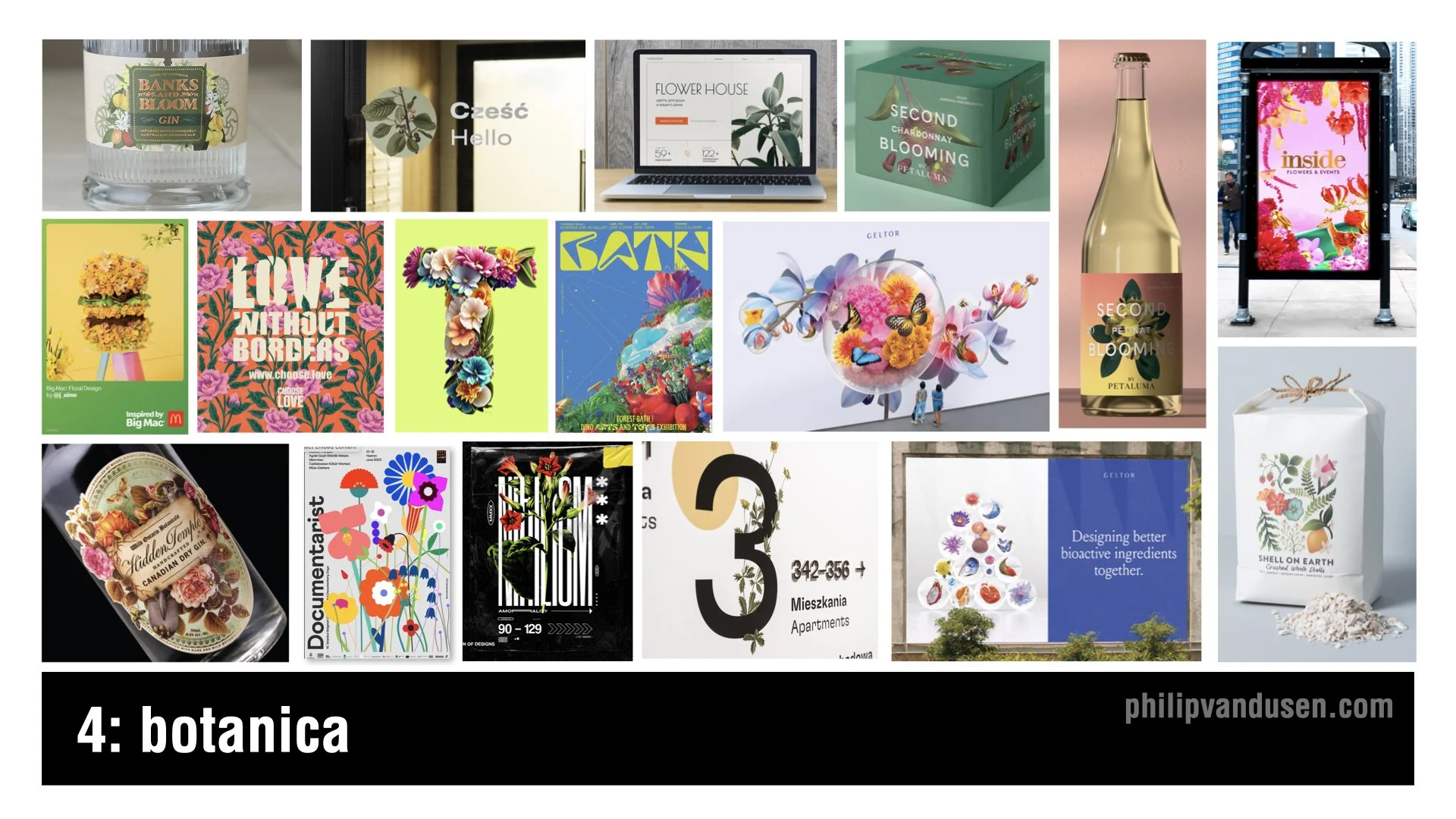
Trend number four is called “Botanica”. In stark contrast to the pervasive visual design trends that are heavily based in digital technology, the Botanica trend brings us back to physical reality, plant life in particular.
I think this trend is a reaction to the political and cultural strife in the world today and is trying to create a sense of peace and calm in the viewer and the consumer.
There's a timeless beauty in these natural forms and colors that are a real delight to the senses. The color and imagery can be realistic and true to life. Or, conversely, it can be hyper real and futuristic, taking the form of AI generated, alien plant life forms that have no basis in reality.
Botanica will be used heavily in product packaging, spirits, print, advertising, and can even be found in way-finding.
Trend 5: Scrapbooking
Trend number five is called “Scrapbooking”, and is essentially a modern twist on collage, with the update being that the colors that are used are often brighter and more cheerful.
In this trend, we're seeing a vibrant and eclectic mix of imagery, the range of textures that often juxtapose radically disparate sources and time periods.
This trend nods to the historical art of collage, dating back to the early 20th century, and used by the Dadaists and Russian Constructivists to challenge the traditional perspectives and create layered meanings.
Brands that are looking to convey modernity with a touch of nostalgia can leverage this trend to create memorable designs and resonate on multiple levels.
Scrapbooking's uses include traditional print media, magazines and posters, web design, editorial illustration, and advertising.

Trend 5: Digital Deconstructivist
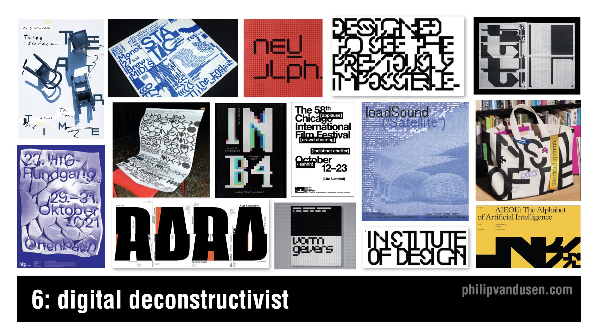
Trend number six is called “Digital Deconstructivist”. This trend is a digital homage to the Deconstructivism movement, which fragmented and manipulated ideas of structure and form.
Mirroring the architectural rebelling of the late 20th century, the Digital Deconstructivist trend shakes up graphic design with layered complexity and unexpected juxtapositions of forms and layers, often relying on slice or pixelated typography.
Text elements are overlaid and reassembled. They challenge readability while pushing the boundaries of conservative design conventions.
It creates a visual language that speaks to the tech savvy and the avantgarde, and it's perfect for interactive media and motion graphics and brands that want to communicate cutting edge thinking.
Trend 7: Environmental Typography

Trend number seven, “Environmental Typography”, is about breaking out of our digital confines and embracing the physical world. It's a blend of graphic design and architecture, where typography becomes an integral part of the environment on a human scale.
This trend harkens back to the days of sign painting, but with a modern approach using bold, towering letters and numbers to create an engaging experience.
Its applications include way-finding in corporate buildings to immersive brand experiences in retail spaces. or bringing an exhibition to life.
Think of it as functional art that not only informs, but also transforms our physical spaces. As brands vie for attention, environmental typography offers an impactful way to communicate messages, whether it's a colossal headline wrapping around a building or a scrolling message that guides you through a space.
Trend 8: Geometrica
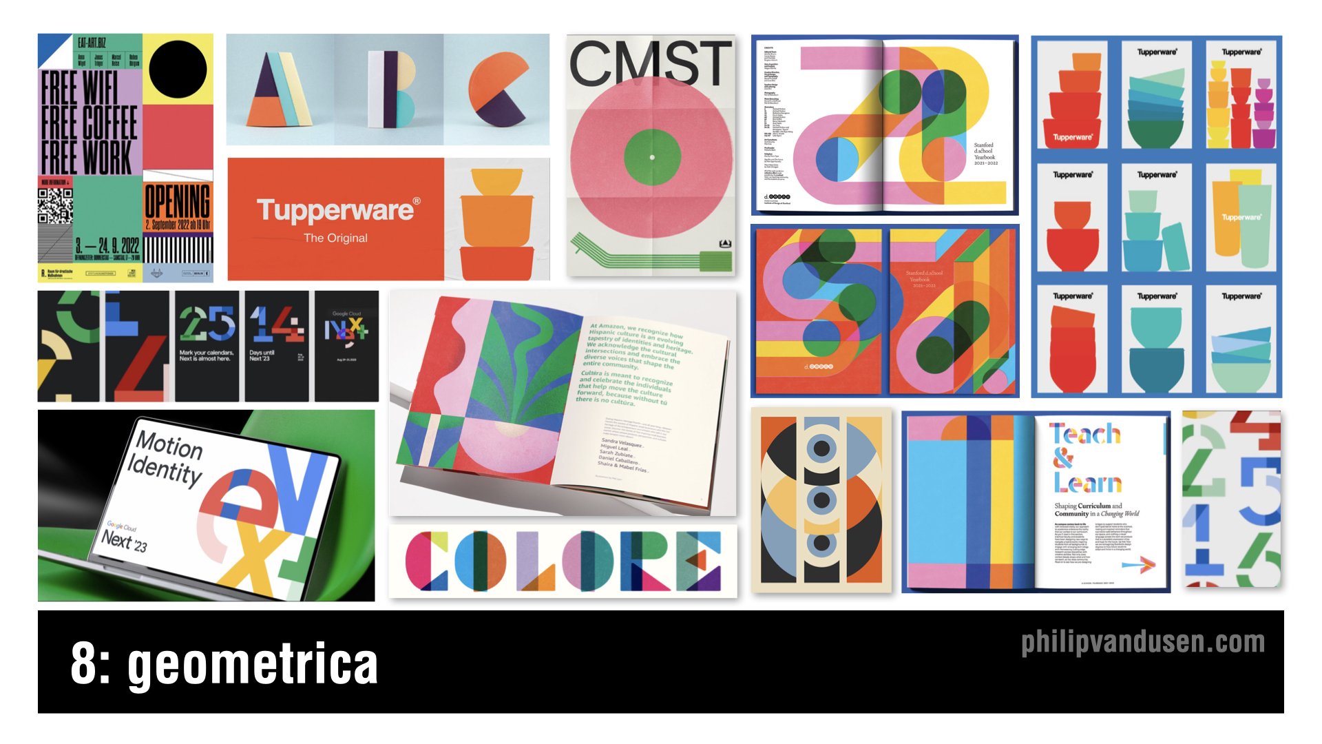
Trend number eight, ‘Geometrica’, celebrates the simplicity and harmony of geometric forms.
With roots in the Bauhaus movement and Swiss style, which both emphasize the beauty of clear, precise geometric shapes, this trend brings those principles into the digital age.
This trend is characterized by bold, youthful colors and shapes interacting in a way that's both playful and meticulously organized. It's a balance of form and function, where the clean lines of geometry meet the limitless possibilities of digital design.
Because design trends can sometimes reflect the extremes of the aesthetic spectrum, this trend is a noticeable reaction against the design chaos that we see in the ‘Anarchist’ and the ‘Digital Deconstructivist’ trends.
Applications for this trend would include mobile app interfaces, web design, print, packaging, and editorial layout, among others.
Bring Your Own Laptop: Adobe Training with Daniel Scott
I want to take a moment and mention that I often get comments on my blog posts and trend videos asking how to achieve the aesthetics in the trends that I'm featuring. So I want to share with you a not-so-secret secret.
Daniel Scott, who in my opinion is one of the best Adobe app trainers out there, has an Adobe training site called Bring Your Own Laptop. The site's subscription based and it's an insane value at only $12 per month, or $84 per year, for access to all the training on the site.
Daniel sometimes even uses the trends that I feature in my YouTube trend videos as examples in his trainings.
So if you want to get better using your favorite Adobe apps, or learn a new one, I suggest that you head over to https://byol.me/philip and check out everything that he has to offer. I hope that you'll use this affiliate link if you want to support my continuing trend-hunting work here, as well as on my YouTube channel.
Now, let's get back to the trends.
Trend 9: Golden Era

Trend number nine is called “Golden Era”. Golden Era is a trend that exudes luxury and sophistication, reminiscent of the Gilded Age and Art Deco's opulence.
Gold has always symbolized wealth and exclusivity, but one of the key intentions of using gold in this way is to differentiate from the heavy use of silver, chrome, and brushed titanium that's so common in digital graphic design and technology design.
This trend is perfect for brands that want to convey a sense of premium quality and timelessness. From packaging to branding, it carries the weight of tradition and can set a product or service apart in a saturated market.
Whether it's a minimalist design that uses flat gold color, or a full blown shiny foil spectacle, Golden Era has applications in print, packaging, fashion, digital media, and environmental design, among others.
Trend 10: Kiddieland

Trend number 10, ‘Kiddieland’, is a playful trend that taps into the joy and uninhibited creativity of childhood.
With all the cultural strife and seriousness in the world, it offers a bit of refuge in its bright colors and whimsical illustrations, and fun typefaces that make the designs feel approachable, and fun.
Kiddieland uses a fusion of simple shapes and bold primary colors that evoke a sense of nostalgia and play, and actually really relates to the ‘Geometrica’ trend that I mentioned previously.
While it's obviously appropriate for companies targeting the kids market, it's also perfect for brands that are young at heart or aiming to communicate simplicity and fun in their messaging.
This style is particularly effective in consumer packaging, education materials, and interactive design. It can also bring a light hearted touch to marketing campaigns and inject energy and life into social media content.
Trend 11: Better Red

Trend number 11, ‘Better Red’, captures the power and intensity of red, a color that's always made a strong statement in design. It's bold, energetic, and typically paired with black and white, so if you want to command attention, use red.
In this trend, the color red is used to create impact and focus. It can be an uninterrupted color backdrop for a minimalist design, as a way to make content shine, or as a part of a more complex pattern that energizes an entire composition.
Better Red is ideal for brands looking to take a powerful stance, whether it's through a website, a poster, or product packaging. This trend can be particularly effective in print, where you want to grab attention quickly, and in packaging where it can also communicate luxury and prestige.
Trend 12: Elasto-type

Trend number 12, ‘Elasto-type’, is a dynamic trend where typography isn't just read, it's felt.
It's characterized by taking fonts and extending them beyond their usual limits, adding a sense of motion to the static page. This technique gives words a visual rhythm that can be seen as a standalone graphic element in their own right and is often used that way.
It's a style that works well for brands looking to convey innovation and can be particularly impactful in digital uses like web design, to animate a static layout or guiding the eye's movement and engaging viewers.
It's also effective in print, offering a fresh perspective on posters, book covers, and any medium where you want the typography to make a really bold statement.
Trend 13: Flaired Fonts
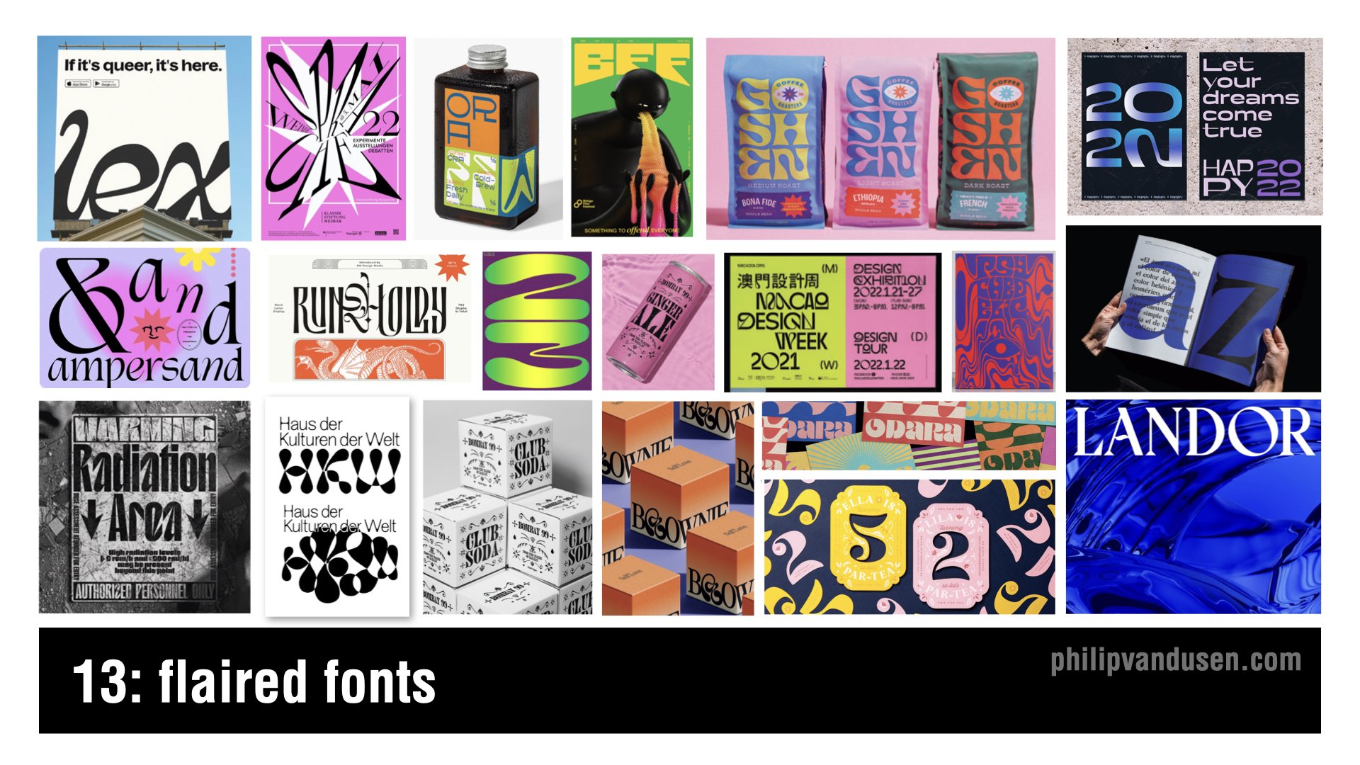
Trend number 13 is ‘Flaired Fonts’, a trend that brings a dose of whimsy and character to typography.
Fonts take on a life of their own with curves and embellishments and a tangible sense of movement. They're a modern take on the days of Art Nouveau's ornamental stylings.
It's almost like they're sans serif fonts, who are trying their hardest on the dance floor to become serifed!
They're versatile enough for creative poster designs, editorial headlines that need to sing, and are perfect for brands that want a unique voice and a personal touch.
In digital applications, where they achieve a level of visual animation, they're a great choice for brands that are looking to express individuality, and as the name says, ‘flair’!
Trend 14: Vintage Americana

Trend number 14 is ‘Vintage Americana’. Vintage Americana is serving, this time, as a rejection of the modern. That is, all-things-AI, technology or anything digital.
It's a feel good, nostalgic nod to a classically American design aesthetic, reminiscent of the mid 20th century. This timeless style uses retro fonts and warm color palettes, imagery, layouts, that conjure up the good old days.
The Vintage Americana trend is perfect for brands that want to establish a perception of heritage and tradition - and those looking to evoke a sense of comfort and reliability.
It works really well virtually anywhere, from print to digital, apparel, spirits, out of home, just to name a few. It can be particularly impactful in packaging, where it can evoke a sense of quality and craftsmanship of bygone eras.
Trend 15: AI Assimilation
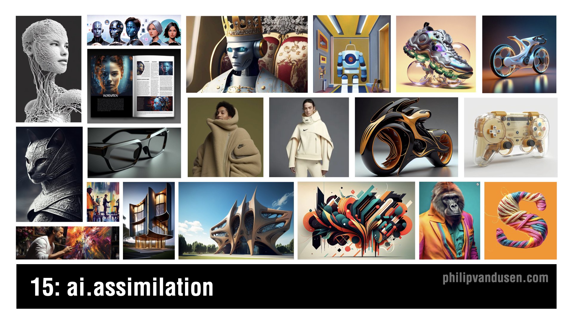
Trend number 15, ‘AI Assimilation’ marks the evolution of artificial intelligence from the novelty it's been in 2023 to a fundamental aspect of creative design in 2024.
It's no longer just about producing fantastical images to share with your friends, it's now a crucial tool that can be used in designing tangible products, items that we interact with every day in our lives.
This trend shows AI's power as an ever expanding reality that's reshaping entire industries as we speak, enabling the creation of objects and spaces that were once impossible to conceive or to visualize.
The aesthetic of AI Assimilation is characterized by its mind bending detail and precision and its ability to radically push the limits of form and function.
Applications include the fine arts, industrial design, product design, transportation, architecture, fashion, accessories, packaging, layout, animation, and that list is just growing longer every single day.
I hope you were inspired by these 15 trends and design for 2024, and if you were, please take a moment and subscribe to my newsletter, Brand•Muse, so you can stay up to date on all the news, trends, resources that make the creative world go ‘round!
As always, I'd also really appreciate it if you'd forward this post, or the associated YouTube Video to a friend or a colleague so others can be inspired too.
Stay creative and bye for now.
How Can We Can Help Your Business?
Is your brand rockin' like nobody elses? Or is it a little tired? Maybe it's just being born. You want to do it right. That's where we come in.
We create new brands from scratch. We fix broken ones. We have all the brainpower, creative chops and marketing magic you’ll ever need and a ton of loyal clients to prove it.
You want nimble? We're the new agency paradigm. We scale up and down depending on your needs so you never pay for resources you aren’t using.
We’ll put the power of brand strategy, design and the most contemporary marketing techniques to work for you. Let’s talk.

15 Trends in Graphic Design for 2023
I often get asked:
"Phil, how do you come up with these trends?"
As far as my trend hunting CV goes, I was VP of Graphic Design and Trend at Old Navy for 11 years and traveled the globe shopping for trend 3x a year, Paris, Tokyo, London, Milan, Berlin etc. I’ve worked with major trend houses like WGSN, Stylus, JWT and Pantone. Trend hunting was my job. Since those formative years, I've been a trend watcher for Fortune 100 clients in the agency world for another 15 - so now 26+ years in, it's kind-of in my blood.
Lots of people get all bent out of shape that they have seen these before. That they feel "old". But what is a "trend" is not a crystal ball. Trends are really about the past - a style or technique that has gained frequent enough usage that it is recognizable as a 'movement' of sorts.
Some people expect trends to be the newest thing - but in reality they are currently POPULAR things - whether they have been around a short or (in some cases) a very long time.
The one thing I’ve learned is that trends are never limited to specific periods of time and are very fluid in how they appear. Trends are revisited, altered, revised - new perspectives are added - they disappear and then they come back over and over (particularly in the fashion industry) Russian Constructivism is 100 years old and it never really seems to go away. Some trends take a few years to grab hold and become recognizable as popular.
TLDR: The short answer is: I observe and collect.
I keep my eyes open for patterns of usage and gaining mass usage. Then I gather, collect images and at the end of the year I categorize them into themes and name them (like I did in my fashion industry days). The names aren't what the whole world is calling them. Often they haven't been 'named' yet by the wider design community or public - so I have to call them something.
I suggest you take a look, just keep yourself informed. You can choose to emulate or propagate these trends, OR you can consciously act/design against them.
It's up to you.
One way or the other I hope I've provided just a little fodder for inspiration in 2023.
Trend #1: Systematic
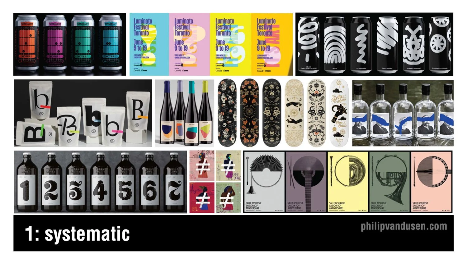
I don't know any designer who doesn't love working in series. Creating multiple variations on a design theme offers really unique challenges as well as exciting opportunities to expand on an idea in a really visually compelling way. Working in series or in systems are particularly well-suited to the food and beverage category as you can see here, but opportunities also exist in apparel, in hard goods, in posters, promotional materials among others. The idea is to maintain an aesthetic thread between the range of items through things like illustration or photography style, color, or typography while maintaining enough consistency for the system to hold together as a group.
Trend #2: Midjourney and AI
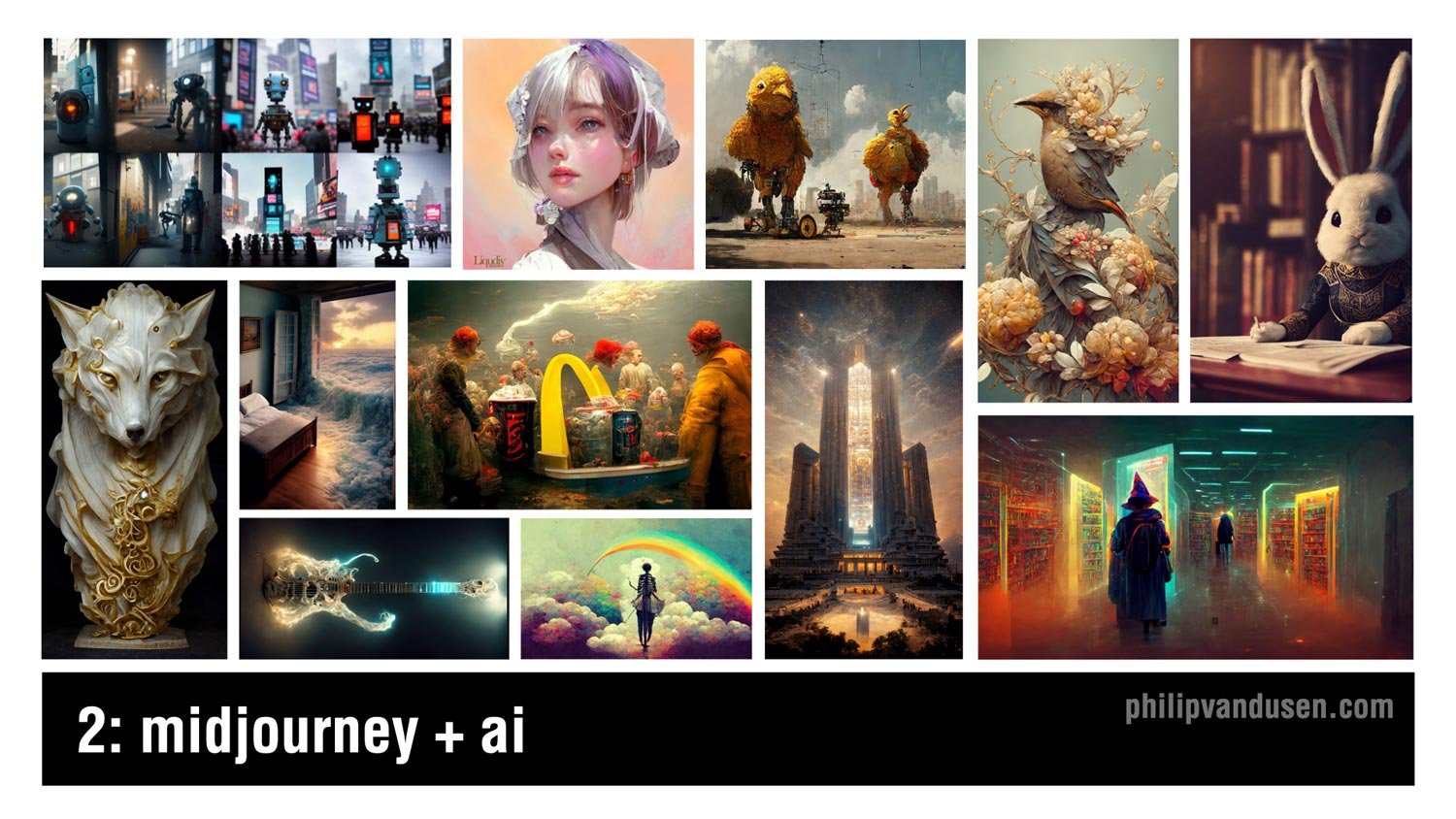
Artificial intelligence has been taking the design and the illustration worlds by storm this year, and it will certainly continue and expand as we move into 2023. Mid journey, the AI illustration tool has been garnering a ton of attention with the quality of work that it produces. Now, while it has deep strengths in imagery that's more fantastical or has a science fiction or a fantasy leaning to it, it can also create work that has fascinatingly inventive when it comes to static objects like the wolf statue on the left or the electric guitar just to the right of the wolf.
Trend #3: Collage

Collage has been around for decades and it finds its roots in Russian constructivism and the data movement at the beginning of the last century. With the invention of digital tools, it became incredibly easy to create collage, but what's harder is how to make it hold together aesthetically and thematically so that it serves the strategic communication required of the design that it's being used in. Collage can be surrealistic, but it can also be used to communicate complex topics in an inventive and multifaceted way, for example, the Netflix History 101 image on the center left or the Adobe Creative Cloud promotional image on the upper right or the Cougar Paper 50th anniversary promotional image on the upper left.
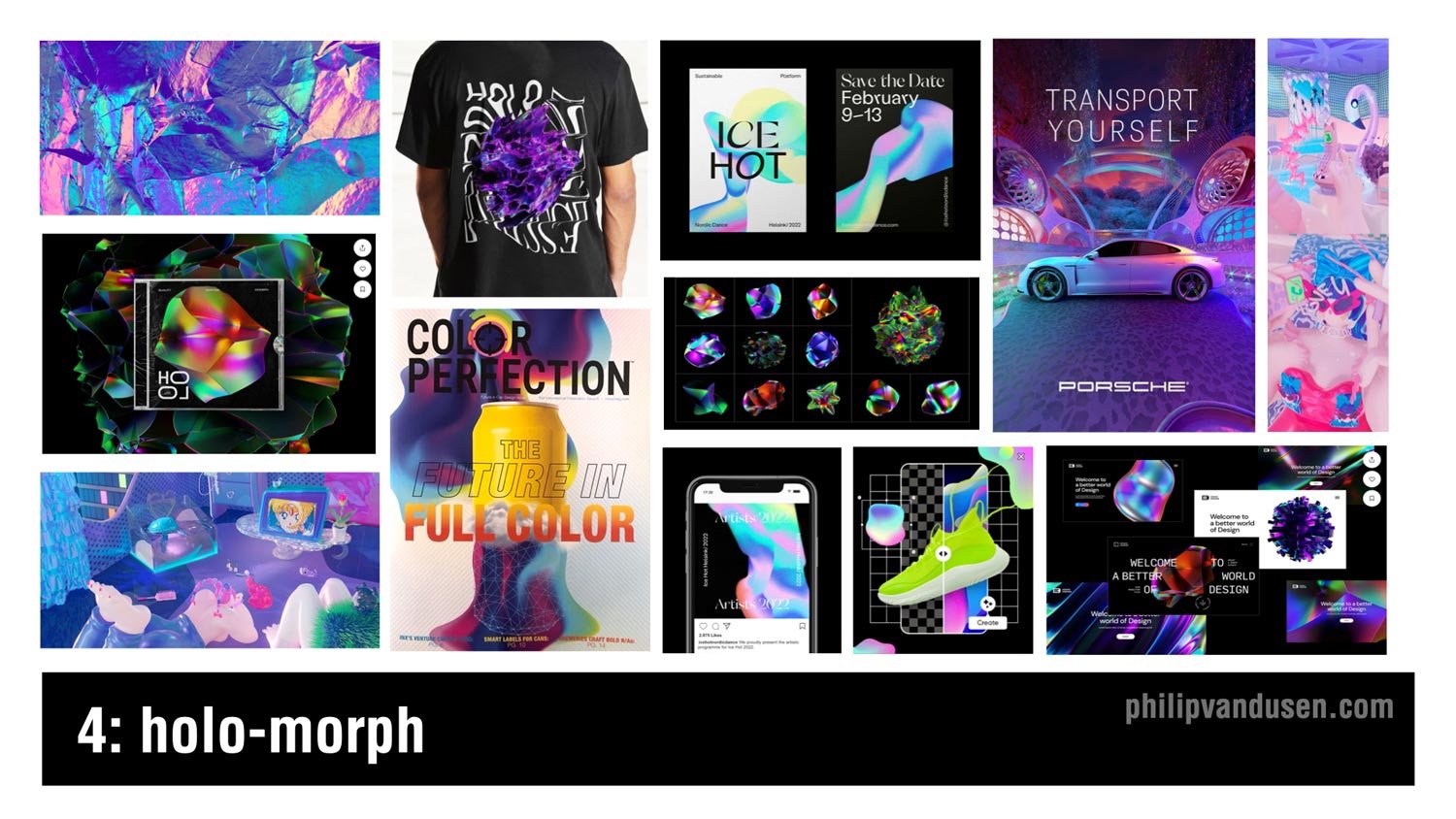
Trend #4: Holo-morph
Holographic imagery requires complex blends of iridescent electric colors rooted in cyan and magenta and green and turquoise. This design trend creates a sense of movement and ongoing evolution as something morphs into being. It communicates a futuristic and a high tech aesthetic that's being used in everything from app design to advertising, poster design, even apparel and packaging. The shapes use dare often amorphic, undulating on a dark ground to accentuate the electric glow of the color blends, and also advances in metallic printing techniques have made it easier to reproduce this look on physical materials and products, which is succeeding in keeping it in the trending category.
Trend #5: Military Inspired
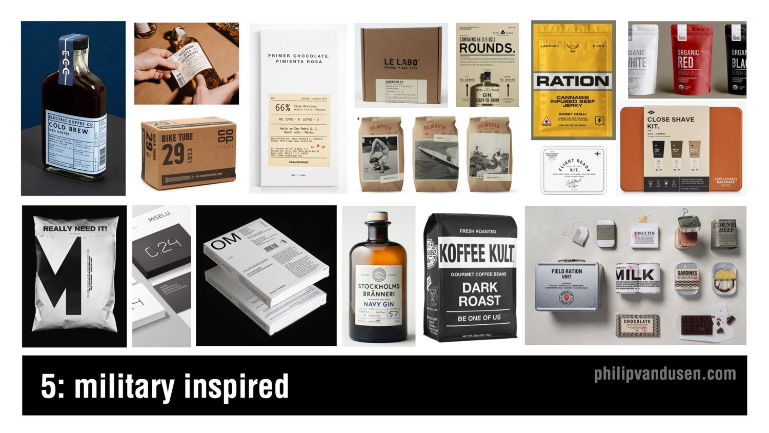
Trend number five is military inspired. Now, the design used in military materials and in generic utilitarian packaging has always held a special allure to designers. The simplicity of these typography driven layouts are made possible by the use of san sera fonts, simple linear dividing lines and strokes, abbreviations, numbers, and technical information. Imagery, photography or illustration are really rarely used and tended detract from the ability to achieve the aesthetic. White open space is really important to maintain as well as severely restricting the use of color and relying mainly on black and white to achieve the look. This design trend is being used heavily in the spirits and food and beverage category, but also in men's accessories and products because this design style has historically been really attractive to male consumers.
Trend #6: Dark Mode Typography

Probably the biggest trend in color in typography that we've been observing is a usage of white text on a black ground, particularly on websites and on mobile. Now historically, designers have been discouraged from using reversed text on black because it can be notoriously difficult to read, particularly if used in large blocks of copy. But as computer monitors have increased in resolution combined with the trend of having significantly less copy on websites, it's made this aesthetic practice more realistic to use. Also, dark mode has infiltrated the preference settings on a lot of computer operating systems as well as web browsers making this typography treatment increasingly acceptable. It also has the added benefit of creating a mysterious and dramatic mood in the designs that it's used on, as well as carrying the perception of premium that people instinctually associate with black and dark rich colors.
Trend #7: Neu-Brutalism

Brutalism refers to the brutalist architecture movement in Western Europe that lasted between the 1950s to the 1970s. It featured raw concrete and was really devoid of paint or decoration. In graphic design, it has roots in the earliest web designs when the internet was only basic HTML and decoration was often clunky and ugly. What I call neu-brutalism vacillates between the unadorned black and white simplicity of the early internet, like the Soft Pillows webpage on the upper left to the intentionally ugly, crowded, and often glitchy functionality of early websites as in the California College of the Arts Career Expo catalog in the upper right. The neu-brutalist design aesthetic is unapologetically aggressive and visually striking, and it's surprising in its simplicity. It's great for use in digital media and apps and websites when you want to stand out from the pack.
Trend #8: 70s Typography

Increasingly, fun is returning to typography and graphic design. More and more designers are using vintage '70s style fonts and type treatments in their design work. We're seeing it in print and packaging and mobile apps, marketing, and even animations. The fonts being used can be bubble like balloon fonts or bold, rounded sera fonts once popular in the golden age of magazine advertising, or they can be trippy swoopy sera fonts that feel simultaneously liquid and psychedelic, ala the '70s illustrator Peter Max.
Trend #9: Lensa-tion

Well, unless you've been living under a rock, you've probably heard about Lensa in recent weeks. Lensa is a design AI app that digests 10 or so pictures of you and then spits out remarkably polished, and in some cases totally gorgeous illustrative portraits of you. It's amazingly fun to play with, and I expect to see this kind of illustration showing up everywhere in personal brand websites, the music industry, entertainment, and of course social media profiles.
Trend #10: Geo-simplicity

The simplicity of basic geometry is the mama that the design community always runs home to when things get too crazy with technology and visual complexity in the design industry. That's what's happening now with geo-simplicity, rooted in the use of bright, often primary colors, super simple geometric shapes of circles, squares, hexagons, and rounded cornered rectangles. This trend has been gaining steam over the last couple years, and as popular culture and society becomes more complex and difficult to navigate, we welcome the simplicity and the cleanliness and the restfulness of this design style. Geo-simplicity is being used in everything from an environmental design and wayfinding to print, packaging, food and beverage, spirits, you name it.
Trend #11: Cyber Wave

Cyber Wave is simultaneously an illustration style and also a design layout style. The combination of heavily manipulated and colorized imagery, photography or illustrations combined with high tech fonts, digital interface and control panel design elements. With nods to techno punk and steampunk and game character design, this trend is heavily used in the music industry, particularly in the Asia-Pacific countries, also in professional gaming culture and cosplay subcultures.
Now, the sportswear industry is embracing this trend heavily because it aligns with the high tech functionality of their products and their shoes, as well as speaking directly to their younger street-wear loving customer demographic.
Trend #12: The Blob
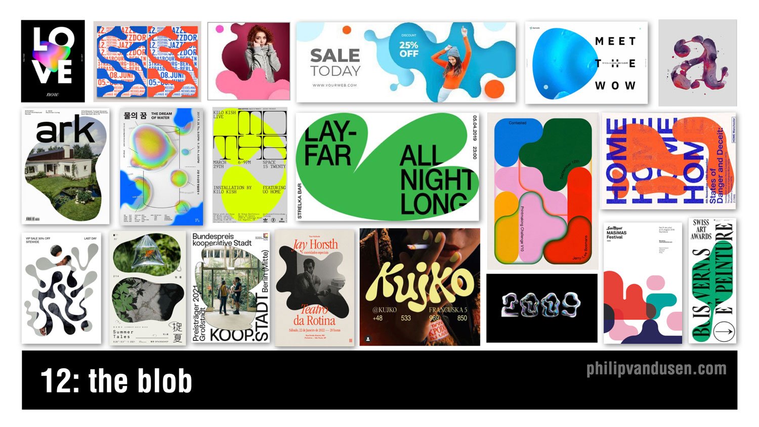
The blob is recognized by the use of amorphic puddle-like shapes as the main visual design element in a layout. The shape can be used as a simple striking vehicle for a field of color, or it can be used to mask illustrations or photography in a visually interesting way. The shapes can be simple or they can be longer and more convoluted. They can also become really inventive type treatments. They can be hand generated, or they can be obviously computer generated. The range is really broad. This design style is a great way to offset simple typographical layouts and inject a level of fun and lightheartedness into a composition trend.
Trend #13: Vaporwave 3.0

I know, I know. Not vaporwave again! But that's why I'm calling it vaporwave 3.0. It's a design trend that is just not going away, so I have to mention it. Look no further than the "new" Twitter blue logo that was released just last week on the left side in the middle. Sure, it's not bleeding in its design anymore, and it's making its way into larger usage, but actually that is the definition of something that's trending. Characterized by the '80s Miami vice type and technicolor sunsets and palm trees, it leverages magenta and cyan heavily to achieve the design aesthetic. It's also showing up in social media, sports wear, gaming, and now even into the realm of fine art and gallery settings as in the image on the top center.
Trend #14: Global Voice

Please understand, I am not trivializing the war in Ukraine by calling it a design trend, because it's not and it shouldn't be. But what I am doing is celebrating and showcasing the amazing work of thousands of designers who've used their superpower to be a global voice for good. Throughout history, designers have led the way when it comes to giving voice to the oppressed and speaking out against injustice in the world. And when it comes to having both the imagination and the creative means to communicate in a really motivating way to the world and speaking truth to power, designers are perfectly suited to the task, and we have to own that responsibility. The war in Ukraine has sadly given the design community another opportunity to showcase that strength, and they've done it in amazing form, shining a global light on a tragic conflict.
Trend #15: Viva Magenta

This is not actually a graphic design trend per se, but a color story trend. But color is an incredibly important part of graphic design. Pantone's Color of the Year in 2023 is called Viva Magenta. It's a bright red with a slightly magenta cast. Last year in 2022, Pantone named “Very Peri”, a periwinkle, as the Color of the Year, which was definitely softer and more muted. But the zeitgeist of popular culture has moved to embracing colors that are more vibrant, leading to this year's Pantone choice. This color trend is already being heavily adopted in the beauty and fashion categories, as well as sporting goods and advertising.
I hope you were inspired by these 15 trends in graphic design for 2023! If you were, make sure head over to my YouTube channel and subscribe for more videos and content on branding, marketing and graphic design.
You also might want to subscribe to my newsletter, “brand•muse” where I share all the latest news, trends, resources and must-read content. Subscribe Here. As always, I'd really appreciate it if you'd share this post a friend or colleague or link to it on social media so others can get inspired too. Thanks for reading, stay creative!
Want to learn how to create the techniques used in these trends?
Check out: Bring Your Own Laptop – with Daniel Scott
I often get comments on my videos asking how to achieve the aesthetics that are in these trends. So I want to share with you a ‘not so secret’ secret with you. Daniel Scott, in my humble opinion, is the best certified Adobe trainer out there, and he has an Adobe app video training website called Bring Your Own Laptop. The site is subscription-based and it is an absolutely insane value at only $12 a month for access to every training he has on his site. Daniel even sometimes uses the trends that I feature in my annual videos as examples in his training videos. So, if you want to get better at using your favorite Adobe apps or even learn a new one, I suggest you head over to:
https://byol.me/philip
(use this affiliate link to support my work, thanks!)

How Can We Can Help Your Business?
Is your brand rockin' like nobody elses? Or is it a little tired? Maybe it's just being born. You want to do it right. That's where we come in.
We create new brands from scratch. We fix broken ones. We have all the brainpower, creative chops and marketing magic you’ll ever need and a ton of loyal clients to prove it.
You want nimble? We're the new agency paradigm. We scale up and down depending on your needs so you never pay for resources you aren’t using.
We’ll put the power of brand strategy, design and the most contemporary marketing techniques to work for you. Let’s talk.

Hot Then Not
One minute what is hot, the next minute will very likely be not.
Everything was going great in high school until that new guy showed up.
Let’s call him Fabio.
Fabio was tall, wore the coolest jeans, but what really did it was his hair.
Fabio had long hair and it was driving all the girls to distraction. All they could talk about was Fabio’s hair.
In the halls they were always staring at Fabio.
Fabio was hot.
It goes without saying that all the other guys in school were feeling - let’s just say: under-appreciated.
So what did they do? One by one they all started to grow their hair long.
Even that guy with curly hair. He was the only guy with curly hair. He had to grow it twice as long because it took twice as much to look long.
Now he just looked like everyone else.
Then it happened.
One day Fabio showed up to school with short hair.
Now short hair was hot.
The other guys were now thinking: ‘Damn, I just spent all this time growing my hair out. I used to have short hair! What was I thinking?’
Well, that’s what’s happening in social media right now:
Fabio is TikTok.
Long hair is short-form video.
And the curly haired guy is Instagram.
TikTok recently announced they are going to be accepting 10 minute videos soon
....and everyone else is still deeeep into growing their hair long.
In fact Adam Mosseri, CEO of Instagram just announced to accountholders that Reels weren’t going to replace photos. He said Instagram is ‘still’ committed to photography.
Even though it certainly doesn’t look like that to anyone paying attention.
The moral of the story is that one minute what is hot, the next minute will very likely be not.
So it’s usually best to hold on to your core competency.
I’m not saying short-form video is going away. It’s not.
But when everyone starts looking just like Fabio...something is bound to change.

12 Trends in Graphic Design for 2022

Let's look at 12 Trends in Graphic Design for 2022!
Trends are movements in design that have gained wide enough usage that they can actually be recognized as a trend. They aren't necessarily brand new. In fact, very little is. Very few things have actually never, ever been done before.
I recommend using trends to stay inspired. You can either follow them or you can consciously react against them. But knowing what is trending is critical to informing your work and to informing your clients.
Trend #1: Diversity + Inclusivity
Design has always been instrumental in facilitating changes in society. Large, fortune 500 companies are now responding to societal changes in areas of diversity and inclusivity and bringing it into the mainstream.
Ethnic diversity, mixed-race couples and families have been depicted in design for years now, but diversity in gender, sexual orientation, and physical ability are becoming much more prevalent and visible.
We're seeing it grow considerably in traditional advertising media, in VR, in illustration, iconography, and stock imagery. Expect this trend to magnify in 2022, as acceptance continues to grow domestically in the U.S. as well as internationally

Trend #2: Metaverse
Mark Zuckerberg has made dramatic pronouncements about Meta's intention to making avatar-inhabited virtual environments a priority for the company.
It's unclear exactly what this world is going to look like or what you'll be able to do or accomplish there, but it's not stopping designers, gaming platforms, illustrators, and animators from starting to visually predict and to depict it.
Any design that can happen in real life, billboards, products, ads, branded environments, t-shirts, branded products will undoubtedly come to life in the Metaverse, probably things we haven't even imagined yet.
Designers are going to be on bleeding edge of finding ways to leverage this new virtual ecosystem to their advantage for both themselves and for their clients

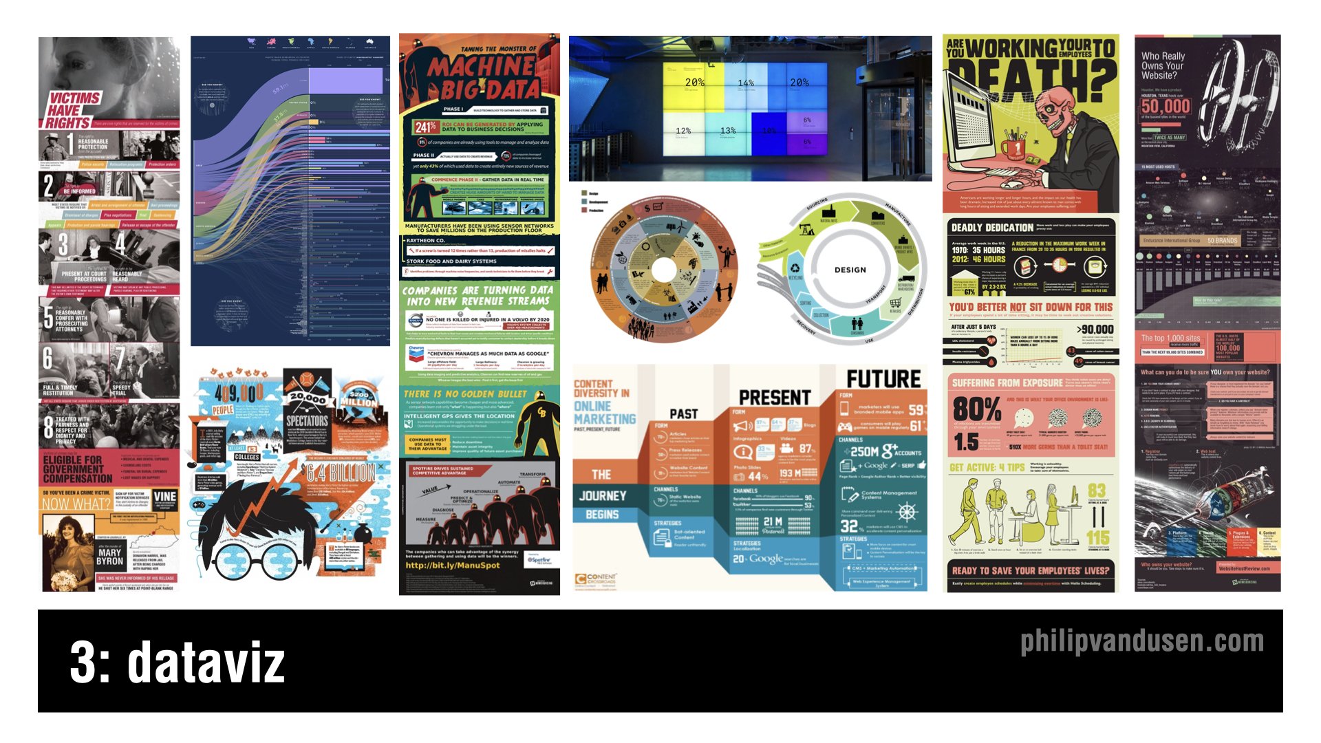
Trend #3: DataViz
We live in a data-rich, and some may say, absolutely saturated world these days. Infographics have been around for years now, but there's a new trend on how the format is being explored.
But typical infographics have lost their appeal and their thumb scroll stopping power so more radical layouts, more inventive imagery, not just the same old icons and stock characters are being used.
It's being done in order to cut through the infographic noise. Infographics are becoming much more creative, inventive, playful, and original illustration-driven designs.
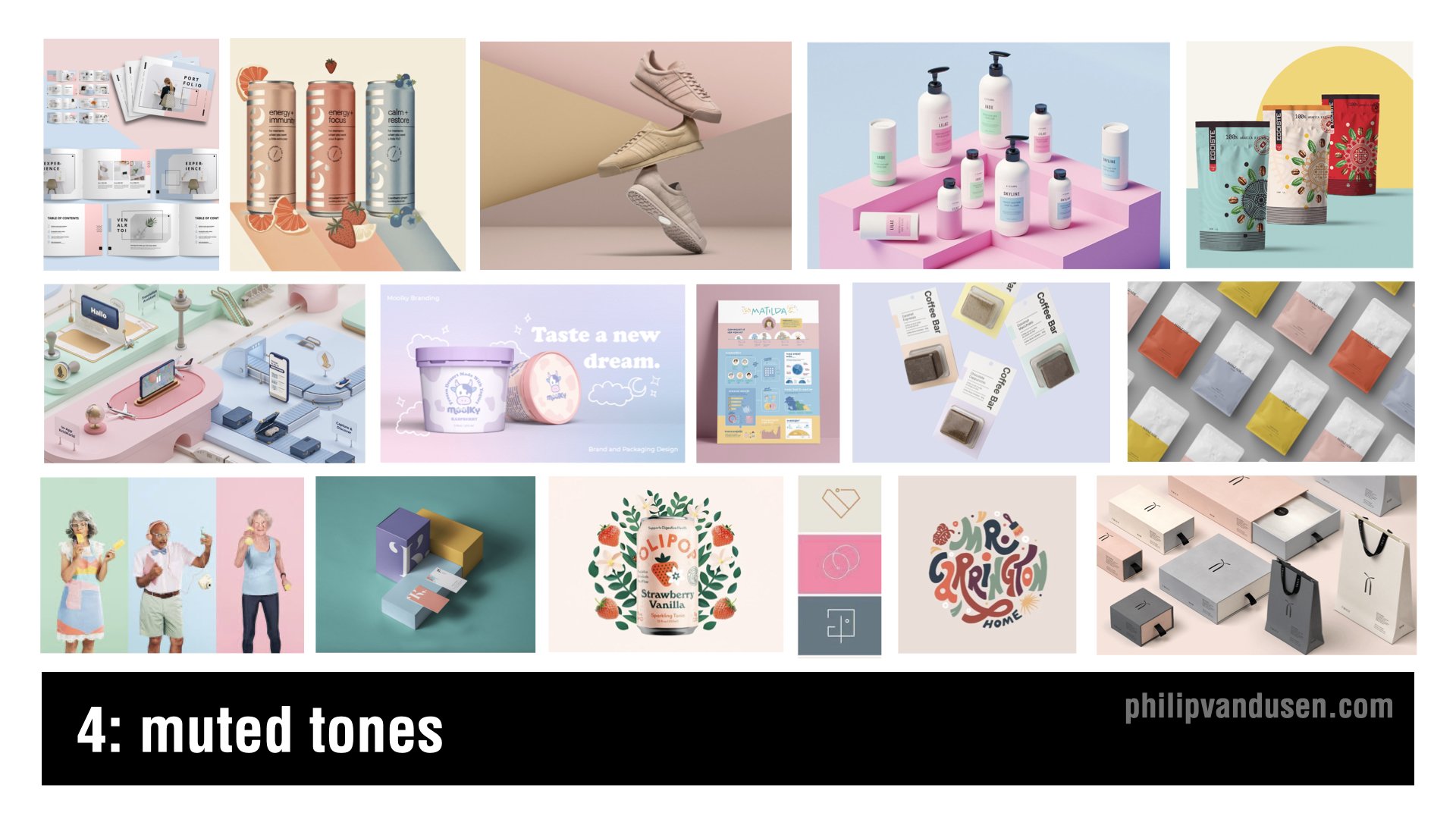
Trend #4: Muted Tones
This is a trend that's emerging where colors that are being used are much more muted, softer, they're less jarring.
It is a reaction against the intense colors that were being used in last year's 2021 trends like “Electric Fade” and “Bright Geo”. Trends frequently emerge that are reactions against other trends and muted tones is definitely one of those.
You'll see that this trend bears out Pantone's Color of the Year choice that I'm going to feature later in this video. The colors used are soft pastels and cosmetic pinks, taupes, and blues.
This trend shows up in consumer package goods, stock photography, fashion, and apparel.
Trend #5: Vintage Apothecary
Vintage Apothecary celebrates vintage typography, flowing, elongated serifs, and ornate borders. 18th-century black and white etching illustrations are also prominently featured in this design style.
This trend shows up in beverages, in food packaging, health and beauty aids, t-shirt design, candles, and the gift industry. It references the Steampunk Movement and is recognized by overlaying detailed layouts and vintage illustration styles.
Vintage Apothecary hearkens back to a simpler time when things weren't mass-produced by the millions, but instead in small, handcrafted batches with real care and real quality.

Trend #6: Eco Everything
Global warming isn't a debate anymore, it's happening much faster than anyone ever thought possible.
The eco-movement, focusing on sustainability and reducing the human carbon footprint in virtually everything we do, make, or use just continues to grow. It's no longer fringe, it's almost a requirement for companies to stake a claim with their consumers about where they stand on the environment.
The days of “greenwashing”, that is giving lip service to sustainability, are long gone. Designers are leading the charge in finding ever more impactful and engaging ways to communicate and market products and services in the green economy.
You can see this trend in hard, good products, in packaging, physical environments, illustration, books, and in color palettes.

Trend #7: Iridescence
Iridescence is somewhat of a continuation of last year's trend that I called “Electric Fade”, it's also related to the Vaporwave trend of a few years ago. But Iridescence is made possible by new, innovative print substrate materials that have reflective and light amplifying properties.
This trend is being seen in technology marketing, in the sportswear industry, in iconography systems and print, AR and VR. It's also beginning to show up in interface design.
I wouldn't be surprised if it actually finds its way into the Metaverse too.
The shapes associated with it can be curve linear and flowing like neon tubing, or they can be sharp and defined and angular in geometric cubes, in geological crystal shapes.

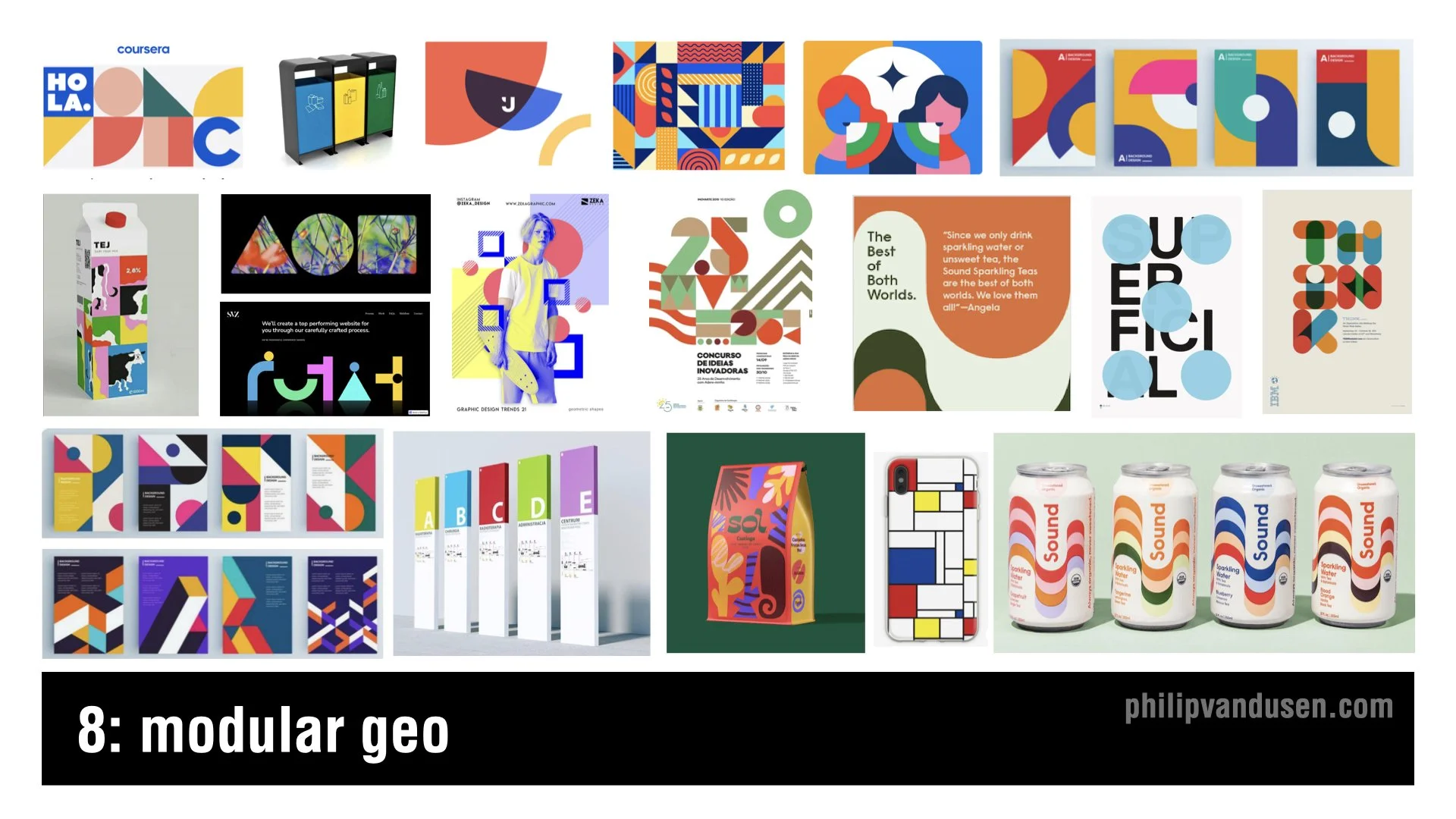
Trend #8: Modular Geo
Modular Geo is an evolution of the “Bright Geo” trend that I featured in my 2021 trend video.
The color used as flat and unmodulated, many times a primary palette is used of bright reds, blues, and yellows. The shapes used in this trend are circles and squares, triangles, parallelograms, and trapezoids.
The aesthetics of the Modular Geo trend have hints of the work of fine artists like Mondrian and Matisse, as well as the work of early Bauhaus design. This trend is being used in print and poster design, packaging, environmental wayfinding, and editorial illustration.
Trend #9: Trippy Type
Sometimes trend happen in pairs, with two diametrically opposed aesthetics that are polar opposites of each other. This is the case with trippy type, it's the polar opposite of the sharp lines and misstructured, rigid compositions that you find in Modular Geo.
This trend is signified by 60s and early 70s, psychedelic typography. Often it's hand-illustrated in shapes with that type and shape itself becoming the primary element or the main focus of the design.
You'll find this trend in new font design, in printed books, illustration, consumer goods, food packaging, fashion, and even motion graphics.

Trend #10: Moving Marks
It's not like animated logos have never been seen before, but it's the extent at which we're seeing them that has really changed.
Animated logo gifs are showing up on corporate email blasts, on website headers, and in apps on a regular basis now. It's the true definition of a trend, a more fringe movement and experimental one that's gained a lot of popular usage that it can now be considered trending.
What's remarkable is the enterprise-size companies that are starting to use these logos ‘on the regular’, as opposed to only periodically in ads on traditional broadcast media.
It's just another indication that “everything is going to video”, even the simple, static company logo can't be counted on anymore to stand still!

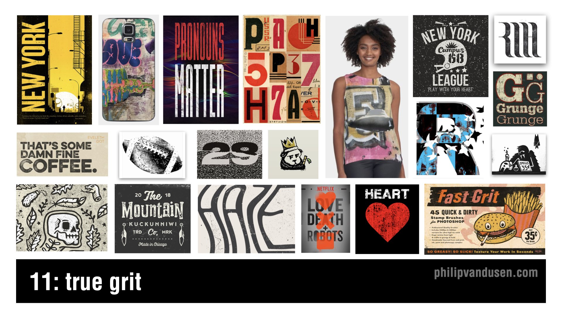
Trend #11: True Grit
True Grit isn't so much of a design style per se as it is a treatment. This trend is recognized by the usage of rough, distressed textures and textural overlays that make images and text look like it's weathered or partially destroyed. It's a reaction against the clean type and stripe design of modular geo or Bauhaus or Swiss Design.
This trend shows up across a broad range of design genres and it's used to add a level of visual interest to a design by aging it, by giving it provenance or history, by adding character.
True Grit shows up in t-shirt design, print and posters, in the music industry, in motion graphics, and also in broadcast entertainment.
Trend #12: Very Peri
Pantone's color of the year for 2022 is called Very Peri, it's basically the color periwinkle. It's not a graphic design trend in and of itself, it's a color story trend. Last year in 2021, Pantone named “Illuminating Yellow” and”Ultimate Gray” as the colors of the year.
But the popular zeitgeist in society has moved towards embracing colors that are more calming and muted like trend #4, Muted Tones, featured above.
Because of the ongoing collective psychological stress of the COVID pandemic, Pantone is forecasting and encouraging a more comforting look for 2022.
This color trend is already being heavily adopted, and you can see it being used everywhere in product design, website design, sports apparel, editorial print, promotional marketing, travel, entertainment, even the financial industry.

I hope you liked this article and the linked YouTube video “12 Trends in Graphic Design for 2022”.
If you were somehow inspired by this trend review, do me a favor and forward it to a colleague or share it on social media! Share the inspiration! I'd really appreciate it and your colleagues will too.
How Can We Can Help Your Business?
Is your brand rockin' like nobody elses? Or is it a little tired? Maybe it's just being born. You want to do it right. That's where we come in.
We create new brands from scratch. We fix broken ones. We have all the brainpower, creative chops and marketing magic you’ll ever need and a ton of loyal clients to prove it.
You want nimble? We're the new agency paradigm. We scale up and down depending on your needs so you never pay for resources you aren’t using.
We’ll put the power of brand strategy, design and the most contemporary marketing techniques to work for you. Let’s talk.

14 Trends in Graphic Design for 2021
I want to share with you 14 trends that I've seen in graphic design moving into 2021 that are exhibiting themselves in the marketplace.
I want to share with you 14 trends that I've seen in graphic design moving into 2021 that are exhibiting themselves in the marketplace.
The thing you want to remember about trends is that trends aren't seeing into the future, they're not some sort of crystal ball. They are movements in design that have gained enough traction and enough usage to actually be recognized as something that is “trending”.
Trends aren't always brand new, in fact, very little has never been done before. I recommend you use trends to stay inspired, take them and make them your own. Take them to a different place in your creative work, or you can consciously react completely against them if that's what you choose to do. But knowing what is trending is critical either way.
#1: A.I. Design
Everything you're going to see on this slide was actually designed by a computer. This is machine learning. This is artificial intelligence designed, created by computers. Now it's not great design, but it's important because even though it's clunky and it's primitive, so was Microsoft Paint back in the day, so were the first Macintosh's right. It will only get better. It will only get more sophisticated over time. Yes, these look kind of surreal and deconstructivist, but they are something that you have to pay attention to.

#2 Electric Fade
Electric Fade has been around for a while, but it just keeps getting deeper. Electric Fade is characterized by electric turquoise and cyans and purples and magentas, being used in curvilinear blends. It's being used in tech and in sportswear and in print and in environments, it's even being used in political ads. Two of the graphics on the right side of this slide are from the Biden-Harris campaign. It used to be really cutting edge, but now in many ways it's going much more mainstream. This is a classic definition of a trend. It is something that's been around for a little while and gaining momentum and used to be a little low on guard, but now it's definitely getting mass usage.

#3 Environ-mental
This is topography that's being used in physical environments. It's used in wayfinding and interior design, art installations, retail stores, and museum display. These are single letters or blocks of text or numbers that are much like a trend that's going to come later in this presentation called singularity. It's stacked topography, it's often in all caps. Often it's wrapping around three-dimensional objects or surfaces or around corners. And it uses elements of force perspective, that's optical illusions that are making elements feel closer or farther away than they are now.

#4 Figure isolation
These are human figures where the background has been removed and they've been placed on open, airy, or blank environments. This creates a juxtaposition between the 3D of the figure and the flatness of the design element's colors and texts that surround them. There are graphic elements, texts, shapes wrapping around through and over the figures. This gives it the design of focal point or an anchor to these more abstract elements. The figure kind of grounds in the abstract composition in reality, and it gives the eye a place to rest and orient itself in terms of the picture plane.

#5 Redline
Red line is characterized by red, black, and white compositions. Red, black, and white are one of the most striking color combinations. It's an emotional spectrum. Color red is angry and powerful environment. In fact, when psychiatric patients are given colors to work with in art therapy, red and black always run out first. This color combination is often used with black and white photography, and it shows up in outdoor advertising, active wear apparel, print, packaging, transportation, and even retail. There's almost no way to go wrong with black, white, and red.

#6 Sliver of Light
Sliver of light isn't as much of a trend as it is a graphic technique to draw the eye into a composition. It's mainly used in illustration and text layouts where the illustration is the primary storytelling device. It's characterized by a Ray of light that acts as a visual pathway to pull the eye into the composition. It's often used with a human figure as the focal point of that light. It's used in things like movie posters and book covers and editorial illustration, and it really creates an intense sense of drama and mystery in the composition.

#7 Architext
This trend is characterized by text blocks that are used as the main design elements. They're used as whimsical shapes, circles, curves, asymmetrical building blocks. These can be paired with photography and illustration, but generally text is the primary focus. Headlines and subheads can sometimes be put at right angles to each other. In this trend, the legibility or the ability to navigate the reading order of these paragraphs is of very little importance. This trend is arty, it's pretentious, and in it topography becomes the main design element in and of itself.

#8 Decontextualize
This trend is characterized by topography in a state of mid destruction. It's traditional elements of designs, topography, graphics, photos, shapes, and elements that are put into a kind of a visual blender. The result is abstract design, design for design's sake. It's used in design publications, in the music industry, in print and magazine work, and in event announcement posters. It's reminiscent of David Carson and Raygun magazine. It breaks all of the rules of design, graphic design that skirts the edges of fine art. Communication in this trend is of very little importance at all.

#9 Bright Geo
This trend is very similar to the Geo Max trend of last year, except the difference lies in the icon and the block shapes. It's characterized by Tetris-like building block shapes that are bisected and quartered circles, simple color palettes of reds, blues, oranges, and greens, also muted tones of gray, and they're all grounded in black or dark navy. Bright Geo is used in brand ID systems and web icons and editorial. It's even used in Google's G Suite icons. It's usually used in flat color compositions only, but it can be used in combination with photography and natural textural elements.

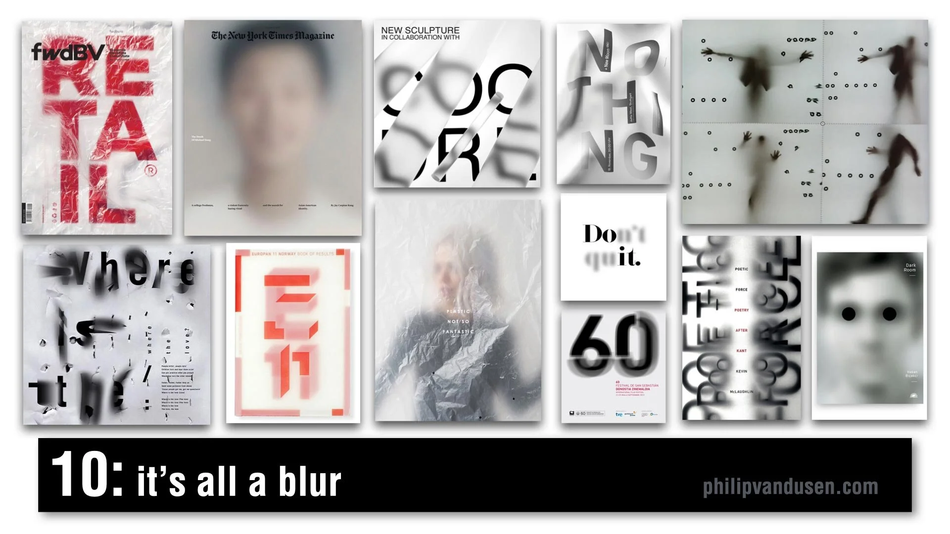
#10 It's All a Blur
One of my favorite trends for 2021, It's All a Blur is a very popular trend and it's characterized by kind of an overlaid scrim of plastic or Mylar or just elements that are plain out of focus. We're seeing it everywhere, it's in video media, in animation, in signage, in editorial, in print. It's being used with figurative elements, typography, numerals, photography, and it creates a depth, a sense of mystery. It sparks curiosity and creates a level of visual movement that brings a real level of interest to a flat graphic picture plane.
#11 Chiseled Type
Chiseled Type is retro typography that's really historically anchored in the sign painting industry. It's a subset of the Sign Painters trend from my 2020 Graphic Design Trend video on YouTube. It's been adopted by art, graffiti, street culture, tattoo culture, and modern sign painters. This trend is characterized by fonts that are crafted to look 3D, as if they were carved out of or into stone or wood. Type designers have really adopted this style and are putting really interesting new twists on it. Single letter forms take on a monolithic life of their own and really become sculptures in their own right.

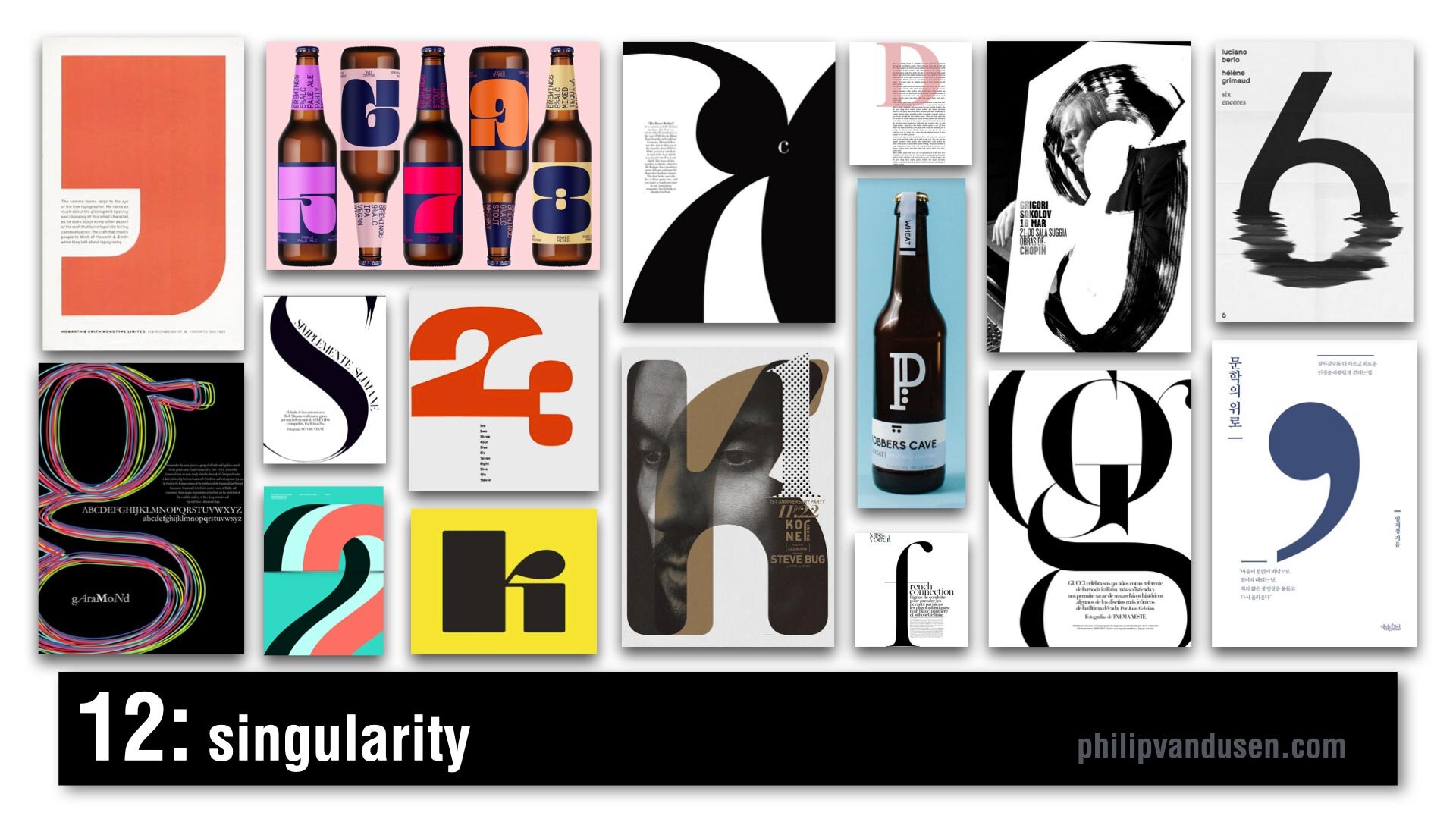
#12 Singularity
Singularity is characterized by composition that uses a single letter or number or a symbol as the main abstract anchor of the composition. It's a celebration of the abstract beauty of a single letter or number and its forms and shapes. It's often dramatically cropped and often used as an abstract element to wrap text around or intertwined with other forms, or it can be treated texturally in brushstrokes or in patterns. It's being used everywhere from editorial print to packaging, to illustration, and promotional posters.
#13 Wavy Gravy
Wavy Gravy is an offshoot of a trend from my 2019 Graphic Design Trend video on YouTube that I called Warp Speed. In this trend, topography is warped to create a wave shape. Sometimes they're regular waves, like an optical illusion to impede legibility of the text. Sometimes it's visually faithful to the text, but it's printed like it's on a waving fabric, like a flag or a banner. It's often used in black and white, but not exclusively. It's used mainly in print, and animation, and posters.

#14 Bee Yellow
Pantone announced its Colors for 2021. The colors are Illuminating Yellow and Ultimate Gray. This is not a graphic design trend in and of itself, it's really more like a dominant color story trend of yellow, black, white, and an injection of gray. I feel it's a psychological reaction against the difficult year that we've had in 2020 with the political upheaval and the Covid-19 pandemic, all of our financial struggles and the negativity overall in the world. It's kind of forecasting or encouraging a brighter outlook for 2021 and it's already being heavily adopted and used everywhere. It's showing up in product design and web design, sports apparel, editorial, print, the financial industry, promotional marketing, travel, and even entertainment.

How Can We Help Your Business Succeed?
Is your brand rockin' like nobody elses? Or is it a little tired? Maybe it's just being born. You want to do it right. That's where we come in.
We create new brands from scratch. We fix broken ones. We have all the brainpower, creative chops and marketing magic you’ll ever need and a ton of loyal clients to prove it.
You want nimble? We're the new agency paradigm. We scale up and down depending on your needs so you never pay for resources you aren’t using.
We’ll put the power of brand strategy, design and the most contemporary marketing techniques to work for you. Let’s talk.

14 Trends in Graphic Design for 2020
Trends are to be defined as movements in design that have gained wide enough usage that they can actually be recognized as a "trend".
Let’s look at some trends for 2020.
But first let’s set some ground rules.
Trends are to be defined as movements in design that have gained wide enough usage that they can actually be recognized as a "trend". They're not necessarily always brand new or the newest thing out there. In fact, very little has never been done before. Some styles go back decades, some go back hundreds of years, but styles are always morphing, they're always being revisited. There's always new "takes" on them, new variations on them. So graphic designers, I encourage you to be inspired by these trends, not necessarily to copy them directly. It's important that you know what they are because you can choose to be inspired by them or you can choose to consciously react against them.
Or if you choose, you can completely ignore them and focus on your own vision or your own ideas. But knowing what they are is critical. And for entrepreneurs and small business people, being aware of trends is assuring that your brand stays contemporary, it stays relevant and that's important to brand perception.
And with that, let's jump right into it and look at some trends.
#1 Betamax
Betamax is to be recognized by rainbow ribbons of color. It references late seventies early eighties video cassette boxes and California surf apparel like the Ocean Pacific brand. It's clean, it's bright, it's has a level of positivity to it and also is reminiscent of Morris Louis, the 1950s American abstract painter who painted color field paintings. It also has references to sixties and seventies home furnishings, a really fun, bright and interesting trend.

#2 1890's Ornate
This trend is to be recognized by deeply detailed, ornate type, borders, frames, ornaments, fluid flourishes of shapes, gilding and gold leafing. The kind of thing that you'd see in pubs and bars and the windows of restaurants. It was revived by Stranger and Stranger, a packaging design firm that's done a whole lot of work in the spirits category and it was also been revived and seen a lot in tattoo culture. It's a reaction against minimalist design. In itself, it's kind of "maximalism". It's linked to the resurgence of premium handcrafted products, craftsmanship, leather goods, IPA beers, woodworking. It's a high-touch, high-attention to detail design style. It's seen also in chalkboard culture where it's like a dichotomy of ideas: super labor-intensive work versus the impermanence of a chalkboard.

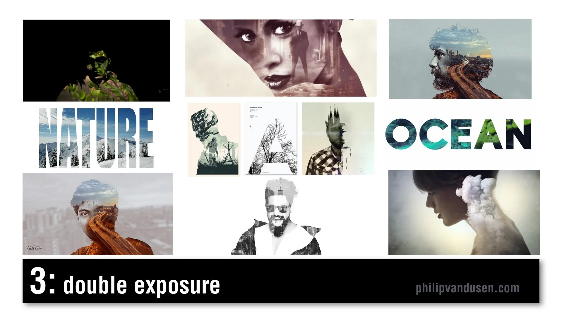
#3 Double Exposure
Double Exposure is seen frequently in motion design. It's recognized by combining imagery: using imagery as masks, masking imagery with imagery. It creates feelings of mystery and romanticism and poeticism. It's used in video and motion, but it's also used in static design. Typography can also be used in masking video. There's increased usage of this style because design applications have made it simpler and easier to produce this effect and it was popularized a few years ago in an HBO special called True Detective in that series trailer.
#4 Electric Gradient
This can be recognized by hyper bright, high-chroma illuminated gradients of color, multiple smooth gradients overtaking the entire image area. It's a reaction against material design and flatness and simplicity. It's being used in illustration and design layout, framing, and typographic treatments. It can be used as a major idea or just as a small element in a larger design. In brand identity, there's a resurgence of complexity and the use of gradients. Historically, gradients had been very hard to produce in print, in physical print, but now that everything is digital, there are no barriers to using gradients. Nothing is holding us back from using them anymore.

#5 Fruitopia
Fruitopia is recognized by fruit being a major visual design element. Fruit being used as a symbolic reference to something else. It can be a great vehicle to leverage color and shape and a design can be linked to a product or just as humor. Fruit is fun. It's sensual. Taste is a key physical sense. It can be used as a complex design tool, as it operates on multiple levels, visual, color, with psychological links to taste memory. It adds a level of humor and whimsy to a design or layout.

#6 Paper Cut
Paper Cut is recognized by hand cut paper or torn paper using realistic shadows to create physical 3D space. Again, it leverages that handcrafted trend, a level of high-touch labor-intensiveness. Again, this is an act of physical creation. It's being used everywhere, in books and posters and illustration and typography. It can be used as abstract shapes or realistic depictions of something sculptural but made out of paper. It can be clean cut or it can have torn edges. It's a very, very versatile trend. It commands a longer and a second look due to its complexity. It's an intention grabber.

#7 Sign Painter
Sign Painter can be recognized by vintage sign painter fonts and hand-brushed hand stroked letter forms, cursives paired with sans-serif block letters. Again, it's a reaction against clean modernism and computer generated design. It embraces the handcrafted design traditions brought into a modern context. This sort of sign painter design requires skill and training because not just anyone can do it and in a way it gives homage and reference to a simpler time when design was not commoditized or computerized.

#8 Geo Max
Geo Max is recognized by super clean, simple geometric abstract shapes, tubes, circles, bright colors. It's a continuation of Neo Geo, a trend from 2019, but it's even simpler. It references Peter Max's illustrations from the 1970s or yellow submarine, the Beatles cartoon movie done by artist Heinz Edelman, who was considered to be the German Peter Max. It's emotionally fun. It's modernistic, it's clean. You can use abstract figures and human forms that have been radically simplified. It appears in posters and food packaging and web design. Some of these images are from the Bloomberg financial report, which shows that even some super conservative companies are using it.

#9 Tactile Type
Tactile Type is recognized by using unusual materials to create typographic designs. Things like cocoa and cheese and plastic tubes, rolled paper, toast, even rusted hardware. Again, it's more of that high-touch, handcrafted time intensive design. Again, a reaction against computer generated design. It commands attention. It's visually complex. It's visually intense. It's used on book covers and posters and editorial illustration, events and promotions. It bridges the gap between sculpture and design.

#10 Stacked & Packed
Stacked & Packed is to be recognized by all type layouts, jigsawed arrangements of typography, interlocking shapes. It can be hand drawn or it can be computer aided design. There's a long thread of historical design references here from vaudeville posters to music posters to boxing match promotional design of the early 20th century. It's used in motivational posters and greeting cards, fine art editorial illustration. Again, this is high-touch, high-concept, time-intensive to create, which seems to be a recurring theme for 2020.

#11 Isometronic
Isometronic is a mashup of the words isometric and animatronic. Isometric projection is a method of visually representing three dimensional objects in two dimensions in technical or engineering drawings. It first made its appearance in gaming apps from the 1980's QBert, Marble Madness, Sega's Zaxxon. It's recognized by non-vanishing point illustration. It's been popularized in mobile phone gaming apps, adventure apps, strategy, building apps. It's not particularly new, but the moving GIF animated versions of isometrics are trending. They're used in websites and email newsletters and digital editorial illustration. They're being used heavily in business categories and business categories are historically slow to take up trends.

#12 Essentialism
Essentialism is another mashup of existentialism and essentials. It's recognized by hyper minimalistic black and whites sans-serif type in broken layouts with truncated letter forms, creative cropping, creating abstract shapes. It's being used in pharma and beauty and health and beauty aid categories. It's also being used in books and in literature and in poster design. It's the exact opposite of handcrafted. It's cold, it's distant, it's non humanistic. It feels computer generated.

#13 Bad Flyer
Bad Flyer is characterized by what looks like a colored paper Xerox with distressed type textures, haphazard collage layout, unusual amateurish font pairing choices. The history comes from band posters and rock 'zine culture and has roots in Ray Gun magazine and David Carson. It's been used in club and music posters, editorial layout, new 'zine culture, design magazines and educated design resources like the AIGA. It's fun, it's inventive, it's gutsy, it feels anti-design establishment. It's kind of the "bad is good" design aesthetic concept. It's handcrafted design but with basic tools, things like colored paper and scissors and glue and a bad Xerox machine.

#14 Throwback Pixels
Throwback Pixels is characterized by bright garish, high chroma color, heavily pixelated, like bad computer painting app, like MacPaint or MS Paint back in the day. It's like a computerized version of the bad flyer trend. It's visually violent, in a way it almost hurts the eyes. Abstract collages of random images and random shapes and random cropping. It's eye catching and it's attention grabbing. Again, it's this "bad is good" design culture. It's computer generated to the extreme in patterns and in texture. It's being used in design magazines and editorial illustration and that image in the lower left is actually from the New York Times special section on streaming, so even news outlets are using it.

After last year's video, people kept asking me, "Philip, how do I create the things that are in this video?"
Well, let me introduce you to Daniel Scott of Bring Your Own Laptop.
I met Daniel when he was a guest on my Brand•Muse interview series on YouTube. Dan's a certified Adobe trainer and a regular speaker at the Adobe Max conference and he has some of the best video training programs out there to learn design applications like Photoshop and Illustrator and InDesign. And if you use my affiliate link you can support my work here on YouTube and I'd really appreciate it. I get a small percentage for sending you to his site. He works on a subscription basis, a very low subscription fee and I tell you it's absolutely worth it. He has incredible training programs.


The Shark and the Chumsicle
When feeding off new trends you have to strategize where you want to play. Do you want to be the first to sink your teeth in? Do you know where are you are in the food chain?
Sharks are trendy. There is a shark feeding dive I do in the Bahamas where they use a 3ft. ball of frozen fish chum (yum!) suspended from a float in 40 feet of water. They rev the boat engines like a dinner bell. In a blink of an eye there are 60 sharks milling around.
The sharks start circling the “chumsicle” in a wide rotating arc. You get to join in and swim along side them. They don’t even notice. The sharks are busy strategizing.
Soon the most ambitious peel off and attack the bait. But they have a hard time because the chumcicle is still frozen. Later, it begins to thaw and the action gives new meaning to the word “frenzy”. At the end, when the ball is dwindling, the remaining sharks fill up on what’s fallen to the sandy bottom.
When feeding off new trends you have to strategize where you want to play. Do you want to be the first to try to sink your teeth in? Do you want to join when it’s a frenzy, the food is flying and the competition is the fiercest? Or do you exercise patience and benefit from the work of others? There is no one correct answer. You just have to commit to where you want to be in the food chain.
photo credit: where2wander.com

Schrödinger's Cookie
Marketing folks know that any time you create a line extension, one consideration is whether or not it will cannibalize your mainline product. However, the greatest worry is always: “Will it degrade the brand?”.
Pop quiz. When I say these flavors, what do you think of? Biscuits and Gravy, Greek Gyro, BLT, Cappucino and NY Reuben. Well, I’ll tell you what I don’t think of. Lay’s Potato Chips. But that’s what they are. The result of Lay’s “Do Us Flavor” campaign of limited-edition chips.
OK, let’s try again. Jelly Donut, Mississippi Mud Pie, Raspberry Danish, English Breakfast Tea and, wait for it…Swedish Fish. Give up? Oreos.
Marketing folks know that any time you create a line extension, one consideration is whether or not it will cannibalize your mainline product. However, the greatest worry is always: “Will it degrade the brand?”.
New flavors can breathe life and excitement into somewhat boring consumer staples. Happily, they give their social media teams something to tweet about. But they beg the existential question: When does an Oreo become not an Oreo? When does it become a parody of itself?
Experimentation and innovation energize and revitalize brands. But care should be taken that we don’t try too hard to fix something that isn’t broken. I mean, yesterday I walked by Pumpkin Spice Twinkies in the store. Is nothing sacred?

I'm Watching You
In business and design we often develop a products by thinking about our customer target and then creating something we think they will want. But often we land far off the mark and wonder what went wrong.
Over a period of 6 years, the photographer John Thackwray photographed the bedrooms of 1200 millennials from around the world. The range of physical environments, materials, colors and collections is absolutely fascinating.
In business and design we often develop a products by thinking about our customer target and then creating something we think they will want. But often we land far off the mark and wonder what went wrong.
What went wrong lies in the difference between thinking and observing.
Successful marketing relies on an intimate knowledge of your customer. You can’t learn what you want to know by asking them, because what they say they want and what they end up buying is often very different. Just ask someone who runs focus groups.
You have to observe them.
After looking at the bedroom photograph of just one of these millennials, I guarantee you could design a product experience that would delight them.
I am sure you have thought long and hard about your customer but have you really observed them?

The Revolution Will Be Commercialized
Brands have always capitalized on societal trends. But many covet the prospect of having a deeper relevance, so they weave cultural trigger points into their messages.
In 1968 I had really long bangs. My haircut was modeled after Sandy, from the TV show “Flipper”. That haircut, a paisley nehru collared shirt from Sears, and a huge peace sign medallion from Spencer’s Gifts made me feel like I was participating in the 60’s revolution from my suburban home in Louisville, Kentucky.
I didn’t know it then, but I was a perfect poster boy for the mass commercialization of hippie counter-culture.
Brands have always capitalized on societal trends. But many covet the prospect of having a deeper relevance, so they weave cultural trigger points into their messages. This is a risky line to toe. It’s very easy to be seen as trivializing them, or worse, profiteering from them.
Just ask Pepsi. #Resist-washing is the new green-washing.
Many of us feel deeply jarred by the current climate of political upheaval and global unrest. Brands, striving to be relevant in our lives are trying to show us they care. But can you show me you care without trying to sell me soda simultaneously?
photo credit: public domain advertisement

Let's Co-Everything
The cost and risk of opening a retail presence has always been a significant barrier for brands just getting started. You used to have to go it alone. But now you don’t have to.
From co-working to bike-sharing to millennials co-habitating with their parents, it looks like owning something yourself is just getting too hard.
Going it alone in retail is hard, too. Just ask American Apparel. One of the fastest growing US companies only a decade ago, they are now closing their doors. They hadn’t made a profit since 2009.
The cost and risk of opening a retail presence has always been a significant barrier for brands just getting started. You used to have to go it alone. But now you don’t have to.
There is a co-retailing startup called Bulletin. It helps smaller brands merchandise their products without having to have a brick and mortar store of their own. They divide up a single retail location into smaller sections, from a shelf to half a store, that you can rent month-to-month. It’s brilliant and is smashing the barrier to entry into physical retail.
The new co-economy is giving rise to this kind of innovation every day. Is there a barrier to entry that is standing in the way of you growing your business or creative practice? Take a step back and ask, “How can I co-it?”
photo credit: Sebastien Wiertz @flickr.com

Surprise and Delight
“Surprise and delight” is a phrase you hear in branding an awful lot. For good reason. Turns out, if a brand can make you feel surprise and delight, chances are you’ll part with some cash.
“Surprise and delight” is a phrase you hear in branding an awful lot. For good reason. Turns out, if a brand can make you feel surprise and delight, chances are you’ll part with some cash.
Last week I flew in from SF to Newark and jumped in a Yellow cab. The driver was an older guy who immediately started sharing his life story with me. I was tired and I can’t say I was thrilled. But I wasn’t prepared for what he said.
“I just drive this cab once a week. Because I’m an astrophysicist the rest of the time. I got my doctorate in Berlin. The best place for STEM education. I drive because I have 4 kids in college. Three of them in med school, one in law and I need the money.” So of course I started pinging him with all the questions I had about the universe. Because, well, you don’t get a captive astrophysicist every day do you?
In the 20 minutes it took us to get to my house, I learned: 1. You can tell those 7 new earth-like planets can sustain life simply by the light emitted from them. 2. Life starts on planets as a result of volcanos. 3. There is water in the sun. (I know, but believe me, he can prove it.)
He completely blew away my taxi brand preconception. And he got a handsome tip. Because he truly surprised and delighted me. That and he didn’t drive like a maniac.
photo credit: pixagraphic@flickr.com

Brandbot Voice
A powerful new touchpoint for reflecting brand personality is appearing. Not only does talking to a ‘bot need to feel “normal” but ideally you want to design a conversational brand voice that aligns with your brand’s positioning.
Danger Will Robinson. Those were the first robot words I remember hearing. Robbie the Robot on "Lost In Space" with his dryer vent tube arms flailing was a voice you could trust. Always watching out for Will.
I got a text the other day from someone who said they met me on Tinder and wanted to chat. Except that I’m not on Tinder. So that was the first giveaway that she was a chat 'bot. The second was that she wanted my credit card number so she could verify my age. Ummm, no.
Our first painful brand 'bot interactions were likely with voice recognition on customer service phone trees. But everyday the chances increase that when we are interacting with a company online, we are actually talking with a chat 'bot. This presents brands with a new and significant opportunity.
A powerful new touchpoint for reflecting brand personality is appearing. Not only does talking to a ‘bot need to feel “normal” but ideally you want to design a conversational brand voice that aligns with your brand’s positioning. And unlike my Tinder friend, it needs to be one you can trust.
photo credit: Scott Beale @ laughing squid, http://www.laughingsquid.com

Open Doors
In branding and design you have to understand what people do in order to fulfill their desires. The challenge is getting the truth.
Just out of college I had a job painting the front doors of 400 apartments in a huge complex. You have to have the door open to paint it, so I got to peer inside 400 families lives. From the outside, all those apartments looked cookie-cutter-same. But when you looked inside they were…
In branding and design you have to understand what people do in order to fulfill their desires. The challenge is getting the truth. What people say they do and what they actually do is often very different. That’s why direct observation is the best way to uncover a consumer need. Seeing is always more accurate than hearing.
Today, people are photographing and posting every waking moment online, essentially opening their apartment doors for anyone to peer in. The Selfie Era. Some call it narcissistic folly. But those of us who leverage consumer insights for a living are having a field day.
photo credit: Hernán Piñera @ flickr.com

The Hunt
Successful brands are always watching. Analyzing the market and spotting where the opportunities are.
All over the country people are actually walking around for once. Heads still buried in their smartphones, they are hunting for something. Pokemon.
Deep down in our DNA we are all still hunters and gatherers.
One of my favorite things about working in fashion, branding and design is trend hunting. Exploring the retail world, stores, cities, cultures, digital environments, observing human behavior. Finding the patterns is challenging, fascinating and intoxicating. If this is happening, what will that cause? What’s next?
Successful brands are always watching. Analyzing the market and spotting where the opportunities are. They get out there and walk around. They know that nothing stands still. What are the macro societal trends? What micro consumer trends are being created from them?
Sure, you can buy a McKinsey & Co. report, but there is nothing like finding that one insight, that one Pokemon of trend hiding in the corner that can make your day. And maybe your third quarter, too.
photo credit: Chase Elliott Clark @ flickr.com

Big Brand Punch: Personal Branding & Brand Personality
We hear it all the time.
“I’m working on developing my personal brand”.
Why are people striving to become more like brands, when corporate brands are desperately looking to humanize themselves. Aren’t these divergent movements?
It‘s about survival.
It used to be a business was a specialist worker, a butcher, a cobbler, a carpenter, a cook. With the industrial revolution, businesses scaled and became companies: Woolworths, Macy's, Proctor & Gamble, Johnson & Johnson, Ford.
Many companies have emotional equities that grew out of the personality of an original founder. The result of this is an unshakable authenticity. For example, Colonel Sanders of KFC, Martha Stewart or Ralph Lauren.
Brands that don't have visible founders strive to invent brand personalities and archetypes through characters, celebrities or humor like the Marlboro Man, GIECO’s gecko, Tony the Tiger, Ronald McDonald or Michael Jordan for Nike.
Why do they do it?
Brand authenticity is very hard to accomplish without “a face” associated with it. Someone to believe and to believe in. Not having a face creates mistrust. In fact, for most people, the term "faceless corporation" is associated with greed, resource pillage and disregard for human needs and dignity in the pursuit of profit. Think BP, IBM, Citibank, Exxon, Comcast, Merrill Lynch. While brands with faces; Virgin, Apple and Tesla, create a sense of ease, familiarity and foster a deeper level of trust.
When it comes right down to it, people trust and identify with brands with human characteristics. It’s what we do as humans. We anthropomorphize things. What is the value in bestowing human characteristics on a non-human entity? Simple. Studies have found that brands that adhere to brand personality archetypes are twice as successful than those that do not. [Boom, drops the mic.]
So how do companies define a personality?
Science. Corporations and brand strategy agencies use consumer insight research, macro and micro socio-economic trend, focus groups and behavioral audits to uncover the human characteristics a brand possesses. "If X-brand walked into a party, What gender are they? What age? What are they wearing? What are they drinking? Talking about?” “If X-brand was an animal what kind of animal would it be?" Brand strategists have been sharpening these exploratory research techniques for decades and know exactly how to dig into our psyches. I know, I’ve been in the focus group labs where it happens.
Big branding gloves.
Brands also utilize a variety of strategic brand positioning tools. The most common being a “brand pyramid”, where the aspects of a brand are mapped in a pyramid shape. The bottom layers establish the functional attributes and benefits. The upper layers clarify the emotional benefits, brand personality and brand essence, the singular fundamental idea that captures what is at a brands emotional core.
Additional strategic brand foundation tools include mission and vision statements, brand values, positioning statements, aspirational consumer target maps – the list goes on. This work can fill volumes. The purpose of this strategic foundation is to assure the consistency and efficacy of brand equities, messaging, advertising, packaging, visual design – essentially every brand touch point. They also set in stone the ethos of what a brand stands for, who it’s customers are, what it delivers, what problem it is solving.
Focused brand strategies and finely tuned brand personalities resonate with consumers. Brand loyalty and affinity are achieved by making the brand feel like an old friend. This is where brand evangelists are made. If you do it right, it can be very lucrative. Just ask Apple. Nike. Rolex. BMW. Some consumers even associate their own personal identities with brands living in that rarified air.
The game changer.
There was a time when workers used to be defined by their jobs and brand affiliations. It used to be: he’s an IBM man, she’s a P&G gal, those are Met Life guys.
With the changes brought about by the internet and the dawn of the global economy, millions have been swept out of employment with corporations and set adrift. They no longer have a workplace, external brands, geography or affiliations to help them anchor their identity. The only hope of survival is self-employment in a new digital world with no roadmap, no borders and no limits. We are becoming a nation of free agents.
But while it has erased so much security, the internet has also leveled the business playing field. Now an individual can have all the media reach, technological capability and infrastructure any large company.
Fighting above your weigh class.

In The Future: All Design Will Be Free
Hear me out on this one. In the future, All Design Will Be Free.
That's right. Free. Anything that can be digitally created: graphic design, music, video, animation, photography, illustration, etc. will be created specifically for you, for free.
Just look at what's happening around us in the branding and design landscape. In the past big branding consultancies could charge top dollar for corporate identities, branding, packaging, collateral, visual media, film, videos, animation. It wasn't uncommon for a Landor, a Pentagram, a Vignelli Associates, to charge $1MM or more from a large corporate ID project. Oodles of research, focus groups, rounds and rounds of explorations and revisions, massive style guides. Don't get me started on advertising. Those dollar figures are sick.
Not to say that those projects don't still happen today, they do. But there is a shift happening.
Those budgets are half what they used to be. Companies are bringing in smaller and smaller agency players that are doing things on the cheap and they are getting cheaper all the time. But corporate ID has taken the smallest hit, all things considered. Where the real bite has come is in the smaller projects. The $50K- $250K projects. "Smaller" being a relative term here.
A couple years ago, I worked on developing a new natural food brand for the biggest grocery store chain in the US. At the last minute, the EVP of private label brands decided to "crowdsource" the brand identity logo. The creative brief was drafted, posted on one of the largest crowdsourcing websites and a prize of $2500 was offered to the winner. We, the agency, were shocked and dismayed, of course. We just watched $100K of our project revenue evaporate. Poof.
Now the design phase of this particular crowdsourcing project saga is a topic for another post. Its long, head-spinning and funny if it wasn't so terrifying. Suffice to say that the client burned 6 weeks of design development time and we were handed a very subpar identity to deal with at the end if it all.
From the point of view of the client, if they could get an identity they liked for $2500 when it was originally going to cost them $100K from the agency, who wouldn't do it?
That's a 97.5% cost reduction, by the way.
We all know crowdsourcing design sites like DesignCrowd, Crowdspring, 99Designs are devaluing design and the design industry as a whole. For example, 99Designs has had 6.5 million logos submitted in the past three years. The company has paid out $20MM - or an average of $3 per design. A sobering figure.
The UK designer Andrew Kelsall posted on his blog a response to a client who decided, after engaging him for a quote, to crowdsource their design project:
"This...is putting hard-working designers out of business. 99% of the designers (on the site)...effectively work for free."
Sadly, this monster was created by the designers themselves. By participating in crowdsourcing, they have driven down prices of design, are promoting pitch-work, and are lowering their own chances of making a living.
But now specifically commissioned creative work is being done for pennies, too.
On Fiverr.com there are literally hundreds of designers who are willing to create work for just five dollars. The site has coders, website builders, videographers, photographers, animators, voice-over artists, musicians, all who offer services for five bucks. In many cases what you get for five bucks is pretty amazing. Granted, designers on the site up-sell for elevated levels of deliverables services, but the precedent is set. And the competition is fierce.
Every day creatives on Fiverr.com are offering more and more for your five bucks.
Hoping to be among the chosen for a project, design hopefuls are doing work for free. Creatives in the developing world economies in particular are making out-sourcing digital creative work incredibly easy and competitive.
In the natural food brand project for the grocery chain I mentioned above, the client received 800 logo submissions to choose from. There were over 250 designers who did work, and some of it very good work, for only the slightest of hope of being chosen. The client saw all the work, evaluated all the work and asked for revisions on a great deal of the work. Then they paid one person for one design.
The rest, 799 designs, they got for free.
Today anything that can be digitally created and transferred: music, design, photography, coding, etc. is being given away for free by talented people who just want their work to be appreciated by someone, somewhere. On Flickr.com, there are currently 58 million photographs available to use under an Attribution Only Creative Commons License. Which means you can use the photos for free commercially, as long as it is attributed to the photographer.
Increasingly, if you want free design work, fonts, video, animations you can get them. Easily. You can use them with the creators blessing. The quality of the work is going up everyday. And it's only going to get better.
And eventually, it will all be free.
Credits:
Image source: "Free Design" http://www.doobybrain.com

Sensory Packaging: Beyond the Box
I was interviewed by Packaging World Magazine about "sensory packaging" last year. I think that the topic is more important that ever. Everywhere you turn brands are engaging a broader range of senses to elevate the customer experience, improve engagement, driving trial and purchase.
I had a conversation with Microsoft a few months ago about how they might be able to "consider" with much more intent and attention the experience people have when they open one of their products. They have come a long way from the days of "What if Microsoft designed the iPod packaging" but they still have a way to go. Their Surface box is really quite sexy with a really nice use of clean lacquer on black matte.
I discussed Apple with them, of course, how could you not? That's who they are watching and chasing of course. Who isn't? Apart from the admirable visual cleanliness of the pack design, the tactile experience, the tightness of the box seams, the nesting of the product, the feeling in your fingers when the box top pulls off is all completely "considered". Even the smell of the interior.
Have you ever smelled the interior of a new computer box? You probably wouldn't even mentally register it, but I would bet that you have a olfactory memory of it. There is even a company that makes a USB device that exudes smells. Imagine if they offered a "new Mac smell". I'd buy one. Just like the car "scent pine trees" that smelled like "new car".
Olfactory memories are the most indelible that humans have. Every time I smell Chanel #5 I think of my grandmother. Every time. She passed 20 years ago. Every time I smell root beer I think of Deerhorn Camp in Wisconsin (long story…)
Here's my extended interview "The Sentient Side of Packaging" from Packaging World Magazine Anne Marie Mohan was a fantastic interviewer and I thank her for making sense of my ramblings where I discussed everything from scratch and sniff to velvet flocking.