

Your Job Doesn’t Care About You
After decades hiring and leading creative teams, I’ve learned the hard truth: your job doesn’t care about you. In this post, I share nine hard-earned lessons on protecting your career, from networking and personal branding to fighting ageism and showing your work. It’s real talk every designer needs to hear.
This is a bit of a rant. A heartfelt one. Less polished than usual. But it needs to be said.
Lately, I’ve had several friends, colleagues, and even members of my creative circles get laid off—some after 20 years of loyalty to a company. That kind of thing hits me hard. And honestly, it pisses me off.
At the same time, I hear from designers who can’t even get in the door—struggling to land interviews or feeling stuck on the outside looking in. If that’s you, I want to tell you a few things I’ve learned over three decades in this industry.
I’ve interviewed around 4,000 designers and hired more than 400. I’ve been a VP of Design at two Fortune 100 companies and an Executive Creative Director at two global branding agencies. I’ve led creative teams as small as three and as large as sixty-five. I’ve seen every side of how companies work—and how they treat people.
And I’m here to share some unfiltered truths about your job, your employer, and your career.
1. You’re the Only One Who’s Got You
You are number one. No one else will watch out for you the way you will.
Companies don’t exist to protect your career—they exist to protect their bottom line. You can give everything you’ve got for years and still be on the chopping block when budgets tighten. So take care of yourself first: your growth, your learning, your opportunities. You are your best safety net.
2. HR Is Not Your Friend (But Recruiters Are)
At your company, HR’s job is to protect the company. You’re a human resource—just like a desk, a computer, or a file cabinet. That sounds harsh, but it’s true.
However, external recruiters can be your allies. They make money by getting you placed. They care about your success because your success pays their bills. Build relationships with them. Keep in touch even when you’re not looking. They can become valuable advocates when you need them most.
3. YOU Are Your Own Career Insurance
Nobody’s going to swoop in to “save” your career. You are your career insurance policy.
That means developing professional agency—the ability to direct your career on your own terms. Build your personal brand. Keep your portfolio sharp. Stay visible. If your name carries credibility, you’ll have power and protection no matter what happens next.
4. The Creative Industry Has an Age Problem
The design and marketing industries are deeply ageist. The AIGA did a massive survey that found fewer than 10% of graphic designers are working past 50. Think about that. Where do the rest go?
The truth is, industries like tech, design, marketing, and entertainment are obsessed with youth. Older designers often get pushed out or quietly sidelined.
That’s why staying current—learning new tools, staying curious, and maintaining relevance—isn’t optional. It’s survival.
5. When It Ends, It’s Probably Not Your Fault
Layoffs happen. Mergers happen. Budgets get slashed. Departments disappear. When it happens to you, it’s rarely because you did something wrong.
The worst thing you can do is internalize it as a personal failure. It’s not. It’s business. Don’t let a company’s decision define your worth. Pick yourself up, learn what you can, and move forward.
6. It’s Who You Know, Not What You Know
You’ve heard it a million times, but it’s still the truth. Relationships are everything.
The job you’ll have next will almost certainly come from someone you know—a past colleague, a classmate, a peer in your network. Cultivate relationships constantly. Check in with people, collaborate, share your work.
This belongs in the “things I wish I’d learned earlier” category. I could have saved myself a lot of pain if I’d realized sooner how much relationships drive opportunity.
7. Stay in Beginner’s Mind
You’re never done learning.
In Zen philosophy, “Beginner’s Mind” means approaching every new challenge with openness, curiosity, and humility. The moment you think you’ve got it all figured out, you start to stagnate. The creative industry evolves too fast for that. Stay curious, stay teachable, stay adaptable.
8. The Shape of Your Skills Matters
Employers love T-shaped people—those with a broad range of knowledge but deep expertise in one area. That’s great for them.
But you? You need to think V-shaped. Go deep in your specialty, yes, but also carve out a few adjacent areas where you can stand out. For example, if you’re a designer, learn strategy. If you’re a strategist, learn presentation skills. The “V” is deeper, sharper, and more self-directed. It’s what gives you leverage.
9. Show Your Work (Even If You’re Not Supposed To)
Here’s a bit of real-world advice that might make a few lawyers nervous.
Non-compete and confidentiality clauses are increasingly unenforceable in places like California—and rarely pursued elsewhere. If you did great work at your last job, show it. Be respectful, of course, but don’t hide your best work out of fear.
If someone sends you a cease-and-desist letter, just take the work down. No one’s going to jail over a portfolio piece. In 99.9% of cases, nothing happens. But hiding your accomplishments out of fear? That’s career suicide.
The Bottom Line
Your job doesn’t care about you. But you can.
You can care enough to keep learning, stay connected, protect your professional identity, and build a reputation that no layoff can take away.
Because at the end of the day, companies will come and go. But your reputation, your network, and your skills—that’s what’s truly yours.

14 Trends in Graphic Design for 2020
Trends are to be defined as movements in design that have gained wide enough usage that they can actually be recognized as a "trend".
Let’s look at some trends for 2020.
But first let’s set some ground rules.
Trends are to be defined as movements in design that have gained wide enough usage that they can actually be recognized as a "trend". They're not necessarily always brand new or the newest thing out there. In fact, very little has never been done before. Some styles go back decades, some go back hundreds of years, but styles are always morphing, they're always being revisited. There's always new "takes" on them, new variations on them. So graphic designers, I encourage you to be inspired by these trends, not necessarily to copy them directly. It's important that you know what they are because you can choose to be inspired by them or you can choose to consciously react against them.
Or if you choose, you can completely ignore them and focus on your own vision or your own ideas. But knowing what they are is critical. And for entrepreneurs and small business people, being aware of trends is assuring that your brand stays contemporary, it stays relevant and that's important to brand perception.
And with that, let's jump right into it and look at some trends.
#1 Betamax
Betamax is to be recognized by rainbow ribbons of color. It references late seventies early eighties video cassette boxes and California surf apparel like the Ocean Pacific brand. It's clean, it's bright, it's has a level of positivity to it and also is reminiscent of Morris Louis, the 1950s American abstract painter who painted color field paintings. It also has references to sixties and seventies home furnishings, a really fun, bright and interesting trend.

#2 1890's Ornate
This trend is to be recognized by deeply detailed, ornate type, borders, frames, ornaments, fluid flourishes of shapes, gilding and gold leafing. The kind of thing that you'd see in pubs and bars and the windows of restaurants. It was revived by Stranger and Stranger, a packaging design firm that's done a whole lot of work in the spirits category and it was also been revived and seen a lot in tattoo culture. It's a reaction against minimalist design. In itself, it's kind of "maximalism". It's linked to the resurgence of premium handcrafted products, craftsmanship, leather goods, IPA beers, woodworking. It's a high-touch, high-attention to detail design style. It's seen also in chalkboard culture where it's like a dichotomy of ideas: super labor-intensive work versus the impermanence of a chalkboard.

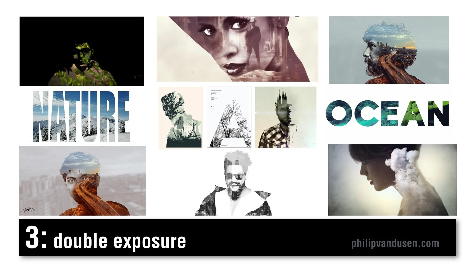
#3 Double Exposure
Double Exposure is seen frequently in motion design. It's recognized by combining imagery: using imagery as masks, masking imagery with imagery. It creates feelings of mystery and romanticism and poeticism. It's used in video and motion, but it's also used in static design. Typography can also be used in masking video. There's increased usage of this style because design applications have made it simpler and easier to produce this effect and it was popularized a few years ago in an HBO special called True Detective in that series trailer.
#4 Electric Gradient
This can be recognized by hyper bright, high-chroma illuminated gradients of color, multiple smooth gradients overtaking the entire image area. It's a reaction against material design and flatness and simplicity. It's being used in illustration and design layout, framing, and typographic treatments. It can be used as a major idea or just as a small element in a larger design. In brand identity, there's a resurgence of complexity and the use of gradients. Historically, gradients had been very hard to produce in print, in physical print, but now that everything is digital, there are no barriers to using gradients. Nothing is holding us back from using them anymore.

#5 Fruitopia
Fruitopia is recognized by fruit being a major visual design element. Fruit being used as a symbolic reference to something else. It can be a great vehicle to leverage color and shape and a design can be linked to a product or just as humor. Fruit is fun. It's sensual. Taste is a key physical sense. It can be used as a complex design tool, as it operates on multiple levels, visual, color, with psychological links to taste memory. It adds a level of humor and whimsy to a design or layout.

#6 Paper Cut
Paper Cut is recognized by hand cut paper or torn paper using realistic shadows to create physical 3D space. Again, it leverages that handcrafted trend, a level of high-touch labor-intensiveness. Again, this is an act of physical creation. It's being used everywhere, in books and posters and illustration and typography. It can be used as abstract shapes or realistic depictions of something sculptural but made out of paper. It can be clean cut or it can have torn edges. It's a very, very versatile trend. It commands a longer and a second look due to its complexity. It's an intention grabber.

#7 Sign Painter
Sign Painter can be recognized by vintage sign painter fonts and hand-brushed hand stroked letter forms, cursives paired with sans-serif block letters. Again, it's a reaction against clean modernism and computer generated design. It embraces the handcrafted design traditions brought into a modern context. This sort of sign painter design requires skill and training because not just anyone can do it and in a way it gives homage and reference to a simpler time when design was not commoditized or computerized.

#8 Geo Max
Geo Max is recognized by super clean, simple geometric abstract shapes, tubes, circles, bright colors. It's a continuation of Neo Geo, a trend from 2019, but it's even simpler. It references Peter Max's illustrations from the 1970s or yellow submarine, the Beatles cartoon movie done by artist Heinz Edelman, who was considered to be the German Peter Max. It's emotionally fun. It's modernistic, it's clean. You can use abstract figures and human forms that have been radically simplified. It appears in posters and food packaging and web design. Some of these images are from the Bloomberg financial report, which shows that even some super conservative companies are using it.

#9 Tactile Type
Tactile Type is recognized by using unusual materials to create typographic designs. Things like cocoa and cheese and plastic tubes, rolled paper, toast, even rusted hardware. Again, it's more of that high-touch, handcrafted time intensive design. Again, a reaction against computer generated design. It commands attention. It's visually complex. It's visually intense. It's used on book covers and posters and editorial illustration, events and promotions. It bridges the gap between sculpture and design.

#10 Stacked & Packed
Stacked & Packed is to be recognized by all type layouts, jigsawed arrangements of typography, interlocking shapes. It can be hand drawn or it can be computer aided design. There's a long thread of historical design references here from vaudeville posters to music posters to boxing match promotional design of the early 20th century. It's used in motivational posters and greeting cards, fine art editorial illustration. Again, this is high-touch, high-concept, time-intensive to create, which seems to be a recurring theme for 2020.

#11 Isometronic
Isometronic is a mashup of the words isometric and animatronic. Isometric projection is a method of visually representing three dimensional objects in two dimensions in technical or engineering drawings. It first made its appearance in gaming apps from the 1980's QBert, Marble Madness, Sega's Zaxxon. It's recognized by non-vanishing point illustration. It's been popularized in mobile phone gaming apps, adventure apps, strategy, building apps. It's not particularly new, but the moving GIF animated versions of isometrics are trending. They're used in websites and email newsletters and digital editorial illustration. They're being used heavily in business categories and business categories are historically slow to take up trends.

#12 Essentialism
Essentialism is another mashup of existentialism and essentials. It's recognized by hyper minimalistic black and whites sans-serif type in broken layouts with truncated letter forms, creative cropping, creating abstract shapes. It's being used in pharma and beauty and health and beauty aid categories. It's also being used in books and in literature and in poster design. It's the exact opposite of handcrafted. It's cold, it's distant, it's non humanistic. It feels computer generated.

#13 Bad Flyer
Bad Flyer is characterized by what looks like a colored paper Xerox with distressed type textures, haphazard collage layout, unusual amateurish font pairing choices. The history comes from band posters and rock 'zine culture and has roots in Ray Gun magazine and David Carson. It's been used in club and music posters, editorial layout, new 'zine culture, design magazines and educated design resources like the AIGA. It's fun, it's inventive, it's gutsy, it feels anti-design establishment. It's kind of the "bad is good" design aesthetic concept. It's handcrafted design but with basic tools, things like colored paper and scissors and glue and a bad Xerox machine.

#14 Throwback Pixels
Throwback Pixels is characterized by bright garish, high chroma color, heavily pixelated, like bad computer painting app, like MacPaint or MS Paint back in the day. It's like a computerized version of the bad flyer trend. It's visually violent, in a way it almost hurts the eyes. Abstract collages of random images and random shapes and random cropping. It's eye catching and it's attention grabbing. Again, it's this "bad is good" design culture. It's computer generated to the extreme in patterns and in texture. It's being used in design magazines and editorial illustration and that image in the lower left is actually from the New York Times special section on streaming, so even news outlets are using it.

After last year's video, people kept asking me, "Philip, how do I create the things that are in this video?"
Well, let me introduce you to Daniel Scott of Bring Your Own Laptop.
I met Daniel when he was a guest on my Brand•Muse interview series on YouTube. Dan's a certified Adobe trainer and a regular speaker at the Adobe Max conference and he has some of the best video training programs out there to learn design applications like Photoshop and Illustrator and InDesign. And if you use my affiliate link you can support my work here on YouTube and I'd really appreciate it. I get a small percentage for sending you to his site. He works on a subscription basis, a very low subscription fee and I tell you it's absolutely worth it. He has incredible training programs.


The Un-Instagrammable
When you are creating a brand, you look for the iconic. The memorable. The indelible. The unique. The un-Instagrammable.

I went on a short trip to a place called Neahtawanta near Traverse City, Michigan last week. It’s a small private enclave of cottages that dates back to the 1890’s. I spent summers there when I was growing up. It holds a lot of fond memories for me.
In “Neah” there is a wooden pavilion on the beach where families gather to cook out, have cocktails and watch the sunset. For over 50 years there was a scrawny evergreen tree that grew at the edge of the water. It had a distinct asymmetrical shape. Like a larger version of Charlie Brown’s Christmas tree. Not your Instagrammable type of a tree.
But it stood out from thousands of other trees in its character, its shape, its sheer tenacity to weather the brutal Michigan winters on the shore of the lake over the decades.
This year, one of the association members decided to design a logo for Neah that she could print and embroider on T-shirts and hats for the other cottage owners and she needed an icon.
This one little tree said “Neah” better than anything else.
When you are creating a brand, you look for the iconic. The memorable. The indelible. The unique.
The un-Instagrammable.

To Win Big, Think Small
A staggering 80% of social media viewing is done on mobile devices. How do people choose what to consume?

“Alice in Wonderland-like” syndrome is a disorder of the brain. The symptoms are named after Lewis Carroll’s protagonist Alice, who went down a rabbit hole and found herself shrinking or expanding depending on her circumstances. People who are afflicted by it misperceive the size and distance of objects, seeing them as larger or smaller than their natural state.
In a white paper, comScore has reported that a staggering 80% of social media viewing is done on mobile devices. How do people choose what to consume? They click on thumbnails that jump out at them. So not only are viewers encountering content at a tiny scale, they are choosing what to click from even tinier thumbnail images.
When designing artwork for social media, for Facebook, for YouTube, you have to zoom way out. When people view your post, your thumbnail may be as small as 3/4 of an inch wide. If your designs have lots of copy, small font sizes or detailed imagery, people are going to get frustrated and scroll right past them. Opportunity lost.
But when people click your thumbnail, you get traffic. When you get traffic, you win. To win big, you have to start by thinking small.

Improving Design Productivity: Creatives Need Privacy
Companies see wall-less creative workspaces as an extension of their brand image. They are more interested in how it looks, than how well it works. And for creatives and designers that's a problem.

I'm a bit of an introvert. I find group activities somewhat draining. I find solitude rejuvenating and I do my best creative work when I'm alone.
Given that, it's kind of funny that I've spent my career leading large groups of designers and artists in creative settings, Fortune 500 companies, global brand consultancies and learning institutions.
I began weaving the web of my career as a fine artist. A solitary pursuit for the most part. When I needed to find a path to make a better living I got my MFA so I could teach. I loved teaching because I love learning and have a passion for helping others to achieve their creative potential.
Later, I found that being a creative director was a lot like teaching except you made a tad more money. Plus, your work and the work of your teams are enjoyed by people all over the world.
No artist wants to work in a total vacuum.
But with this transition came a need to be more outgoing. To be more often involved in group pursuits than individual ones. I built up that muscle. And it took a lot of trips to the gym.
Susan Cain, in her book "Quiet: The Power of Introverts in a World That Can't Stop Talking" writes about how in the 20th century as our society moved from agrarian communities in the country to the cities, we changed. We went from working with a small group of people who we knew well to living and working in large groups of people we didn't know. Being "outgoing" became the goal. Our heros became the great salesman of the world. Our bible, Dale Carnegie's "How to win friends and influence people".
This evolution brought with it physical changes to where and how we are working. In the corporate world and in design studios, the move to create open floor plan work spaces has reached a critical mass. In a reaction to breaking down the walls of de-personalization that the Dilbert-esque office cubicle seas wrought, we have lost something that was worth protecting. Solitude. As it turns out, designers need solitude.
They need quiet and privacy to ruminate and play with ideas. Without distraction.
The casualties of this evolution are everywhere. You can see them in any design studio in the world hiding under their noise-cancelling headphones. They aren't just getting into their own jams. They are trying to escape the constant noise and distraction that the crumbling of the cubicle walls has brought down on them.
One designer at Whirlpool articulates what I have heard over and over in my years as a creative leader:
"I work in an open-plan office, and hate talking to the people near me. I just don't want to annoy everyone else. So instead, I hole up at my desk, earphones on all day. I email people who sit five feet from me. Whoever designed my office has absolutely failed.”
“Instead of making people more collaborative, it separated them. This trend needs to stop."
The results of this trend are also quantifiable it turns out. Finland's Institute of Occupational Health reports a decline of 5-10% of the performance of cognitive tasks like reading, writing and other creative work when in an open office setting. Management might be too drunk on work-pod Kool-Aide and the cost savings in office furniture. Or the shoulder-surfing-tabs-keeping and "what the hell are these people doing?".
Open office plans just look cool. And if we look cool and modern, we are cool and modern, right? I mean, can you imagine a design firm with cubes? I didn't think so. This, it turns out, is a big part of the problem.
The facts increasingly point to this: Companies see open, collaborative spaces as an extension of their brand image. They are more interested in how it looks, than how well it actually works. Solitude is just out of fashion. Simple as that. And for creatives and designers that's a problem.
It should be a problem for their companies, too.
All this is outweighing optimal creative productivity. And since when has business turned its back on improved productivity? Especially when in today's business world, creativity and innovation are what separates the winners from the also-rans.
The fact is people whose work is distracted make 50% more mistakes and take twice as long to finish. Maybe this has something to do with the fact that we are working longer hours than ever.
Plus, most designers don't like it. You've heard "A happy wife is a happy life"? Well, it goes triple for a happy designer.
The real question is: What does work? The answer is choice. Balance. Companies and agencies need to give designers access to both kinds of work spaces. If I were to place a bet, I would bet that the spaces that afford designers quiet, uninterrupted concentration and a reasonable amount of visual privacy will be the ones being fought over. Tooth and nail, if I know my designers.
The pendulum of open floor plan offices needs to swing back to center.
In re-watching Susan Cain's amazing TED talk about the power of introversion, one statement jumped out at me. "There are no revelations without solitude."
What design revelations and innovations have we already missed by removing our creatives space to think?
photo credit: Ben Mautner @flickr.com

Video Is The New Black
It's estimated that 80% of all content consumed on the web will be video by 2020. To the entrepreneur, brand owner or creative professional, “video is the new black”. The once nice-to-have is now a requirement to remain competitive.

When I was 11, I filmed an epic disaster movie in my basement on a Super 8mm camera. It was called “Ball!”, and told the story of a Godzilla-sized Nerf basketball that destroyed an entire town, which consisted of my slot car race track, HO gauge train set and a lot of plastic army men. I used a lot of lighter fluid. Let’s just say it’s a good thing there weren’t smoke detectors in those days.
At the time, my friends and I were drawing lots of robots and war scenes on paper and sharing them with each other. Needless to say the screening of “Ball!” for my buds put me in a class of my own in the storytelling department. Because my story was moving.
It's estimated that 80% of all content consumed on the web will be video by 2020. Gulp. Facebook, YouTube, Snapchat, Netflix, Hulu, Amazon, Instagram and their mother are now starting to stream original programming. Not happy with being merely platforms, they are jumping into being content creators.
Video is the new black. The nice-to-have is now a requirement to remain competitive. For the entrepreneur, brand owner or creative professional the important question is: Are you moving yet?
photo credit: Philip VanDusen

Let's Co-Everything
The cost and risk of opening a retail presence has always been a significant barrier for brands just getting started. You used to have to go it alone. But now you don’t have to.
From co-working to bike-sharing to millennials co-habitating with their parents, it looks like owning something yourself is just getting too hard.
Going it alone in retail is hard, too. Just ask American Apparel. One of the fastest growing US companies only a decade ago, they are now closing their doors. They hadn’t made a profit since 2009.
The cost and risk of opening a retail presence has always been a significant barrier for brands just getting started. You used to have to go it alone. But now you don’t have to.
There is a co-retailing startup called Bulletin. It helps smaller brands merchandise their products without having to have a brick and mortar store of their own. They divide up a single retail location into smaller sections, from a shelf to half a store, that you can rent month-to-month. It’s brilliant and is smashing the barrier to entry into physical retail.
The new co-economy is giving rise to this kind of innovation every day. Is there a barrier to entry that is standing in the way of you growing your business or creative practice? Take a step back and ask, “How can I co-it?”
photo credit: Sebastien Wiertz @flickr.com

Measuring Up: Quantifying Designers Performance
One question that’s plagued many a creative director is this: How you measure a creatives performance? You can measure an account person by how much business and revenue they generate. How about designers?
Designers in the commercial design industry are tasked with creating work that works. Work that pleases the client, delights the consumer and drives sales of goods or services. Sometime that includes the work pleasing the creative director, sometimes not. It’s commercial work, not fine art. Fine art has the luxury of being subjective and can be purely conceptual. Commercial work has to sell stuff.
The clearest metric to evaluate design work and by extension, the worker, is "adoption rate". Did the client choose the work? Did it make it to shelf, or on-air? Could the client quantify a sales bump? Or were all your designs left in the "outs" bin.
A slightly more subjective metric is whether the design delivered on the strategy of the project. Does the designer consistently hit the target - doing work that actually makes it to a client presentation (that is, past the CD and the account director whether the client chooses it or not).
The final criteria is the WOW factor. Is it gorgeous? Did it make the CD's eyes tear up just a little bit? Pure aesthetics are important, too, and a seasoned creative leader knows beautiful work when they see it. We were trained to recognize it and we have years of experience judging it. It also has a tendency to win awards if you’re lucky on top of being good.
I generally take notes as the year passes and capture who did what work in my designers goals folders, so at annual review time there are clear examples to reference in your conversations.
Other factors also influence a designers success in the studio. Do they show up to work on time? Is the work ready at critique time? Is it visually presented well? How well do they speak strategically to the work? What do they bring to the table in brainstorming sessions? What do they contribute when it comes to studio-wide inspiration? What creative energy two they bring to the workplace? How are their client relationships? All important factors.
But the crucial metric of a designers success is certainly “adoption”. Do they do strategic design work that makes it through the gauntlet? Is that work of high aesthetic quality? If the answers there are yes, you’ve got a winner on your hands and many other sins can be forgiven.
Credits: Image Source: Flickr.com: University of Salford Press, Techhub Manchester Murals Project