
12 Graphic Design Trends for 2026
Today we’re digging into the creative trends that will be shaping our industry in 2026 across graphic design, illustration, packaging, and virtually every corner of visual communication. You’ll see patterns emerging that are grounded in shifts in culture, technology, and materials, both digital and physical.
There are thematic threads weaving through these trends. A push toward physicality and texture, and an interest in depth and layered meaning. You’ll also see reactions for and against the slickness we’ve been seeing in AI-generated content. Designers everywhere are rebuilding a sense of human presence in their work. That will be the dominant story of design in 2026.
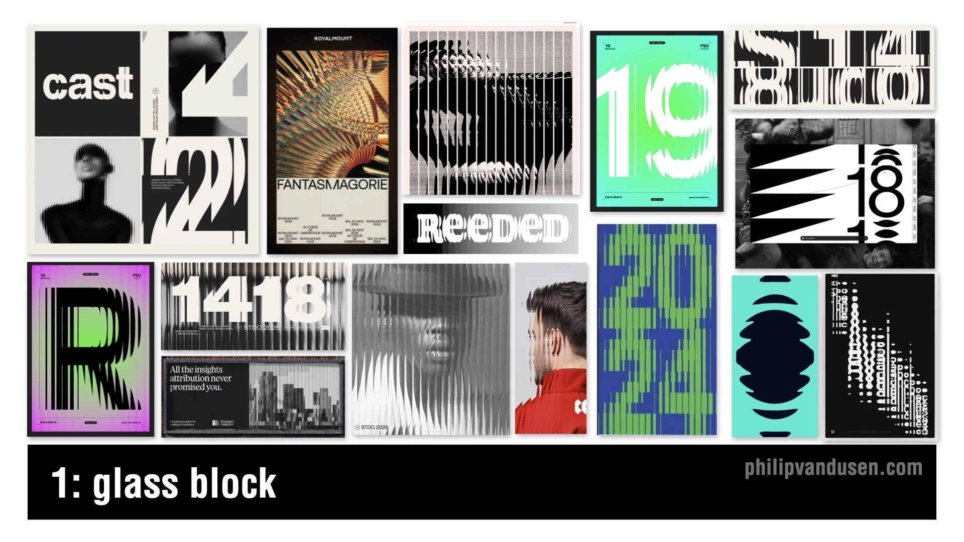
1. Glass Block
The Glass Block trend is showing up everywhere. Vertical ribbing, refracted imagery, type distorted through translucent barriers. Think privacy glass brought into the digital space. It gives you something modern and tactile without committing to full 3D.
This trend signals a move toward digital materiality, where design isn’t flat anymore. It makes creative work feel more physical and more structural. It feels like architectural materials crossing over into layout design.
You will see this in posters, album covers, editorial work, and especially motion, where the distortion comes alive.
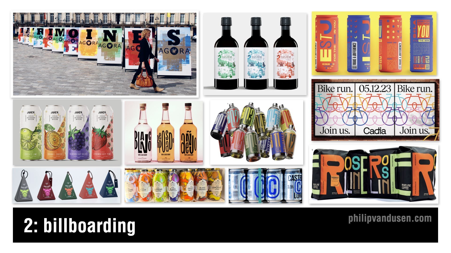
2. Billboarding
Billboarding is about design in multiples. The designs are variations of each other that relate visually through imagery, color, or illustration style — whatever holds them together as a group.
You see variations in colorway and intentional shape repetition. Designed to link up like puzzle pieces, creating a whole.
Billboarding is really about glanceability. In a crowded social feed or on crowded shelves, you have one second to grab attention, and designs in series do that extremely well. This trend shows up in packaging, poster design, event design, retail displays, and wearables merchandising.
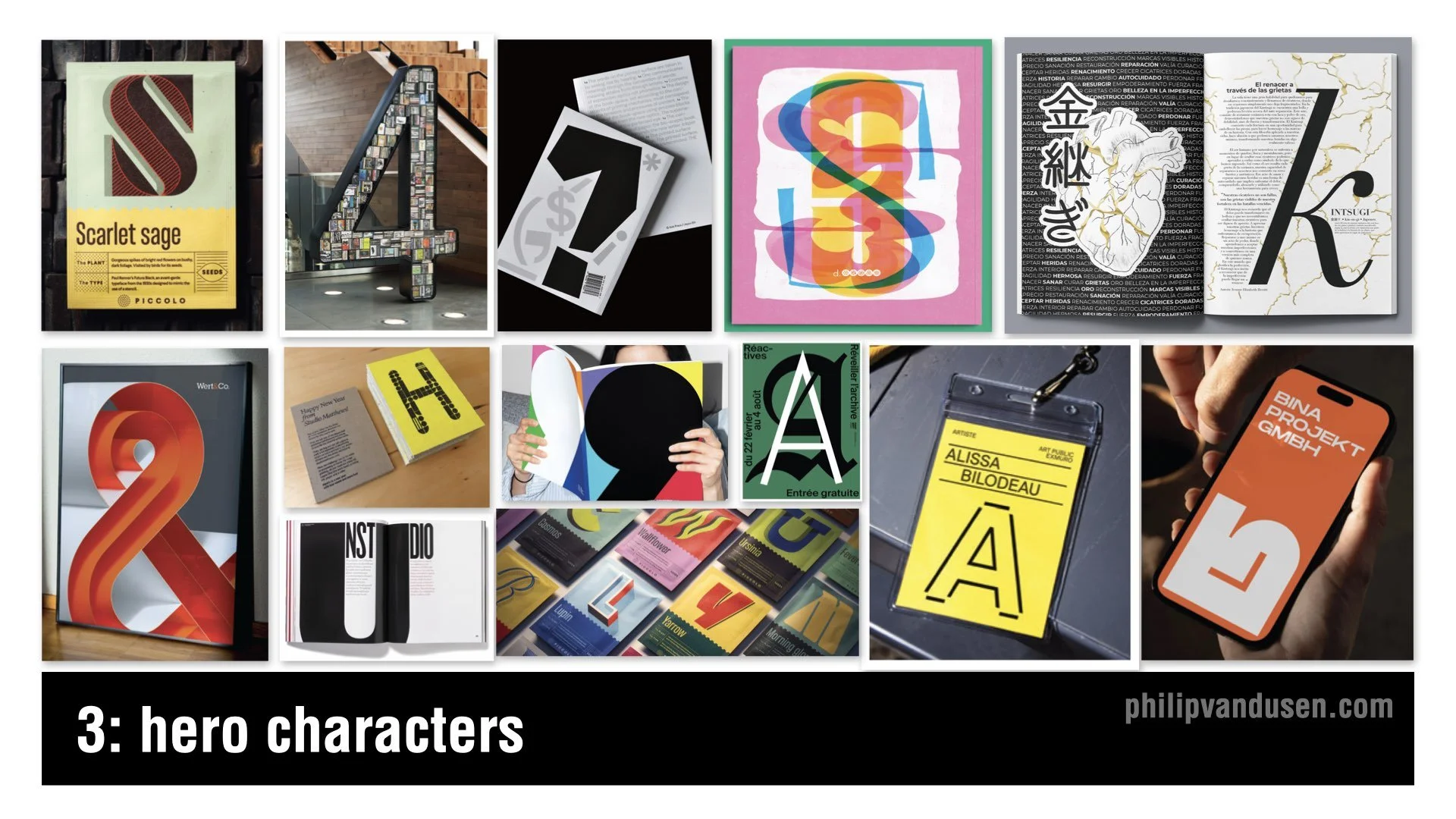
3. Hero Characters
The Hero Characters trend is a celebration of the beauty of a single letter in a font style shown at large scale, dominating layouts so we experience type in a different way. Designers are pulling single letters out of the alphabet and treating them like heroes — letterforms that become dominating sculptural objects.
A hero character lets a layout be comparatively understated while still having something expressive and striking to anchor it visually. This trend puts personality back into typography through exploded scale and singular focus.
It’s great for identity systems, packaging, signage, editorial design, and motion graphics.
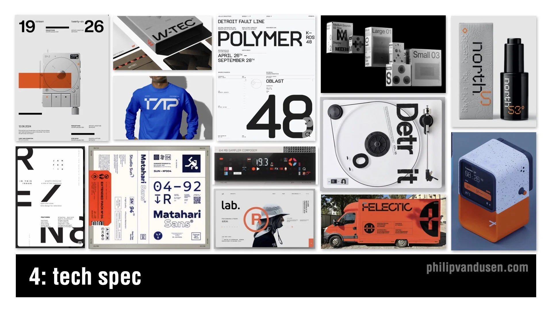
4. Tech Spec
Tech Spec is all about engineered precision. You’ll see wide tracking, strict grids, numeric codes, industrial icons, grayscale palettes, and sharp accent colors. It looks like something from a science lab, a consumer electronics product, or a piece of aerospace equipment.
This aesthetic speaks to how people feel about technology right now. There is excitement, but also anxiety. Tech Spec gives us a language to communicate systems, logic, and engineered austerity. It embraces sleek, high-tech, utilitarian design — a mash-up of new-wave tech brutalism and aerospace precision.
You’ll see this trend across editorial design, men’s fashion, wearables, consumer electronics product design, and promotional pieces.
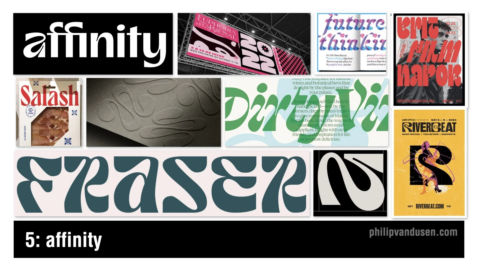
5. Affinity
Driven by the identity aesthetic of the design software brand Affinity — often positioned as an “Adobe killer” — the Affinity trend is all about friendly, rhythmic, soft-edged letterforms. Liquid terminals and warm curves juxtaposed with sharper angles create a dichotomy of form that feels decidedly nontraditional. They also come across in a slightly psychedelic way.
This trend is happening because brands want humanity back. It pushes against the coldness of tech aesthetics and gives us something emotional and approachable without being childish.
You’ll see it in event design, editorial layouts, food and beverage branding, and the more trend-forward identity systems.
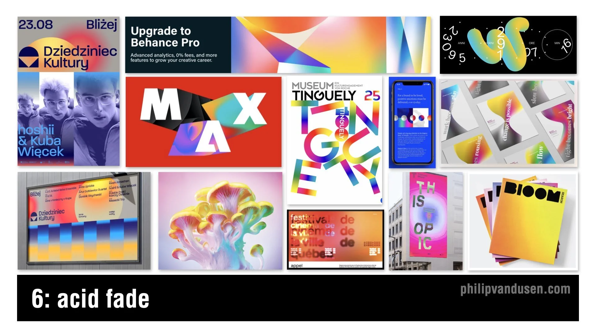
6. Acid Fade
Color is exploding again. Acid Fade takes high-saturation gradients and turns them into neon, prismatic, heat-map blends. Smooth transitions meet psychedelic liquidity.
AI tools have made it easier than ever to experiment with color. Freed from traditional color theory, designers are pushing vibrancy as far as possible. It’s youthful, optimistic, and rebellious. Color is back in a big way and it’s meant to be loud.
This trend shows up in music events, digital art, tech marketing, Gen-Z packaging, editorial layouts, and motion graphics where gradients feel dynamic and alive. Acid Fade is playful, optimistic, and trippy.
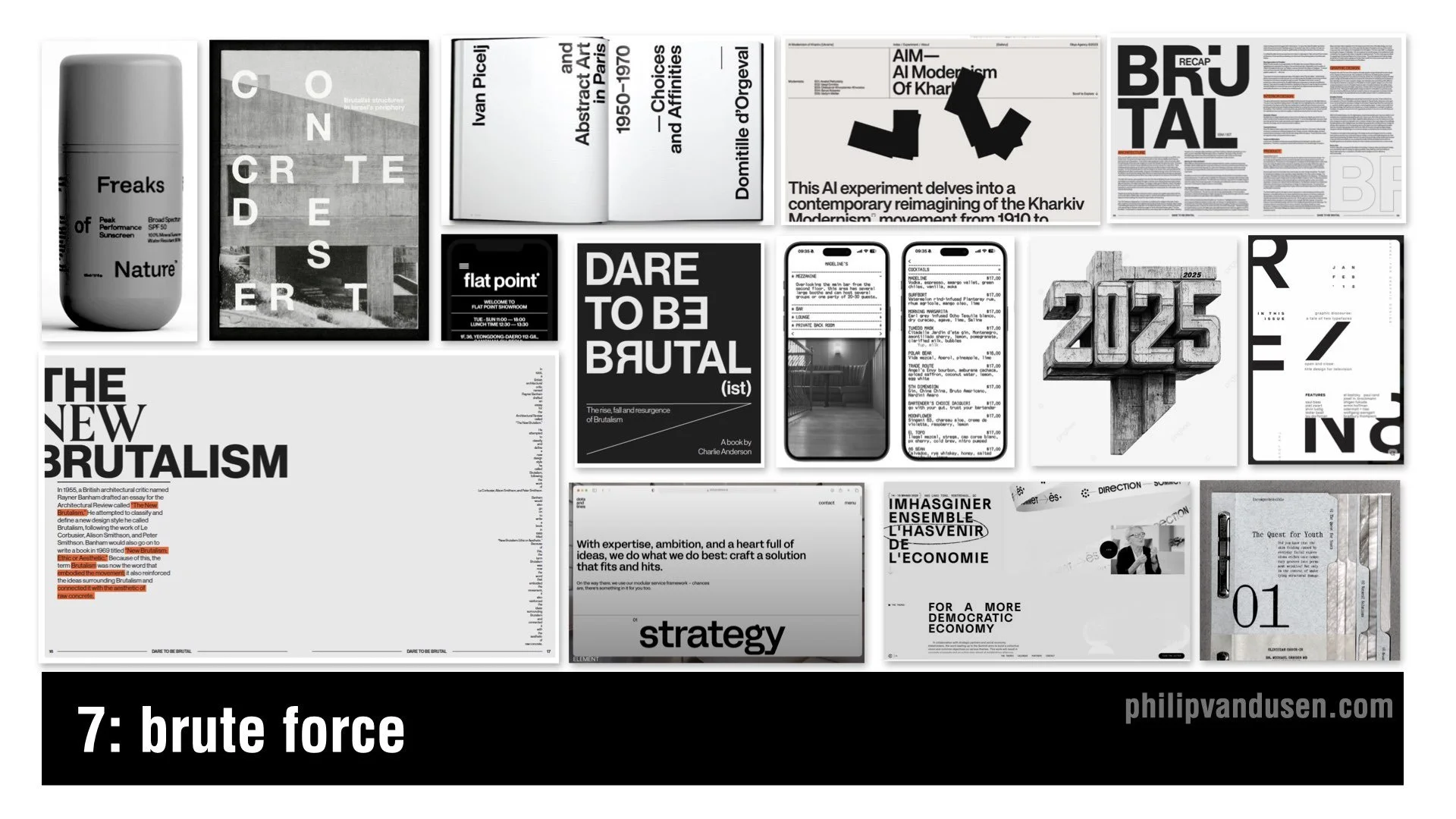
7. Brute Force
We have seen brutalism before, but Brute Force is its more mature sibling. Heavy stacked typography. Spreadsheet-style grids. Deadpan compositions that thumb their nose at trying to be visually appealing or beautiful. It’s mainly executed with black and white palettes with sparse color hits. It feels haphazard but also very intentional.
The appeal here is honesty. When so much design is polished and dependent on color and imagery, Brute Force feels grounded, offering the viewer a blunt version of the truth. It has structure, but it has zero pretense.
You’ll see Brute Force in editorial design, art institutions, fashion, website design, health and beauty products, and high-end packaging.
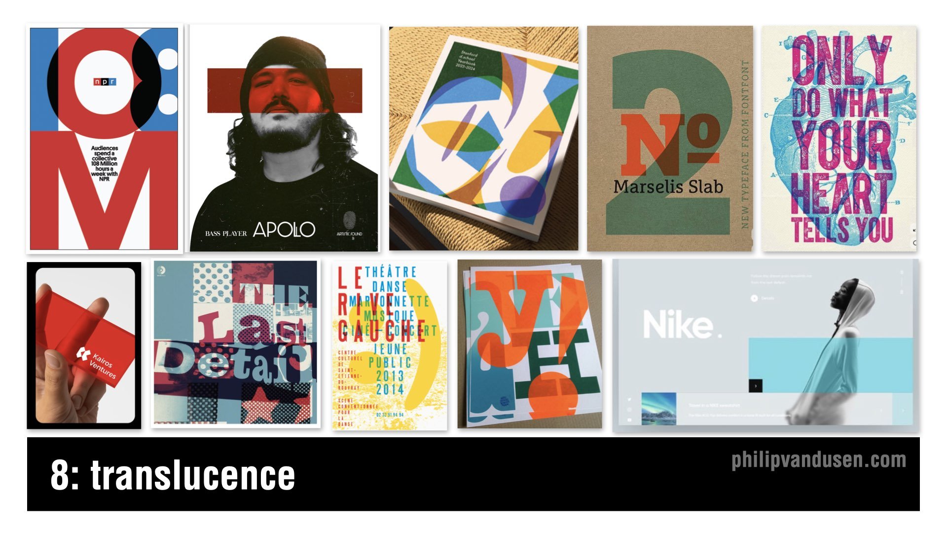
8. Translucence
The Translucence trend builds a multi-dimensional world through overlapping transparent layers. This is the graphic design version of vellum or frosted plastic. Designers want to create visual depth without resorting to fully 3D representation. It uses transparency to provide dimension, mood, and compositional complexity all in one.
The trend aims to manipulate visual space in a modular way. It signals visual storytelling through layers and asks the viewer to participate by mentally completing the image.
Designers are using it in silkscreen poster design, book covers, activewear branding, and dynamic website layouts.
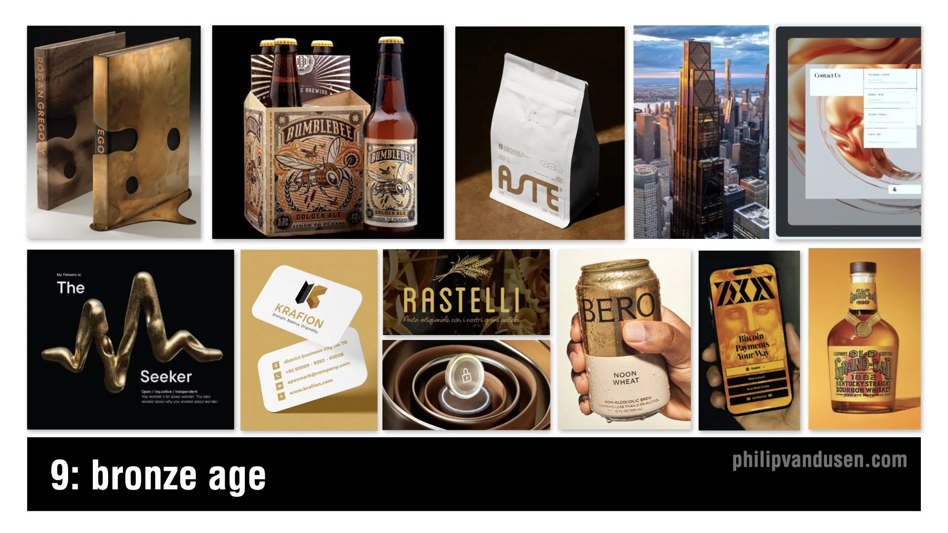
9. Bronze Age
Bronze Age is all about metallic warmth. Bronze tones and mineral textures create a look that is ancient and futuristic at the same time. Bronze feels less flashy than gold — more grounded and sophisticated.
This trend is rising because, in a time when technology surrounds us at every turn, consumers crave craftsmanship. Bronze feels artisanal and connected to real materials. It will be used in spirits, coffee, fragrances, premium packaging, and architecture — as seen in the new JP Morgan building in New York City.
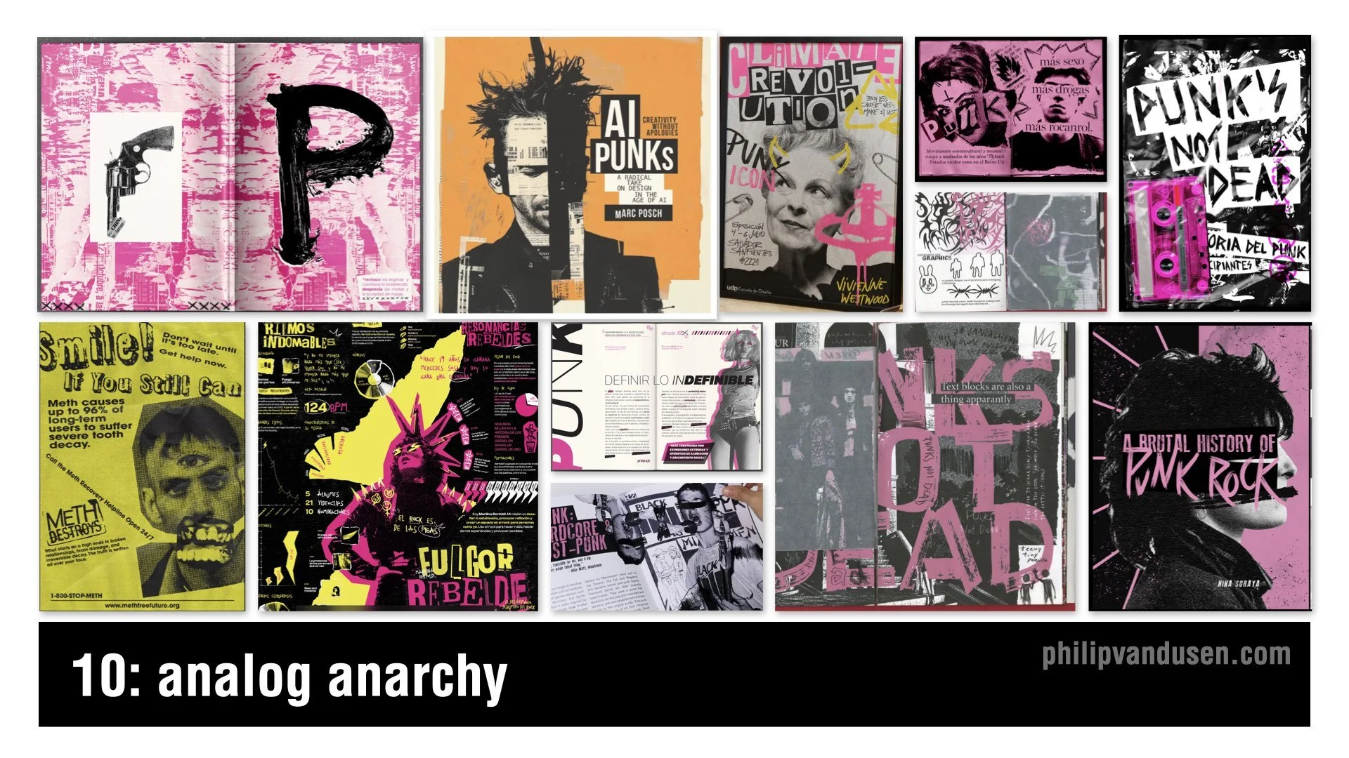
10. Analog Anarchy
Analog Anarchy brings punk back into contemporary design. It relies heavily on gritty black-and-white photocopy textures and hand-cut collage aesthetics. Think ransom-note type, acid yellows and neon pinks, chaotic layouts, and defiant political energy. It’s messy and naïve in a deliberately controlled way.
In a world dominated by high-tech tools and AI-driven image creation, younger designers are looking back to DIY subcultures for inspiration.
Analog Anarchy appears in music, fashion, and editorial design that taps into a rebellious zeitgeist.
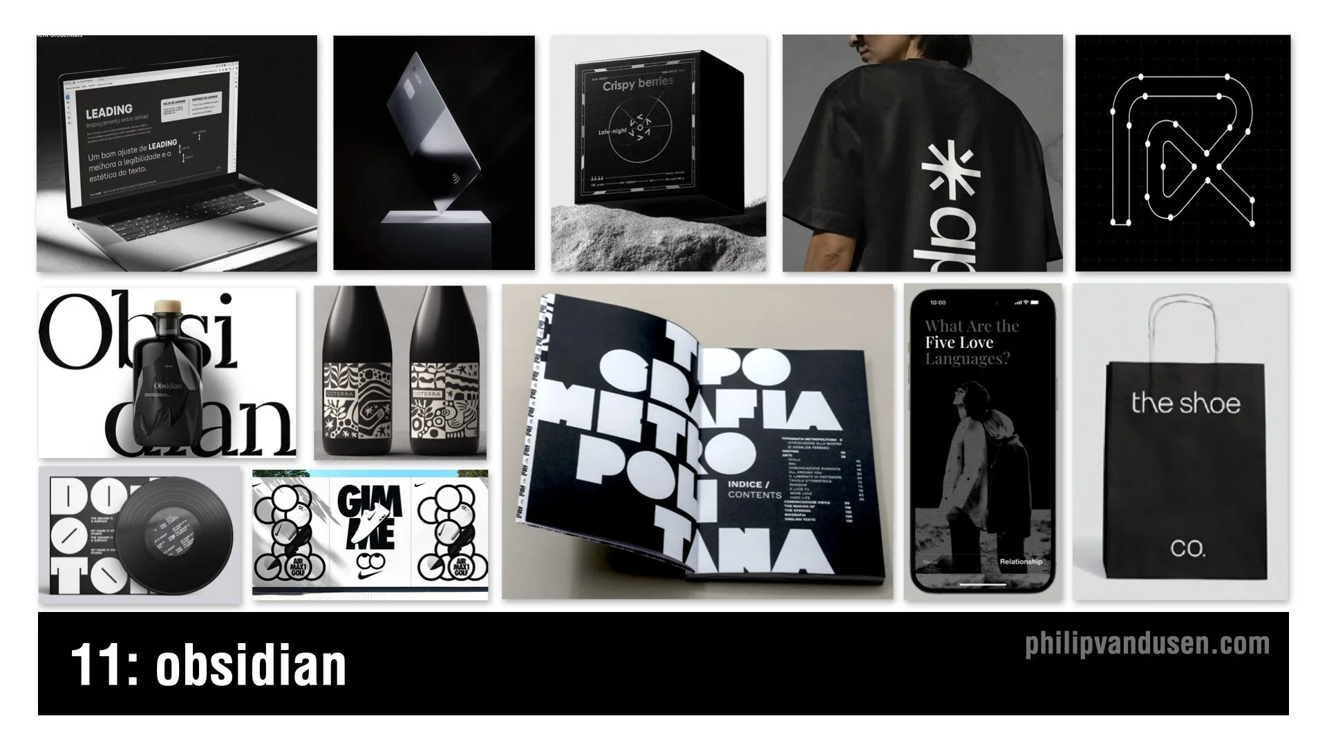
11. Obsidian
Obsidian is deep, glossy black power dressing for brands. It uses precise typography, minimal color, and dramatic contrast between matte and gloss to create an aura of mystery and luxury.
This trend is an intentional rejection of the electric color and whimsical imagery dominating other areas of design. When everyone goes bright, luxury goes dark. It gives premium brands a sense of drama in a design culture fueled by more-is-more photography and AI-composited visuals.
Obsidian appears in perfume, tech hardware, boutique fashion, luxury packaging, and high-end retail environments.
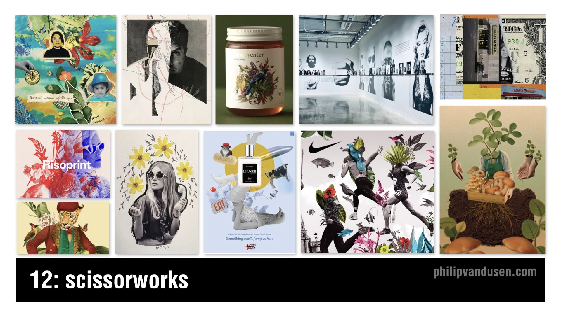
12. Scissorworks
In direct response to AI’s polished imagery, Scissorworks brings hand-done collage back into the spotlight. It’s a renaissance of analog expression that leans into imperfection and narrative depth. This trend uses found artwork, imperfect cut edges, and archaic imagery to create juxtapositions that invite viewer interpretation.
Scissorworks embraces play, experimentation, and human irregularity. It shows up in album art, editorial illustration, boutique packaging, fashion lookbooks, and museum display design.
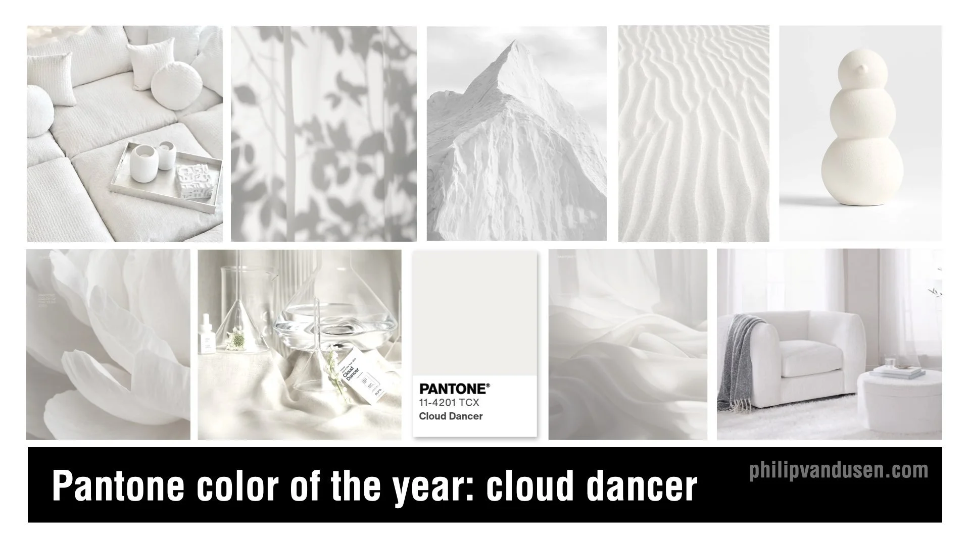
Bonus: Pantone’s 2026 Color of the Year: Cloud Dancer
Pantone’s 2026 Color of the Year, Cloud Dancer, is a soft, bone-white neutral meant to signal clarity, simplicity, and a creative reset. Pantone positions it as a warm, balanced white that brings breathing room to design and works across interiors, fashion, branding, and digital experiences.
To be honest, it’s a safe and somewhat non-committal choice. But Cloud Dancer does function well as a neutral backdrop, especially when paired with the bolder, more expressive trends emerging in 2026. It plays a supporting role when used as a base layer for texture, contrast, or high-impact color.
Final Thoughts
Across all of these trends, a clear tension emerges. Some designers are leaning into texture, physicality, and human craft. Others are embracing engineered precision and technical aesthetics. The push and pull between the digital and the physical — between control and chaos, between machine and hand — will define the creative landscape of 2026.
Treat these trends as inspiration, not instruction. Explore them, reinterpret them, or ignore them entirely. They exist to spark ideas and help you make more informed creative decisions as you navigate the year ahead.
~Thanks!
Philip VanDusen
