

12 Graphic Design Trends for 2026
Explore 12 major graphic design trends for 2026, curated by the branding and design strategist, Philip VanDusen. A full guide to the visual movements that will be shaping branding, packaging, illustration, web, and motion design in 2026.
Today we’re digging into the creative trends that will be shaping our industry in 2026 across graphic design, illustration, packaging, and virtually every corner of visual communication. You’ll see patterns emerging that are grounded in shifts in culture, technology, and materials, both digital and physical.
There are thematic threads weaving through these trends. A push toward physicality and texture, and an interest in depth and layered meaning. You’ll also see reactions for and against the slickness we’ve been seeing in AI-generated content. Designers everywhere are rebuilding a sense of human presence in their work. That will be the dominant story of design in 2026.
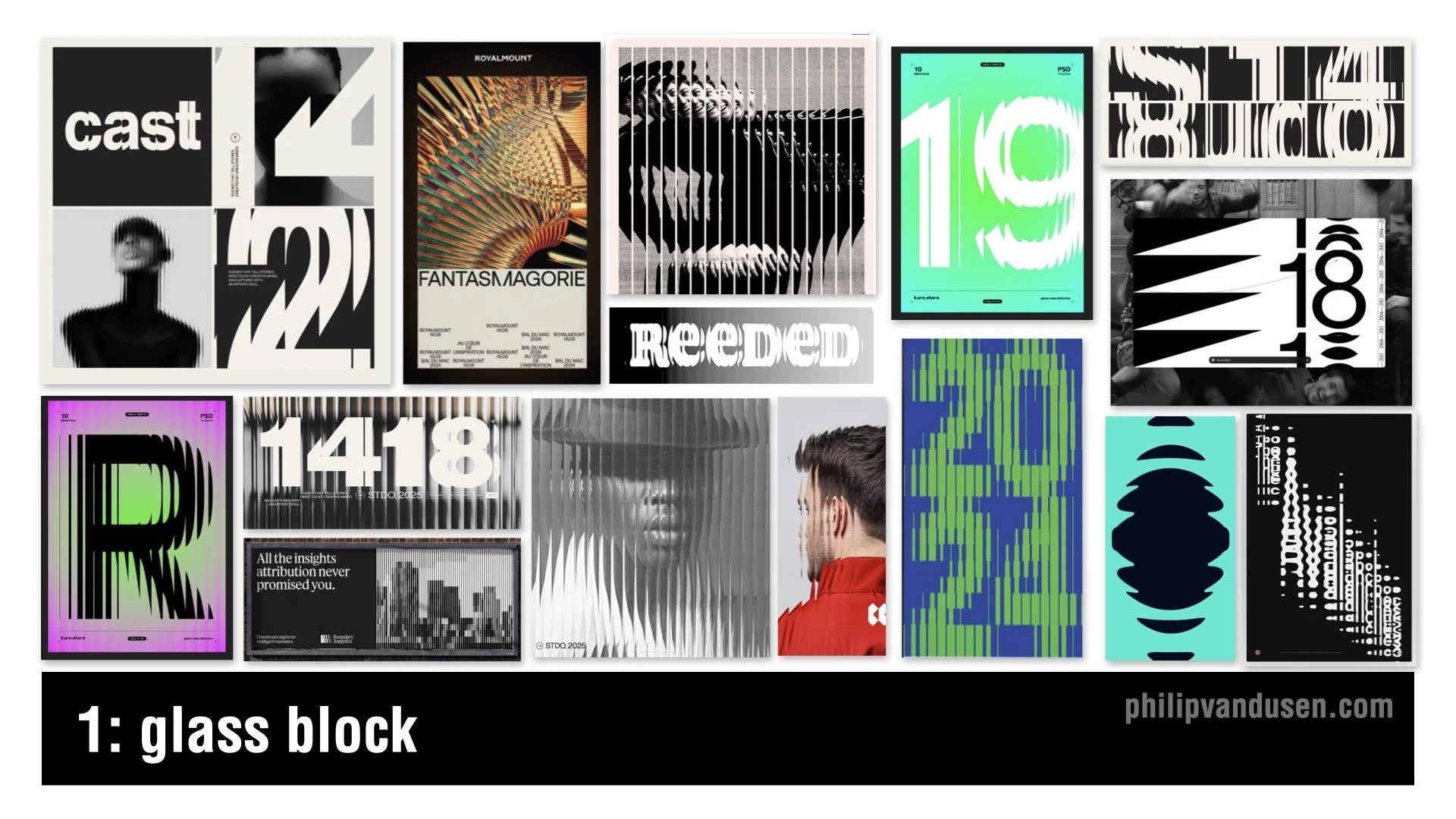
1. Glass Block
The Glass Block trend is showing up everywhere. Vertical ribbing, refracted imagery, type distorted through translucent barriers. Think privacy glass brought into the digital space. It gives you something modern and tactile without committing to full 3D.
This trend signals a move toward digital materiality, where design isn’t flat anymore. It makes creative work feel more physical and more structural. It feels like architectural materials crossing over into layout design.
You will see this in posters, album covers, editorial work, and especially motion, where the distortion comes alive.
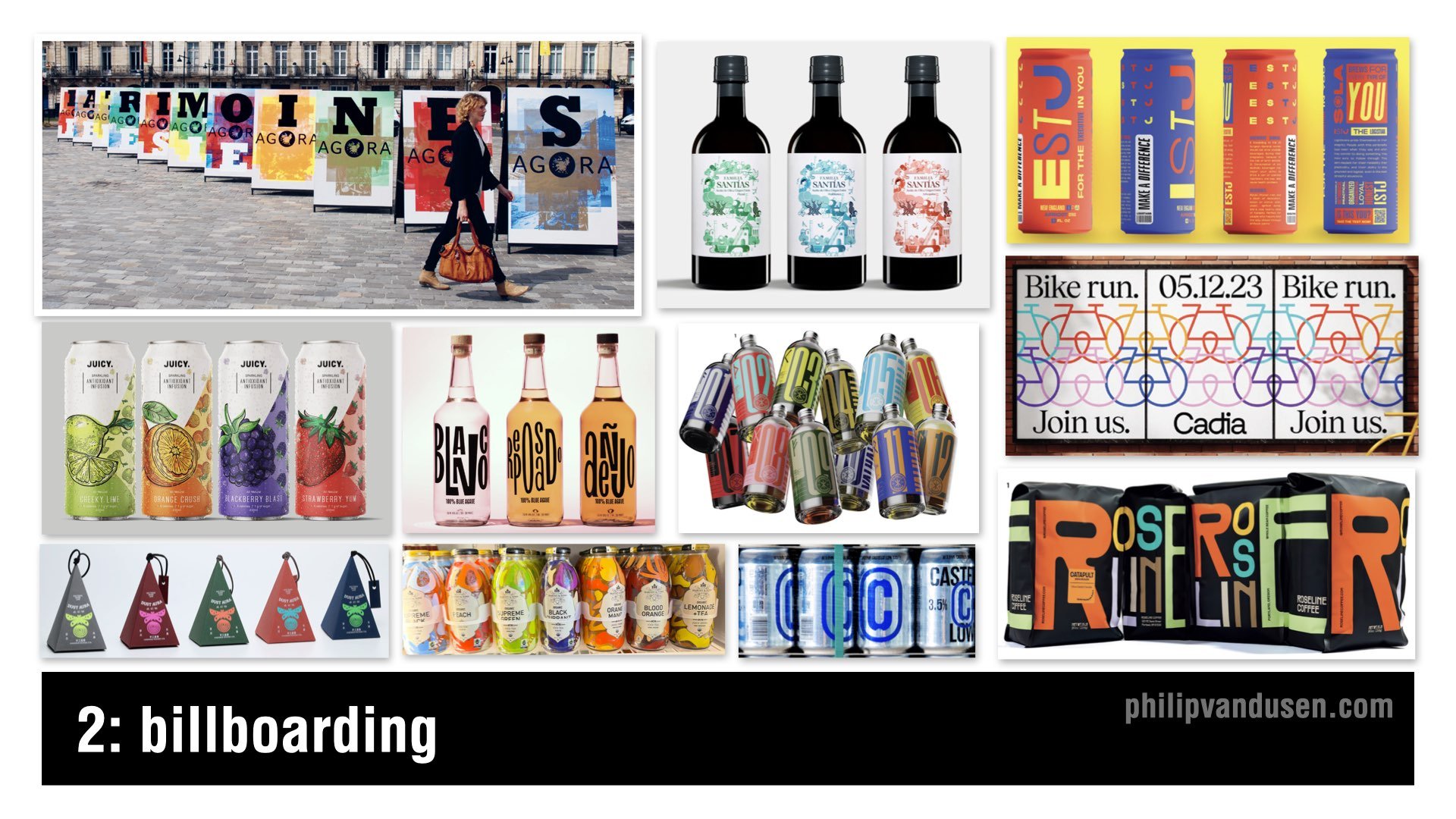
2. Billboarding
Billboarding is about design in multiples. The designs are variations of each other that relate visually through imagery, color, or illustration style — whatever holds them together as a group.
You see variations in colorway and intentional shape repetition. Designed to link up like puzzle pieces, creating a whole.
Billboarding is really about glanceability. In a crowded social feed or on crowded shelves, you have one second to grab attention, and designs in series do that extremely well. This trend shows up in packaging, poster design, event design, retail displays, and wearables merchandising.
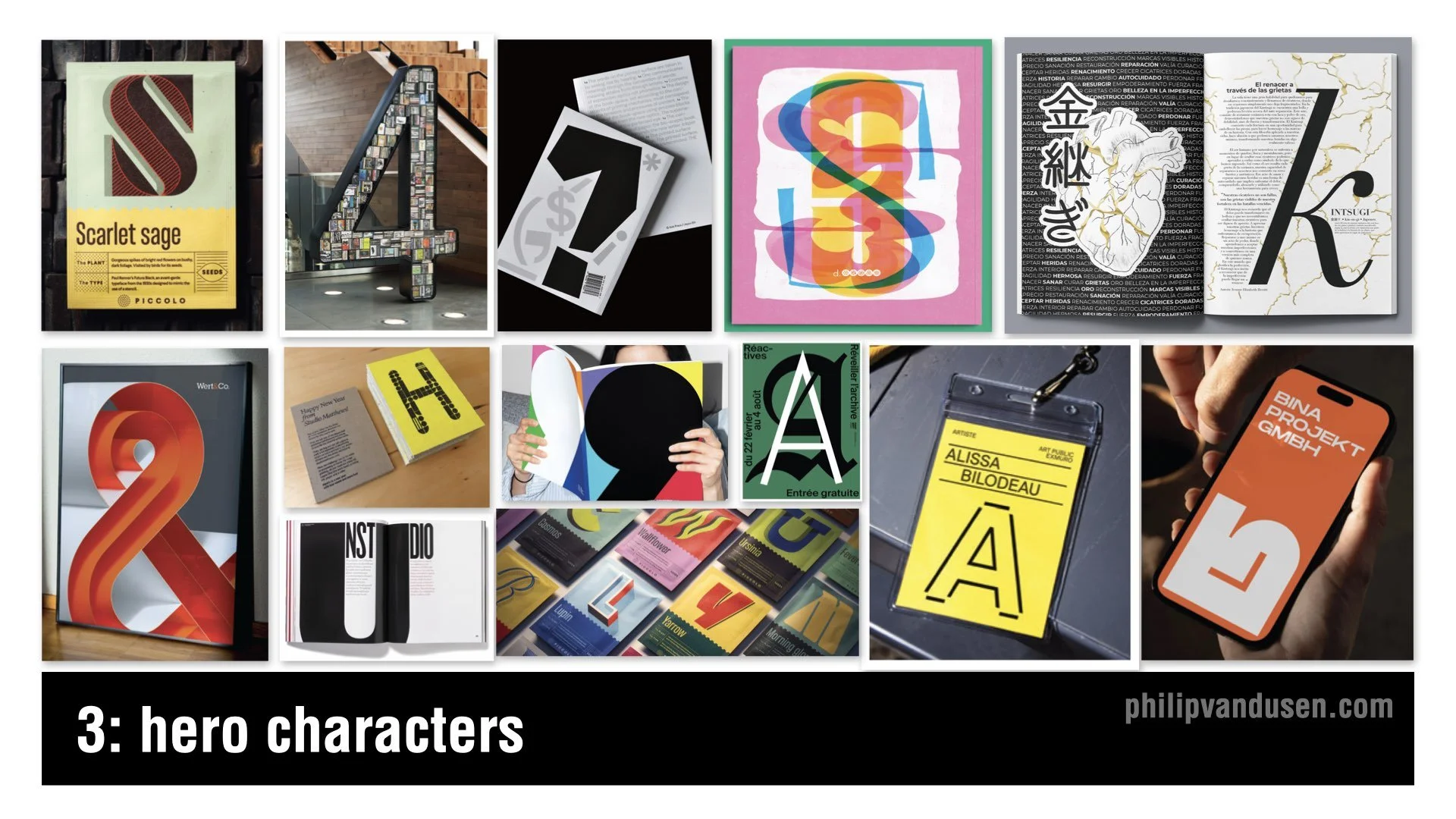
3. Hero Characters
The Hero Characters trend is a celebration of the beauty of a single letter in a font style shown at large scale, dominating layouts so we experience type in a different way. Designers are pulling single letters out of the alphabet and treating them like heroes — letterforms that become dominating sculptural objects.
A hero character lets a layout be comparatively understated while still having something expressive and striking to anchor it visually. This trend puts personality back into typography through exploded scale and singular focus.
It’s great for identity systems, packaging, signage, editorial design, and motion graphics.
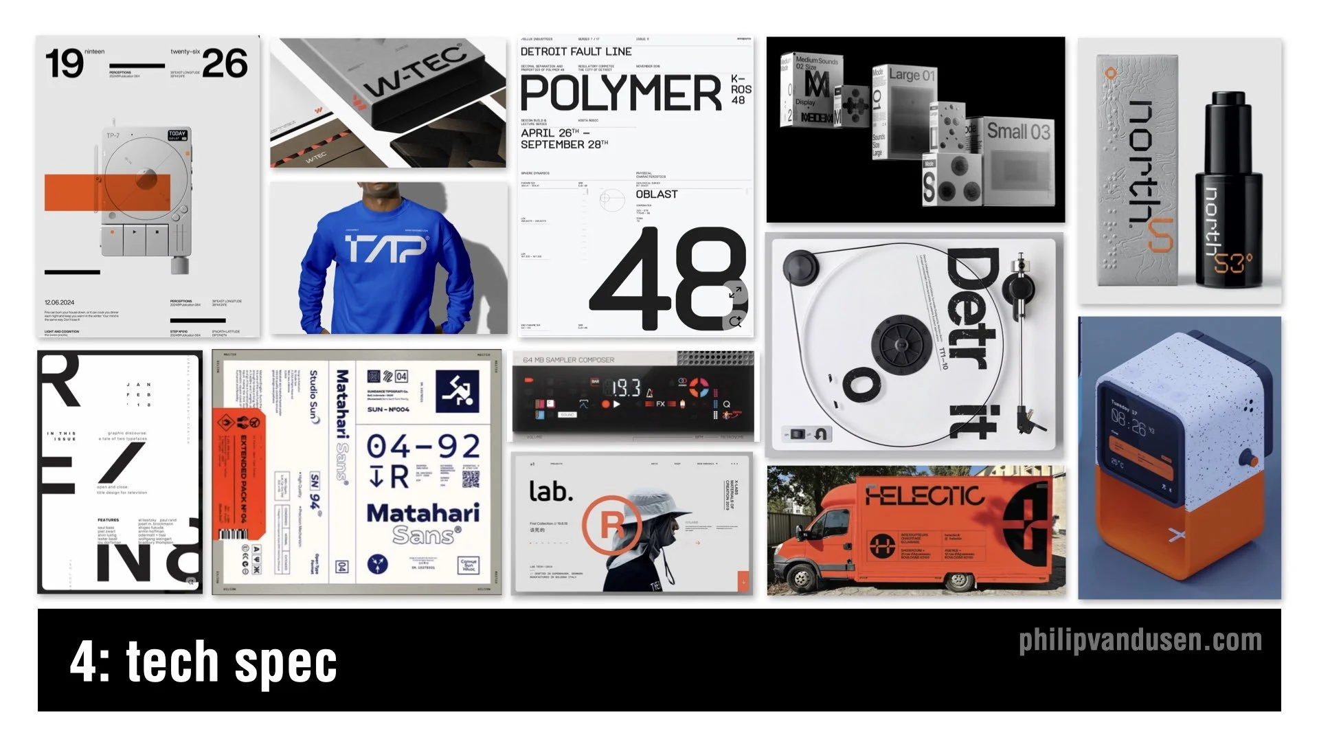
4. Tech Spec
Tech Spec is all about engineered precision. You’ll see wide tracking, strict grids, numeric codes, industrial icons, grayscale palettes, and sharp accent colors. It looks like something from a science lab, a consumer electronics product, or a piece of aerospace equipment.
This aesthetic speaks to how people feel about technology right now. There is excitement, but also anxiety. Tech Spec gives us a language to communicate systems, logic, and engineered austerity. It embraces sleek, high-tech, utilitarian design — a mash-up of new-wave tech brutalism and aerospace precision.
You’ll see this trend across editorial design, men’s fashion, wearables, consumer electronics product design, and promotional pieces.
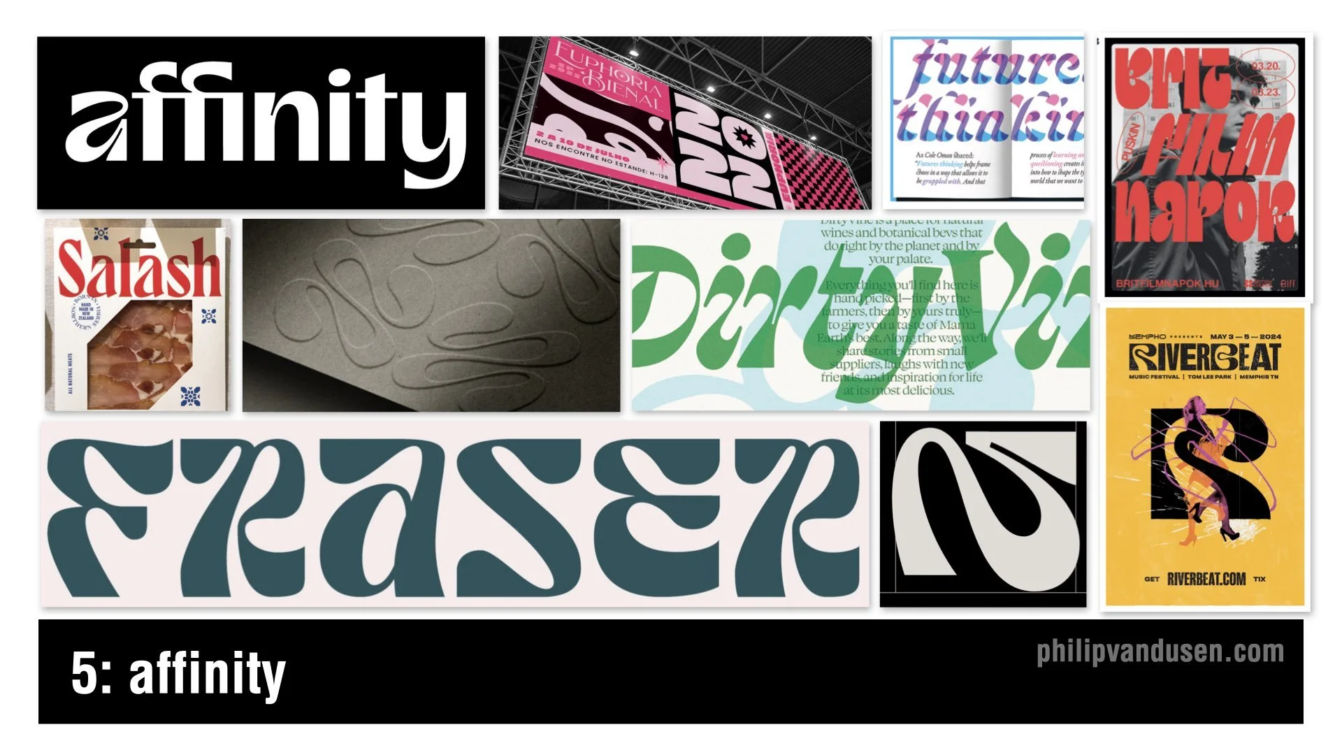
5. Affinity
Driven by the identity aesthetic of the design software brand Affinity — often positioned as an “Adobe killer” — the Affinity trend is all about friendly, rhythmic, soft-edged letterforms. Liquid terminals and warm curves juxtaposed with sharper angles create a dichotomy of form that feels decidedly nontraditional. They also come across in a slightly psychedelic way.
This trend is happening because brands want humanity back. It pushes against the coldness of tech aesthetics and gives us something emotional and approachable without being childish.
You’ll see it in event design, editorial layouts, food and beverage branding, and the more trend-forward identity systems.
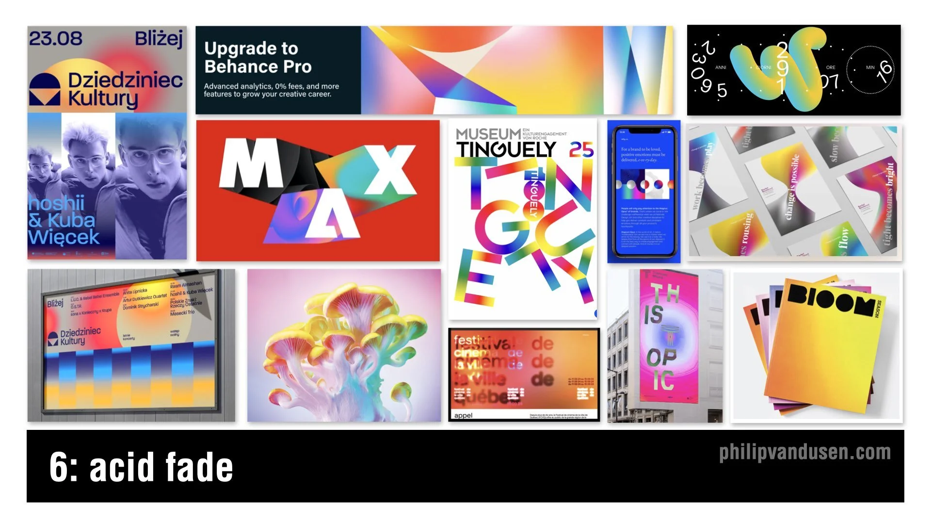
6. Acid Fade
Color is exploding again. Acid Fade takes high-saturation gradients and turns them into neon, prismatic, heat-map blends. Smooth transitions meet psychedelic liquidity.
AI tools have made it easier than ever to experiment with color. Freed from traditional color theory, designers are pushing vibrancy as far as possible. It’s youthful, optimistic, and rebellious. Color is back in a big way and it’s meant to be loud.
This trend shows up in music events, digital art, tech marketing, Gen-Z packaging, editorial layouts, and motion graphics where gradients feel dynamic and alive. Acid Fade is playful, optimistic, and trippy.
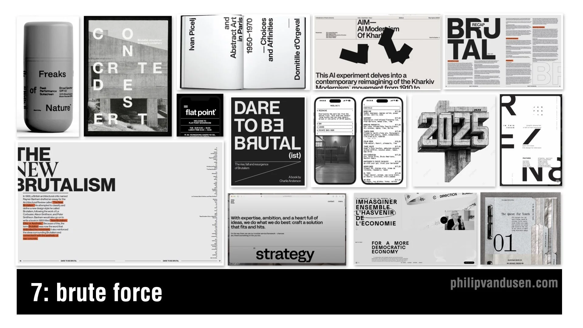
7. Brute Force
We have seen brutalism before, but Brute Force is its more mature sibling. Heavy stacked typography. Spreadsheet-style grids. Deadpan compositions that thumb their nose at trying to be visually appealing or beautiful. It’s mainly executed with black and white palettes with sparse color hits. It feels haphazard but also very intentional.
The appeal here is honesty. When so much design is polished and dependent on color and imagery, Brute Force feels grounded, offering the viewer a blunt version of the truth. It has structure, but it has zero pretense.
You’ll see Brute Force in editorial design, art institutions, fashion, website design, health and beauty products, and high-end packaging.
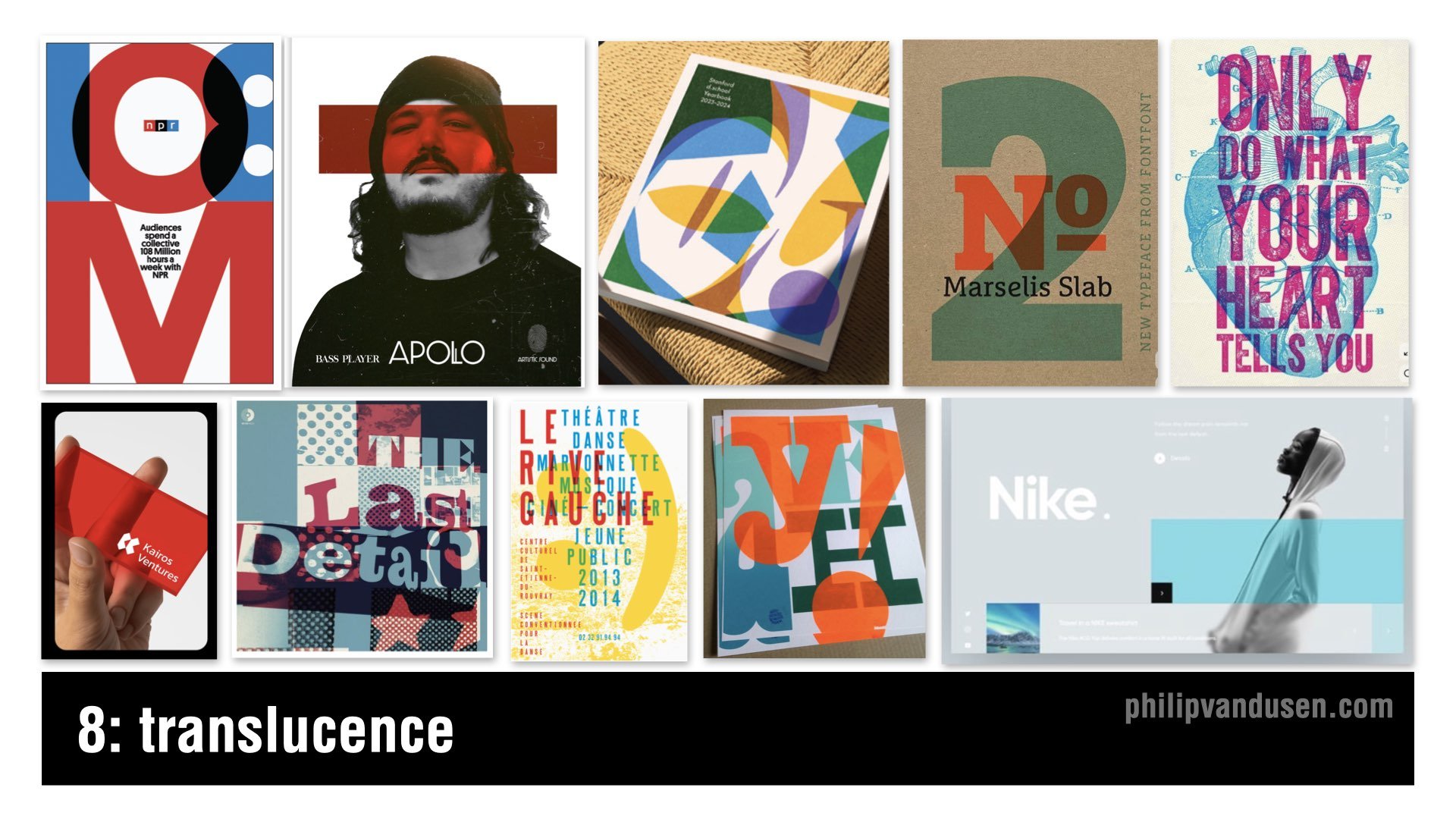
8. Translucence
The Translucence trend builds a multi-dimensional world through overlapping transparent layers. This is the graphic design version of vellum or frosted plastic. Designers want to create visual depth without resorting to fully 3D representation. It uses transparency to provide dimension, mood, and compositional complexity all in one.
The trend aims to manipulate visual space in a modular way. It signals visual storytelling through layers and asks the viewer to participate by mentally completing the image.
Designers are using it in silkscreen poster design, book covers, activewear branding, and dynamic website layouts.
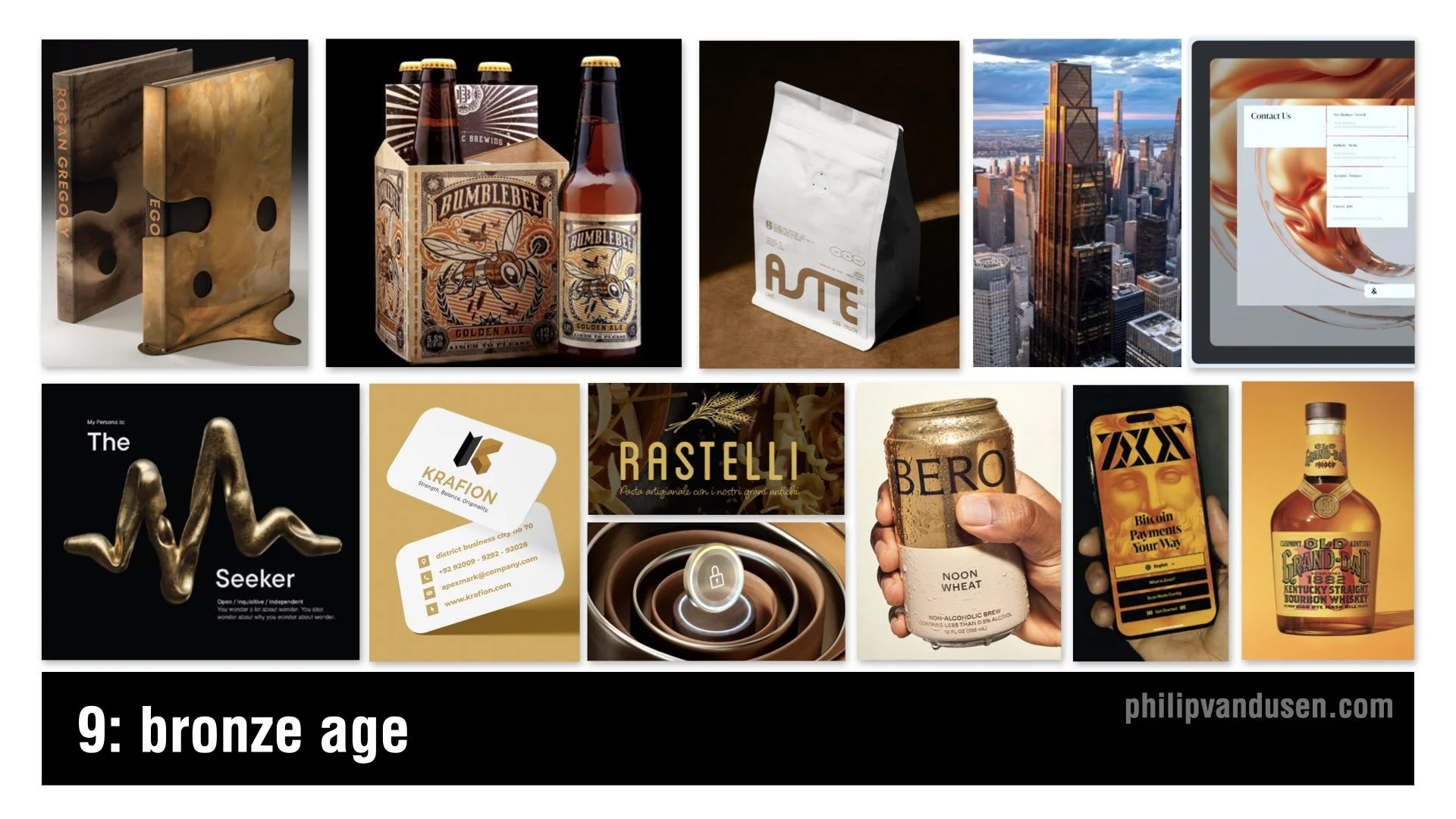
9. Bronze Age
Bronze Age is all about metallic warmth. Bronze tones and mineral textures create a look that is ancient and futuristic at the same time. Bronze feels less flashy than gold — more grounded and sophisticated.
This trend is rising because, in a time when technology surrounds us at every turn, consumers crave craftsmanship. Bronze feels artisanal and connected to real materials. It will be used in spirits, coffee, fragrances, premium packaging, and architecture — as seen in the new JP Morgan building in New York City.
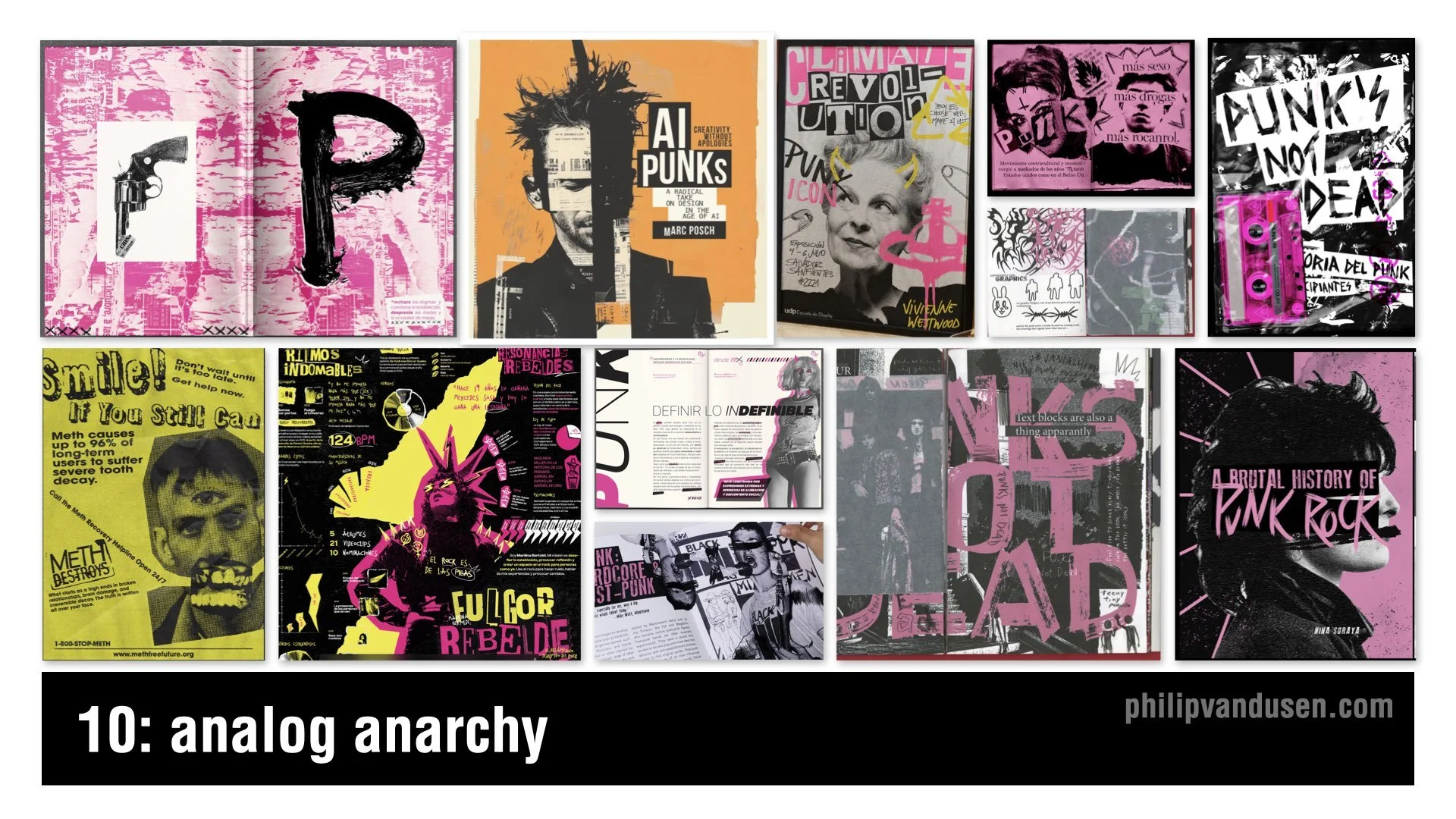
10. Analog Anarchy
Analog Anarchy brings punk back into contemporary design. It relies heavily on gritty black-and-white photocopy textures and hand-cut collage aesthetics. Think ransom-note type, acid yellows and neon pinks, chaotic layouts, and defiant political energy. It’s messy and naïve in a deliberately controlled way.
In a world dominated by high-tech tools and AI-driven image creation, younger designers are looking back to DIY subcultures for inspiration.
Analog Anarchy appears in music, fashion, and editorial design that taps into a rebellious zeitgeist.
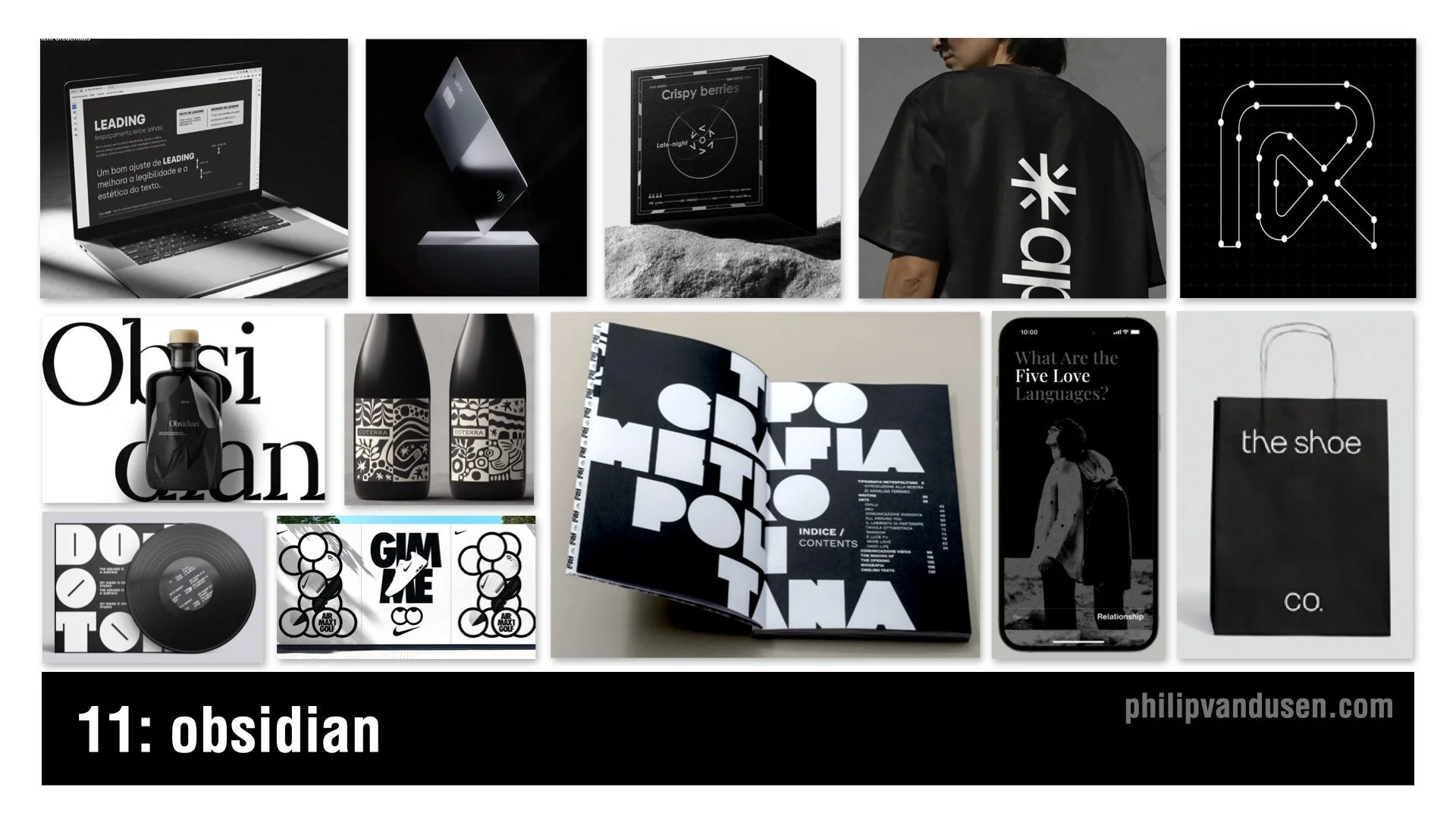
11. Obsidian
Obsidian is deep, glossy black power dressing for brands. It uses precise typography, minimal color, and dramatic contrast between matte and gloss to create an aura of mystery and luxury.
This trend is an intentional rejection of the electric color and whimsical imagery dominating other areas of design. When everyone goes bright, luxury goes dark. It gives premium brands a sense of drama in a design culture fueled by more-is-more photography and AI-composited visuals.
Obsidian appears in perfume, tech hardware, boutique fashion, luxury packaging, and high-end retail environments.
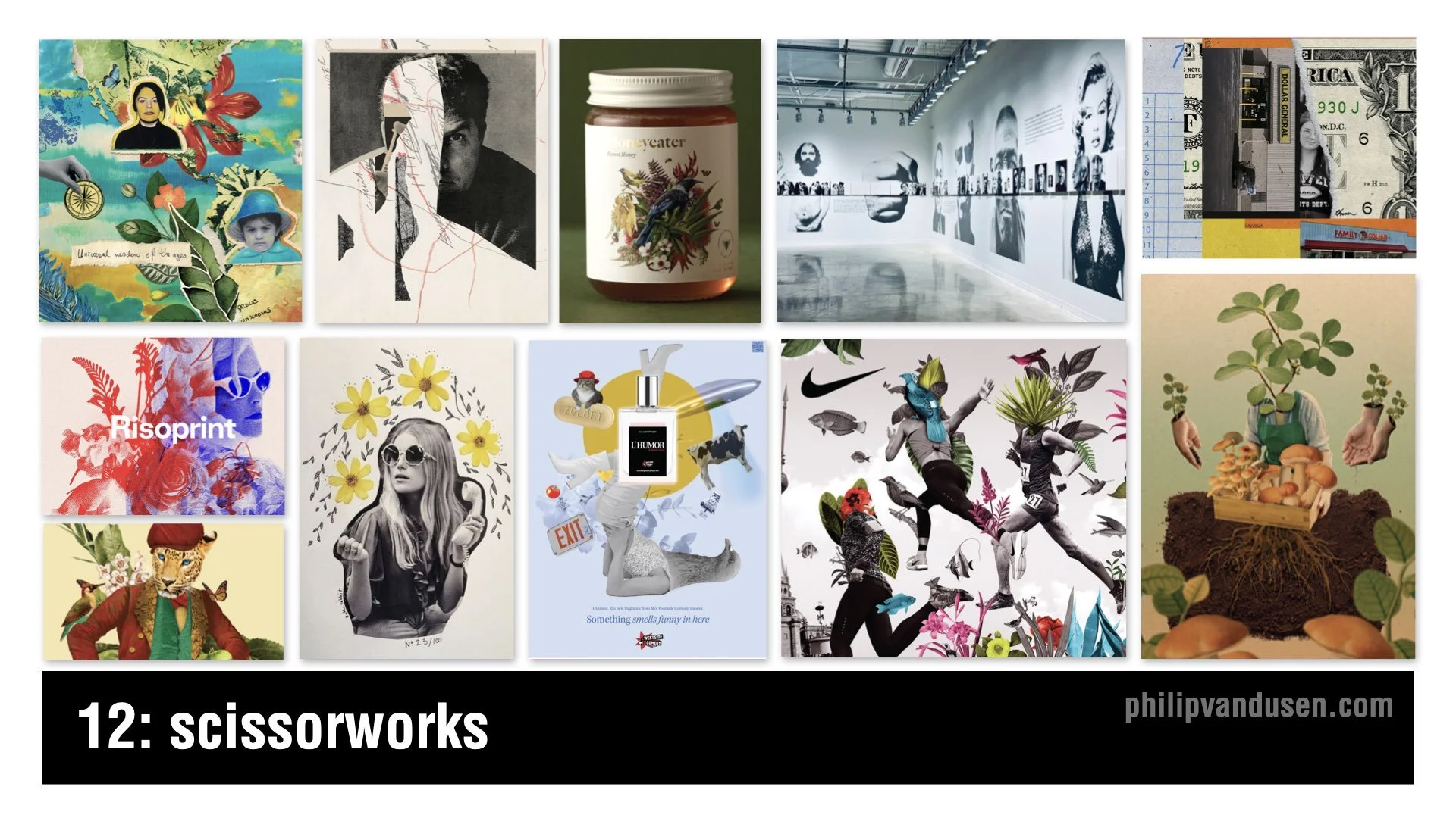
12. Scissorworks
In direct response to AI’s polished imagery, Scissorworks brings hand-done collage back into the spotlight. It’s a renaissance of analog expression that leans into imperfection and narrative depth. This trend uses found artwork, imperfect cut edges, and archaic imagery to create juxtapositions that invite viewer interpretation.
Scissorworks embraces play, experimentation, and human irregularity. It shows up in album art, editorial illustration, boutique packaging, fashion lookbooks, and museum display design.
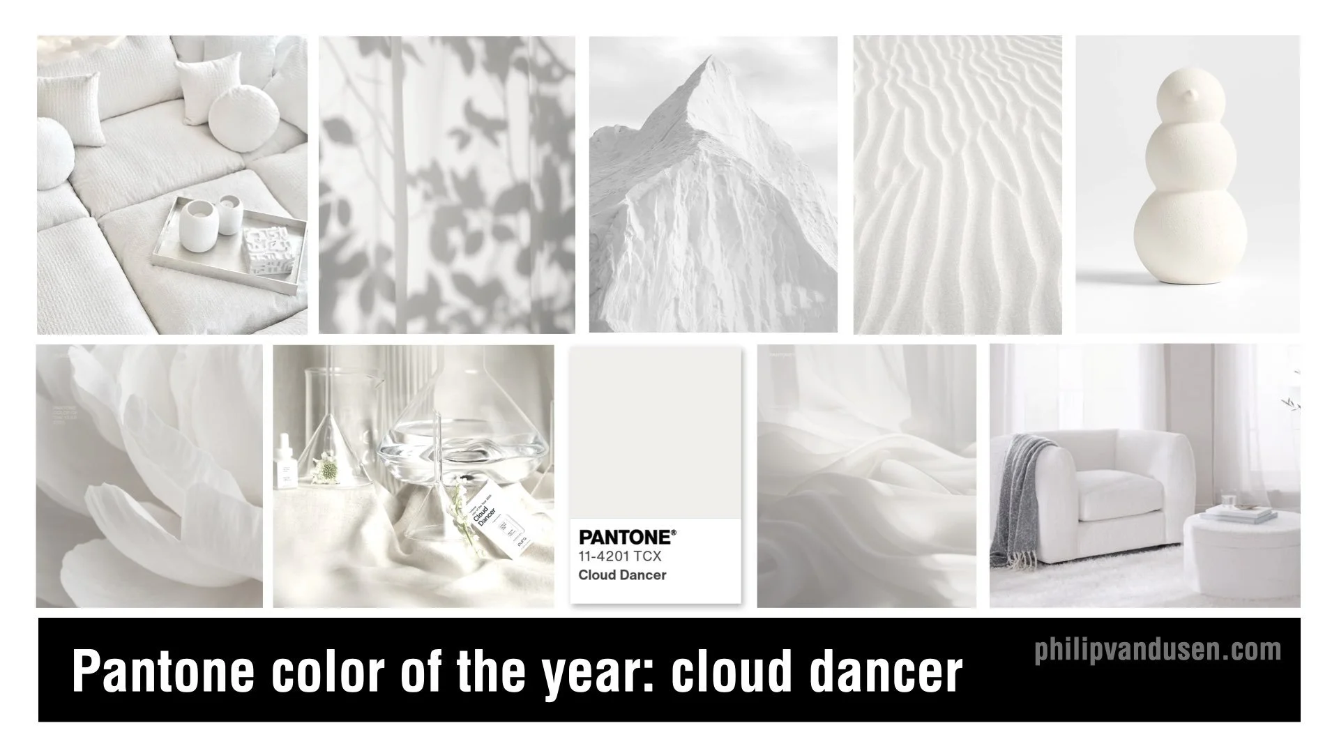
Bonus: Pantone’s 2026 Color of the Year: Cloud Dancer
Pantone’s 2026 Color of the Year, Cloud Dancer, is a soft, bone-white neutral meant to signal clarity, simplicity, and a creative reset. Pantone positions it as a warm, balanced white that brings breathing room to design and works across interiors, fashion, branding, and digital experiences.
To be honest, it’s a safe and somewhat non-committal choice. But Cloud Dancer does function well as a neutral backdrop, especially when paired with the bolder, more expressive trends emerging in 2026. It plays a supporting role when used as a base layer for texture, contrast, or high-impact color.
Final Thoughts
Across all of these trends, a clear tension emerges. Some designers are leaning into texture, physicality, and human craft. Others are embracing engineered precision and technical aesthetics. The push and pull between the digital and the physical — between control and chaos, between machine and hand — will define the creative landscape of 2026.
Treat these trends as inspiration, not instruction. Explore them, reinterpret them, or ignore them entirely. They exist to spark ideas and help you make more informed creative decisions as you navigate the year ahead.
~Thanks!
Philip VanDusen
Watch the Video on YouTube

From Designer to Creative Director: The Roadmap No One Tells You About
How to go from Designer to Creative Director: leadership, visibility, strategy, and one bonus step that will set you apart.
If you’re a designer with your eye on becoming a Creative Director, you’ve probably noticed that the path isn’t always clear. It can feel like you’re navigating an invisible roadmap. The truth is, moving from Designer to Creative Director isn’t about having the sharpest design skills. In fact, very little of it is about your technical ability.
It’s about leadership. It’s about visibility. It’s about understanding business strategy.
The transition from execution to direction requires an entirely new skill set. Let’s dig into what that actually looks like.
Visibility: Exposure to Upper Management
Here’s a hard truth: 80% of your success won’t come from how great you are at Illustrator, Photoshop, or Figma. It comes from who sees you doing your work. Multiple studies confirm that visibility to decision-makers is the single biggest driver of career advancement.
Upper management doesn’t see the hours you put in, the late nights, or the clever tweaks to your design files. They only know what you show them.
So, how do you get on their radar?
Take on high-visibility projects, especially ones where you’ll present your work.
Build genuine relationships with decision-makers - offer value, share ideas, and step up when someone needs help.
Speak up in meetings. Don’t just agree or sit quietly; have a point of view.
The key is to treat visibility like part of your job, not an afterthought.
Leadership: Learn to Manage and Mentor
Creative Directors don’t just design - they lead. They manage people, mentor junior talent, and guide teams toward a unified vision. But here’s the challenge: you’re not going to be handed management opportunities early on. You need to seek them out.
Start small. Manage an intern, guide a freelancer, or take a junior designer under your wing. This helps you practice giving constructive feedback, offering creative direction, and learning how to collaborate with cross-functional teams like strategy, finance, and HR.
Think of leadership like a muscle. The earlier you start flexing it, the stronger it becomes. And when you can demonstrate that you’re already doing the job of a Creative Director - even in small ways - you’re signaling you’re ready for the next step.
Reliability: Project Planning and Delivery
Here’s a misconception: Creative Directors are just “big idea” people. Yes, vision is important, but reliability is what makes you promotable.
That means learning how to own a timeline, manage budgets, and keep projects on track. Even as a designer, you can begin developing this skill set.
Volunteer to manage project milestones and deadlines.
Get familiar with budgets and resource allocation.
Learn project management tools like Asana, Trello, or Monday.
Over-communicate progress, challenges, and wins.
Reliability is a leadership trait. When leadership trusts you to deliver on time and on budget, you’ve moved out of the realm of “talented designer” into “future leader.”
Influence: Client Management and Presentations
One of the biggest leaps in becoming a Creative Director is learning how to represent creative work. It’s not about saying, “I think this looks good.” It’s about tying creative decisions to strategy.
When you present, frame your work around business goals and customer needs. Why this color? Why this layout? How does it solve the client’s problem?
When handling criticism, don’t take feedback personally. Mirror back what you’ve heard, ask clarifying questions, and negotiate solutions. Defend your ideas when they’re strategically strong - but don’t dig in just because it’s your preference.
Strong Creative Directors don’t just sell ideas; they build trust.
Ownership: Be Solutions-Oriented
The difference between being a contributor and a leader often comes down to one thing: how you approach problems.
Instead of flagging issues, bring solutions. If the timeline is too tight, suggest where the team can streamline. If a concept gets rejected, propose pivots that keep the strategy intact. If workloads are unmanageable, advocate for resources and quantify the impact.
Taking ownership demonstrates that you’re already thinking like a Creative Director.
Power Tip: Get a Mentor
Here’s something I wish I had learned earlier: don’t try to figure this out alone.
Landing a Creative Director role is one thing; thriving in it is another. The first 90 days are critical. All eyes are on you - your team, your clients, your cross-functional partners. A mentor can help you set the right tone, build trust quickly, and avoid pitfalls.
You can start by finding someone inside your company who’s walked the path before you. Or, you can invest in a professional coach who can help accelerate your growth and shorten your learning curve. Either way, having someone to guide you is invaluable.
Make the Leap
If you want to make the leap from Designer to Creative Director, the formula is clear:
Get seen.
Step into leadership early.
Build reliability.
Learn to influence.
Take ownership.
And above all, don’t do it alone - get a mentor.
Start practicing these skills now, and you won’t just stand out as a designer - you’ll start proving you’re ready for the next level.
👉 If you’re serious about advancing your creative career and want support from others on the same journey, check out BONFIRE, my mastermind community. It’s where ambitious mid-to-late career creative pros sharpen their leadership skills, share strategies, and keep each other accountable.
Because you don’t have to climb this ladder alone.

15 TRENDS IN GRAPHIC DESIGN FOR 2025
15 Trends in Graphic Design for 2025. Understanding trends in graphic design is a great way to stay creatively inspired, culturally relevant and to assure your success as a creative entrepreneur.

Design trends—love them or hate them, they shape the creative industry. Some trends evolve from past aesthetics, while others emerge as bold new directions. Whether you choose to embrace them, adapt them, or push against them, staying aware of these shifts helps you stay ahead of the curve.
In 2025, we’re seeing a mix of digital innovation, nostalgic revivals, and fresh takes on minimalism, color, and typography. These trends are showing up across branding, packaging, web design, social media, print, and motion graphics.
Here’s a look at 15 graphic design trends that are making waves this year

1. Neon Nostalgia
Neon Nostalgia is all about vibrant electric color palettes, soft airbrushed gradients, and glowing retro-futuristic elements that pull straight from the "Synthwave" aesthetic. Picture those neon-drenched Miami sunsets, chrome typography, and VHS distortion effects, but with a modern digital polish.
We’re seeing this trend make waves in music branding, fashion, social media, and UI design, where it taps into nostalgia but also brings a dreamlike, cyberpunk-inspired vibrance to contemporary design.
Expect to see this look in poster and website design, advertising, and motion graphics, where motion blur, streaked lights, and electric hues amplify the visual experience. Whether it’s in digital or print, Neon Nostalgia is about making an emotional statement with color and light.
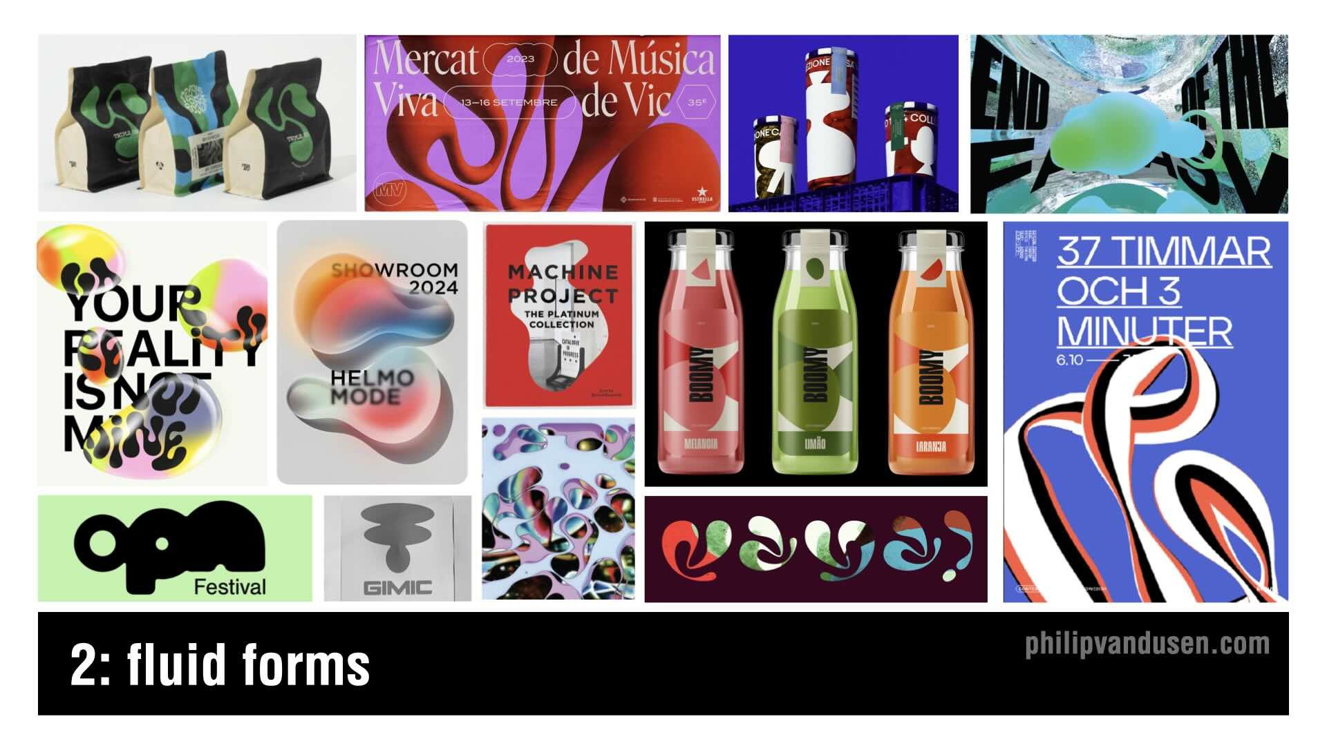
2. Fluid Forms
Forget sharp edges! —Design in 2025 is melting.
Fluid Forms embraces organic, flowing shapes that feel like liquid, morphing across layouts in a dynamic, unpredictable way. These undulating curves, soft reflections, and translucent overlays create a sense of movement and weightlessness that’s both futuristic and soothing.
I'm seeing this trend in motion design, posters and packaging, where more rigid grid layouts can benefit from an injection of natural, free-flowing elements.
These fluid visuals draw inspiration from water, smoke, and molten materials. The look pairs well with soft gradients, glass-like transparency, and light distortions, creating a hyper-modern - BUT also organic - aesthetic.
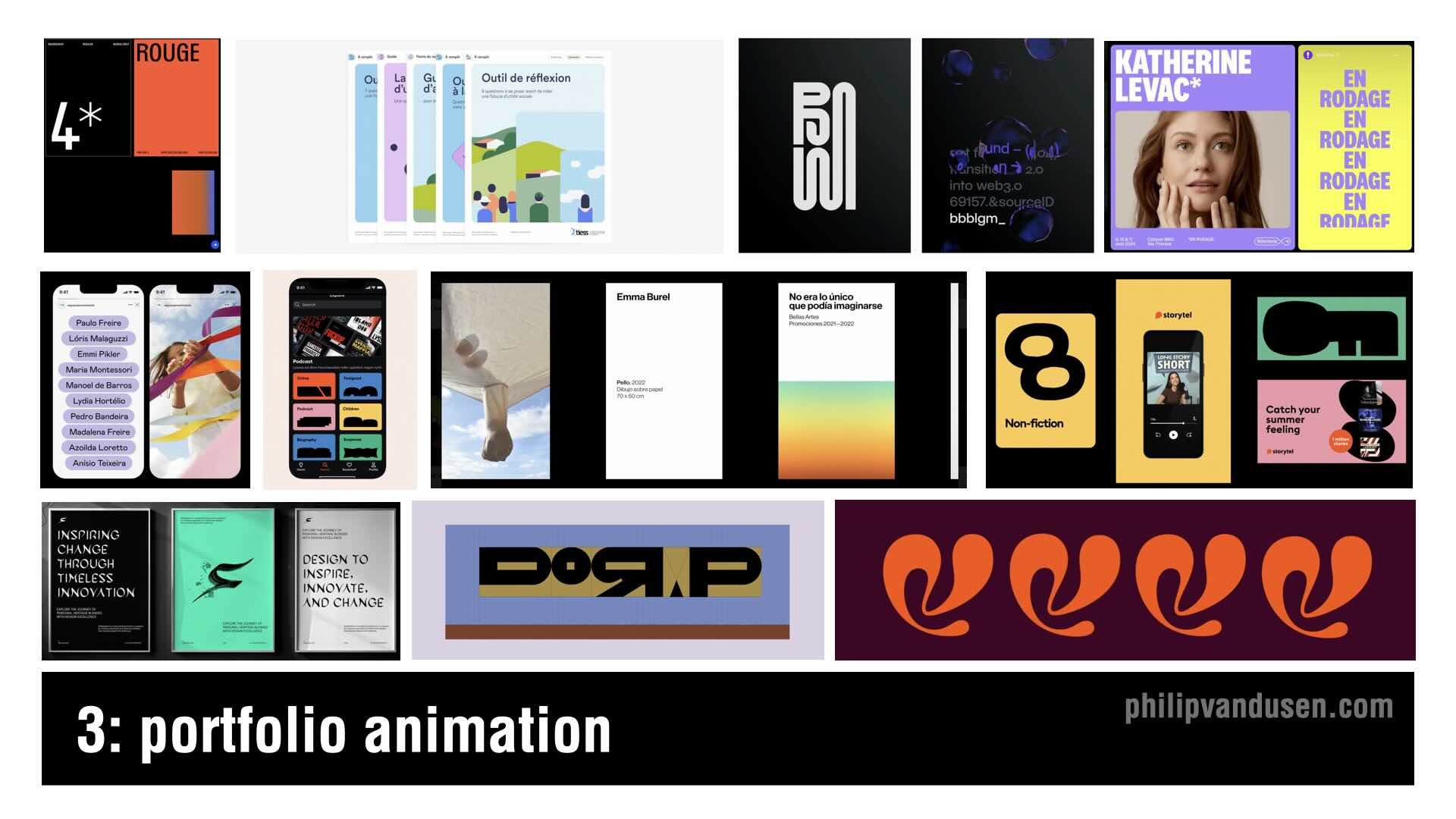
3. Portfolio Animation
This is not actually a 'design trend' per se, but more a trend in how creatives are displaying their designs. In 2025, Portfolio Animations are increasing and taking center stage. Designers are bringing static works to life with subtle, seamless motion effects. (*Note: Follow the YouTube video link at the end of this article to see these portfolio animations in motion)
This trend is all about using animation to enhance the storytelling of your project case studies. It's intended to guide the viewer’s experience, and create and entertaining and interactive experience—but without overwhelming the design itself.
I'm seeing things like micro-animations, hover effects, kinetic typography, and scrolling transitions to make portfolios feel more dynamic and engaging. When it's done right, these animations add depth, personality, and interactivity, helping you stand out in our crowded industry.
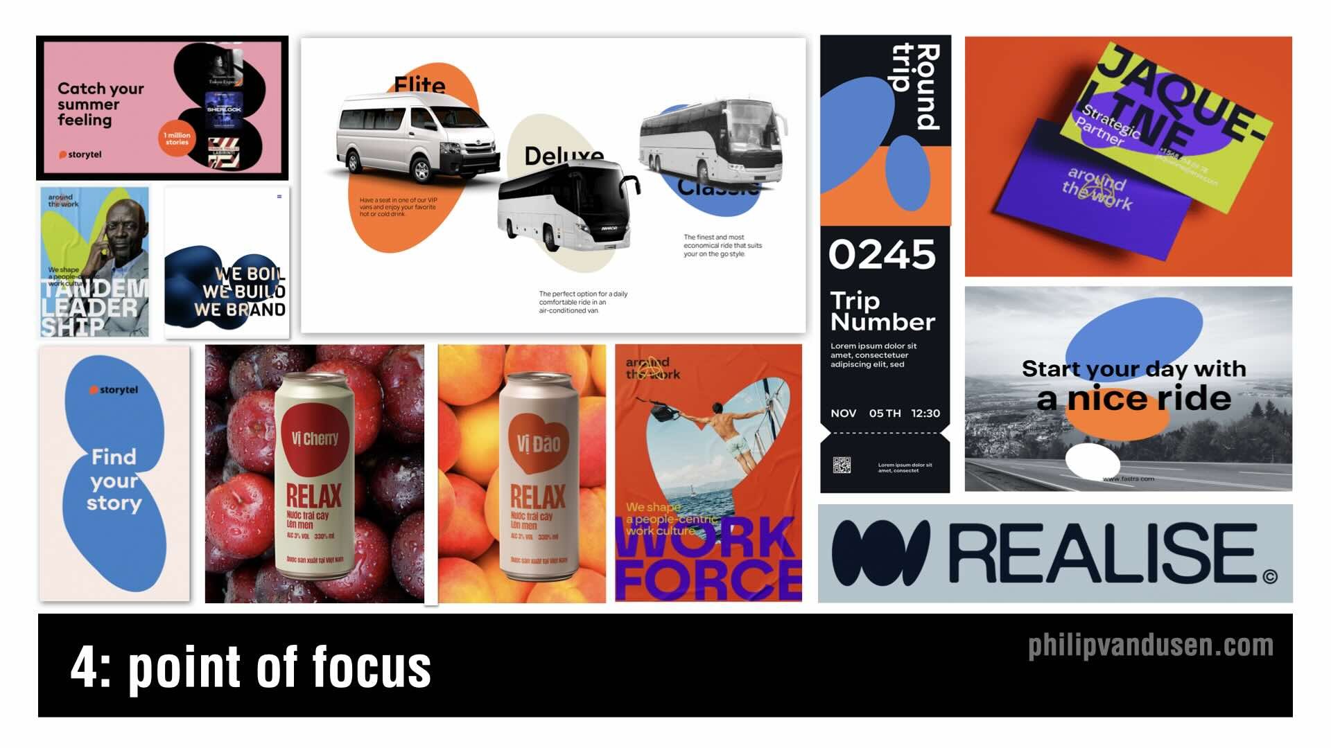
4. Point of Focus
Minimalist but intentional, Point of Focus is a trend that uses bold circular elements, dots, and targeted focal points to guide the viewer’s eye with precision. Whether it’s a central dot, irregular oval, or an image mask, this technique creates an extremely simple, but still powerful composition.
Circles have always been symbolic, timeless, and visually anchoring, which is why this trend is so striking. It draws inspiration from modernist poster design, Bauhaus minimalism, and editorial layouts, where strategic use of white space and carefully placed focal points are used to create high-impact communications.

5. Collage Couture
Collage is nothing new, but in 2025, it’s getting a high-fashion makeover.
Collage Couture blends photography, illustration, and typography into a layered, sophisticated, and curated aesthetic that feels avant-garde, and bold.
This trend takes inspiration from fashion "lookbooks", vintage magazine spreads, and Dadaist collage techniques, reworking them into a modern, visually dynamic approach.
This trend is thriving in branding, editorial, social media campaigns, and print design, where mixed-media compositions create complex layouts that are open to multiple interpretations.

6. Sketchbook
Designers are embracing imperfection with Sketchbook, a trend that celebrates raw, hand-drawn elements and the creative process itself. This aesthetic focuses on the textured, pencil-sketched, ink-brushed, and marker-lined feel that can make digital work look organic and personal.
The beauty of this trend is its spontaneity—loose line work, messy scribbles, and layered doodles create a sense of energy and authenticity. It’s a concerted reaction against overly polished, vector-perfect design.
We’re seeing this style in editorial design, apparel graphics, brand illustration styles, and motion graphics. Whether it’s paired with clean layouts for contrast or fully embraced in its rawest form, Sketchbook brings back hands-on creativity in an increasingly digital world.

7. Eco Minimalism
Eco Minimalism strips away excess, using simple typography, and organic shapes to create a natural, calming visual style. It merges the clarity of minimalism but with the less austere use of curvilinear shapes, balancing simplicity with authenticity.
This trend's thriving in packaging, print, website design, and environmental graphics, where brands want to emphasize eco-conscious values but in a non-cliche way.
The color palettes are not the usually expected muted greens and neutrals - but instead are bright and cheery, featured in clean, sparse layouts.
With consumers being more mindful of their choices these days, brands using Eco Minimalism can communicate transparency and sustainability, all wrapped up in a contemporary design aesthetic.

8. Geo Puzzle
Geometric design and grids have always been a cornerstone of modern aesthetics, but in 2025, it’s being deconstructed into modular, puzzle-like compositions.
Geo Puzzle takes familiar geometric shapes and assembles them into dynamic, almost checkerboard layouts.
This trend is particularly strong in event design, editorial layout, web design, UX and posters, where the interplay of bold color-blocking, and asymmetry creates a visually engaging, "structured-but-still-playful" feel.
The Bauhaus movement and Swiss design principles are heavy influences, but now designers are using bright, unexpected color pairings and fragmented layouts to give it a fresh, contemporary edge. Geo Puzzle is a great way for brands to feel modern, innovative, and adaptable while still maintaining a sense of structure and order.
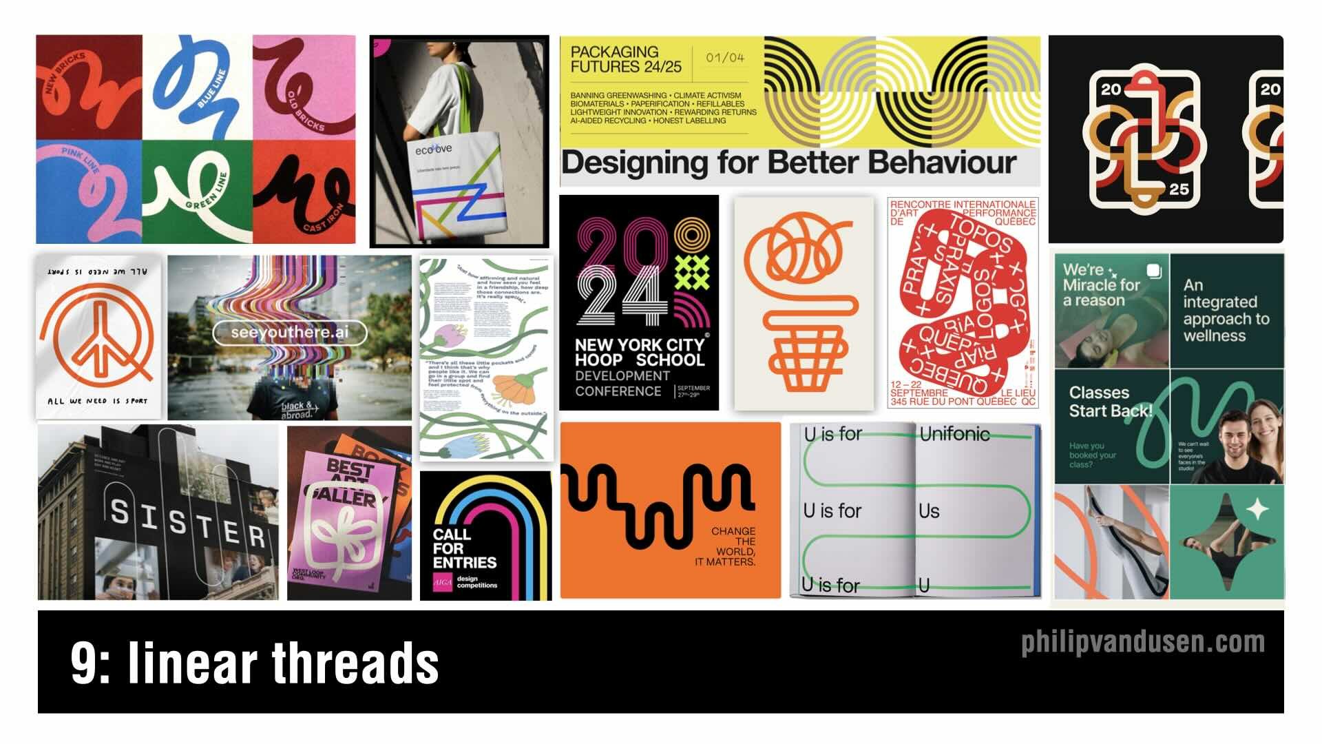
9. Linear Threads
The Linear Threads trend embraces continuous, flowing linework that's used to create intricate compositions that connect typography and design elements and lead the viewers eye through the work.
Inspired by technical contour drawing and playful linear vector sketches, Linear Threads works well in corporate communications, advertising, packaging, and interactive graphics. The linear elements often are monochrome or duo-tone, allowing the intricacy of the line work to stand out without overpowering the design.
What makes this trend so versatile is its ability to feel both organic and structured—it can be soft and expressive - or precise and engineered - but still always offering a sense of interconnectedness.

10. Photo Obscura
Photo Obscura—is a trend that plays with fragmentation, transparency, and selective reveals. Images are being masked, blurred, distorted, and cut into geometric or abstract shapes to create layered, intriguing compositions.
This trend shows up in editorial layouts, album covers, interactive web design, and advertising, where obscured imagery draws the viewer in and adds a sense of mystery and abstraction.
It can help designers create unexpected visual narratives. By selectively hiding and revealing parts of an image, Photo Obscura plays with perception and storytelling.
This technique has been used in fine art and avant-garde photography for decades, but in 2025, it’s taking center stage in commercial design—where the visual mystery is key to capturing audiences attention for just long enough to stop the thumb scrolling.

11. Chromatic Simplicity
Color is one of the most powerful design tools, and Chromatic Simplicity proves that less can be more. This trend embraces monochromatic and duotone palettes, reducing designs to one or two bold hues for maximum visual impact. The result is clean, modern, and undeniably striking.
Historically, this trend traces back to early printmaking and poster design, where limited ink colors led to high-contrast, statement-making visuals. Often used in isolated photographs in the past, this style is now found in entire compositions.
By stripping away color complexity, it makes layouts feel bold and intentional.
This trend is showing up in social media, editorial layouts, print communications and packaging - among others. Whether soft and understated or loud and high-energy, Chromatic Simplicity allows color to do all the heavy lifting.

12. Typography Alchemy
This trend celebrates typography as an art form by breaking all the rules. This trend mixes regular and italic, extra bold and thin, serif and sans-serif, stretched and compressed—creating a dynamic, expressive typographic style.
This design technique is bold, irreverent, and unpredictable, pulling inspiration from Dadaist collage, Deconstructivism, and experimental 'zine culture. It’s showing up in poster design, album covers, fashion branding, and social media graphics.
We’ve seen typography mash-ups before, but in 2025, these combinations feel even more kinetic. Typography Alchemy makes type more than just a tool for communication—it turns it into the main visual element, demanding attention and helping you push creative boundaries.

13. Media Matters
As digital aesthetics continue to dominate, designers are rediscovering the tactile beauty of physical-media-inspired design. Media Matters uses paints and inks to add a handcrafted, imperfect quality to digital work.
This trend is emerging in illustration, editorial, posters and book covers, where designers are using analog textures to create warmth and authenticity. It’s a direct reaction to overly polished, hyper-clean design, bringing a human, crafted touch back into the mix.
Even in digital spaces, I'm seeing designers use hand-drawn elements and distressed textures to mimic the richness of real-world media. In a time where everything feels so mass-produced, Media Matters reminds us of how much power there still is in texture, depth, and physicality in design.

14. Hyper Bubble
Typography is getting bigger, softer, and bolder with the Hyper Bubble trend.
Inspired by inflated, air-filled, and balloon-like letters, this aesthetic makes type feel playful, exaggerated, and tactile.
This look first surfaced in the Y2K era, but in 2025, it’s evolved with 3D rendering, glossy highlights, and hand-drawn puffy typefaces that add an extra dose of nostalgia. Brands are using Hyper Bubble in fashion, packaging, and social media design to stand out in a fun, energetic way.
We’re also seeing designers push the boundaries with animated type, interactive typography, and ultra-exaggerated proportions. Whether glossy and volumetric or flat, matte and cartoonish, Hyper Bubble brings a sense of fun to typography again.
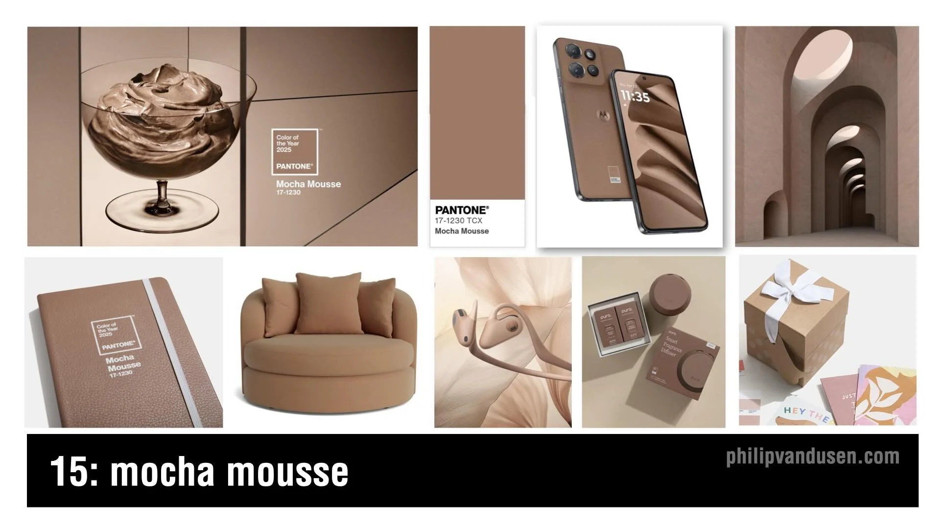
15. Mocha Mousse
Pantone's color of the year is called Mocha Mousse.
This color theme embraces creamy browns, velvety taupes, light caramel hues, moving away from cold neutrals and grays in favor of earthy, inviting tones.
This color is intended to evoke a sense of calm in a turbulent world, offering stability, nostalgia, and sophistication. This makes it ideal for luxury branding, coffee packaging, accessories, editorial design, and home decor.
Mocha Mousse pairs well with pastels, warm golds, and muted oranges, to create a refined palette that feels natural and timeless.
The combination of minimalism and warmth makes Mocha Mousse a go-to choice for brands that want to feel premium, sustainable, and fashionable.
Conclusion
Whether you embrace these trends or push against them, staying aware of where design is headed keeps you sharp and ahead of the curve.
Which of these trends excites you the most? Let me know in the comments.
Watch the full "15 Trends in Graphic Design for 2025" YouTube video HERE.
