
15 Graphic Design Trends for 2024

Let’s dive into 15 trends in design that I've recognized in the market that will influence the creative industry in 2024.
But first a little context: I was in the fashion industry for 15 years and travelled the globe shopping for trend 4 times a year, Tokyo, London, Milan, Berlin, Paris, etc. Trend hunting was my job. I’ve worked with a host of the major trend houses like WGSN, Stylus, JWT, Pantone.
The one thing I’ve learned over the years is that trends are never limited to specific periods of time and are very fluid in how they appear.
Trends are revisited, altered, revised, new perspectives are added, they disappear and then they come back over and over - particularly in the fashion industry. The design aesthetic called Russian Constructivism is over 100 years old and it never really seems to go away!
Some trends may take a few years to grab hold and become recognizable as popular.
Some of you reading, who see and recognize trends early - may have mentally registered them long before seasoned folks do, so these trends may seem ‘old’ to you already. But to many, who have no formal training in design history these trends are totally new.
What I recommend is using trends to stay inspired, possibly use as a jumping off point in your work and then making that design your own.
Or, you can choose to consciously react against these trends. It's totally up to you, but knowing what the trend is is critical to informing your work one way or the other and to keeping your clients informed as well.
Now let's look at some trends!
Trend 1: Heatmapping

Trend number one is called “Heatmapping”. This trend is characterized by blends of color often depicted as a rainbow of colors emanating from a source object or creating some kind of abstract shape. These colors suggest the kind of heat map that you would see if you used infrared imaging to look at or scan an object or a scene.
It also suggests the result of eye tracking evaluation software that's often used in consumer research. The subject matter can be figurative, or an abstract shape, or something organic, like a flower, as in the packaging on the upper left.
This technique is being used in a wide range of places, from apparel, to home furnishings, app design, print media and web design.
Trend 2: Activist
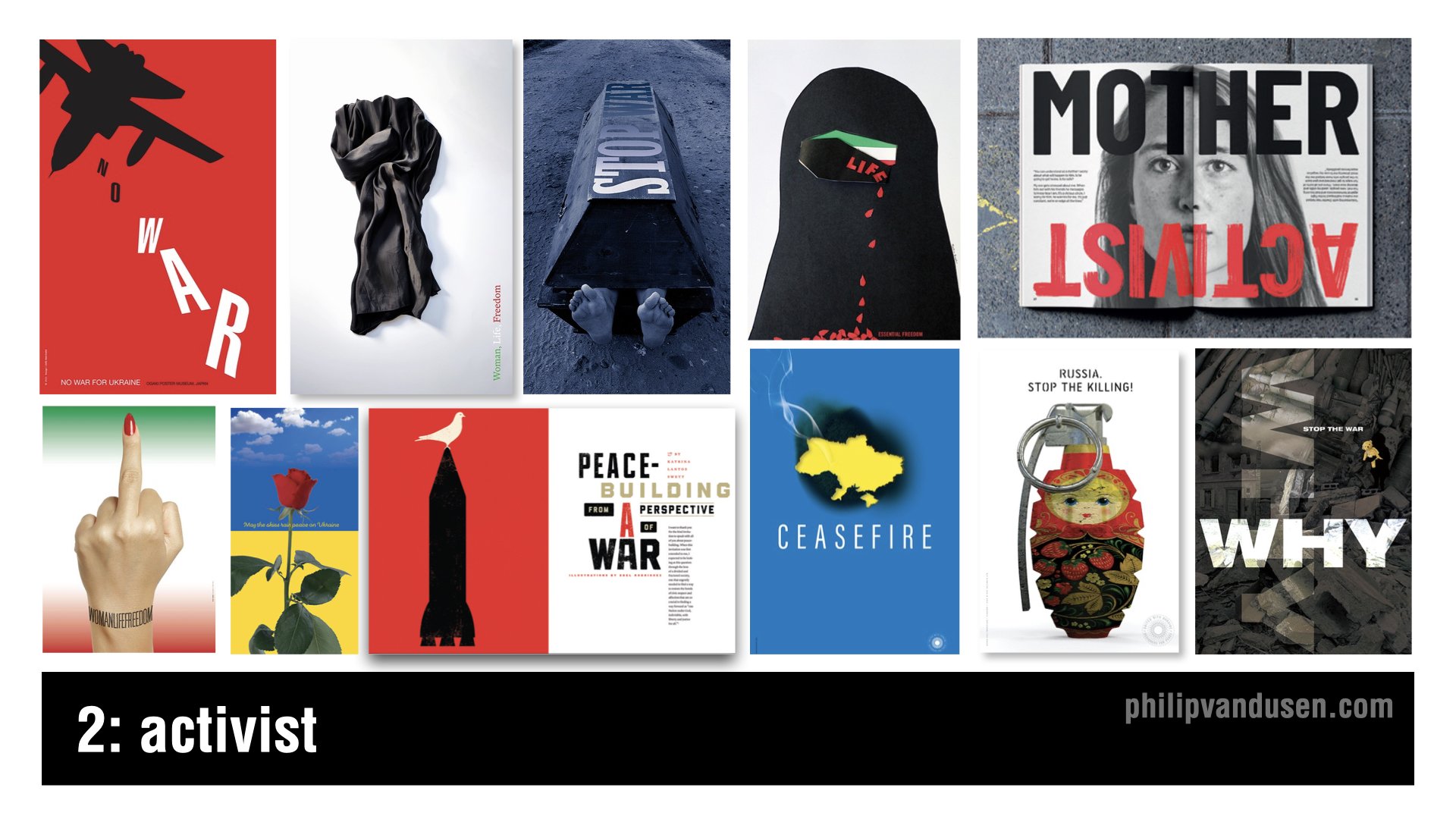
Trend number two is called “Activist”. The geopolitical landscape has been particularly intense in the last year and will continue to be unfortunately through 2024.
Now, I want you to understand I'm not trivializing violent conflicts by calling them a ‘design trend’. They aren't and they shouldn't be.
But what we need to recognize is that throughout history, designers have led the way when it comes to highlighting injustice in the world and inspiring action and change.
And when it comes to having both the imagination and the creative means to communicate in a motivating way, we designers are perfectly suited to the task.
Let's celebrate the amazing work of thousands of designers who will be flexing their superpower of visual communication in 2024 and continue to be a global voice for good.
Trend 3: Anarchist

Trend number three is called “Anarchist”. This trend is reminiscent of the two trends that have frequently been called ‘maximalism’ and ‘glitch’, that have been combined in a visual mashup.
This trend is characterized by a complete visual anarchy in imagery, color, and typography, hence the name. There also seems to be a sense of nihilism in this visual style.
Very little true design communication is intended or achieved. Instead, the intention is to create complete visual chaos. This technique can take the form of digital static or complex photographic collage or compositing.
And this trend relies almost entirely on imagery, although it often incorporates a Deconstructivist use of typography as well.
Trend 4: Botanica
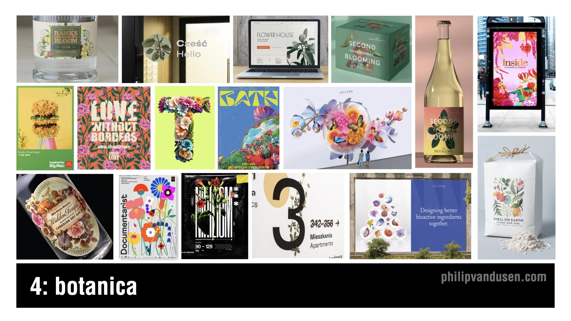
Trend number four is called “Botanica”. In stark contrast to the pervasive visual design trends that are heavily based in digital technology, the Botanica trend brings us back to physical reality, plant life in particular.
I think this trend is a reaction to the political and cultural strife in the world today and is trying to create a sense of peace and calm in the viewer and the consumer.
There's a timeless beauty in these natural forms and colors that are a real delight to the senses. The color and imagery can be realistic and true to life. Or, conversely, it can be hyper real and futuristic, taking the form of AI generated, alien plant life forms that have no basis in reality.
Botanica will be used heavily in product packaging, spirits, print, advertising, and can even be found in way-finding.
Trend 5: Scrapbooking
Trend number five is called “Scrapbooking”, and is essentially a modern twist on collage, with the update being that the colors that are used are often brighter and more cheerful.
In this trend, we're seeing a vibrant and eclectic mix of imagery, the range of textures that often juxtapose radically disparate sources and time periods.
This trend nods to the historical art of collage, dating back to the early 20th century, and used by the Dadaists and Russian Constructivists to challenge the traditional perspectives and create layered meanings.
Brands that are looking to convey modernity with a touch of nostalgia can leverage this trend to create memorable designs and resonate on multiple levels.
Scrapbooking's uses include traditional print media, magazines and posters, web design, editorial illustration, and advertising.

Trend 5: Digital Deconstructivist
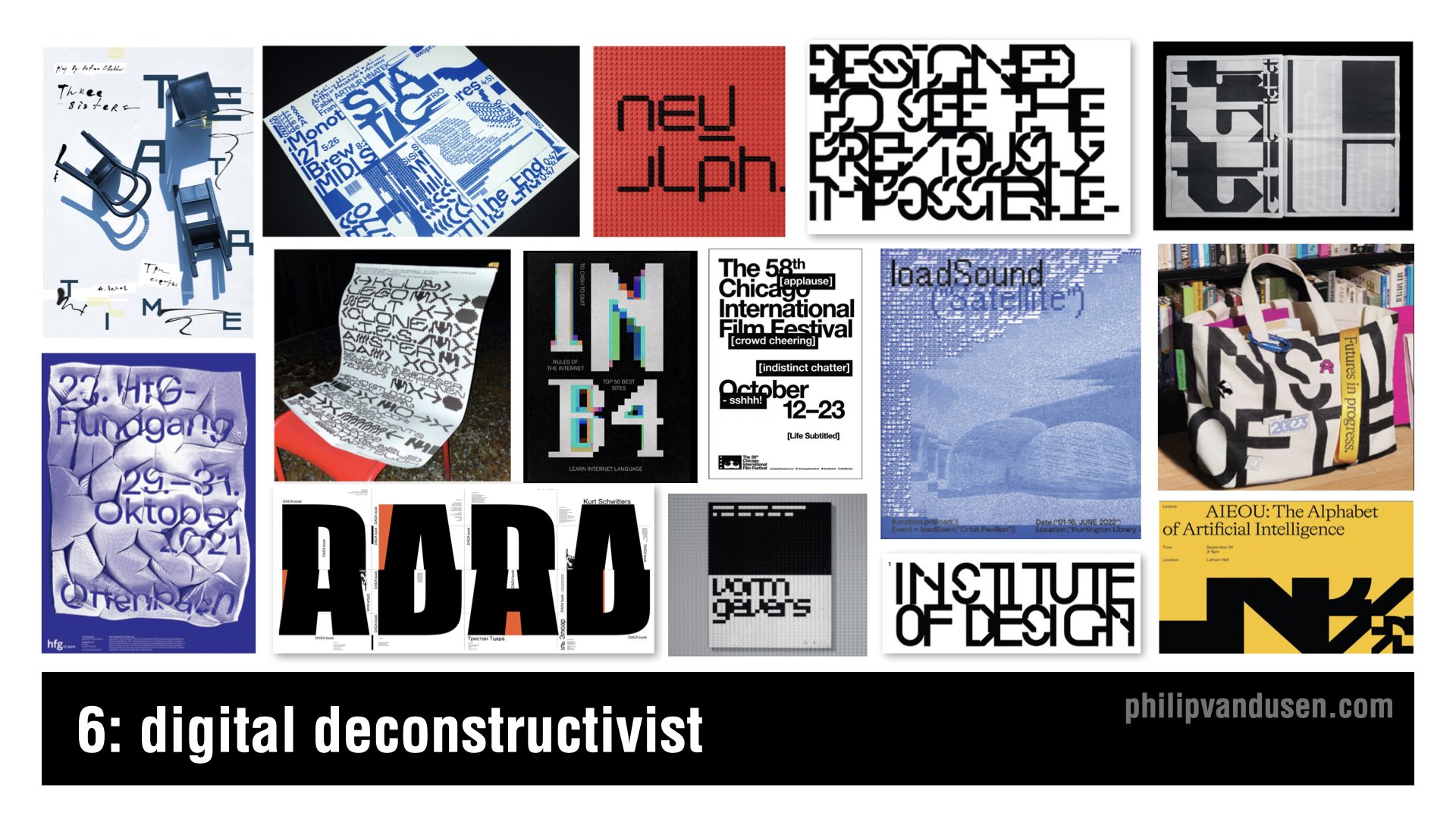
Trend number six is called “Digital Deconstructivist”. This trend is a digital homage to the Deconstructivism movement, which fragmented and manipulated ideas of structure and form.
Mirroring the architectural rebelling of the late 20th century, the Digital Deconstructivist trend shakes up graphic design with layered complexity and unexpected juxtapositions of forms and layers, often relying on slice or pixelated typography.
Text elements are overlaid and reassembled. They challenge readability while pushing the boundaries of conservative design conventions.
It creates a visual language that speaks to the tech savvy and the avantgarde, and it's perfect for interactive media and motion graphics and brands that want to communicate cutting edge thinking.
Trend 7: Environmental Typography

Trend number seven, “Environmental Typography”, is about breaking out of our digital confines and embracing the physical world. It's a blend of graphic design and architecture, where typography becomes an integral part of the environment on a human scale.
This trend harkens back to the days of sign painting, but with a modern approach using bold, towering letters and numbers to create an engaging experience.
Its applications include way-finding in corporate buildings to immersive brand experiences in retail spaces. or bringing an exhibition to life.
Think of it as functional art that not only informs, but also transforms our physical spaces. As brands vie for attention, environmental typography offers an impactful way to communicate messages, whether it's a colossal headline wrapping around a building or a scrolling message that guides you through a space.
Trend 8: Geometrica
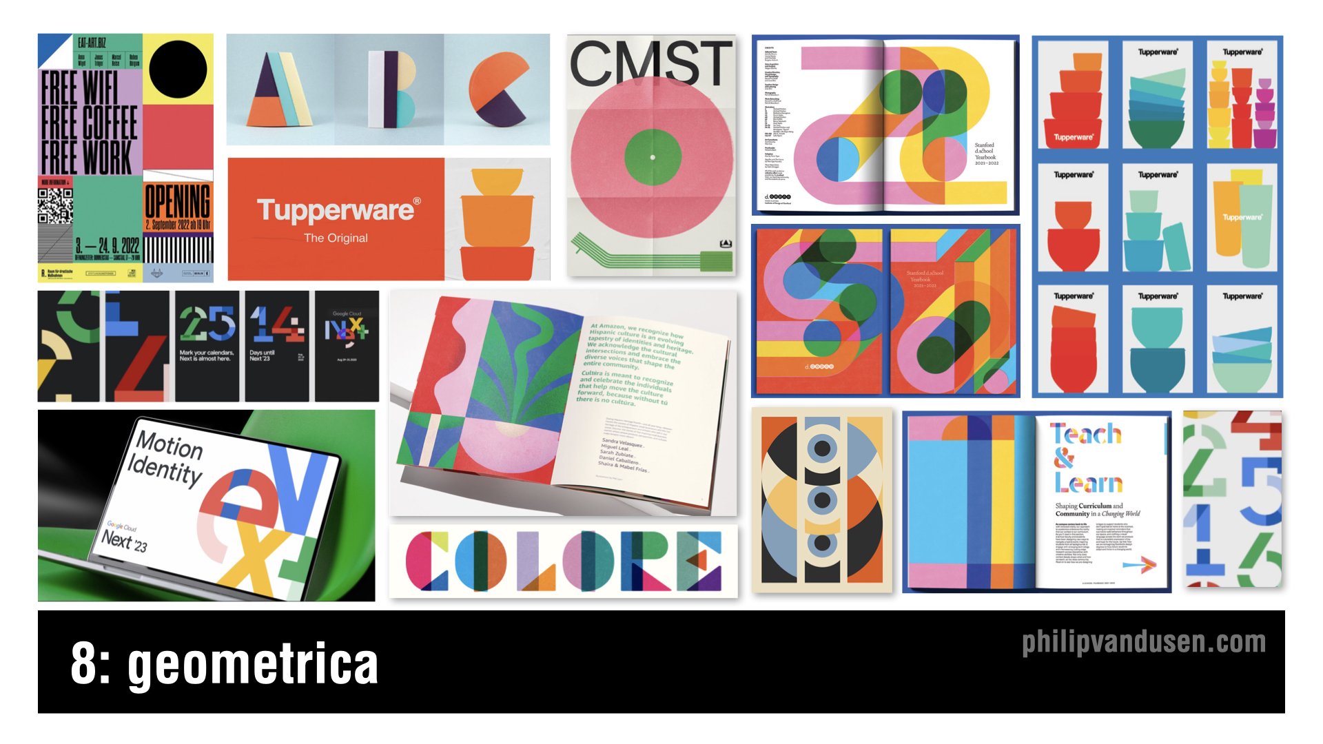
Trend number eight, ‘Geometrica’, celebrates the simplicity and harmony of geometric forms.
With roots in the Bauhaus movement and Swiss style, which both emphasize the beauty of clear, precise geometric shapes, this trend brings those principles into the digital age.
This trend is characterized by bold, youthful colors and shapes interacting in a way that's both playful and meticulously organized. It's a balance of form and function, where the clean lines of geometry meet the limitless possibilities of digital design.
Because design trends can sometimes reflect the extremes of the aesthetic spectrum, this trend is a noticeable reaction against the design chaos that we see in the ‘Anarchist’ and the ‘Digital Deconstructivist’ trends.
Applications for this trend would include mobile app interfaces, web design, print, packaging, and editorial layout, among others.
Bring Your Own Laptop: Adobe Training with Daniel Scott
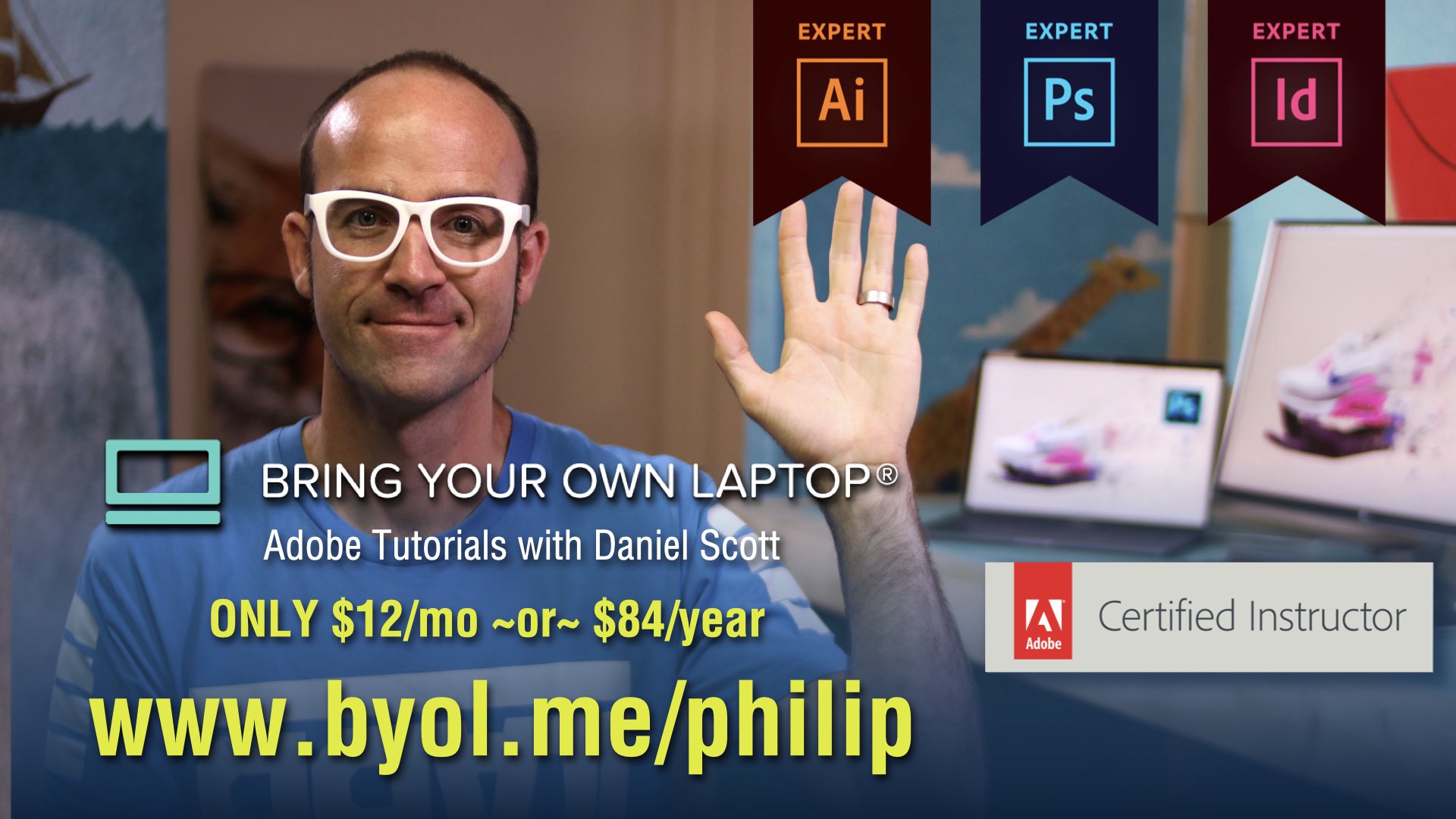
I want to take a moment and mention that I often get comments on my blog posts and trend videos asking how to achieve the aesthetics in the trends that I'm featuring. So I want to share with you a not-so-secret secret.
Daniel Scott, who in my opinion is one of the best Adobe app trainers out there, has an Adobe training site called Bring Your Own Laptop. The site's subscription based and it's an insane value at only $12 per month, or $84 per year, for access to all the training on the site.
Daniel sometimes even uses the trends that I feature in my YouTube trend videos as examples in his trainings.
So if you want to get better using your favorite Adobe apps, or learn a new one, I suggest that you head over to https://byol.me/philip and check out everything that he has to offer. I hope that you'll use this affiliate link if you want to support my continuing trend-hunting work here, as well as on my YouTube channel.
Now, let's get back to the trends.
Trend 9: Golden Era

Trend number nine is called “Golden Era”. Golden Era is a trend that exudes luxury and sophistication, reminiscent of the Gilded Age and Art Deco's opulence.
Gold has always symbolized wealth and exclusivity, but one of the key intentions of using gold in this way is to differentiate from the heavy use of silver, chrome, and brushed titanium that's so common in digital graphic design and technology design.
This trend is perfect for brands that want to convey a sense of premium quality and timelessness. From packaging to branding, it carries the weight of tradition and can set a product or service apart in a saturated market.
Whether it's a minimalist design that uses flat gold color, or a full blown shiny foil spectacle, Golden Era has applications in print, packaging, fashion, digital media, and environmental design, among others.
Trend 10: Kiddieland

Trend number 10, ‘Kiddieland’, is a playful trend that taps into the joy and uninhibited creativity of childhood.
With all the cultural strife and seriousness in the world, it offers a bit of refuge in its bright colors and whimsical illustrations, and fun typefaces that make the designs feel approachable, and fun.
Kiddieland uses a fusion of simple shapes and bold primary colors that evoke a sense of nostalgia and play, and actually really relates to the ‘Geometrica’ trend that I mentioned previously.
While it's obviously appropriate for companies targeting the kids market, it's also perfect for brands that are young at heart or aiming to communicate simplicity and fun in their messaging.
This style is particularly effective in consumer packaging, education materials, and interactive design. It can also bring a light hearted touch to marketing campaigns and inject energy and life into social media content.
Trend 11: Better Red

Trend number 11, ‘Better Red’, captures the power and intensity of red, a color that's always made a strong statement in design. It's bold, energetic, and typically paired with black and white, so if you want to command attention, use red.
In this trend, the color red is used to create impact and focus. It can be an uninterrupted color backdrop for a minimalist design, as a way to make content shine, or as a part of a more complex pattern that energizes an entire composition.
Better Red is ideal for brands looking to take a powerful stance, whether it's through a website, a poster, or product packaging. This trend can be particularly effective in print, where you want to grab attention quickly, and in packaging where it can also communicate luxury and prestige.
Trend 12: Elasto-type

Trend number 12, ‘Elasto-type’, is a dynamic trend where typography isn't just read, it's felt.
It's characterized by taking fonts and extending them beyond their usual limits, adding a sense of motion to the static page. This technique gives words a visual rhythm that can be seen as a standalone graphic element in their own right and is often used that way.
It's a style that works well for brands looking to convey innovation and can be particularly impactful in digital uses like web design, to animate a static layout or guiding the eye's movement and engaging viewers.
It's also effective in print, offering a fresh perspective on posters, book covers, and any medium where you want the typography to make a really bold statement.
Trend 13: Flaired Fonts
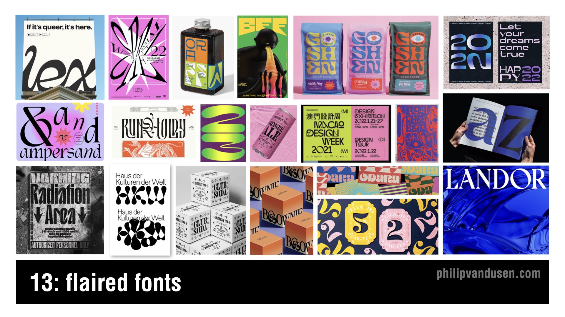
Trend number 13 is ‘Flaired Fonts’, a trend that brings a dose of whimsy and character to typography.
Fonts take on a life of their own with curves and embellishments and a tangible sense of movement. They're a modern take on the days of Art Nouveau's ornamental stylings.
It's almost like they're sans serif fonts, who are trying their hardest on the dance floor to become serifed!
They're versatile enough for creative poster designs, editorial headlines that need to sing, and are perfect for brands that want a unique voice and a personal touch.
In digital applications, where they achieve a level of visual animation, they're a great choice for brands that are looking to express individuality, and as the name says, ‘flair’!
Trend 14: Vintage Americana

Trend number 14 is ‘Vintage Americana’. Vintage Americana is serving, this time, as a rejection of the modern. That is, all-things-AI, technology or anything digital.
It's a feel good, nostalgic nod to a classically American design aesthetic, reminiscent of the mid 20th century. This timeless style uses retro fonts and warm color palettes, imagery, layouts, that conjure up the good old days.
The Vintage Americana trend is perfect for brands that want to establish a perception of heritage and tradition - and those looking to evoke a sense of comfort and reliability.
It works really well virtually anywhere, from print to digital, apparel, spirits, out of home, just to name a few. It can be particularly impactful in packaging, where it can evoke a sense of quality and craftsmanship of bygone eras.
Trend 15: AI Assimilation
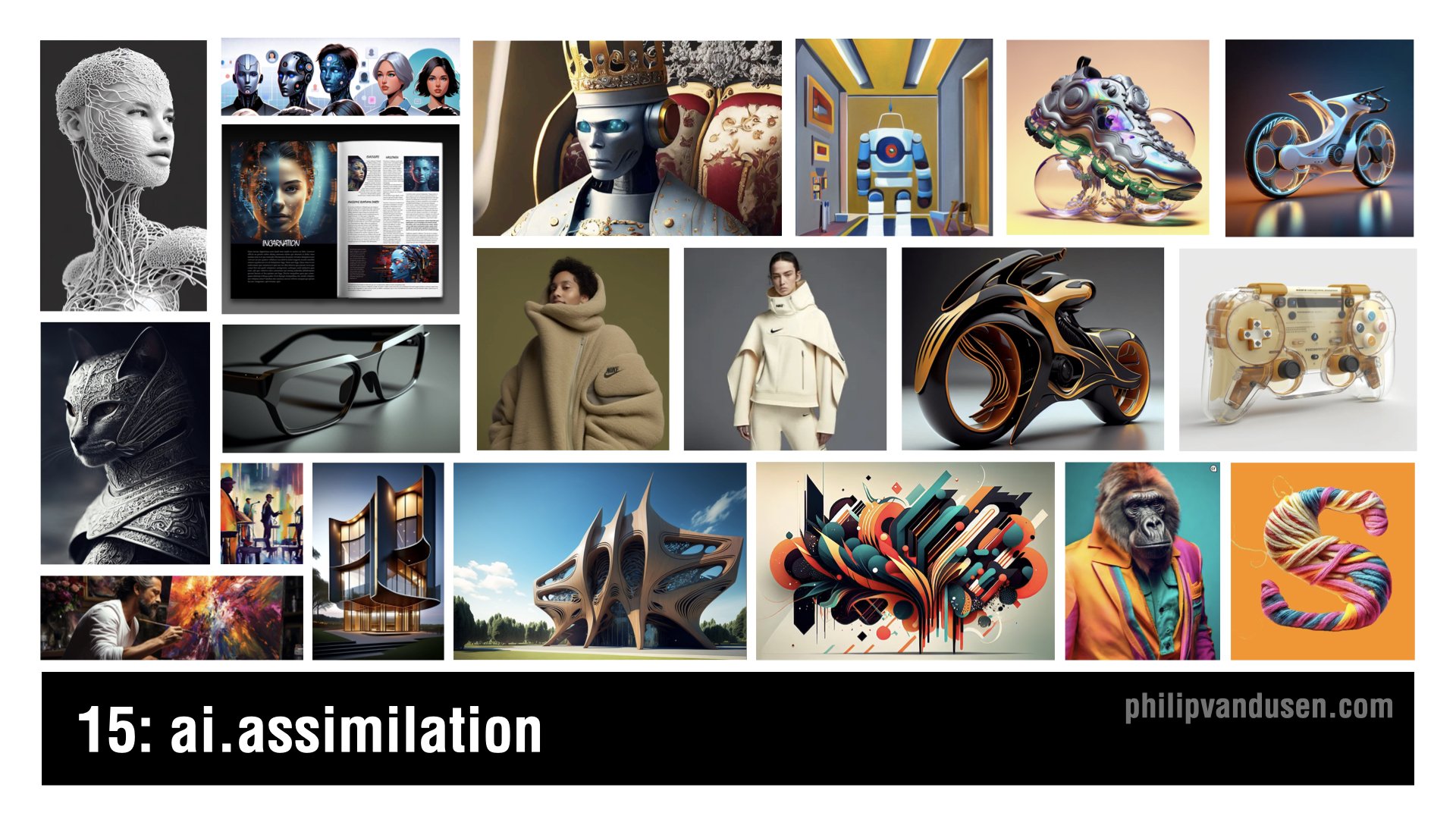
Trend number 15, ‘AI Assimilation’ marks the evolution of artificial intelligence from the novelty it's been in 2023 to a fundamental aspect of creative design in 2024.
It's no longer just about producing fantastical images to share with your friends, it's now a crucial tool that can be used in designing tangible products, items that we interact with every day in our lives.
This trend shows AI's power as an ever expanding reality that's reshaping entire industries as we speak, enabling the creation of objects and spaces that were once impossible to conceive or to visualize.
The aesthetic of AI Assimilation is characterized by its mind bending detail and precision and its ability to radically push the limits of form and function.
Applications include the fine arts, industrial design, product design, transportation, architecture, fashion, accessories, packaging, layout, animation, and that list is just growing longer every single day.
I hope you were inspired by these 15 trends and design for 2024, and if you were, please take a moment and subscribe to my newsletter, Brand•Muse, so you can stay up to date on all the news, trends, resources that make the creative world go ‘round!
As always, I'd also really appreciate it if you'd forward this post, or the associated YouTube Video to a friend or a colleague so others can be inspired too.
Stay creative and bye for now.
How Can We Can Help Your Business?
Is your brand rockin' like nobody elses? Or is it a little tired? Maybe it's just being born. You want to do it right. That's where we come in.
We create new brands from scratch. We fix broken ones. We have all the brainpower, creative chops and marketing magic you’ll ever need and a ton of loyal clients to prove it.
You want nimble? We're the new agency paradigm. We scale up and down depending on your needs so you never pay for resources you aren’t using.
We’ll put the power of brand strategy, design and the most contemporary marketing techniques to work for you. Let’s talk.