

Do You Trust Me?
The biggest FMCG brands in the world are outsourcing trust to creators, what does that tell you about where the power sits today?
Something crazy happened.
The CEO of Unilever, one of the biggest and most respected brand builders on the planet, admitted something out loud that most execs would never admit.
Brands are, by default, suspicious.
That’s not my phrasing. That’s straight from Fernando Fernandez.
This is the guy sitting atop Dove, Marmite, Hellman's, Ben & Jerry's, Lipton, Persil and a catalog of household names with ad budgets that dwarf the GDP of most small nations.
And he's saying: Consumers don’t trust us anymore.
And you know what? He’s right.
Everything is optimized.
Everything is targeted.
Everything is engineered.
Consumers feel that. They've developed gold-plated ad bullshit filters.
You feel it too. I know you do.
Every creative professional I talk to says the same thing:
People don't buy what brands say. They buy what trusted humans say.
And Unilever, of all companies, just proved it.
Their solution isn’t to double down on brand messaging.
It isn’t to hire another global agency or firehose even more millions into traditional ads.
He said the answer is creators.
Real humans.
People with their own voices, their own audiences, their own credibility.
Unilever is shifting serious ad dollars toward influencers because they’re no longer just another channel.
They’re the only voices consumers believe.
That’s a signal you should not ignore.
If the biggest FMCG brands in the world are outsourcing trust to creators, what does that tell you about where the power sits today?
Spoiler Alert: It’s not with corporations.
It’s with people.
And I'm not talking about Mr. Beast-level creator-people.
I'm talking about you and me.
You might think of yourself as a designer, strategist, illustrator, developer, consultant, creative entrepreneur, whatever.
But in 2025, that’s not enough.
You need to be a creator, too.
Not for vanity metics like subscribers, or 'likes'.
You need to do it for your own economic resilience.
When brands need trusted voices, they go looking for humans with audiences.
And creative professionals are uniquely positioned to win here.
You already understand storytelling.
You already understand what makes a message authentic.
You already understand what makes a brand feel real.
That’s creator DNA.
If you show your face, share your point of view, and build a relationship with your audience, you become the thing Unilever is desperately trying to buy.
A trusted human.
And guess what?
Creators get paid.
I never usually share my numbers, but in just the last few years I've made multiple 6 figures in revenue from being a creator.
Sponsorships.
Affiliates.
Product partnerships.
Campaign integrations.
Brands are pouring billions into creator marketing and begging for authentic partners who can vouch for them with integrity.
This is a revenue stream sitting right beside your creative practice, waiting to be turned on.
I not asking you to "sell out" - or become part of the problem.
Here's the plan:
You promote only products you believe in.
You get paid for bringing value to your community.
Your community gets trusted, curated recommendations.
Brands get the credibility they want.
It's win/win.
Here’s the truth I want you to take with you:
The most valuable asset you can build is trust.
And trust only comes from being present, visible, and human.
So, if you want new opportunities flowing to you - rather than you chasing them...
If you want leverage, optionality, and a business that grows without grinding harder…
Start creating.
Start showing up.
Start building an audience and becoming a voice they can trust.
Because the world doesn’t need more brands shouting at us.
It needs more humans.
And that’s you.
Your Job Doesn’t Care About You
After decades hiring and leading creative teams, I’ve learned the hard truth: your job doesn’t care about you. In this post, I share nine hard-earned lessons on protecting your career, from networking and personal branding to fighting ageism and showing your work. It’s real talk every designer needs to hear.
This is a bit of a rant. A heartfelt one. Less polished than usual. But it needs to be said.
Lately, I’ve had several friends, colleagues, and even members of my creative circles get laid off—some after 20 years of loyalty to a company. That kind of thing hits me hard. And honestly, it pisses me off.
At the same time, I hear from designers who can’t even get in the door—struggling to land interviews or feeling stuck on the outside looking in. If that’s you, I want to tell you a few things I’ve learned over three decades in this industry.
I’ve interviewed around 4,000 designers and hired more than 400. I’ve been a VP of Design at two Fortune 100 companies and an Executive Creative Director at two global branding agencies. I’ve led creative teams as small as three and as large as sixty-five. I’ve seen every side of how companies work—and how they treat people.
And I’m here to share some unfiltered truths about your job, your employer, and your career.
1. You’re the Only One Who’s Got You
You are number one. No one else will watch out for you the way you will.
Companies don’t exist to protect your career—they exist to protect their bottom line. You can give everything you’ve got for years and still be on the chopping block when budgets tighten. So take care of yourself first: your growth, your learning, your opportunities. You are your best safety net.
2. HR Is Not Your Friend (But Recruiters Are)
At your company, HR’s job is to protect the company. You’re a human resource—just like a desk, a computer, or a file cabinet. That sounds harsh, but it’s true.
However, external recruiters can be your allies. They make money by getting you placed. They care about your success because your success pays their bills. Build relationships with them. Keep in touch even when you’re not looking. They can become valuable advocates when you need them most.
3. YOU Are Your Own Career Insurance
Nobody’s going to swoop in to “save” your career. You are your career insurance policy.
That means developing professional agency—the ability to direct your career on your own terms. Build your personal brand. Keep your portfolio sharp. Stay visible. If your name carries credibility, you’ll have power and protection no matter what happens next.
4. The Creative Industry Has an Age Problem
The design and marketing industries are deeply ageist. The AIGA did a massive survey that found fewer than 10% of graphic designers are working past 50. Think about that. Where do the rest go?
The truth is, industries like tech, design, marketing, and entertainment are obsessed with youth. Older designers often get pushed out or quietly sidelined.
That’s why staying current—learning new tools, staying curious, and maintaining relevance—isn’t optional. It’s survival.
5. When It Ends, It’s Probably Not Your Fault
Layoffs happen. Mergers happen. Budgets get slashed. Departments disappear. When it happens to you, it’s rarely because you did something wrong.
The worst thing you can do is internalize it as a personal failure. It’s not. It’s business. Don’t let a company’s decision define your worth. Pick yourself up, learn what you can, and move forward.
6. It’s Who You Know, Not What You Know
You’ve heard it a million times, but it’s still the truth. Relationships are everything.
The job you’ll have next will almost certainly come from someone you know—a past colleague, a classmate, a peer in your network. Cultivate relationships constantly. Check in with people, collaborate, share your work.
This belongs in the “things I wish I’d learned earlier” category. I could have saved myself a lot of pain if I’d realized sooner how much relationships drive opportunity.
7. Stay in Beginner’s Mind
You’re never done learning.
In Zen philosophy, “Beginner’s Mind” means approaching every new challenge with openness, curiosity, and humility. The moment you think you’ve got it all figured out, you start to stagnate. The creative industry evolves too fast for that. Stay curious, stay teachable, stay adaptable.
8. The Shape of Your Skills Matters
Employers love T-shaped people—those with a broad range of knowledge but deep expertise in one area. That’s great for them.
But you? You need to think V-shaped. Go deep in your specialty, yes, but also carve out a few adjacent areas where you can stand out. For example, if you’re a designer, learn strategy. If you’re a strategist, learn presentation skills. The “V” is deeper, sharper, and more self-directed. It’s what gives you leverage.
9. Show Your Work (Even If You’re Not Supposed To)
Here’s a bit of real-world advice that might make a few lawyers nervous.
Non-compete and confidentiality clauses are increasingly unenforceable in places like California—and rarely pursued elsewhere. If you did great work at your last job, show it. Be respectful, of course, but don’t hide your best work out of fear.
If someone sends you a cease-and-desist letter, just take the work down. No one’s going to jail over a portfolio piece. In 99.9% of cases, nothing happens. But hiding your accomplishments out of fear? That’s career suicide.
The Bottom Line
Your job doesn’t care about you. But you can.
You can care enough to keep learning, stay connected, protect your professional identity, and build a reputation that no layoff can take away.
Because at the end of the day, companies will come and go. But your reputation, your network, and your skills—that’s what’s truly yours.

From Designer to Creative Director: The Roadmap No One Tells You About
How to go from Designer to Creative Director: leadership, visibility, strategy, and one bonus step that will set you apart.
If you’re a designer with your eye on becoming a Creative Director, you’ve probably noticed that the path isn’t always clear. It can feel like you’re navigating an invisible roadmap. The truth is, moving from Designer to Creative Director isn’t about having the sharpest design skills. In fact, very little of it is about your technical ability.
It’s about leadership. It’s about visibility. It’s about understanding business strategy.
The transition from execution to direction requires an entirely new skill set. Let’s dig into what that actually looks like.
Visibility: Exposure to Upper Management
Here’s a hard truth: 80% of your success won’t come from how great you are at Illustrator, Photoshop, or Figma. It comes from who sees you doing your work. Multiple studies confirm that visibility to decision-makers is the single biggest driver of career advancement.
Upper management doesn’t see the hours you put in, the late nights, or the clever tweaks to your design files. They only know what you show them.
So, how do you get on their radar?
Take on high-visibility projects, especially ones where you’ll present your work.
Build genuine relationships with decision-makers - offer value, share ideas, and step up when someone needs help.
Speak up in meetings. Don’t just agree or sit quietly; have a point of view.
The key is to treat visibility like part of your job, not an afterthought.
Leadership: Learn to Manage and Mentor
Creative Directors don’t just design - they lead. They manage people, mentor junior talent, and guide teams toward a unified vision. But here’s the challenge: you’re not going to be handed management opportunities early on. You need to seek them out.
Start small. Manage an intern, guide a freelancer, or take a junior designer under your wing. This helps you practice giving constructive feedback, offering creative direction, and learning how to collaborate with cross-functional teams like strategy, finance, and HR.
Think of leadership like a muscle. The earlier you start flexing it, the stronger it becomes. And when you can demonstrate that you’re already doing the job of a Creative Director - even in small ways - you’re signaling you’re ready for the next step.
Reliability: Project Planning and Delivery
Here’s a misconception: Creative Directors are just “big idea” people. Yes, vision is important, but reliability is what makes you promotable.
That means learning how to own a timeline, manage budgets, and keep projects on track. Even as a designer, you can begin developing this skill set.
Volunteer to manage project milestones and deadlines.
Get familiar with budgets and resource allocation.
Learn project management tools like Asana, Trello, or Monday.
Over-communicate progress, challenges, and wins.
Reliability is a leadership trait. When leadership trusts you to deliver on time and on budget, you’ve moved out of the realm of “talented designer” into “future leader.”
Influence: Client Management and Presentations
One of the biggest leaps in becoming a Creative Director is learning how to represent creative work. It’s not about saying, “I think this looks good.” It’s about tying creative decisions to strategy.
When you present, frame your work around business goals and customer needs. Why this color? Why this layout? How does it solve the client’s problem?
When handling criticism, don’t take feedback personally. Mirror back what you’ve heard, ask clarifying questions, and negotiate solutions. Defend your ideas when they’re strategically strong - but don’t dig in just because it’s your preference.
Strong Creative Directors don’t just sell ideas; they build trust.
Ownership: Be Solutions-Oriented
The difference between being a contributor and a leader often comes down to one thing: how you approach problems.
Instead of flagging issues, bring solutions. If the timeline is too tight, suggest where the team can streamline. If a concept gets rejected, propose pivots that keep the strategy intact. If workloads are unmanageable, advocate for resources and quantify the impact.
Taking ownership demonstrates that you’re already thinking like a Creative Director.
Power Tip: Get a Mentor
Here’s something I wish I had learned earlier: don’t try to figure this out alone.
Landing a Creative Director role is one thing; thriving in it is another. The first 90 days are critical. All eyes are on you - your team, your clients, your cross-functional partners. A mentor can help you set the right tone, build trust quickly, and avoid pitfalls.
You can start by finding someone inside your company who’s walked the path before you. Or, you can invest in a professional coach who can help accelerate your growth and shorten your learning curve. Either way, having someone to guide you is invaluable.
Make the Leap
If you want to make the leap from Designer to Creative Director, the formula is clear:
Get seen.
Step into leadership early.
Build reliability.
Learn to influence.
Take ownership.
And above all, don’t do it alone - get a mentor.
Start practicing these skills now, and you won’t just stand out as a designer - you’ll start proving you’re ready for the next level.
👉 If you’re serious about advancing your creative career and want support from others on the same journey, check out BONFIRE, my mastermind community. It’s where ambitious mid-to-late career creative pros sharpen their leadership skills, share strategies, and keep each other accountable.
Because you don’t have to climb this ladder alone.

What Works in Content Marketing Today (And What Doesn’t)
If you're building a business, a personal brand, or even just trying to keep your professional profile visible, the way you approach content today needs to be very different from how it looked just a few years ago.
Content marketing isn’t what it used to be.
If you're building a business, a personal brand, or even just trying to keep your professional profile visible, the way you approach content today needs to be very different from how it looked just a few years ago. I’ve been in the branding and marketing space long enough to see more than a few seismic shifts, and we’re smack in the middle of one right now.
There was a time - not that long ago - when the name of the game was volume. Blog daily. Post on every social channel. Schedule your calendar weeks in advance and spray your message across as many platforms as possible. The logic made sense at the time: more content meant more chances to get noticed.
But that strategy? It’s dead. Or at least, it’s dying fast.
In today’s world, attention is fractured, distractions are endless, and the platforms are flooded with algorithm-chasing, AI-generated filler. The sheer abundance of content has made us more selective about what we give our time to. We’re not craving more content. We’re craving better content - stuff that actually means something, helps us, makes us feel something, or connects us to others.
This shift from volume to value is one of the biggest mindset changes you need to make in the current business environment. It’s no longer about how often you post - it’s about how useful, authentic, and resonant your content is. One strong, insight-packed video or a thoughtful, evergreen blog post can outperform ten forgettable social snippets. Quality isn’t just a preference now - it’s the cost of entry.
That doesn’t mean stop posting. It means be intentional. A detailed article that answers a real question, a short film that stirs emotion, a case study that teaches as well as promotes - these are the kinds of pieces that continue to work long after you’ve published them. They generate trust, establish authority, and actually serve your audience.
And this brings me to another foundational change: content can’t just be about traffic anymore. It has to be about connection.
For years, the goal was clicks. Metrics ruled the conversation. “How many views?” “What’s the conversion rate?” And those things still matter, of course - but increasingly, the real metric of success is engagement that leads to community. Are people responding to your content? Are they sharing it, talking about it, reaching out to you because of it? Do they feel like you see them, and that they’re part of something with you?
Content today needs to create a sense of belonging. People are seeking connection now more than ever - especially in a digital landscape that often feels cold, loud, and anonymous. So what does this mean practically? It means engaging with people. Responding to comments. Asking questions. Telling stories that spark identification. Creating environments, even virtual ones, where people can gather and interact - not just with you, but with each other.
It’s no longer about the size of your audience. It’s about the strength of the relationship you build with the one person reading, watching, or listening at that moment.
Another major evolution is how content functions within the customer journey. There was a time when content was just a fancy sales pitch. You’d publish a blog post or video that basically said: “Here’s what we do - now go buy it.” But today’s audiences are more skeptical. More informed. Less tolerant of being sold to.
People don’t want to be pitched - they want to be guided. Your content should be a journey, not a billboard. That means delivering different types of value at different stages. At first, it might be educational - something that teaches without asking for anything in return. Then, as trust builds, it becomes more about providing proof - case studies, testimonials, deeper insights. Finally, when someone’s ready to take action, your content should show them how, clearly and confidently, without pressure.
This shift is especially important because it challenges the traditional view of content as a one-off effort. Great content now has to be part of an ecosystem, each piece playing a specific role in a longer relationship arc. If you treat every post like a cold open and a hard close, you’re going to lose people. But if you think about content as a series of conversations over time, you’ll win trust - and eventually, business.
Now let’s talk about distribution - because how you share your content matters as much as what you create. People aren’t consuming content the way they used to. Short-form video has exploded. Scrolling is second nature. Attention spans are fractured across multiple platforms, and each one demands a slightly different language, tone, and rhythm.
Here’s the thing, though: you don’t need to create entirely new content for every platform. You just need to think modular. One long-form video can become a dozen short clips. A podcast can yield Instagram quotes, LinkedIn posts, or email tips. A blog post can be broken into threads, carousel decks, or YouTube talking points.
You don’t have to reinvent the wheel each week. You just have to reshape it for the terrain. Think of your content like LEGO bricks - designed to be reassembled in different ways for different places.
This is how creators today stay visible without burning out. And it’s completely doable - even for a solo entrepreneur or small team.
But even more important than distribution is the tone of your content. Because here’s another thing that’s changed: people want realness. Overproduced, overly polished content can feel out of touch or inauthentic. The brands and creators that are winning today are the ones who are showing up as themselves.
That means being willing to share your story. Your process. Your mistakes, not just your wins. Vulnerability is magnetic. Authenticity is the new authority. And storytelling is how you cut through the noise - not with a gimmick, but with your truth.
The companies doing this well don’t just talk about what they sell. They talk about why they do it, how they do it, and the people behind it. And they do it with transparency. They’re not trying to look perfect - they’re trying to be understood. That’s a huge shift, and one you can lean into no matter your size or industry.
There’s also been a massive leap forward in personalization, thanks to data and AI. The barrier to creating content that feels like it was made for one person has never been lower. You now have access to tools that can segment your audience, track behavior, and generate personalized experiences at scale.
The smart move is to use those tools - not to manipulate, but to serve more effectively. Tailor your messaging. Customize your offers. Refine your content based on what’s resonating and what’s not. That kind of responsiveness is what keeps people engaged. It also shows you’re paying attention.
Approach your content like a scientist. Hypothesize, test, measure, adjust. The platforms are giving you feedback every day - open rates, click-throughs, comments, shares. That’s data. Use it.
And finally, one of the most important shifts in recent years is the move from brand voice to individual voice. We trust people more than we trust corporations. We always have. But today, that truth is amplified by the power of personal platforms. Your audience wants to hear from you - not a logo, not a generic brand tone, but a real human being.
That’s why personal brands, micro-influencers, and founder-led content are performing so well. It’s why employees are becoming brand ambassadors and why customer stories carry more weight than any paid ad. We trust faces, not facades.
If you run a company, showcase your people. If you’re a solo creator, lean into your own story. If you’re in marketing, think about how you can feature the real humans behind your product or service. Let people speak. Let them be seen. That’s what builds trust now.
We’re also entering a space where interactivity is becoming the norm. People don’t just want to watch or read - they want to participate. Whether it’s polls, live Q&As, quizzes, or immersive tech like augmented reality, the expectation is shifting from consumption to co-creation.
This is a big opportunity. Because when you invite your audience to contribute - to respond, to create, to shape the experience - you deepen the relationship. And relationships are the real ROI of content marketing in the current business marketing environment.
So yes, content marketing has changed. The platforms are different. The tools are better. But the biggest transformation is philosophical. We’re moving away from volume and visibility as our north stars - and toward value, connection, and trust.
It’s no longer about flooding the market. It’s about showing up with meaning, purpose, and clarity. It’s about building relationships that matter. And it’s about creating content that doesn’t just get views - but gets remembered.
Because in the current business environment, that’s what wins.

The Best Digital Networking Strategy for Designers and Entrepreneurs
Discover modern networking strategies for designers and entrepreneurs that actually work in today’s digital world.
When you hear the word “networking,” do you perk up - or do you cringe?
If you’re like most creatives or entrepreneurs, traditional networking conjures up images of awkward mixers, outdated business card swaps, or cold DMs on LinkedIn that go nowhere.
Sure, those approaches can still work. But here’s the truth: Networking has evolved.
In today’s digital-first world, networking doesn’t have to feel cringey or transactional. It can be creative, authentic, and - dare I say - enjoyable.
So if you're ready to rethink how you build connections and start expanding your professional network in ways that actually work, here are the strategies you need to know.
1. Make a Killer First Impression (Digitally)
In a remote and hybrid world, your online presence is your first impression. Before anyone ever meets you, they’re checking you out on:
LinkedIn
Your website
Platforms like Behance, Dribbble, or Medium
Start with LinkedIn. It’s more than just a resume - treat it like your personal billboard. Optimize it:
Use a professional headshot
Write a compelling headline (use those 220 characters!)
Make the “About” section tell your story, not just list titles
Then expand your presence on niche platforms. Designers should consider forums like Adobe Creative Cloud, or subreddits like r/graphic_design. Entrepreneurs might hang out on IndieHackers, Discord servers, or community Slack groups.
But no matter the platform, engage. Comment, ask thoughtful questions, and contribute. Passive lurking won’t get you noticed - generosity and curiosity will.
2. Use Content as a Networking Magnet
Want to network without networking? Post content.
Yep, that’s the power move. Whether it’s a case study on LinkedIn, a time-lapse design process on Instagram, or a podcast episode where you share insights - content creates connection.
Here’s the magic: Once you’ve been creating content for a while, people start to say things like:
“I feel like I already know you.”
That kind of “pre-relationship” is gold. It lowers the friction for future conversations and opens the door to real connection - because you’ve already been delivering value.
3. Try Creative, Non-Traditional Networking Tactics
Tired of the same “show up to this event” advice? Here are a few modern alternatives:
Virtual Coffee Chats
Use platforms like Lunchclub or reach out via LinkedIn to people you admire. Casual, 20-minute Zoom coffees are easy and often impactful.Virtual Co-Working
Try platforms like Focusmate or even host your own Zoom co-working session. The pressure’s off - and some of these casual sessions turn into long-term connections.Personalized Video Intros
Want to really stand out? Skip the templated DMs. Instead, record a quick 30-second video explaining why someone’s work inspired you and why you’d like to connect. Bonjoro, Loom, and Vidyard make it easy.Workshops over Conferences
Skip the overwhelming conferences and join smaller, hands-on workshops. Collaboration builds stronger bonds than business cards ever will.
4. Tap into Local + Digital Communities
Don’t underestimate the power of connecting locally - even if it starts digitally.
Whether it's a Slack group for NYC creatives or a Facebook group for Austin entrepreneurs, these spaces often lead to IRL meetups, partnerships, or client work.
Pro tip: Join city-based groups and channels. Look for design or entrepreneur collectives in your city, then show up - online and off.
5. Join (or Start) a Mastermind Group
One of the most powerful ways to build lasting, meaningful professional relationships? Masterminds.
A mastermind is a small, curated group of professionals who meet regularly to:
Share insights and resources
Offer honest feedback
Hold each other accountable
Champion each other’s success
Unlike surface-level networking, masterminds go deep. They create real trust. Real opportunity. Real friendships.
In fact, I call the BONFIRE mastermind community I run for creative professionals a “brave space” - not just a safe one. Because growth takes guts, and support makes all the difference.
Want to explore what BONFIRE could do for your network (and your career)? Check it out here.
6. In-House Creatives: Your Networking Plan Looks Different
If you work in-house, building your network isn’t about meetups - it’s about visibility.
Here’s what works:
Get Seen by Executive Leadership
Stats say 80% of career advancement is about exposure, not performance. Volunteer for cross-functional initiatives. Present at team meetings. Get your face in the room.Connect Across Departments
Build relationships in HR, strategy, marketing, and product. Broader exposure = more opportunities.Join Internal Groups
Many companies have Slack channels, internal blogs, or newsletters. Show up and contribute - it’s great internal PR.Leverage Upward Connections
Reach out to leaders in other teams. Ask for insights or advice. Most senior people are more generous than you think - especially when approached with curiosity.
Recap: The Modern Networking Formula
Here’s how to start building a meaningful, high-impact network today:
Optimize your digital presence. Treat your profiles like personal billboards.
Create content. It builds social proof and invites connection.
Engage in niche communities. Comment, ask questions, offer help.
Try new tactics. Virtual coffees, coworking, and personalized videos win.
Join a mastermind. They’re transformational - both professionally and personally.
For in-house pros: Visibility is your secret weapon. Use it wisely.
Networking doesn’t have to be stiff, sleazy, or exhausting. It can be natural. Generous. And yes - even enjoyable.
And when done well, networking stops being something you do and becomes part of who you are.
If you’re ready to build a smarter network and grow your creative career with the support of a community that gets it, check out BONFIRE. You’ll meet others who are building, exploring, and leveling up - just like you.
Until next time, stay creative.

How to Find a Job in the Creative Industry (Even in a Tough Market)
Struggling to land a creative job? Learn 5 proven strategies to stand out, get interviews, and get hired.
Let’s face it - the job market right now is no cakewalk. Especially if you’re a mid-to-late career creative professional, it can feel like your years of experience are somehow working against you.
Whether you’re a graphic designer, marketer, copywriter, video editor, or some creative hybrid of them all, landing that next job (or freelance gig) can feel like pushing a boulder uphill.
But here’s the truth: it’s not hopeless. You just need to shift your approach. In this post, I’ll walk you through 5 powerful strategies that have helped me - and the creative professionals I mentor - stand out and succeed in this crazy, evolving industry.
Let’s dive in.
1. Tailor Your Resume to the Role
Most resumes I see? Generic. One-size-fits-all. And unfortunately, that doesn’t fly anymore.
If you're applying online, your resume is likely being scanned by an ATS (Applicant Tracking System) before a human ever sees it. If you’re not using the keywords and phrasing from the job description itself, you may not even make the first cut.
Here’s what to do:
Google “ATS resume formatting” and follow those guidelines to the letter.
Pull keywords directly from the job listing and include them naturally in your resume.
Focus on results: Did you increase engagement by 25%? Reduce project timelines by 40%? Say it.
And if you’re applying for a senior role, elevate your language. Talk about leadership, strategy, cross-functional collaboration, and outcomes.
This isn’t about bragging. It’s about making sure the hiring manager can quickly see your value.
2. Optimize Your LinkedIn Like a Pro Portfolio
Most creatives treat LinkedIn like a glorified digital Rolodex. But it’s actually one of the most powerful marketing tools you have.
Here’s where to focus:
Headline (the line under your name): Use all 220 characters. Stack relevant titles and specialties so you’re searchable (this is heavily indexed by LinkedIn’s algorithm).
Banner image: Think of it as your personal billboard. Showcase your work, promote your website, or include a call-to-action.
About section: You get 2,000 characters-use them. Make the first 2–3 lines so compelling that people click “See More.” Tell a story that shows who you are, what you do, and what problems you solve.
I break this all down in detail in my YouTube video, LinkedIn Power Tips – How To Build an Incredible Profile and Get More Clients. (Link’s in the description if you’re watching the video, or on my site.)
Bottom line: LinkedIn is a living, breathing portfolio. Use it.
3. Connect Directly With Hiring Managers
Yes, cold outreach can feel awkward - but when done right, it works.
Use tools like Apollo or LinkedIn Sales Navigator to find decision-makers: creative directors, marketing VPs, agency owners, etc. Then send a personalized message (not a bland template).
Mention why you admire their work, what value you bring, and how you’d love to connect. No hard sell. Just be genuine.
And if this job hunt is starting to feel isolating? You're not alone.
That's one reason I created BONFIRE, my mastermind community for creative pros. It’s where we share strategies, navigate job transitions, and give each other the kind of feedback and support that actually moves careers forward.
If that sounds like something you need, check out philipvandusen.com/BONFIRE. We'd love to have you around the fire.
4. Build Your Network (For Real)
When I was trying to break into the apparel industry, I didn’t just blast resumes. I talked to people. A lot of people.
Go to local meetups. Join AIGA. Attend online webinars. Go to actual trade shows and IRL industry conferences. Comment thoughtfully on LinkedIn posts. DM people you admire.
The key? Make it about them first. Ask questions. Share insights. Don’t just “like”-engage.
Opportunities in the creative world often come from conversations, not job boards. Be visible. Be curious. And be helpful.
5. Practice the Interview - Like It’s a Presentation
You finally land the interview - congrats! But don’t wing it.
Prep your stories:
Where did you solve a complex design or branding challenge?
When did you lead a team or influence business strategy?
How did your work directly impact a brand’s visibility or growth?
And when walking through your portfolio, don’t just explain how it looks. Talk about:
The goal behind each project
The audience you were targeting
The business context and competitive landscape
That’s the kind of strategic thinking that makes hiring managers lean in.
Also - do your homework. Read up on the company, their latest product launches, their tone of voice, and culture. If you walk into an interview not knowing who you’re talking to, you’re sunk before you start.
Quick Recap:
Tailor your resume: Use keywords, quantify wins, and aim for clarity over creativity.
Optimize LinkedIn: Treat it like a portfolio, not a placeholder.
Connect with hiring managers: Personal outreach beats blind applications every time.
Build your network: Show up. Online and IRL.
Crush the interview: Tell compelling stories that align creative thinking with business goals.
If you’re feeling stuck or discouraged, I get it. It’s easy to feel like the deck is stacked against you - especially with all the noise about AI, automation, and shrinking job markets.
But here’s the truth: You’re still needed. Your creativity, your experience, your voice - they matter.
What doesn’t work anymore is waiting passively for opportunity to knock.
Take control. Get strategic. And surround yourself with others doing the same.
And if you’re looking for that kind of support system, check out BONFIRE🔥. It’s a crew of driven creatives committed to helping each other grow.
Stay focused. Stay visible. Stay creative.

How to Get Your Content Recommended by ChatGPT and AI Tools
Build your personal brand and business by getting your content recommended by ChatGPT and AI tools. Here's how to optimize for relevance, authority, and long-term visibility.
Let me ask you something:
Are you creating content and wondering why it’s not gaining more traction?
Do you ever feel like you’re shouting into the void - posting great videos, blog posts, or podcasts - but barely making a dent in visibility?
Well, here’s a bit of good news: there's a whole new content discovery engine emerging. And it’s not YouTube. It’s not Google.
It’s AI.
Yep - ChatGPT, Gemini, Claude, and other AI models are fast becoming one of the most powerful discovery engines for content creators. These tools are changing how people find things online, and if you understand how they work, they can become your greatest marketing ally.
Let me tell you how I found this out...
The Moment That Blew My Mind
I got a message from a guy in India who told me something wild. He said he’d never heard of me before - until he asked ChatGPT for “the best video on how to increase brand visibility when you are not a market leader.”
Guess what video ChatGPT recommended?
Mine.
Not a list. Not a bunch of options. Just one video.
Now I’ve been doing SEO for years. I know how to optimize YouTube content. But this was different. ChatGPT isn’t serving up links the way Google does. It’s curating. It’s recommending. And that’s a game-changer.
Welcome to the AI Recommendation Revolution
AI tools aren’t built like search engines. They don’t rank by backlinks or stuffing keywords. Instead, they’re looking for relevance, authority, and trustworthiness.
So if your content is clearly answering a user’s question in a helpful, high-quality way - AI takes notice.
And if your name and your work are showing up consistently across platforms? Even better. That’s digital authority in action.
This is what I call the AI Recommendation Revolution - and it's something every smart content creator needs to be paying attention to.
Why AI Recommendations Matter So Much Right Now
Here’s the big idea: AI tools like ChatGPT are problem-solving engines. They exist to help people get clear, accurate, fast answers.
So if you’re creating helpful, educational content (which, let’s be honest, most of us are), these AI tools are designed to love you - but only if they can actually find and understand your work.
And when they do? That recommendation is golden. It’s more than just a link - it’s an implicit endorsement. One or two suggestions, not twenty.
Less competition. More visibility. Higher trust.
How to Optimize Your Content to Get Recommended by AI
Let’s break this down into eight clear steps:
1. Create High-Quality, Evergreen Content
AI doesn’t care about clickbait or viral trends. It cares about content that lasts - stuff that will still be relevant a year or two from now.
Tip: Avoid using years in your titles unless timeliness is essential. “Branding Trends for 2023” has a shelf life. “How to Build a Personal Brand” does not.
2. Optimize Metadata and Descriptions
Think titles, descriptions, tags. Use natural language that mirrors how people ask questions. For example:
“How to grow your personal brand when no one knows you yet.”
Make your descriptions detailed and thoughtful - summarize your video, include keywords organically, and avoid spammy stuffing.
3. Use Transcripts and Captions
AI tools love text. Closed captions, cleaned-up transcripts, and even posting the transcript in your blog or description can make your content easier to understand - and recommend.
4. Pair Videos with Blog Posts
Text is still king in AI-land. Pair your videos with blog articles, summaries, or even LinkedIn posts. It increases the surface area of your content and helps AI see you as an expert worth surfacing.
5. Be Everywhere: Build Cross-Platform Authority
The more places you show up - podcasts, blogs, YouTube, social media - the more credible you look to AI tools. Ask podcast hosts to link to your content. Comment in relevant threads. Publish across platforms. It adds up.
6. Match User Intent
Think about what your audience is really searching for. What pain points are they typing into search bars? What questions are they asking AI?
Create content that answers those questions, clearly and directly.
7. Use AI to Discover What to Create
This is the meta part: use ChatGPT to find out what questions people are asking in your niche. Tools like “Answer the Public” are great, too.
Then, make videos or articles that answer those exact questions. It’s like SEO, but for the future.
8. Keep People Watching
AI tools track user satisfaction through engagement signals. So:
Hook them fast.
Deliver value quickly.
Use CTAs that spark likes, shares, and comments.
The better your content performs with actual humans, the more likely it is to get the AI thumbs-up.
In today’s rapidly evolving content landscape, understanding how AI tools like ChatGPT surface and recommend content is more than a neat trick - it’s becoming essential strategy. As creators, marketers, and creative professionals, we need to adapt to how discovery works now, not just how it used to work.
This article broke down practical, doable steps you can take to increase your chances of being recommended by AI tools - not by hacking algorithms, but by doubling down on value, clarity, and authority.
Whether you’re trying to grow your personal brand, attract clients, or simply get your ideas in front of the right people, optimizing for AI discoverability is a smart, future-proof move.
Think of this not as a trend, but a shift in the rules of visibility - and now you know how to play the game.

10 Mistakes Small Businesses Will Make This Year
Discover the top 10 small business mistakes to avoid - from ignoring AI and automation tools to underestimating mobile optimization, customer retention, and video marketing. Learn how to strengthen your brand strategy, boost marketing performance, and grow your business smarter in today’s competitive digital landscape.
If you're a small business owner - or if you work with small business clients - there are some common mistakes that can cost you time, money, and momentum.
These aren’t random slip-ups. They’re the kinds of blind spots that quietly eat away at growth and competitiveness.
Here are ten of the biggest mistakes small businesses are likely to make this year - and how to avoid them.
1. Ignoring AI and Automation Tools
AI isn’t some distant future tech - it’s already reshaping how smart businesses operate. From automating repetitive tasks to optimizing marketing campaigns and predicting customer behavior, AI is now table stakes for efficiency and scalability.
If your competitors are using AI to improve response times, personalize outreach, and streamline operations, while you're still stuck in manual mode, you're going to fall behind - fast. Embracing AI now gives you a running start.
2. Neglecting a Mobile-First Strategy
Most web traffic today comes from mobile devices. Yet far too many small business websites still load slowly, display poorly, or are just plain hard to use on phones.
In 2025, a mobile-friendly site isn’t a “nice to have” - it’s the minimum bar. Your site should load fast, be easy to navigate, and make buying or contacting you seamless on any screen size. If not, you're losing customers before they even see what you're offering.
3. Failing to Personalize Marketing Campaigns
Blasting the same generic message to everyone doesn’t cut it anymore. Customers expect relevance. If you're not segmenting your audience and tailoring messages based on interests or behavior, you’re leaving revenue on the table.
Even a simple email that lets people click on a product they’re curious about - tagging them based on that action - can open the door to more personalized, higher-converting follow-up. Smart personalization builds stronger relationships and drives better results.
4. Relying Too Much on Organic Social Media
Organic content is great for nurturing your audience - but it’s slow, and social algorithms are fickle. If you're depending solely on organic reach, you’re gambling with your visibility.
A smarter strategy includes paid advertising to boost your best content and reach new audiences. Diversify your efforts: social, email, SEO. Don’t get caught off guard by a single platform shifting the rules overnight.
5. Skipping Video Content Marketing
Video has moved from “optional” to “essential.” Whether it’s Reels, livestreams, or explainers, video connects with audiences in ways static images or text can’t.
And here’s the thing: you don’t need a fancy studio to get started. A smartphone and a good idea can create more authentic, relatable content than an overproduced campaign. In fact, video often converts better - especially on landing pages - so it's worth the effort to incorporate it regularly.
6. Underestimating Customer Retention
New customers are exciting - but retaining existing ones is where the real ROI lives. It's cheaper, easier, and often more profitable.
Happy customers become repeat buyers and brand advocates. Keep them close by delivering stellar service, rewarding loyalty, and continuing the relationship beyond the sale. Don’t treat them like transactions; treat them like partners in your growth.
7. Failing to Share Authentic Customer Stories
Trust is built through transparency. Highlighting real experiences - testimonials, case studies, user-generated content - builds credibility and connection.
People can sniff out polished, fake-sounding stories a mile away. Keep it real. When prospects see how you’ve helped people like them, they’re far more likely to trust you with their business.
8. Lacking a Clear Brand Identity and Voice
A scattered brand confuses your audience. Consistent messaging, visuals, and tone are essential - especially as more businesses turn to AI to generate content.
If you haven’t defined your brand voice, AI tools won’t know how to represent you. Clarify your brand’s personality, values, and visual identity so that every touchpoint reinforces the same clear message.
9. Relying on Gut Feelings Over Analytics
Instinct is valuable - but data is indispensable. Without metrics guiding your decisions, you're just guessing.
Analytics tools today are more accessible than ever. Use them to track what’s working - whether it’s website performance, email engagement, or ad conversions - and make strategic, informed decisions based on actual results.
10. Avoiding Collaborations and Partnerships
No business succeeds alone. Strategic partnerships can open new doors, expand your reach, and even save you money.
Whether it’s co-marketing, shared resources, or hosting events together, collaboration creates leverage. Don’t let fear of competition or ego hold you back. There’s plenty of opportunity to go around - and working together is often the fastest path to growth.
Avoiding these ten mistakes can make the difference between treading water and gaining real momentum in your business. Each of these pitfalls - whether it’s neglecting mobile optimization, ignoring the power of AI, or relying too heavily on organic social - represents a gap that your competitors could easily exploit. But with awareness and intentional action, these gaps become opportunities.
The goal of this post isn’t just to point out what you might be doing wrong in your small business - it’s to offer a clear, proactive roadmap for staying competitive, building resilience, and driving smarter growth in a fast-evolving landscape.
If you take even a few of these insights and apply them to your brand or business strategy, you'll already be ahead of the curve.
Make sure to take a moment and subscribe to my newsletter, brand•muse for more insights, resources and inspiration! SUBSCRIBE HERE
Personal Branding Power Tips
Whether you’re running your own branding or design agency or working as an in-house designer, this is for you. Personal branding isn’t just a “nice to have” anymore. It’s a career insurance policy and a gateway to influence.
Today we’re diving deep into a topic that I know is important to so many creative pros and entrepreneurs: personal branding.
But this isn’t the same conversation we’ve been having for the last decade. Today, I want to introduce you to what I call Personal Branding 2.0 — an ADVANCED look at how personal branding has evolved and how YOU, as a creative professional, can build a brand that opens doors, attracts opportunities, and future-proofs your career.
Whether you’re running your own branding or design agency or working as an in-house designer, this is for you. Personal branding isn’t just a “nice to have” anymore. It’s a career insurance policy and a gateway to influence.
So, let’s talk about what’s changed, what’s working now, and most more specifically, 5 WAYS you can TAKE ACTION to build your brand in innovative ways.
1. Leveraging New Platforms and Formats
The first big change in personal branding is the way we use platforms and content formats to build our presence. A few years ago, having a polished portfolio, a LinkedIn profile, and maybe some work on Behance was enough. Not anymore.
Let’s start with short-form video. Platforms like TikTok, Instagram Reels, YouTube Shorts, and even LinkedIn have made short videos a huge tool for personal branding. Why? Because they showcase not just your work but your personality, your thought process, and your values — quickly and authentically. They make you a real human being - not just a "profile".
Tactical tip:
Here’s a simple way to start. Create a short video series where you share quick insights into your creative process. For example, “3 Mistakes Brands Make When Designing a Logo” or “Behind-the-Scenes of My Client Project.” Keep it real. Show your face, be conversational, and don’t overthink it.
Now, the MINDSET SHIFT here is key. A lot of us grew up in an industry where everything had to be perfect before it was shared. But today, audiences connect more with authenticity than perfection. Don’t be afraid to show what I like to call "the messy middle" or even share failures — because that’s relatable.
Another shift is the rise of multi-channel micro-presences. This means spreading your presence beyond just LinkedIn or Instagram into niche platforms. Think Substack for thought leadership, Dribbble for visual experiments, or even Clubhouse if you want to participate in live discussions.
Why is this new? It's because audiences are fragmented now. Being active in multiple smaller spaces builds touch-points with different communities while helping you stand out.
Pro tip: Cross-link your content between platforms. For example, turn a LinkedIn post into a Substack article or a video snippet.
2. Owning Your Narrative: Personal Branding as Storytelling
Next, let’s talk about one of my favorite concepts: storytelling. Personal Branding 2.0 is about telling stories, not just sharing “what you do.”
We’ve all heard of the elevator pitch, right? “Hi, I’m Jane, and I’m a designer specializing in XYZ.” But here’s the thing: a pitch alone isn’t enough anymore. People want a connection. Your brand story needs to be multi-layered and human.
Tactical tip: Break your brand story into three parts:
1. Your Journey — Share the moments that shaped who you are as a professional. Maybe you struggled to find your first design job or took a big risk that paid off.
2. Your Mission — What drives you? Why do you do what you do? This is where your values come in.
3. Your Vision — Where are you headed? How can you help clients or companies achieve their goals?
When you share your story, don’t be afraid to weave in challenges and pivots. Vulnerability builds trust.
Want to know one "power tool" for storytelling? Case studies. I don’t mean just showing the “before” and “after” of a project. I mean diving into your thought process, the challenges you faced, and how you solved problems creatively. Case studies position you as a thinker, not just a designer.
Pro mindset shift: Start viewing case studies as personal brand assets — not just client deliverables.
3. Building Influence Through Community and Collaboration
Here’s where it gets really interesting: Personal branding is no longer a SOLO sport. It’s about COMMUNITY AND COLLABORATION.
Let’s start with community. One of the most underrated ways to build your brand is to establish yourself as a RESOURCE AND CONNECTOR. This could mean hosting small virtual workshops, moderating panels, or simply sharing resources that help other creatives succeed.
Why does this work? Because when you position yourself as someone who gives, you naturally attract people who want to work with you.
Tactical tip:
Find a way to help your community — whether that’s your peers, clients, or industry professionals. Maybe you create a resource library for other designers or host a monthly Zoom Q&A. Whatever it is, be consistent.
Another advanced strategy is COLLABORATIVE CONTENT CREATION. Partnering with other creative pros, influencers, or even small brands can expand your reach like nothing else can.
For example, co-host a YouTube video, run an Instagram Live together, or create joint content like a “collab series” on LinkedIn. Collaboration not only gets you in front of a new audience but also adds credibility to your brand.
The MINDSET SHIFT here is to stop seeing others as COMPETITORS. Instead, think of them as ALLIES in growing together.
4. Embracing Emerging Tech in Personal Branding
Now let’s talk about the tools that are helping us do this better, faster, and smarter. Emerging technology — particularly AI and automation — has opened up brand-building opportunities we couldn’t have imagined a few years ago.
First up: AI TOOLS. AI isn’t just for automating tasks. It can be a powerful asset in maintaining brand consistency and creating content quickly.
Tactical Tip:
Use AI tools like ChatGPT to generate ideas for blog posts, scripts, or captions. Tools like Canva AI or Adobe Firefly can help you design assets FAST that fit your visual brand.
If you’re creating video content, tools like Descript, CapCut or Runway can streamline editing, transcriptions, and even visual effects.
The MINDSET SHIFT here is to see AI as a creative partner, and not to FEAR that it's replacing your skills. The human touch is still critical. AI is just a new tool that gives you leverage.
Next, let’s talk about AUTOMATION FOR BRAND VISIBILITY. Scheduling tools and content repurposing platforms have come a long way. Today’s tools don’t just automate posts — they optimize them based on audience behavior.
Tactical tip:
Use platforms like Buffer, Later, or Hootsuite to create automated posting schedules for social media. Then take it a step further with tools like Missinglettr or Metricool, which analyze your most successful content and help you repurpose it into new formats. A single LinkedIn post can become an email, a video outline, or a series of 'threads'.
The MINDSET SHIFT here is to think of automation as a MULTIPLIER for your effort. The less time you spend on repetitive tasks, the more you can focus on creating impactful content and building relationships.
5. Mindset Shifts for Personal Branding 2.0
The last thing I want to cover is the mindset you need to make these advanced strategies work. Personal Branding 2.0 requires you to think bigger about your work and your impact.
The first mindset shift is to move from a “PORTFOLIO” mindset to a “LEGACY” mindset. Your personal brand isn’t just about the work you’ve done — it’s about the IMPACT you’ve made - and are making.
Tactical Tip:
Start showcasing the results of your work, not just the deliverables. Did a rebrand increase a client’s revenue? Did your design improve user experience? Highlight that.
The second MINDSET SHIFT is about RESILIANCE. Let’s face it — industries are changing fast. Personal branding is your career insurance policy. It gives you visibility, adaptability, and leverage when things shift.
To do this, you need to know your unique strengths and messaging so you can pivot when needed.
If you’re ready to go deeper into building a resilient, advanced personal brand, I want to invite you to join my BONFIRE mastermind community. It’s a space for creative pros like you to get support, strategies, and accountability as you grow your career and personal brand. Just go to philipvandusen.com/bonfire if you want to check it out.
Remember:
Personal branding isn’t just about getting noticed or vanity metrics — it’s about building a career and a reputation you’re proud of.

The Best LinkedIn Video Strategy for Small Business
Have you ever felt like you’re ignoring LinkedIn in your video marketing strategy? I get it - when most of us think about video marketing, we picture Instagram Reels, TikTok, or maybe YouTube Shorts.
LinkedIn doesn’t always get the love it deserves, but it’s a hidden gem, especially if you want to connect with professionals, build real business relationships and actually get clients.
Have you ever felt like you’re ignoring LinkedIn in your video marketing strategy?
I get it—when most of us think about video marketing, we picture Instagram Reels, TikTok, or maybe YouTube Shorts.
LinkedIn doesn’t always get the love it deserves, but it’s a hidden gem, especially if you want to connect with professionals, build real business relationships and actually get clients...
I'm going to give you 7 STEPS on exactly how to use LinkedIn video to attract your ideal audience. I’ll break it down and by the end, you’ll know how to create content that actually WORKS FOR YOU, no matter what kind of business or brand you’re building.
Let’s jump in.
Step 1: Understand LinkedIn’s Video Formats
Okay, so first things first—you’ve got to understand the different types of videos LinkedIn supports. LinkedIn isn’t a one-size-fits-all platform, and each video format serves a different purpose. So, let’s talk about your options.
Feed Videos. These are the OG's of LinkedIn video. Feed videos are your classic posts that show up in your network’s feed. They’re versatile, too—you can post them on your personal profile or a company page. They can be up to 10 minutes long, and LinkedIn supports horizontal, vertical, or square orientations. So, you’ve got a lot of flexibility.
One thing I love about feed videos is that they don’t just vanish into the ether. Once you post them, they’re stored under the video tab in your activity section. That means people can go back and find them later, which is perfect if you’re building a library of valuable content.
Next up, we’ve got LinkedIn’s SHORT VIDEOS. These are newer and designed for quick, high-impact messaging. The sweet spot here is between 45 seconds and 2 minutes.
Now, these are best in vertical format—think smartphone-friendly. And here’s a little tip: since these videos autoplay silently in the feed, you’ve got to grab attention visually. Use captions, bold text, or even a quick headline at the top to draw people in.
Finally, there’s LINKEDIN LIVE. The livestream format on LinkedIn is SO underutilized, but it’s a powerhouse if you want to build deeper relationships with your audience. The audiences tend to be smaller on LinkedIn, but the engagement that actually results in an action being taken is much higher than some other platforms.
With live video, you can engage in real time, answer questions, and even funnel viewers into your email list or consultations.
The great thing is that after the event, the video doesn’t just disappear. It lives on in the Events tab under your activity section.
And here’s a PRO TIP: Some marketers like to trim the replay to just the first few seconds to keep it exclusive for live attendees, but others keep the entire event accessible for long-term value. You can experiment and see what works for you.
Step 2: Start Small with Short Videos
So now you know the formats—where do you start? If you’re new to LinkedIn video, start small. Here's my advice: Create 10 short videos.
Why short videos? Because they’re quick to produce and perfect for testing different ideas to see what resonates with your audience.
There’s only one exception: if your content requires a lot of technical detail—like screen shares or tutorials—you might want to go straight to feed videos. Those are much better suited for that kind of content.
Step 3: How to Decide What Your Video Topics Should Be
One of the biggest challenges I hear from people is, “What should my videos be about?” And honestly, this is where most people get stuck. They overthink it. So, let me help you simplify this process.
First, think about the questions you get asked all the time by your clients, colleagues, or network. What are the most common issues people in your audience face? Those questions are gold because they show you exactly what your audience wants to know. Answering them in your videos is an easy win.
Next, consider what makes you an expert. What’s something you know inside and out that your audience might struggle with? Maybe it’s a specific skill, like project management, or an industry trend you’ve been tracking. Share that knowledge in a way that’s actionable—something people can apply right away.
Another great way to pick topics is to think about what’s happening in your industry or niche right now. "News" basically - time-sensitive info. Are there any big changes, challenges, or opportunities? For example, if you’re in marketing, you might talk about how AI is transforming content creation. If you’re in design, maybe it’s about the latest UX trends.
And here’s a PRO TIP: Don’t be afraid to get personal. Some of the best LinkedIn videos come from sharing your own experiences. It could be a lesson you learned the hard way, a success story, or even a failure you grew from. People connect with stories, so don’t underestimate the power of being a little vulnerable.
BUT not A LOT vulnerable! LinkedIn is still a more business-like platforms than others.
Last, remember that not every video has to be groundbreaking. Sometimes, the basics are what people really need. A simple “how-to” video or a quick tip can perform just as well—if not better—than a deep dive.
Step 4: Use the "Hamburger Method" to Plan Your Content
Let’s talk about strategy. When it comes to LinkedIn video, I recommend what I like to call the “Hamburger Method.” It’s simple, effective, and keeps your content fresh without feeling repetitive or too salesy.
Here’s how it works:
1. Top Bun: Start with a video that’s relevant to your audience but not directly tied to your business. For example, if you’re a marketing strategist, you could create a video about creator burnout. This kind of content helps you connect with your audience on a personal level.
2. The Patty: Next, go for the 'MEAT'—a video that directly relates to your product or service. For example, you could follow up with a video on how to grow your email list using LinkedIn newsletters.
3. Bottom Bun: Finally, wrap it up with another indirectly related but valuable video. Maybe you address a challenge your audience faces, like how to generate inbound leads without relying on referrals.
The beauty of this approach is that it balances VALUE with PROMOTION. You’re not overwhelming your audience with sales pitches, but you’re also not leaving your business goals on the table.
Step 5: Tailor Your Content to Your Brand
Let’s be real—your video content strategy depends on who you are and what you’re trying to achieve. A personal brand will approach this differently than a company page. So, let me give you a few ideas tailored to different scenarios.
For PERSONAL BRANDS, you might focus on showcasing your expertise and personality. Think direct-to-camera videos, behind-the-scenes looks, or live Q&A sessions.
If you’re managing a company page, your focus could shift to team spotlights, product demos, or event coverage. And if you’re camera-shy, don’t worry—you can still share tutorials, customer success stories, or highlights from your company culture.
Step 6: Don’t Skip the Text
Here’s something that might surprise you: longer text descriptions actually help video performance on LinkedIn. I know, it sounds counterintuitive, but hear me out.
Take the time to transcribe your video into your post description. Format it nicely with short paragraphs, headers, or even bullet points to make it easy to read. This not only helps with accessibility but also gives context to people who might not have time to watch the full video.
You do have to be aware on the word count limitations on LinkedIn posts though. So depending on the length pf the video, the whole transcript might not actually FIT in the post description. But in that case just post a 'excerpt' and encourage readers to watch 'the video for the full story'.
Step 7: Track Your Success
Finally, let’s talk metrics. Each LinkedIn video type has its own success benchmarks. FEED VIDEOS are great for sparking discussions and attracting connection requests. SHORT VIDEOS are perfect for driving profile visits. And for LIVE VIDEOS, monitor conversion rates, like email sign-ups or direct inquiries.
On the whole, keep an eye on your profile visits, connection requests, and direct messages. These are often the clearest signs that your videos are working for you.
OK so let's do a quick review:
1. Understand LinkedIn's video formats
2. Start Small with Short Videos
3. How to Decide What Your Video Topics Should Be
4. Use the "Hamburger Method" to Plan Your Content
5. Tailor Your Content to Your Brand
6. Don’t Skip the Text
7. Track Your Success
That's it! A step-by-step guide to mastering LinkedIn video.
Remember, you don’t need to tackle everything at once. Start small, experiment, and build on what works.
LinkedIn might not be the trendiest video platform out there, but it’s a goldmine for connecting with professionals and growing your business.

What Do Tater Tots and Content Marketing Have In Common?
If you create content, you’ve probably got a bunch of “leftovers” lying around — why not repurpose them? Create something snackable. Same ingredients, different format. Because people like to consume things in different ways.
Back in the 1950s, two brothers, Golden and Francis Nephi Grigg, were cranking out french fries at their Ore-Ida potato plant.
Business was booming, but there was one problem.
After making the fries, they had mountains of potato scraps left over.
At first, they sold the scraps to farmers as pig feed, but that wasn’t exactly a goldmine.
So, in true entrepreneurial fashion, Golden and Francis got clever.
They chopped up the scraps, tossed in a little flour and seasoning, and pressed them into little rectangles.
The result?
Tater Tots.
Born out of... leftovers.
Not exactly glamorous, but tasty enough to win over the frozen food aisle.
And after a little price hike to make them seem fancier (because, why not?), people went crazy for them.
Tots became a goldmine.
Waste turned into a cult-favorite.
It turns out that some people don't want fries all the time.
They want something they can pop into their mouths.
Something more fun and snack-able.
What does this have to do with you?
Take a moment and think about all of that social content you've been creating.
Maybe it's articles, blog posts, IG reels, or podcasts.
These are your fries.
But what if people don't want fries all the time?

Are Your Best Ideas Going to Waste?
If you create content - whether it’s a podcast, a post, a newsletter, or a YouTube video - you don’t have to stop at just one format.
People ask me all the time how I built my multiple 6-figure creative business.
I can sum up a key factor in one word: horsepower
Let me tell you a little story.
Before engines, horses did the heavy lifting. The world was powered, literally, by horses.
The unit of “horsepower” was invented by James Watt in the 18th century. But it wasn’t actually based on a horse’s maximum output.
It was based on the amount of energy a horse could sustain all day long - turning a 24-foot mill wheel 2.5 times per minute.
Watt called that 1 horsepower.
But biologists later discovered that in short bursts, a horse can crank out as much as 14.9 horsepower.
Meaning, you can actually get more horsepower per horse.
Here’s why this matters to you...
If you create content - whether it’s a podcast, a post, a newsletter, or a YouTube video - you don’t have to stop at just one format.
Your one “horse” of content can do 15x the work, if you harness it right.
A single piece of content can be transcribed, clipped, quoted, tweeted, turned into a carousel, an Instagram Reel, a blog post, a LinkedIn article, an email, a newsletter, a downloadable pdf, a YouTube Short...the list goes on.
The fact is: Most creators severely underutilize their ideas.
You might think the work is over once you hit publish.
But that’s just the first lap around the mill wheel.
In my mastermind group, many members are getting started with content - they’re learning to turn one piece of content into a real engine.
The shift is real...and profitable.
So, if you’re trying to become more visible, attract clients, and grow your business, don't create more - instead, multiply what you already have.
Don’t settle for one horsepower when you’ve got fifteen under the hood.
Saddle up.

15 TRENDS IN GRAPHIC DESIGN FOR 2025
15 Trends in Graphic Design for 2025. Understanding trends in graphic design is a great way to stay creatively inspired, culturally relevant and to assure your success as a creative entrepreneur.

Design trends—love them or hate them, they shape the creative industry. Some trends evolve from past aesthetics, while others emerge as bold new directions. Whether you choose to embrace them, adapt them, or push against them, staying aware of these shifts helps you stay ahead of the curve.
In 2025, we’re seeing a mix of digital innovation, nostalgic revivals, and fresh takes on minimalism, color, and typography. These trends are showing up across branding, packaging, web design, social media, print, and motion graphics.
Here’s a look at 15 graphic design trends that are making waves this year

1. Neon Nostalgia
Neon Nostalgia is all about vibrant electric color palettes, soft airbrushed gradients, and glowing retro-futuristic elements that pull straight from the "Synthwave" aesthetic. Picture those neon-drenched Miami sunsets, chrome typography, and VHS distortion effects, but with a modern digital polish.
We’re seeing this trend make waves in music branding, fashion, social media, and UI design, where it taps into nostalgia but also brings a dreamlike, cyberpunk-inspired vibrance to contemporary design.
Expect to see this look in poster and website design, advertising, and motion graphics, where motion blur, streaked lights, and electric hues amplify the visual experience. Whether it’s in digital or print, Neon Nostalgia is about making an emotional statement with color and light.
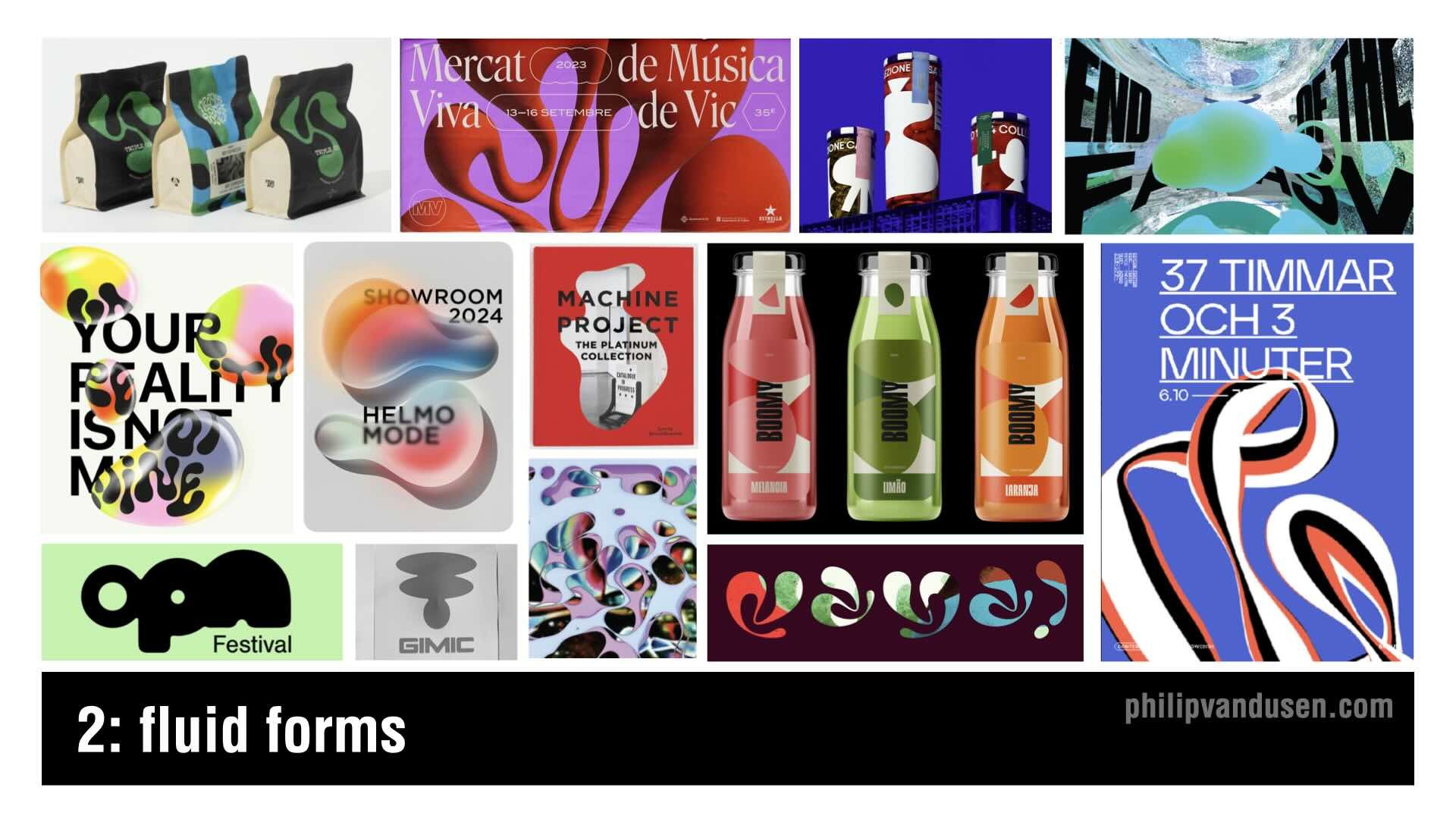
2. Fluid Forms
Forget sharp edges! —Design in 2025 is melting.
Fluid Forms embraces organic, flowing shapes that feel like liquid, morphing across layouts in a dynamic, unpredictable way. These undulating curves, soft reflections, and translucent overlays create a sense of movement and weightlessness that’s both futuristic and soothing.
I'm seeing this trend in motion design, posters and packaging, where more rigid grid layouts can benefit from an injection of natural, free-flowing elements.
These fluid visuals draw inspiration from water, smoke, and molten materials. The look pairs well with soft gradients, glass-like transparency, and light distortions, creating a hyper-modern - BUT also organic - aesthetic.
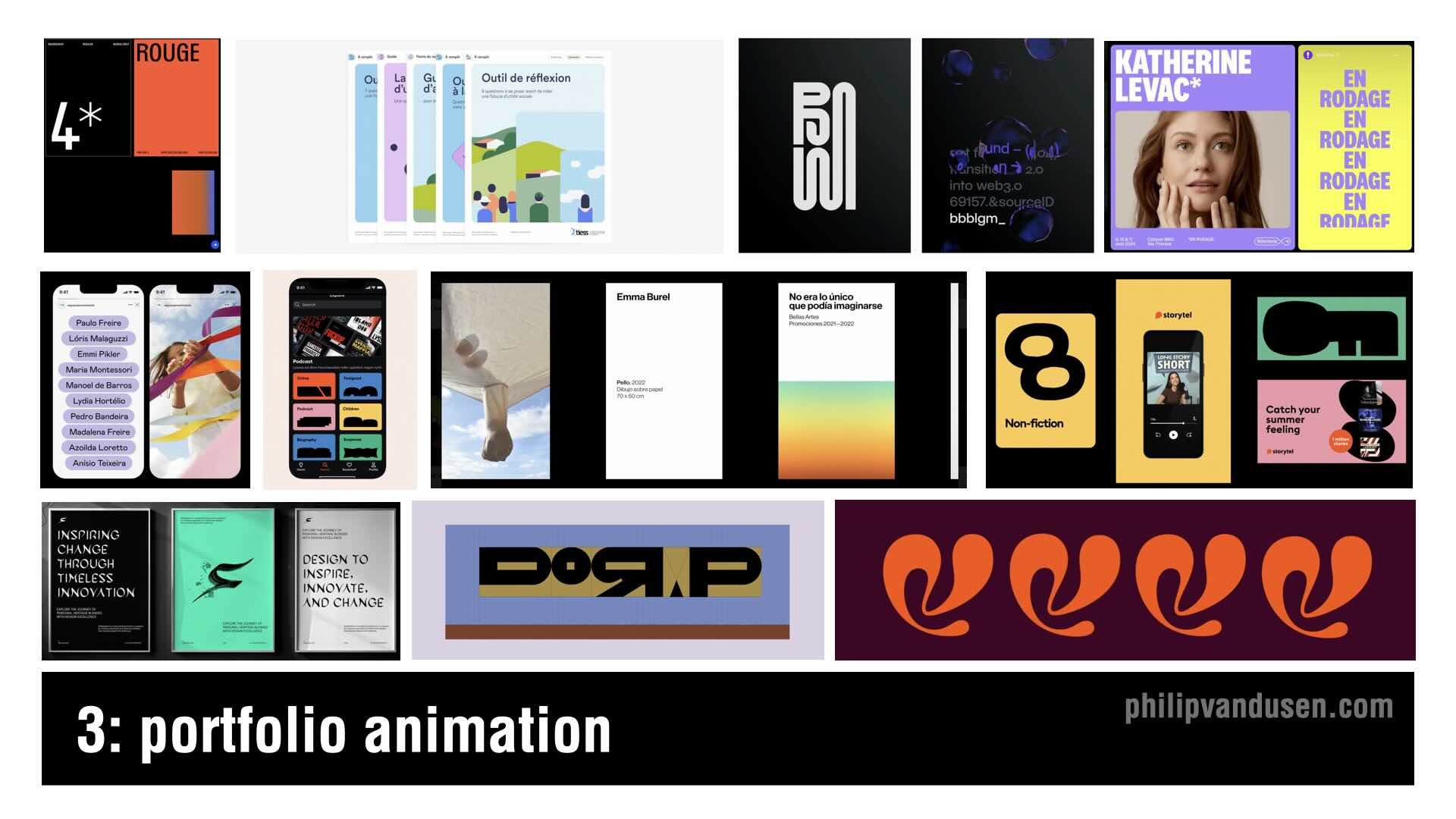
3. Portfolio Animation
This is not actually a 'design trend' per se, but more a trend in how creatives are displaying their designs. In 2025, Portfolio Animations are increasing and taking center stage. Designers are bringing static works to life with subtle, seamless motion effects. (*Note: Follow the YouTube video link at the end of this article to see these portfolio animations in motion)
This trend is all about using animation to enhance the storytelling of your project case studies. It's intended to guide the viewer’s experience, and create and entertaining and interactive experience—but without overwhelming the design itself.
I'm seeing things like micro-animations, hover effects, kinetic typography, and scrolling transitions to make portfolios feel more dynamic and engaging. When it's done right, these animations add depth, personality, and interactivity, helping you stand out in our crowded industry.
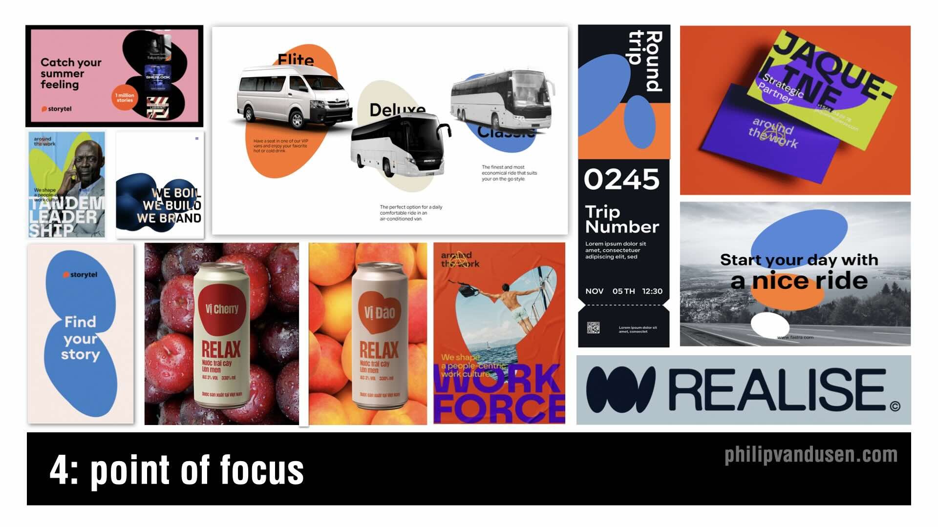
4. Point of Focus
Minimalist but intentional, Point of Focus is a trend that uses bold circular elements, dots, and targeted focal points to guide the viewer’s eye with precision. Whether it’s a central dot, irregular oval, or an image mask, this technique creates an extremely simple, but still powerful composition.
Circles have always been symbolic, timeless, and visually anchoring, which is why this trend is so striking. It draws inspiration from modernist poster design, Bauhaus minimalism, and editorial layouts, where strategic use of white space and carefully placed focal points are used to create high-impact communications.

5. Collage Couture
Collage is nothing new, but in 2025, it’s getting a high-fashion makeover.
Collage Couture blends photography, illustration, and typography into a layered, sophisticated, and curated aesthetic that feels avant-garde, and bold.
This trend takes inspiration from fashion "lookbooks", vintage magazine spreads, and Dadaist collage techniques, reworking them into a modern, visually dynamic approach.
This trend is thriving in branding, editorial, social media campaigns, and print design, where mixed-media compositions create complex layouts that are open to multiple interpretations.

6. Sketchbook
Designers are embracing imperfection with Sketchbook, a trend that celebrates raw, hand-drawn elements and the creative process itself. This aesthetic focuses on the textured, pencil-sketched, ink-brushed, and marker-lined feel that can make digital work look organic and personal.
The beauty of this trend is its spontaneity—loose line work, messy scribbles, and layered doodles create a sense of energy and authenticity. It’s a concerted reaction against overly polished, vector-perfect design.
We’re seeing this style in editorial design, apparel graphics, brand illustration styles, and motion graphics. Whether it’s paired with clean layouts for contrast or fully embraced in its rawest form, Sketchbook brings back hands-on creativity in an increasingly digital world.

7. Eco Minimalism
Eco Minimalism strips away excess, using simple typography, and organic shapes to create a natural, calming visual style. It merges the clarity of minimalism but with the less austere use of curvilinear shapes, balancing simplicity with authenticity.
This trend's thriving in packaging, print, website design, and environmental graphics, where brands want to emphasize eco-conscious values but in a non-cliche way.
The color palettes are not the usually expected muted greens and neutrals - but instead are bright and cheery, featured in clean, sparse layouts.
With consumers being more mindful of their choices these days, brands using Eco Minimalism can communicate transparency and sustainability, all wrapped up in a contemporary design aesthetic.

8. Geo Puzzle
Geometric design and grids have always been a cornerstone of modern aesthetics, but in 2025, it’s being deconstructed into modular, puzzle-like compositions.
Geo Puzzle takes familiar geometric shapes and assembles them into dynamic, almost checkerboard layouts.
This trend is particularly strong in event design, editorial layout, web design, UX and posters, where the interplay of bold color-blocking, and asymmetry creates a visually engaging, "structured-but-still-playful" feel.
The Bauhaus movement and Swiss design principles are heavy influences, but now designers are using bright, unexpected color pairings and fragmented layouts to give it a fresh, contemporary edge. Geo Puzzle is a great way for brands to feel modern, innovative, and adaptable while still maintaining a sense of structure and order.
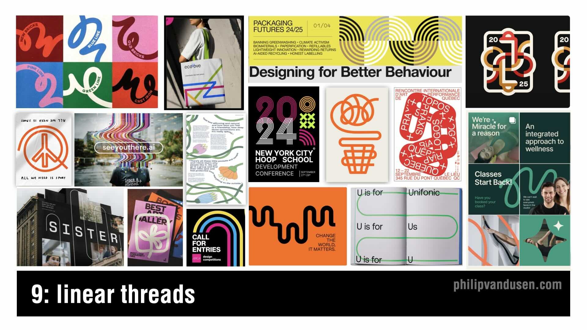
9. Linear Threads
The Linear Threads trend embraces continuous, flowing linework that's used to create intricate compositions that connect typography and design elements and lead the viewers eye through the work.
Inspired by technical contour drawing and playful linear vector sketches, Linear Threads works well in corporate communications, advertising, packaging, and interactive graphics. The linear elements often are monochrome or duo-tone, allowing the intricacy of the line work to stand out without overpowering the design.
What makes this trend so versatile is its ability to feel both organic and structured—it can be soft and expressive - or precise and engineered - but still always offering a sense of interconnectedness.

10. Photo Obscura
Photo Obscura—is a trend that plays with fragmentation, transparency, and selective reveals. Images are being masked, blurred, distorted, and cut into geometric or abstract shapes to create layered, intriguing compositions.
This trend shows up in editorial layouts, album covers, interactive web design, and advertising, where obscured imagery draws the viewer in and adds a sense of mystery and abstraction.
It can help designers create unexpected visual narratives. By selectively hiding and revealing parts of an image, Photo Obscura plays with perception and storytelling.
This technique has been used in fine art and avant-garde photography for decades, but in 2025, it’s taking center stage in commercial design—where the visual mystery is key to capturing audiences attention for just long enough to stop the thumb scrolling.

11. Chromatic Simplicity
Color is one of the most powerful design tools, and Chromatic Simplicity proves that less can be more. This trend embraces monochromatic and duotone palettes, reducing designs to one or two bold hues for maximum visual impact. The result is clean, modern, and undeniably striking.
Historically, this trend traces back to early printmaking and poster design, where limited ink colors led to high-contrast, statement-making visuals. Often used in isolated photographs in the past, this style is now found in entire compositions.
By stripping away color complexity, it makes layouts feel bold and intentional.
This trend is showing up in social media, editorial layouts, print communications and packaging - among others. Whether soft and understated or loud and high-energy, Chromatic Simplicity allows color to do all the heavy lifting.

12. Typography Alchemy
This trend celebrates typography as an art form by breaking all the rules. This trend mixes regular and italic, extra bold and thin, serif and sans-serif, stretched and compressed—creating a dynamic, expressive typographic style.
This design technique is bold, irreverent, and unpredictable, pulling inspiration from Dadaist collage, Deconstructivism, and experimental 'zine culture. It’s showing up in poster design, album covers, fashion branding, and social media graphics.
We’ve seen typography mash-ups before, but in 2025, these combinations feel even more kinetic. Typography Alchemy makes type more than just a tool for communication—it turns it into the main visual element, demanding attention and helping you push creative boundaries.

13. Media Matters
As digital aesthetics continue to dominate, designers are rediscovering the tactile beauty of physical-media-inspired design. Media Matters uses paints and inks to add a handcrafted, imperfect quality to digital work.
This trend is emerging in illustration, editorial, posters and book covers, where designers are using analog textures to create warmth and authenticity. It’s a direct reaction to overly polished, hyper-clean design, bringing a human, crafted touch back into the mix.
Even in digital spaces, I'm seeing designers use hand-drawn elements and distressed textures to mimic the richness of real-world media. In a time where everything feels so mass-produced, Media Matters reminds us of how much power there still is in texture, depth, and physicality in design.

14. Hyper Bubble
Typography is getting bigger, softer, and bolder with the Hyper Bubble trend.
Inspired by inflated, air-filled, and balloon-like letters, this aesthetic makes type feel playful, exaggerated, and tactile.
This look first surfaced in the Y2K era, but in 2025, it’s evolved with 3D rendering, glossy highlights, and hand-drawn puffy typefaces that add an extra dose of nostalgia. Brands are using Hyper Bubble in fashion, packaging, and social media design to stand out in a fun, energetic way.
We’re also seeing designers push the boundaries with animated type, interactive typography, and ultra-exaggerated proportions. Whether glossy and volumetric or flat, matte and cartoonish, Hyper Bubble brings a sense of fun to typography again.
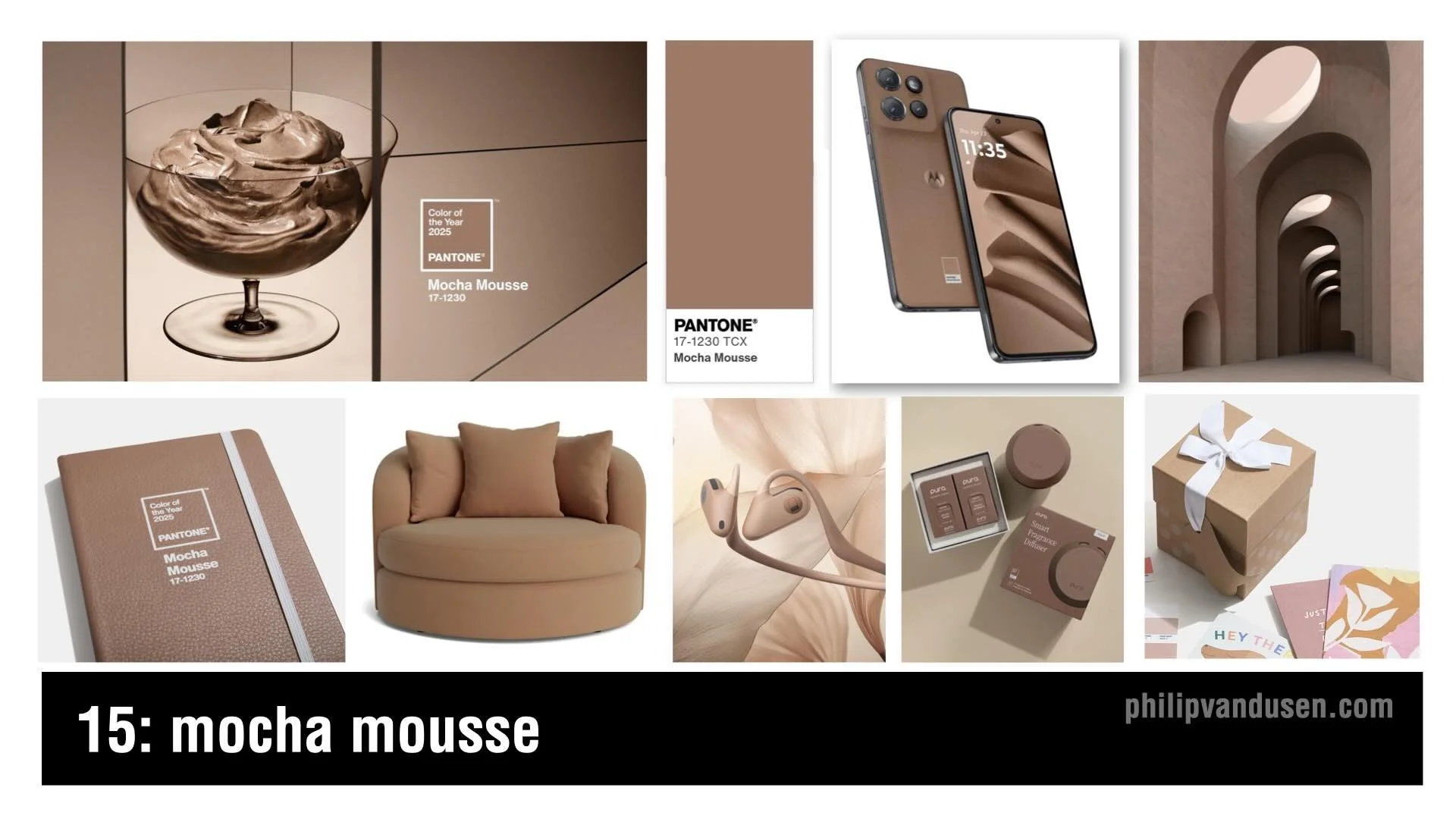
15. Mocha Mousse
Pantone's color of the year is called Mocha Mousse.
This color theme embraces creamy browns, velvety taupes, light caramel hues, moving away from cold neutrals and grays in favor of earthy, inviting tones.
This color is intended to evoke a sense of calm in a turbulent world, offering stability, nostalgia, and sophistication. This makes it ideal for luxury branding, coffee packaging, accessories, editorial design, and home decor.
Mocha Mousse pairs well with pastels, warm golds, and muted oranges, to create a refined palette that feels natural and timeless.
The combination of minimalism and warmth makes Mocha Mousse a go-to choice for brands that want to feel premium, sustainable, and fashionable.
Conclusion
Whether you embrace these trends or push against them, staying aware of where design is headed keeps you sharp and ahead of the curve.
Which of these trends excites you the most? Let me know in the comments.
Watch the full "15 Trends in Graphic Design for 2025" YouTube video HERE.
