14 Trends in Graphic Design for 2021
I want to share with you 14 trends that I've seen in graphic design moving into 2021 that are exhibiting themselves in the marketplace.
The thing you want to remember about trends is that trends aren't seeing into the future, they're not some sort of crystal ball. They are movements in design that have gained enough traction and enough usage to actually be recognized as something that is “trending”.
Trends aren't always brand new, in fact, very little has never been done before. I recommend you use trends to stay inspired, take them and make them your own. Take them to a different place in your creative work, or you can consciously react completely against them if that's what you choose to do. But knowing what is trending is critical either way.
#1: A.I. Design
Everything you're going to see on this slide was actually designed by a computer. This is machine learning. This is artificial intelligence designed, created by computers. Now it's not great design, but it's important because even though it's clunky and it's primitive, so was Microsoft Paint back in the day, so were the first Macintosh's right. It will only get better. It will only get more sophisticated over time. Yes, these look kind of surreal and deconstructivist, but they are something that you have to pay attention to.
#2 Electric Fade
Electric Fade has been around for a while, but it just keeps getting deeper. Electric Fade is characterized by electric turquoise and cyans and purples and magentas, being used in curvilinear blends. It's being used in tech and in sportswear and in print and in environments, it's even being used in political ads. Two of the graphics on the right side of this slide are from the Biden-Harris campaign. It used to be really cutting edge, but now in many ways it's going much more mainstream. This is a classic definition of a trend. It is something that's been around for a little while and gaining momentum and used to be a little low on guard, but now it's definitely getting mass usage.
#3 Environ-mental
This is topography that's being used in physical environments. It's used in wayfinding and interior design, art installations, retail stores, and museum display. These are single letters or blocks of text or numbers that are much like a trend that's going to come later in this presentation called singularity. It's stacked topography, it's often in all caps. Often it's wrapping around three-dimensional objects or surfaces or around corners. And it uses elements of force perspective, that's optical illusions that are making elements feel closer or farther away than they are now.
#4 Figure isolation
These are human figures where the background has been removed and they've been placed on open, airy, or blank environments. This creates a juxtaposition between the 3D of the figure and the flatness of the design element's colors and texts that surround them. There are graphic elements, texts, shapes wrapping around through and over the figures. This gives it the design of focal point or an anchor to these more abstract elements. The figure kind of grounds in the abstract composition in reality, and it gives the eye a place to rest and orient itself in terms of the picture plane.
#5 Redline
Red line is characterized by red, black, and white compositions. Red, black, and white are one of the most striking color combinations. It's an emotional spectrum. Color red is angry and powerful environment. In fact, when psychiatric patients are given colors to work with in art therapy, red and black always run out first. This color combination is often used with black and white photography, and it shows up in outdoor advertising, active wear apparel, print, packaging, transportation, and even retail. There's almost no way to go wrong with black, white, and red.
#6 Sliver of Light
Sliver of light isn't as much of a trend as it is a graphic technique to draw the eye into a composition. It's mainly used in illustration and text layouts where the illustration is the primary storytelling device. It's characterized by a Ray of light that acts as a visual pathway to pull the eye into the composition. It's often used with a human figure as the focal point of that light. It's used in things like movie posters and book covers and editorial illustration, and it really creates an intense sense of drama and mystery in the composition.
#7 Architext
This trend is characterized by text blocks that are used as the main design elements. They're used as whimsical shapes, circles, curves, asymmetrical building blocks. These can be paired with photography and illustration, but generally text is the primary focus. Headlines and subheads can sometimes be put at right angles to each other. In this trend, the legibility or the ability to navigate the reading order of these paragraphs is of very little importance. This trend is arty, it's pretentious, and in it topography becomes the main design element in and of itself.
#8 Decontextualize
This trend is characterized by topography in a state of mid destruction. It's traditional elements of designs, topography, graphics, photos, shapes, and elements that are put into a kind of a visual blender. The result is abstract design, design for design's sake. It's used in design publications, in the music industry, in print and magazine work, and in event announcement posters. It's reminiscent of David Carson and Raygun magazine. It breaks all of the rules of design, graphic design that skirts the edges of fine art. Communication in this trend is of very little importance at all.
#9 Bright Geo
This trend is very similar to the Geo Max trend of last year, except the difference lies in the icon and the block shapes. It's characterized by Tetris-like building block shapes that are bisected and quartered circles, simple color palettes of reds, blues, oranges, and greens, also muted tones of gray, and they're all grounded in black or dark navy. Bright Geo is used in brand ID systems and web icons and editorial. It's even used in Google's G Suite icons. It's usually used in flat color compositions only, but it can be used in combination with photography and natural textural elements.
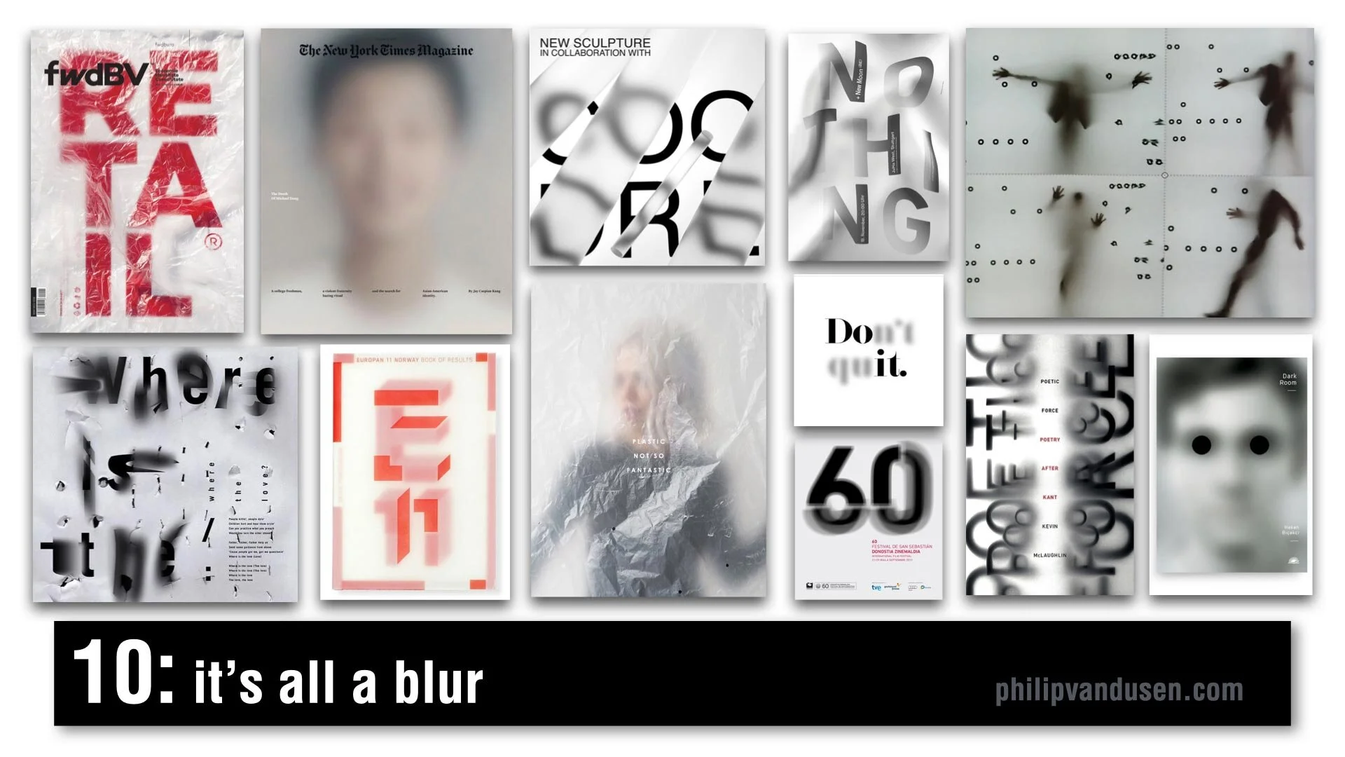
#10 It's All a Blur
One of my favorite trends for 2021, It's All a Blur is a very popular trend and it's characterized by kind of an overlaid scrim of plastic or Mylar or just elements that are plain out of focus. We're seeing it everywhere, it's in video media, in animation, in signage, in editorial, in print. It's being used with figurative elements, typography, numerals, photography, and it creates a depth, a sense of mystery. It sparks curiosity and creates a level of visual movement that brings a real level of interest to a flat graphic picture plane.
#11 Chiseled Type
Chiseled Type is retro typography that's really historically anchored in the sign painting industry. It's a subset of the Sign Painters trend from my 2020 Graphic Design Trend video on YouTube. It's been adopted by art, graffiti, street culture, tattoo culture, and modern sign painters. This trend is characterized by fonts that are crafted to look 3D, as if they were carved out of or into stone or wood. Type designers have really adopted this style and are putting really interesting new twists on it. Single letter forms take on a monolithic life of their own and really become sculptures in their own right.
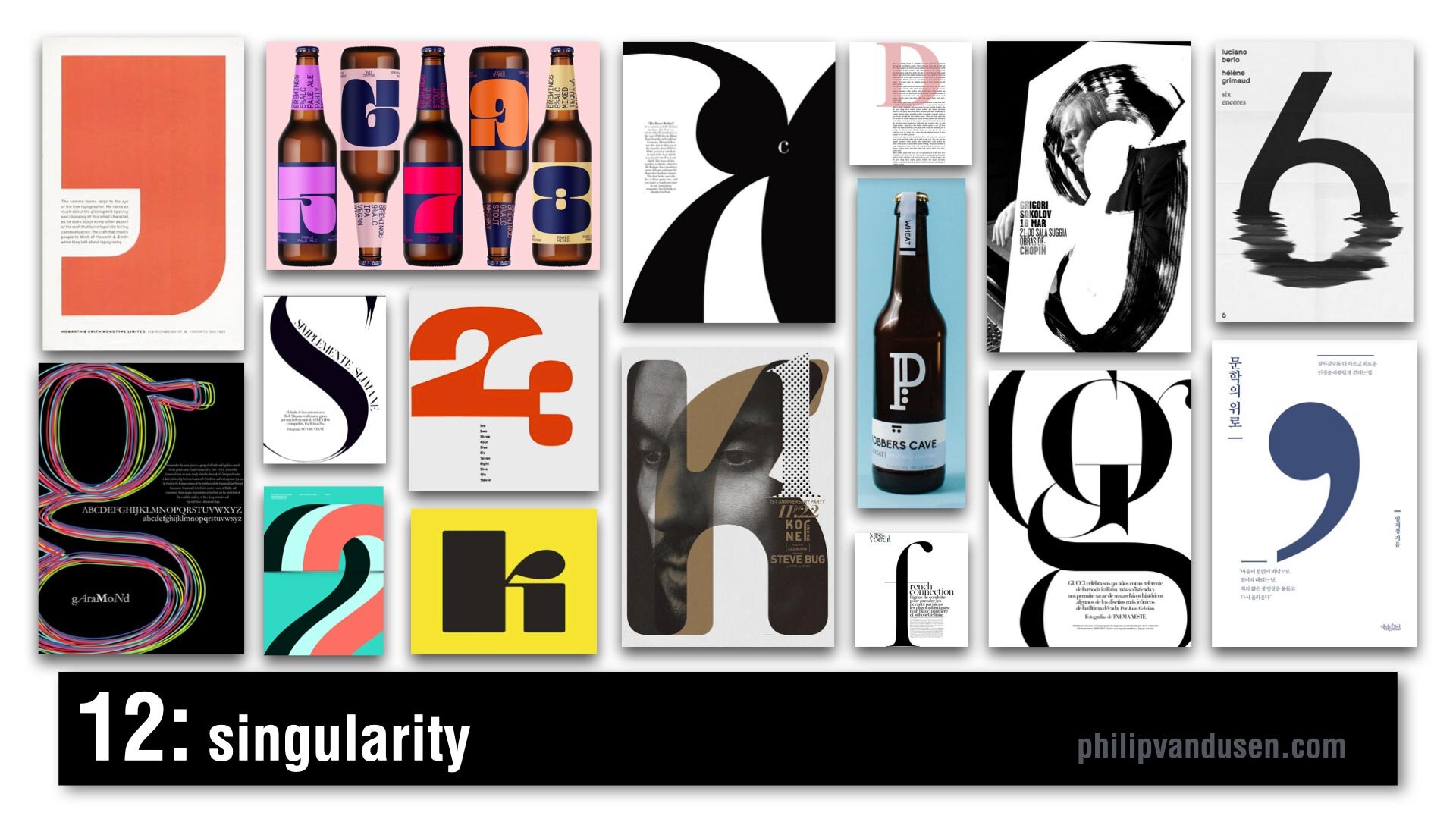
#12 Singularity
Singularity is characterized by composition that uses a single letter or number or a symbol as the main abstract anchor of the composition. It's a celebration of the abstract beauty of a single letter or number and its forms and shapes. It's often dramatically cropped and often used as an abstract element to wrap text around or intertwined with other forms, or it can be treated texturally in brushstrokes or in patterns. It's being used everywhere from editorial print to packaging, to illustration, and promotional posters.
#13 Wavy Gravy
Wavy Gravy is an offshoot of a trend from my 2019 Graphic Design Trend video on YouTube that I called Warp Speed. In this trend, topography is warped to create a wave shape. Sometimes they're regular waves, like an optical illusion to impede legibility of the text. Sometimes it's visually faithful to the text, but it's printed like it's on a waving fabric, like a flag or a banner. It's often used in black and white, but not exclusively. It's used mainly in print, and animation, and posters.
#14 Bee Yellow
Pantone announced its Colors for 2021. The colors are Illuminating Yellow and Ultimate Gray. This is not a graphic design trend in and of itself, it's really more like a dominant color story trend of yellow, black, white, and an injection of gray. I feel it's a psychological reaction against the difficult year that we've had in 2020 with the political upheaval and the Covid-19 pandemic, all of our financial struggles and the negativity overall in the world. It's kind of forecasting or encouraging a brighter outlook for 2021 and it's already being heavily adopted and used everywhere. It's showing up in product design and web design, sports apparel, editorial, print, the financial industry, promotional marketing, travel, and even entertainment.
How Can We Help Your Business Succeed?
Is your brand rockin' like nobody elses? Or is it a little tired? Maybe it's just being born. You want to do it right. That's where we come in.
We create new brands from scratch. We fix broken ones. We have all the brainpower, creative chops and marketing magic you’ll ever need and a ton of loyal clients to prove it.
You want nimble? We're the new agency paradigm. We scale up and down depending on your needs so you never pay for resources you aren’t using.
We’ll put the power of brand strategy, design and the most contemporary marketing techniques to work for you. Let’s talk.


