
14 Trends in Graphic Design for 2020
Let’s look at some trends for 2020.
But first let’s set some ground rules.
Trends are to be defined as movements in design that have gained wide enough usage that they can actually be recognized as a "trend". They're not necessarily always brand new or the newest thing out there. In fact, very little has never been done before. Some styles go back decades, some go back hundreds of years, but styles are always morphing, they're always being revisited. There's always new "takes" on them, new variations on them. So graphic designers, I encourage you to be inspired by these trends, not necessarily to copy them directly. It's important that you know what they are because you can choose to be inspired by them or you can choose to consciously react against them.
Or if you choose, you can completely ignore them and focus on your own vision or your own ideas. But knowing what they are is critical. And for entrepreneurs and small business people, being aware of trends is assuring that your brand stays contemporary, it stays relevant and that's important to brand perception.
And with that, let's jump right into it and look at some trends.
#1 Betamax
Betamax is to be recognized by rainbow ribbons of color. It references late seventies early eighties video cassette boxes and California surf apparel like the Ocean Pacific brand. It's clean, it's bright, it's has a level of positivity to it and also is reminiscent of Morris Louis, the 1950s American abstract painter who painted color field paintings. It also has references to sixties and seventies home furnishings, a really fun, bright and interesting trend.

#2 1890's Ornate
This trend is to be recognized by deeply detailed, ornate type, borders, frames, ornaments, fluid flourishes of shapes, gilding and gold leafing. The kind of thing that you'd see in pubs and bars and the windows of restaurants. It was revived by Stranger and Stranger, a packaging design firm that's done a whole lot of work in the spirits category and it was also been revived and seen a lot in tattoo culture. It's a reaction against minimalist design. In itself, it's kind of "maximalism". It's linked to the resurgence of premium handcrafted products, craftsmanship, leather goods, IPA beers, woodworking. It's a high-touch, high-attention to detail design style. It's seen also in chalkboard culture where it's like a dichotomy of ideas: super labor-intensive work versus the impermanence of a chalkboard.

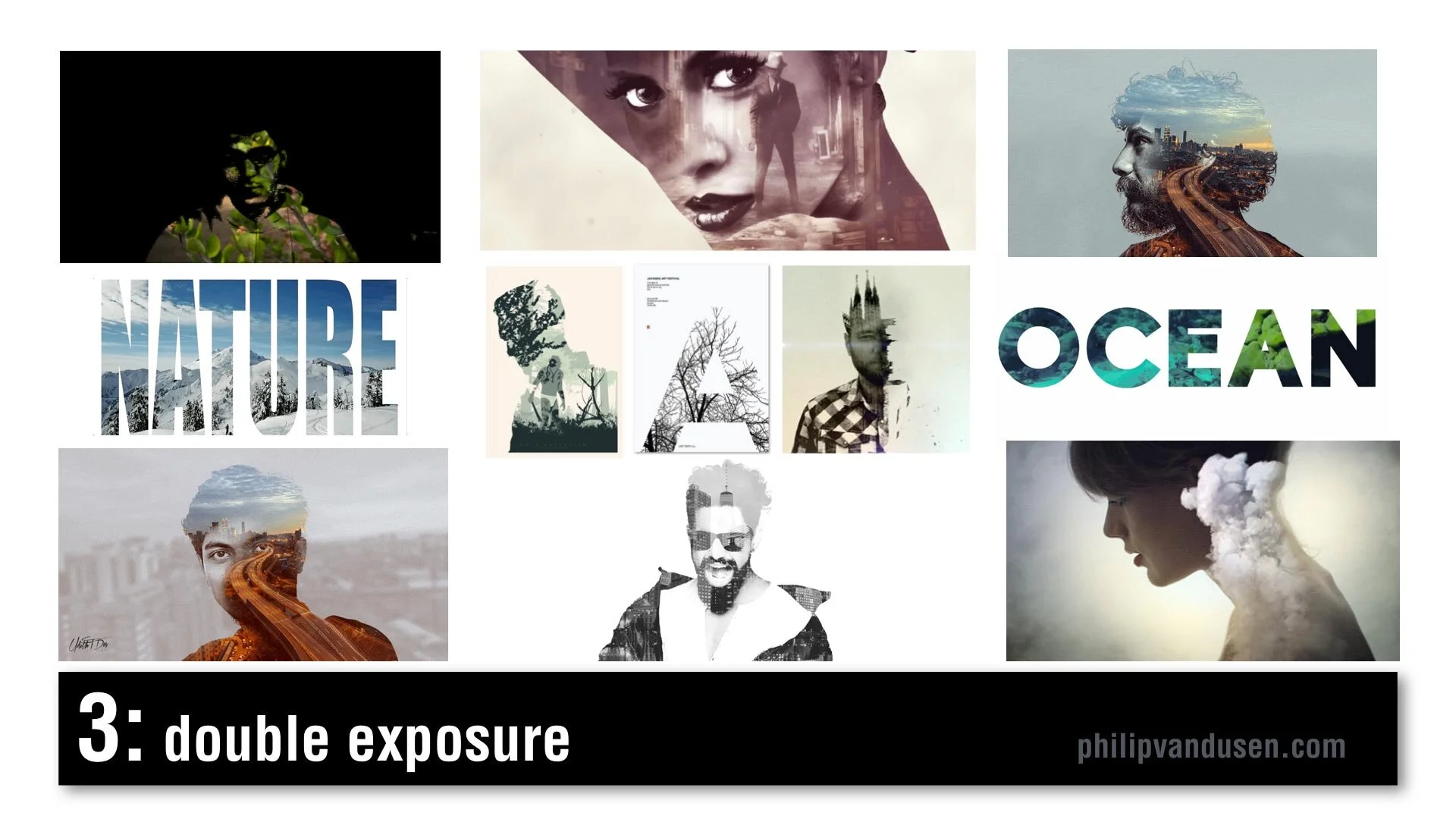
#3 Double Exposure
Double Exposure is seen frequently in motion design. It's recognized by combining imagery: using imagery as masks, masking imagery with imagery. It creates feelings of mystery and romanticism and poeticism. It's used in video and motion, but it's also used in static design. Typography can also be used in masking video. There's increased usage of this style because design applications have made it simpler and easier to produce this effect and it was popularized a few years ago in an HBO special called True Detective in that series trailer.
#4 Electric Gradient
This can be recognized by hyper bright, high-chroma illuminated gradients of color, multiple smooth gradients overtaking the entire image area. It's a reaction against material design and flatness and simplicity. It's being used in illustration and design layout, framing, and typographic treatments. It can be used as a major idea or just as a small element in a larger design. In brand identity, there's a resurgence of complexity and the use of gradients. Historically, gradients had been very hard to produce in print, in physical print, but now that everything is digital, there are no barriers to using gradients. Nothing is holding us back from using them anymore.

#5 Fruitopia
Fruitopia is recognized by fruit being a major visual design element. Fruit being used as a symbolic reference to something else. It can be a great vehicle to leverage color and shape and a design can be linked to a product or just as humor. Fruit is fun. It's sensual. Taste is a key physical sense. It can be used as a complex design tool, as it operates on multiple levels, visual, color, with psychological links to taste memory. It adds a level of humor and whimsy to a design or layout.

#6 Paper Cut
Paper Cut is recognized by hand cut paper or torn paper using realistic shadows to create physical 3D space. Again, it leverages that handcrafted trend, a level of high-touch labor-intensiveness. Again, this is an act of physical creation. It's being used everywhere, in books and posters and illustration and typography. It can be used as abstract shapes or realistic depictions of something sculptural but made out of paper. It can be clean cut or it can have torn edges. It's a very, very versatile trend. It commands a longer and a second look due to its complexity. It's an intention grabber.

#7 Sign Painter
Sign Painter can be recognized by vintage sign painter fonts and hand-brushed hand stroked letter forms, cursives paired with sans-serif block letters. Again, it's a reaction against clean modernism and computer generated design. It embraces the handcrafted design traditions brought into a modern context. This sort of sign painter design requires skill and training because not just anyone can do it and in a way it gives homage and reference to a simpler time when design was not commoditized or computerized.

#8 Geo Max
Geo Max is recognized by super clean, simple geometric abstract shapes, tubes, circles, bright colors. It's a continuation of Neo Geo, a trend from 2019, but it's even simpler. It references Peter Max's illustrations from the 1970s or yellow submarine, the Beatles cartoon movie done by artist Heinz Edelman, who was considered to be the German Peter Max. It's emotionally fun. It's modernistic, it's clean. You can use abstract figures and human forms that have been radically simplified. It appears in posters and food packaging and web design. Some of these images are from the Bloomberg financial report, which shows that even some super conservative companies are using it.

#9 Tactile Type
Tactile Type is recognized by using unusual materials to create typographic designs. Things like cocoa and cheese and plastic tubes, rolled paper, toast, even rusted hardware. Again, it's more of that high-touch, handcrafted time intensive design. Again, a reaction against computer generated design. It commands attention. It's visually complex. It's visually intense. It's used on book covers and posters and editorial illustration, events and promotions. It bridges the gap between sculpture and design.

#10 Stacked & Packed
Stacked & Packed is to be recognized by all type layouts, jigsawed arrangements of typography, interlocking shapes. It can be hand drawn or it can be computer aided design. There's a long thread of historical design references here from vaudeville posters to music posters to boxing match promotional design of the early 20th century. It's used in motivational posters and greeting cards, fine art editorial illustration. Again, this is high-touch, high-concept, time-intensive to create, which seems to be a recurring theme for 2020.

#11 Isometronic
Isometronic is a mashup of the words isometric and animatronic. Isometric projection is a method of visually representing three dimensional objects in two dimensions in technical or engineering drawings. It first made its appearance in gaming apps from the 1980's QBert, Marble Madness, Sega's Zaxxon. It's recognized by non-vanishing point illustration. It's been popularized in mobile phone gaming apps, adventure apps, strategy, building apps. It's not particularly new, but the moving GIF animated versions of isometrics are trending. They're used in websites and email newsletters and digital editorial illustration. They're being used heavily in business categories and business categories are historically slow to take up trends.

#12 Essentialism
Essentialism is another mashup of existentialism and essentials. It's recognized by hyper minimalistic black and whites sans-serif type in broken layouts with truncated letter forms, creative cropping, creating abstract shapes. It's being used in pharma and beauty and health and beauty aid categories. It's also being used in books and in literature and in poster design. It's the exact opposite of handcrafted. It's cold, it's distant, it's non humanistic. It feels computer generated.

#13 Bad Flyer
Bad Flyer is characterized by what looks like a colored paper Xerox with distressed type textures, haphazard collage layout, unusual amateurish font pairing choices. The history comes from band posters and rock 'zine culture and has roots in Ray Gun magazine and David Carson. It's been used in club and music posters, editorial layout, new 'zine culture, design magazines and educated design resources like the AIGA. It's fun, it's inventive, it's gutsy, it feels anti-design establishment. It's kind of the "bad is good" design aesthetic concept. It's handcrafted design but with basic tools, things like colored paper and scissors and glue and a bad Xerox machine.

#14 Throwback Pixels
Throwback Pixels is characterized by bright garish, high chroma color, heavily pixelated, like bad computer painting app, like MacPaint or MS Paint back in the day. It's like a computerized version of the bad flyer trend. It's visually violent, in a way it almost hurts the eyes. Abstract collages of random images and random shapes and random cropping. It's eye catching and it's attention grabbing. Again, it's this "bad is good" design culture. It's computer generated to the extreme in patterns and in texture. It's being used in design magazines and editorial illustration and that image in the lower left is actually from the New York Times special section on streaming, so even news outlets are using it.

After last year's video, people kept asking me, "Philip, how do I create the things that are in this video?"
Well, let me introduce you to Daniel Scott of Bring Your Own Laptop.
I met Daniel when he was a guest on my Brand•Muse interview series on YouTube. Dan's a certified Adobe trainer and a regular speaker at the Adobe Max conference and he has some of the best video training programs out there to learn design applications like Photoshop and Illustrator and InDesign. And if you use my affiliate link you can support my work here on YouTube and I'd really appreciate it. I get a small percentage for sending you to his site. He works on a subscription basis, a very low subscription fee and I tell you it's absolutely worth it. He has incredible training programs.
