

Design Rush Features Verhaal in Best Beauty Product Packaging Designs for 2023
The popular design website DesignRush is honoring the work of Verhaal Brand Design by featuring the brand identity and packaging design work we did for Marie Bertrand, Founder of SkinScience in launching the private label line of products, Aliquote Skin.
We’re proud of the work we did in developing the Aliquote Skin line and are happy to be receiving the recognition of our branding and packaging expertise.
You can access DesignRush’s feature of our work by visiting this page..
Here is just a sample of our Aliquote Skin work. You can view the full case study here.


Ground Control, to Major Brand
Avoiding branding failures: lesson from a rocket launch.
Last month in the town of Port Isabel, Texas they had a bit of a problem.
SpaceX had just test launched Starship Rocket, with the most powerful engine they’d built to date.
SpaceX expected the event to go down in history.
It did.
But not for the reason they were hoping it would.
The rockets engines ignited and a massive cloud of debris and thousands of basketball sized chunks of concrete were blown in all directions.
One of the chunks damaged the rocket causing it to explode moments after lift-off.
The good news is the rocket was unmanned.
The bad news was that for nearby Port Isabel it meant being blanketed in a gritty layer of sand, dirt and concrete.
It all happened because SpaceX, in its rush to launch, had not engineered the launch pad with a trench system to divert the rocket’s energy away from directly impacting the ground.
Months before, NASA had told SpaceX that their launch pad design could mean disaster.
But SpaceX ignored them.
So the launch pad got blown to smithereens destroying the rocket, and leaving Port Isabel buried under the remains of SpaceX’s crater of failure.
In my agency work, I’ve seen a number of brand launches follow a similar story line.
The client (SpaceX) is in a rush. The branding agency (NASA) recommends a proven approach. The client ignores it.
The launchpad (the brand) gets pulverized and the customer target (Port Isabel) gets covered in a lot of crud.
You usually refrain from telling your clients outright that ignoring your branding recommendations could mean disaster.
You might not tell them you’re the rocket scientist in your role as launch partner.
But when it comes down to it, you are.
And it’s your job to act like it.
Advocate for what’s right to create a successful launch.
And if you’re ignored, it might be a good idea to take a few steps back.
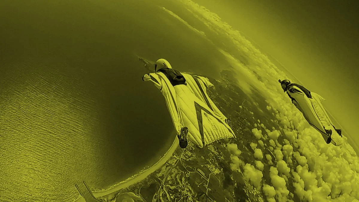
Put On Your Squirrel Suit
Have you ever seen those people who jump off cliffs in squirrel suits?
Have you ever seen those people who jump off cliffs in squirrel suits?
A squirrel suit (or ‘wingsuit’ as Wikipedia calls them) is basically a big onesie that has fabric panels sewn between the legs and between the arms and torso.
When you jump off a cliff, if you hold your body just right, you can achieve a sort of gliding flight, as opposed to just, well…free falling.
The first guy to try using a squirrel suit was a 33 year-old Parisian tailor named Franz Reichelt, who in 1912 jumped off the Eiffel Tower to test his invention.
Witnesses say he stared over the edge for quite some time before jumping.
It didn’t end well for Franz, but that’s beside the point.
It got me wondering about these more modern day squirrel suit flying people.
My big question is: “How do you practice this?”
That is, before jumping off a cliff.
I’m sure there is some way. A wind tunnel, doing it with a parachute, maybe.
But the real answer is…
You don’t. One day you just jump.
Eventually you just have to decide that this is the day you’re going to jump off the cliff.
Joey Cofone, the author of “The Laws of Creativity” once said, “Jumping off cliffs is the only way to grow.”
I couldn’t agree more.
Additionally, I’d have to add this: It’s also the only way to find out if you can fly.
Just last week, Lauren Williams, a member of the Brand Design Masters Facebook group from Australia had been staring at the edge of her personal cliff and thinking about it for quite some time.
“…literally months.” Lauren told me.
She made the fortunate mistake of posting a comment in the group about her hesitation and fear of starting to post content.
I say “mistake” because of course, I seized upon it and challenged her to post something by the end of the day…ok, it was a little encouraging push closer to the edge.
But that’s my job, right?
I told her I was going to check up on her about it, too.
And guess what happened?
She put on her squirrel suit and did it. She jumped.
The most amazing thing about her first flight was that her first post was about…wait for it….being terrified about posting!
Honest, authentic, funny (I mean, come’on there’s a cat and a cucumber involved…) and IMHO totally brilliant for a first post.
If you’re curious about the cat and the cucumber, here’s the post. Maybe you can follow her to give her a little encouragement.
The other Facebook group members cheered and congratulated her for leaping.
And flying.
Today I went back on her Instagram profile and there’s a 2nd post up there now!
This time it’s a beautiful reel of her portfolio and her services. A higher cliff. A more ambitious flight.
So, if you’ve been anxious, procrastinating, and staring over the edge of your personal cliff for quite some time.
Don’t think about the jumping part.
Think about the flying part.
And put on your squirrel suit.

15 Trends in Graphic Design for 2023
I often get asked:
"Phil, how do you come up with these trends?"
As far as my trend hunting CV goes, I was VP of Graphic Design and Trend at Old Navy for 11 years and traveled the globe shopping for trend 3x a year, Paris, Tokyo, London, Milan, Berlin etc. I’ve worked with major trend houses like WGSN, Stylus, JWT and Pantone. Trend hunting was my job. Since those formative years, I've been a trend watcher for Fortune 100 clients in the agency world for another 15 - so now 26+ years in, it's kind-of in my blood.
Lots of people get all bent out of shape that they have seen these before. That they feel "old". But what is a "trend" is not a crystal ball. Trends are really about the past - a style or technique that has gained frequent enough usage that it is recognizable as a 'movement' of sorts.
Some people expect trends to be the newest thing - but in reality they are currently POPULAR things - whether they have been around a short or (in some cases) a very long time.
The one thing I’ve learned is that trends are never limited to specific periods of time and are very fluid in how they appear. Trends are revisited, altered, revised - new perspectives are added - they disappear and then they come back over and over (particularly in the fashion industry) Russian Constructivism is 100 years old and it never really seems to go away. Some trends take a few years to grab hold and become recognizable as popular.
TLDR: The short answer is: I observe and collect.
I keep my eyes open for patterns of usage and gaining mass usage. Then I gather, collect images and at the end of the year I categorize them into themes and name them (like I did in my fashion industry days). The names aren't what the whole world is calling them. Often they haven't been 'named' yet by the wider design community or public - so I have to call them something.
I suggest you take a look, just keep yourself informed. You can choose to emulate or propagate these trends, OR you can consciously act/design against them.
It's up to you.
One way or the other I hope I've provided just a little fodder for inspiration in 2023.
Trend #1: Systematic
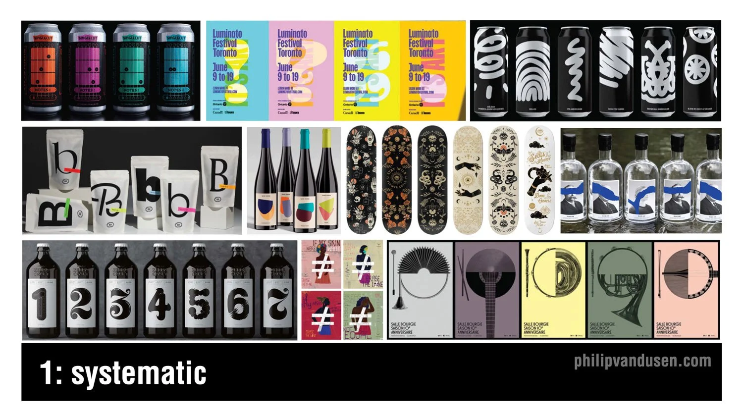
I don't know any designer who doesn't love working in series. Creating multiple variations on a design theme offers really unique challenges as well as exciting opportunities to expand on an idea in a really visually compelling way. Working in series or in systems are particularly well-suited to the food and beverage category as you can see here, but opportunities also exist in apparel, in hard goods, in posters, promotional materials among others. The idea is to maintain an aesthetic thread between the range of items through things like illustration or photography style, color, or typography while maintaining enough consistency for the system to hold together as a group.
Trend #2: Midjourney and AI
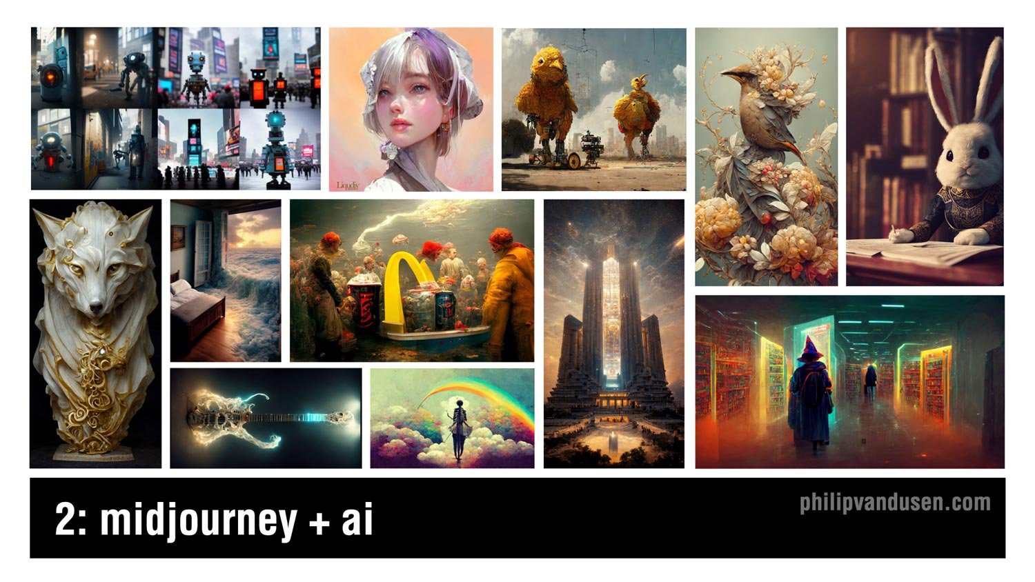
Artificial intelligence has been taking the design and the illustration worlds by storm this year, and it will certainly continue and expand as we move into 2023. Mid journey, the AI illustration tool has been garnering a ton of attention with the quality of work that it produces. Now, while it has deep strengths in imagery that's more fantastical or has a science fiction or a fantasy leaning to it, it can also create work that has fascinatingly inventive when it comes to static objects like the wolf statue on the left or the electric guitar just to the right of the wolf.
Trend #3: Collage

Collage has been around for decades and it finds its roots in Russian constructivism and the data movement at the beginning of the last century. With the invention of digital tools, it became incredibly easy to create collage, but what's harder is how to make it hold together aesthetically and thematically so that it serves the strategic communication required of the design that it's being used in. Collage can be surrealistic, but it can also be used to communicate complex topics in an inventive and multifaceted way, for example, the Netflix History 101 image on the center left or the Adobe Creative Cloud promotional image on the upper right or the Cougar Paper 50th anniversary promotional image on the upper left.
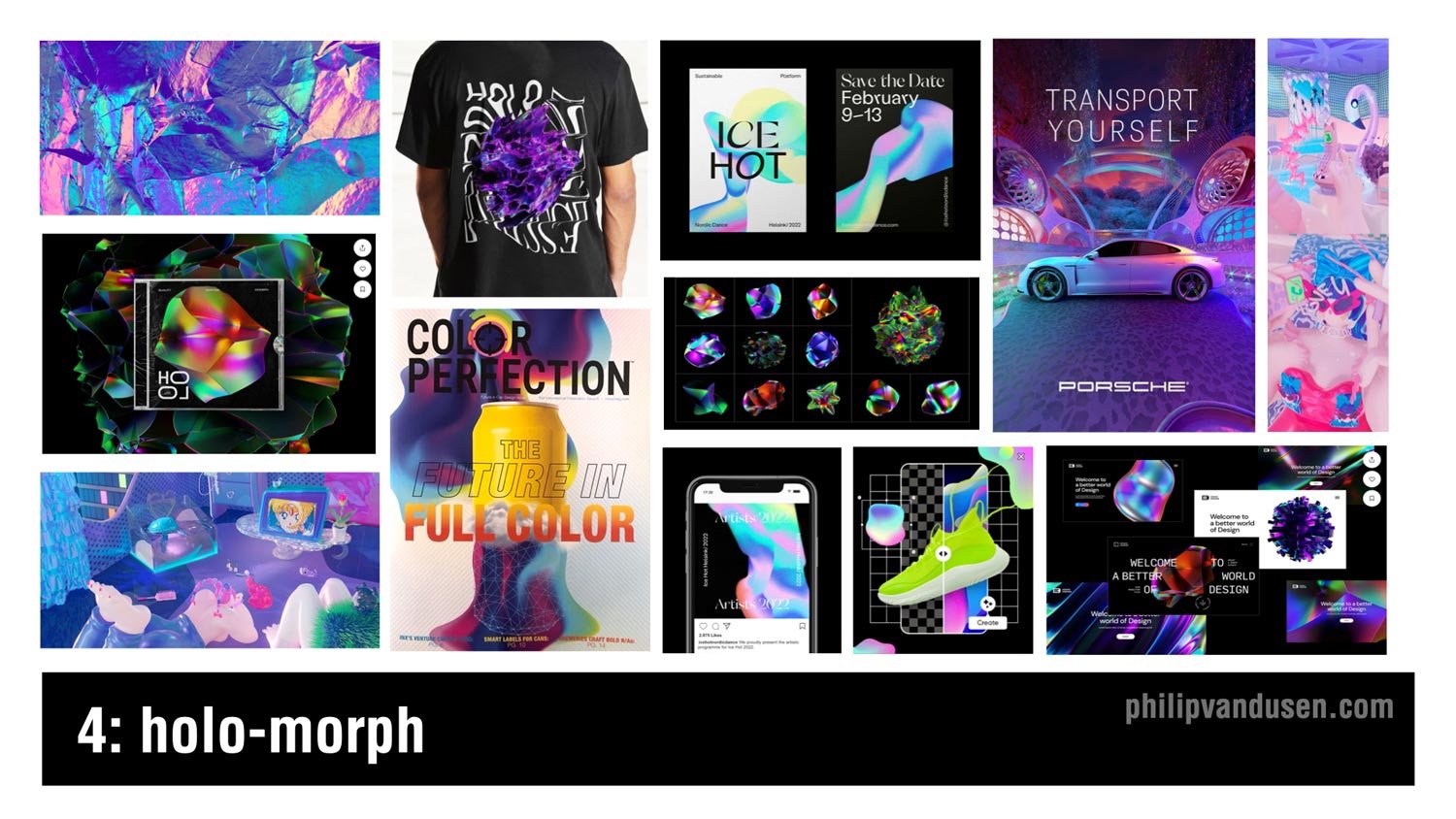
Trend #4: Holo-morph
Holographic imagery requires complex blends of iridescent electric colors rooted in cyan and magenta and green and turquoise. This design trend creates a sense of movement and ongoing evolution as something morphs into being. It communicates a futuristic and a high tech aesthetic that's being used in everything from app design to advertising, poster design, even apparel and packaging. The shapes use dare often amorphic, undulating on a dark ground to accentuate the electric glow of the color blends, and also advances in metallic printing techniques have made it easier to reproduce this look on physical materials and products, which is succeeding in keeping it in the trending category.
Trend #5: Military Inspired
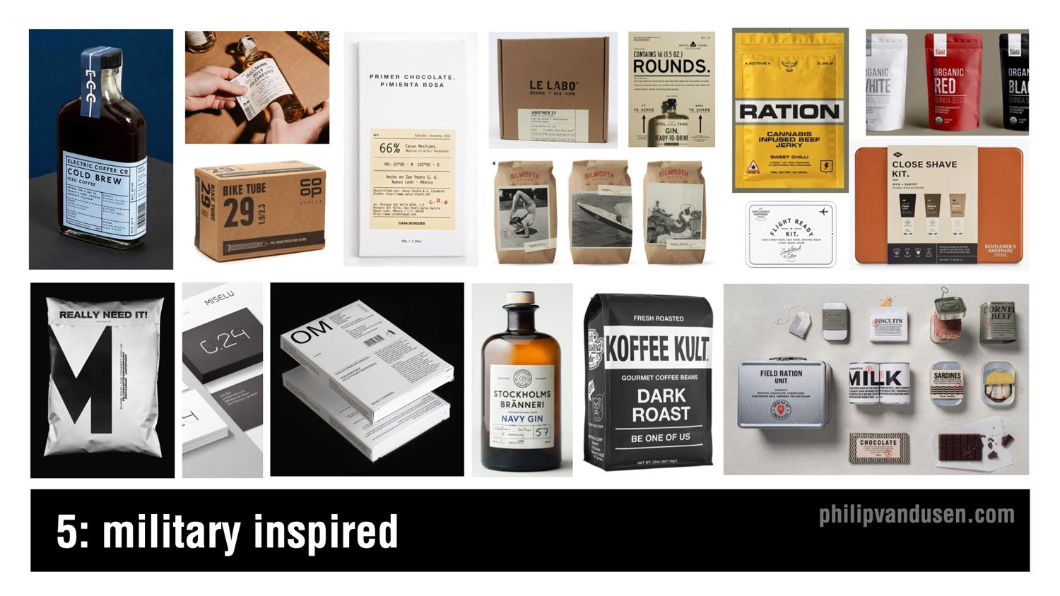
Trend number five is military inspired. Now, the design used in military materials and in generic utilitarian packaging has always held a special allure to designers. The simplicity of these typography driven layouts are made possible by the use of san sera fonts, simple linear dividing lines and strokes, abbreviations, numbers, and technical information. Imagery, photography or illustration are really rarely used and tended detract from the ability to achieve the aesthetic. White open space is really important to maintain as well as severely restricting the use of color and relying mainly on black and white to achieve the look. This design trend is being used heavily in the spirits and food and beverage category, but also in men's accessories and products because this design style has historically been really attractive to male consumers.
Trend #6: Dark Mode Typography

Probably the biggest trend in color in typography that we've been observing is a usage of white text on a black ground, particularly on websites and on mobile. Now historically, designers have been discouraged from using reversed text on black because it can be notoriously difficult to read, particularly if used in large blocks of copy. But as computer monitors have increased in resolution combined with the trend of having significantly less copy on websites, it's made this aesthetic practice more realistic to use. Also, dark mode has infiltrated the preference settings on a lot of computer operating systems as well as web browsers making this typography treatment increasingly acceptable. It also has the added benefit of creating a mysterious and dramatic mood in the designs that it's used on, as well as carrying the perception of premium that people instinctually associate with black and dark rich colors.
Trend #7: Neu-Brutalism

Brutalism refers to the brutalist architecture movement in Western Europe that lasted between the 1950s to the 1970s. It featured raw concrete and was really devoid of paint or decoration. In graphic design, it has roots in the earliest web designs when the internet was only basic HTML and decoration was often clunky and ugly. What I call neu-brutalism vacillates between the unadorned black and white simplicity of the early internet, like the Soft Pillows webpage on the upper left to the intentionally ugly, crowded, and often glitchy functionality of early websites as in the California College of the Arts Career Expo catalog in the upper right. The neu-brutalist design aesthetic is unapologetically aggressive and visually striking, and it's surprising in its simplicity. It's great for use in digital media and apps and websites when you want to stand out from the pack.
Trend #8: 70s Typography

Increasingly, fun is returning to typography and graphic design. More and more designers are using vintage '70s style fonts and type treatments in their design work. We're seeing it in print and packaging and mobile apps, marketing, and even animations. The fonts being used can be bubble like balloon fonts or bold, rounded sera fonts once popular in the golden age of magazine advertising, or they can be trippy swoopy sera fonts that feel simultaneously liquid and psychedelic, ala the '70s illustrator Peter Max.
Trend #9: Lensa-tion

Well, unless you've been living under a rock, you've probably heard about Lensa in recent weeks. Lensa is a design AI app that digests 10 or so pictures of you and then spits out remarkably polished, and in some cases totally gorgeous illustrative portraits of you. It's amazingly fun to play with, and I expect to see this kind of illustration showing up everywhere in personal brand websites, the music industry, entertainment, and of course social media profiles.
Trend #10: Geo-simplicity

The simplicity of basic geometry is the mama that the design community always runs home to when things get too crazy with technology and visual complexity in the design industry. That's what's happening now with geo-simplicity, rooted in the use of bright, often primary colors, super simple geometric shapes of circles, squares, hexagons, and rounded cornered rectangles. This trend has been gaining steam over the last couple years, and as popular culture and society becomes more complex and difficult to navigate, we welcome the simplicity and the cleanliness and the restfulness of this design style. Geo-simplicity is being used in everything from an environmental design and wayfinding to print, packaging, food and beverage, spirits, you name it.
Trend #11: Cyber Wave

Cyber Wave is simultaneously an illustration style and also a design layout style. The combination of heavily manipulated and colorized imagery, photography or illustrations combined with high tech fonts, digital interface and control panel design elements. With nods to techno punk and steampunk and game character design, this trend is heavily used in the music industry, particularly in the Asia-Pacific countries, also in professional gaming culture and cosplay subcultures.
Now, the sportswear industry is embracing this trend heavily because it aligns with the high tech functionality of their products and their shoes, as well as speaking directly to their younger street-wear loving customer demographic.
Trend #12: The Blob
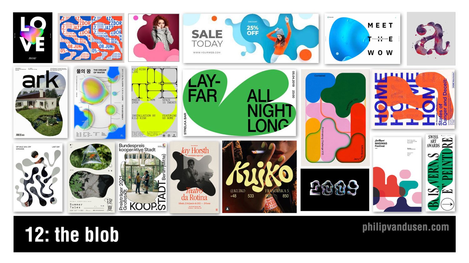
The blob is recognized by the use of amorphic puddle-like shapes as the main visual design element in a layout. The shape can be used as a simple striking vehicle for a field of color, or it can be used to mask illustrations or photography in a visually interesting way. The shapes can be simple or they can be longer and more convoluted. They can also become really inventive type treatments. They can be hand generated, or they can be obviously computer generated. The range is really broad. This design style is a great way to offset simple typographical layouts and inject a level of fun and lightheartedness into a composition trend.
Trend #13: Vaporwave 3.0

I know, I know. Not vaporwave again! But that's why I'm calling it vaporwave 3.0. It's a design trend that is just not going away, so I have to mention it. Look no further than the "new" Twitter blue logo that was released just last week on the left side in the middle. Sure, it's not bleeding in its design anymore, and it's making its way into larger usage, but actually that is the definition of something that's trending. Characterized by the '80s Miami vice type and technicolor sunsets and palm trees, it leverages magenta and cyan heavily to achieve the design aesthetic. It's also showing up in social media, sports wear, gaming, and now even into the realm of fine art and gallery settings as in the image on the top center.
Trend #14: Global Voice

Please understand, I am not trivializing the war in Ukraine by calling it a design trend, because it's not and it shouldn't be. But what I am doing is celebrating and showcasing the amazing work of thousands of designers who've used their superpower to be a global voice for good. Throughout history, designers have led the way when it comes to giving voice to the oppressed and speaking out against injustice in the world. And when it comes to having both the imagination and the creative means to communicate in a really motivating way to the world and speaking truth to power, designers are perfectly suited to the task, and we have to own that responsibility. The war in Ukraine has sadly given the design community another opportunity to showcase that strength, and they've done it in amazing form, shining a global light on a tragic conflict.
Trend #15: Viva Magenta

This is not actually a graphic design trend per se, but a color story trend. But color is an incredibly important part of graphic design. Pantone's Color of the Year in 2023 is called Viva Magenta. It's a bright red with a slightly magenta cast. Last year in 2022, Pantone named “Very Peri”, a periwinkle, as the Color of the Year, which was definitely softer and more muted. But the zeitgeist of popular culture has moved to embracing colors that are more vibrant, leading to this year's Pantone choice. This color trend is already being heavily adopted in the beauty and fashion categories, as well as sporting goods and advertising.
I hope you were inspired by these 15 trends in graphic design for 2023! If you were, make sure head over to my YouTube channel and subscribe for more videos and content on branding, marketing and graphic design.
You also might want to subscribe to my newsletter, “brand•muse” where I share all the latest news, trends, resources and must-read content. Subscribe Here. As always, I'd really appreciate it if you'd share this post a friend or colleague or link to it on social media so others can get inspired too. Thanks for reading, stay creative!
Want to learn how to create the techniques used in these trends?
Check out: Bring Your Own Laptop – with Daniel Scott
I often get comments on my videos asking how to achieve the aesthetics that are in these trends. So I want to share with you a ‘not so secret’ secret with you. Daniel Scott, in my humble opinion, is the best certified Adobe trainer out there, and he has an Adobe app video training website called Bring Your Own Laptop. The site is subscription-based and it is an absolutely insane value at only $12 a month for access to every training he has on his site. Daniel even sometimes uses the trends that I feature in my annual videos as examples in his training videos. So, if you want to get better at using your favorite Adobe apps or even learn a new one, I suggest you head over to:
https://byol.me/philip
(use this affiliate link to support my work, thanks!)

How Can We Can Help Your Business?
Is your brand rockin' like nobody elses? Or is it a little tired? Maybe it's just being born. You want to do it right. That's where we come in.
We create new brands from scratch. We fix broken ones. We have all the brainpower, creative chops and marketing magic you’ll ever need and a ton of loyal clients to prove it.
You want nimble? We're the new agency paradigm. We scale up and down depending on your needs so you never pay for resources you aren’t using.
We’ll put the power of brand strategy, design and the most contemporary marketing techniques to work for you. Let’s talk.