

Succeed in the Creative Economy - Verhaal Brand Design
Check out this cool profile about us on SubKits Go Solo blog.

Check out this great profile that Go Solo did on us on Substack via SubKit.
If you want to know more about Go Solo and SubKit:
Instagram: @subkit
LinkedIn: @subkit
Twitter: @wearesubkit
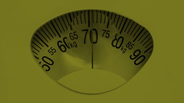
The Marketing Miracle Diet
I’ve always been a tall person. But for most of my life I was also pretty thin and could eat just about anything I wanted. It never affected me much.

I’ve always been a tall person.
But for most of my life I was also pretty thin and could eat just about anything I wanted. It never affected me much.
My wife, Beth hated me for it.
But then, I hit middle age.
Slowly the proverbial ‘spare tire’ made an appearance. The progression was sneaky, a pound here, a pound there.
I just hadn’t been paying attention.
At 6’3” I’d always hovered around 185 lbs. But I realized somehow I had ballooned up to 225. None of my pants fit. Something had to be done.
So I asked Beth what I should do. She suggested that maybe I start counting calories.
Calories mattered? Who knew!
So I said to myself what any techie middle aged guy would say: “There’s gotta be an app for that!”
I found an app where you enter in everything you eat and it totals the calories so you can control your intake.
To tell you that I had no idea at all how many calories were in food would be an understatement.
Did you know a Hostess Apple pie, (which up until then qualified as ‘health food’ as far as I was concerned) has over 500 calories? That’s 1/4 of what my TOTAL daily intake was supposed to be!
So I counted. I paid attention. I tracked my numbers and put in the work.
And guess what? In just a few months I lost 40 pounds and got back down to 185.
So what does losing weight have to do with branding and marketing?
Maybe you have been using the same marketing tactics for years.
Running the same ads. The same copy. The same platforms.
Your results slip a little, a couple fewer leads each month,a little less engagement. Nothing dramatic.
Just a slow leak of branding effectiveness.
And suddenly you realize your brand has gained 40 pounds and is eating Twinkies on the couch at 11:00am on a Thursday.
Analytics really matter? Who knew!
So what’s the solution?
You start paying attention. Start tracking your numbers. Put in the work by changing some behaviors.
...I wish I could say that there is an app for that.
But there isn’t.

One Man Brand
You may not know this, but I’m not just a design and branding guy. I’m also a musician.

You may not know this, but I’m not just a design and branding guy. I’m also a musician.
I’ve been playing guitar and bass since I was a pre-teen and am now learning to actually read music and play piano.
I’ve done multi-track recording from the days of 4-track cassette machines to today, recording digitally with Logic Pro.
The cool thing about multi-track recording is that you can play all the instruments yourself and sound like a huge band.
Which leads me to a TikTok video I saw yesterday that completely blew my mind.
Maybe you’ve seen it too.
It shows a somewhat chubby guy (hey, I’m not shaming here, the dudes got his bare belly hangin’ out and you can’t not see it) who’s playing the guitar, while he’s playing the drums and singing all at the same time.
He’s actually hitting the drums with a drum stick and strumming chords with the same hand simultaneously.
He sounds like a full-on rock band that’s pretty much kickin’ ass and takin’ names.
But he’s also working really damn hard to do it.
What kicked on my branding brain though was a comment someone left on the video:
“Why doesn’t he just get a couple pals to help out? Can you image how much more awesome he would be?”
When we consultants, freelancers and entrepreneurs first start running our businesses, we need to keep expenses low and take huge pride in doing everything ourselves.
We try to be a one-person band. We do the branding, the marketing, deliver the products and services, we do the books, we do all the admin.
In the beginning, we can kick out the jams solo for the most part.
But eventually one day we realize it’s really damn hard to do it that way.
And then we ask ourselves: What if I got a couple pals to help out?
We have to figure out how to scale.
Because when we do that, we find out how much more awesome we can be.

So Hot Right Now
Hoy Fung Sriracha, also known as "Rooster Sauce”, is a billion dollar brand.

Hoy Fung Sriracha, also known as "Rooster Sauce”, is a billion dollar brand.
The sauce was first produced in the 1930’s by a woman named Thanom Chakkapak in the town of Si Racha in Thailand.
Sriracha started off as a condiment for pho and fried noodles, but it now is also eaten in soup, jams, cocktails, eggs, burgers and even lollipops.
Hell, Lay’s even puts it in potato chips.
Sriracha is one of the most recognizable hot sauce brands in the world.
It has very distinctive packaging. A simple clear squeeze bottle with a white rooster illustration showcasing bright red product inside and a green cap.
But the most remarkable thing about Sriracha isn’t its popularity.
It’s how it got that popular.
It’s that Sriracha became a billion dollar brand without advertising.
Not one dollar spent on ads.
Instead, Hoy Fung relied entirely on word-of-mouth.
A word-of-mouth marketing strategy relies entirely on the quality of the product.
It relies on the brand delivering a remarkable customer experience every single time.
But it only works if your product is so damn good that everyone wants to tell their family and friends about it.
So good that people can’t not talk about it.
And Sriracha is that damn good.
And that’s what Hoy Fung did.
They delivered a consistently exhilarating flavor experience for 90 years.
Of course, word-of-mouth has existed since the beginning of time.
But with the mass adoption of the internet and the social sharing technologies that have come with it, the power of word-of-mouth has become supercharged.
You might even say red hot. *sorry, couldn’t resist*
So if you want your customers to do your advertising for you.
You have to start with the product.
Make it that damn good.
So people can’t not talk about it.
And let the internet take it from there

slip and slide
Something was happening at the house with the slip-and-slide.

Something was happening at the house with the slip-and-slide.
What was happening was that there was a lot less happening.
A few blocks away from us is a house where the kids have a slip-and-slide that was an irresistible magnet to all the kids in the neighborhood when the weather got hot.
That yard was packed with neighborhood kids running around, getting wet, laughing their heads off.
But then it wasn’t, and the kids who lived there were wondering where all the other kids had gone.
What they didn’t know was that the family two doors down from us had recently purchased a palatial bouncy castle water slide complete with rotating sprinkler arms.
But the kids at the slip-and-slide house didn’t know that.
They just knew that no one was showing up to play.
Clients come to me with the same problem.
Customers aren’t showing up like they used to and they don’t really know why.
And they don’t know what to do about it.
When I am assessing a clients brand, one of the things that I am frequently amazed by are blind spots they have in really knowing who their competition is and what they are doing.
A competitive audit is one of the most illuminating phases in a brand re-design project.
How does your brand stack up to others in the competitive landscape?
How are they articulating the problem/solution/capabilities message to prospects in a compelling way?
How are they creating differentiation?
Assessing the competition invariably makes it very clear what the problem is and what needs to be addressed.
Because if you don’t know there’s a new bouncy castle water slide down the street…
You’re just going to be left standing in your yard wondering where everyone went.

Hot Then Not
One minute what is hot, the next minute will very likely be not.

Everything was going great in high school until that new guy showed up.
Let’s call him Fabio.
Fabio was tall, wore the coolest jeans, but what really did it was his hair.
Fabio had long hair and it was driving all the girls to distraction. All they could talk about was Fabio’s hair.
In the halls they were always staring at Fabio.
Fabio was hot.
It goes without saying that all the other guys in school were feeling - let’s just say: under-appreciated.
So what did they do? One by one they all started to grow their hair long.
Even that guy with curly hair. He was the only guy with curly hair. He had to grow it twice as long because it took twice as much to look long.
Now he just looked like everyone else.
Then it happened.
One day Fabio showed up to school with short hair.
Now short hair was hot.
The other guys were now thinking: ‘Damn, I just spent all this time growing my hair out. I used to have short hair! What was I thinking?’
Well, that’s what’s happening in social media right now:
Fabio is TikTok.
Long hair is short-form video.
And the curly haired guy is Instagram.
TikTok recently announced they are going to be accepting 10 minute videos soon
....and everyone else is still deeeep into growing their hair long.
In fact Adam Mosseri, CEO of Instagram just announced to accountholders that Reels weren’t going to replace photos. He said Instagram is ‘still’ committed to photography.
Even though it certainly doesn’t look like that to anyone paying attention.
The moral of the story is that one minute what is hot, the next minute will very likely be not.
So it’s usually best to hold on to your core competency.
I’m not saying short-form video is going away. It’s not.
But when everyone starts looking just like Fabio...something is bound to change.

The Numbers Game
Creating masterpieces is a numbers game.
Before I was a branding guy, I was a fine artist.
I actually have a masters degree in painting - not graphic design. Graphic design I picked up along the way. But that’s a story for another day.
What I really want to tell you about is one of my favorite artists of all time, Pablo Picasso.
In his lifetime Picasso created over 150,000 works of art. Drawings, sculptures, prints, engravings, murals, ceramic sand paintings.
It could be argued that he was one of the most prolific artists in history.
He banged stuff out right and left. Boom, there’s another drawing.
His studio was literally littered with...well, Picasso’s.
Boom, here’s another one...
He didn’t get caught up in perfection.
Now, let me ask you a question:
How many of these 150k works of art are considered to be masterpieces today?
Probably less than 100.
I know there is some curator out there turning red in the face right now thinking...”But every Picasso is a masterpiece!”
The fact is, less than .5% of the artistic content he produced ever mattered in the long run.
So if you’re creatively stuck and are being a perfectionist about that one piece of content you have had on your marketing ‘to do’ list for weeks...
Bang it out.
Because creating masterpieces is a numbers game.
You just have to start.

All Together Now
Together we can accomplish things we never could alone.

Somewhere along the line when I was coming up in my professional career and just starting to pay attention to business and brands and marketing, I heard an interesting little factoid that stuck with me:
There has never been a major war in a country that has McDonald's.
At the time, this is how I parsed that statement:
Big companies and global capitalism is so invested in making money that they (by hook, crook, or political maneuvering) won’t allow a war to disrupt commerce in any way.
It said that big business controls us all, controls culture, that we exist to serve them.
But something happened a few weeks ago that made me question that assumption.
What happened was that McDonald's announced it was closing 850 stores in Russia in response to that nations unprovoked attack on Ukraine.
For a monolith like McD’s to close 850 stores as a show of solidarity, as a reflection of the will of the people to protest, to sanction, to fight back is pretty freakin’ cool if you ask me.
Cool, because it shows me that big business can serve us.
When we unite, we control them.
And because McDonald's listened and responded to the will of the people, they increased their brand loyalty in the hearts and minds of billions around the world.
It gives new meaning to the words on their signs:
"Billions and Billions Served".

12 Trends in Graphic Design for 2022

Let's look at 12 Trends in Graphic Design for 2022!
Trends are movements in design that have gained wide enough usage that they can actually be recognized as a trend. They aren't necessarily brand new. In fact, very little is. Very few things have actually never, ever been done before.
I recommend using trends to stay inspired. You can either follow them or you can consciously react against them. But knowing what is trending is critical to informing your work and to informing your clients.
Trend #1: Diversity + Inclusivity
Design has always been instrumental in facilitating changes in society. Large, fortune 500 companies are now responding to societal changes in areas of diversity and inclusivity and bringing it into the mainstream.
Ethnic diversity, mixed-race couples and families have been depicted in design for years now, but diversity in gender, sexual orientation, and physical ability are becoming much more prevalent and visible.
We're seeing it grow considerably in traditional advertising media, in VR, in illustration, iconography, and stock imagery. Expect this trend to magnify in 2022, as acceptance continues to grow domestically in the U.S. as well as internationally

Trend #2: Metaverse
Mark Zuckerberg has made dramatic pronouncements about Meta's intention to making avatar-inhabited virtual environments a priority for the company.
It's unclear exactly what this world is going to look like or what you'll be able to do or accomplish there, but it's not stopping designers, gaming platforms, illustrators, and animators from starting to visually predict and to depict it.
Any design that can happen in real life, billboards, products, ads, branded environments, t-shirts, branded products will undoubtedly come to life in the Metaverse, probably things we haven't even imagined yet.
Designers are going to be on bleeding edge of finding ways to leverage this new virtual ecosystem to their advantage for both themselves and for their clients

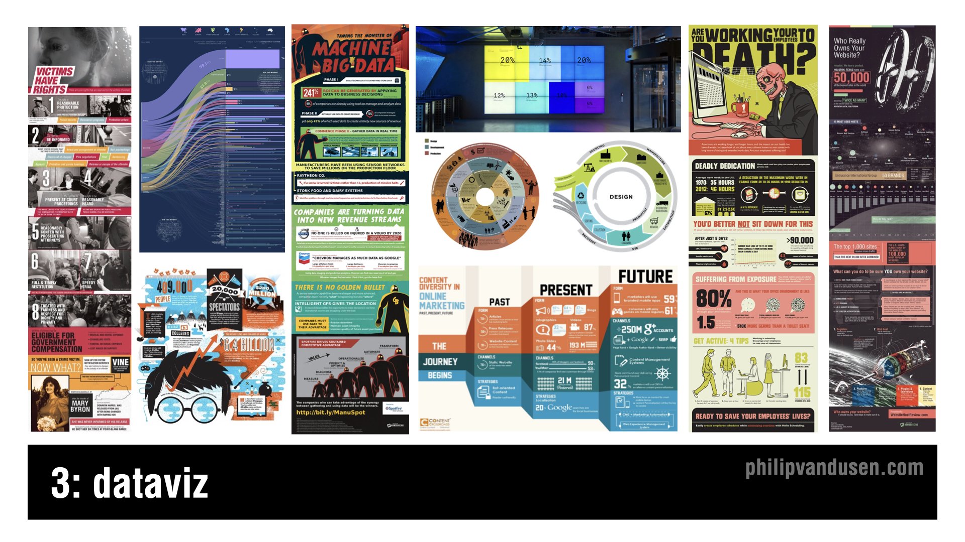
Trend #3: DataViz
We live in a data-rich, and some may say, absolutely saturated world these days. Infographics have been around for years now, but there's a new trend on how the format is being explored.
But typical infographics have lost their appeal and their thumb scroll stopping power so more radical layouts, more inventive imagery, not just the same old icons and stock characters are being used.
It's being done in order to cut through the infographic noise. Infographics are becoming much more creative, inventive, playful, and original illustration-driven designs.
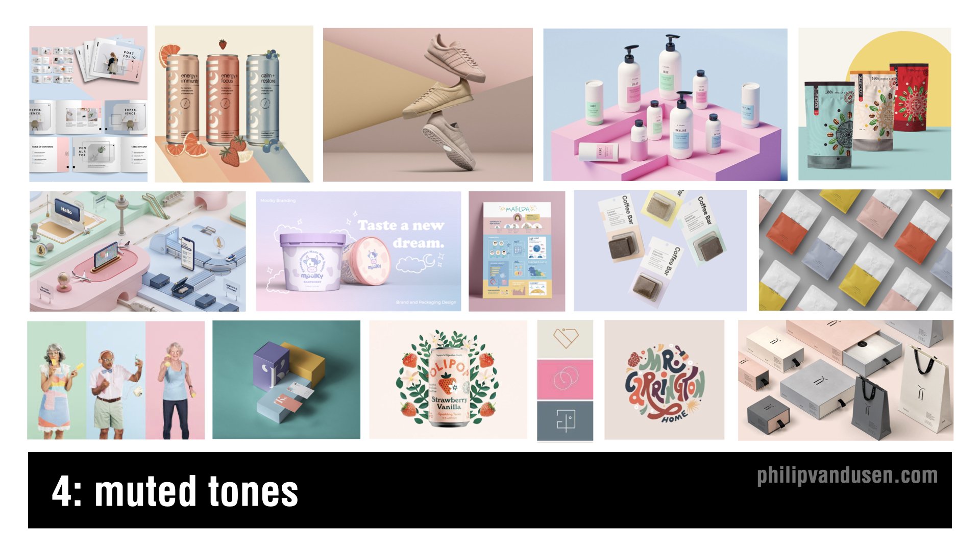
Trend #4: Muted Tones
This is a trend that's emerging where colors that are being used are much more muted, softer, they're less jarring.
It is a reaction against the intense colors that were being used in last year's 2021 trends like “Electric Fade” and “Bright Geo”. Trends frequently emerge that are reactions against other trends and muted tones is definitely one of those.
You'll see that this trend bears out Pantone's Color of the Year choice that I'm going to feature later in this video. The colors used are soft pastels and cosmetic pinks, taupes, and blues.
This trend shows up in consumer package goods, stock photography, fashion, and apparel.
Trend #5: Vintage Apothecary
Vintage Apothecary celebrates vintage typography, flowing, elongated serifs, and ornate borders. 18th-century black and white etching illustrations are also prominently featured in this design style.
This trend shows up in beverages, in food packaging, health and beauty aids, t-shirt design, candles, and the gift industry. It references the Steampunk Movement and is recognized by overlaying detailed layouts and vintage illustration styles.
Vintage Apothecary hearkens back to a simpler time when things weren't mass-produced by the millions, but instead in small, handcrafted batches with real care and real quality.

Trend #6: Eco Everything
Global warming isn't a debate anymore, it's happening much faster than anyone ever thought possible.
The eco-movement, focusing on sustainability and reducing the human carbon footprint in virtually everything we do, make, or use just continues to grow. It's no longer fringe, it's almost a requirement for companies to stake a claim with their consumers about where they stand on the environment.
The days of “greenwashing”, that is giving lip service to sustainability, are long gone. Designers are leading the charge in finding ever more impactful and engaging ways to communicate and market products and services in the green economy.
You can see this trend in hard, good products, in packaging, physical environments, illustration, books, and in color palettes.

Trend #7: Iridescence
Iridescence is somewhat of a continuation of last year's trend that I called “Electric Fade”, it's also related to the Vaporwave trend of a few years ago. But Iridescence is made possible by new, innovative print substrate materials that have reflective and light amplifying properties.
This trend is being seen in technology marketing, in the sportswear industry, in iconography systems and print, AR and VR. It's also beginning to show up in interface design.
I wouldn't be surprised if it actually finds its way into the Metaverse too.
The shapes associated with it can be curve linear and flowing like neon tubing, or they can be sharp and defined and angular in geometric cubes, in geological crystal shapes.

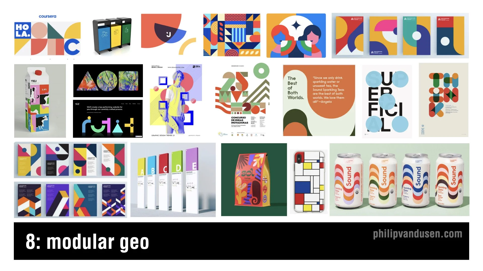
Trend #8: Modular Geo
Modular Geo is an evolution of the “Bright Geo” trend that I featured in my 2021 trend video.
The color used as flat and unmodulated, many times a primary palette is used of bright reds, blues, and yellows. The shapes used in this trend are circles and squares, triangles, parallelograms, and trapezoids.
The aesthetics of the Modular Geo trend have hints of the work of fine artists like Mondrian and Matisse, as well as the work of early Bauhaus design. This trend is being used in print and poster design, packaging, environmental wayfinding, and editorial illustration.
Trend #9: Trippy Type
Sometimes trend happen in pairs, with two diametrically opposed aesthetics that are polar opposites of each other. This is the case with trippy type, it's the polar opposite of the sharp lines and misstructured, rigid compositions that you find in Modular Geo.
This trend is signified by 60s and early 70s, psychedelic typography. Often it's hand-illustrated in shapes with that type and shape itself becoming the primary element or the main focus of the design.
You'll find this trend in new font design, in printed books, illustration, consumer goods, food packaging, fashion, and even motion graphics.

Trend #10: Moving Marks
It's not like animated logos have never been seen before, but it's the extent at which we're seeing them that has really changed.
Animated logo gifs are showing up on corporate email blasts, on website headers, and in apps on a regular basis now. It's the true definition of a trend, a more fringe movement and experimental one that's gained a lot of popular usage that it can now be considered trending.
What's remarkable is the enterprise-size companies that are starting to use these logos ‘on the regular’, as opposed to only periodically in ads on traditional broadcast media.
It's just another indication that “everything is going to video”, even the simple, static company logo can't be counted on anymore to stand still!

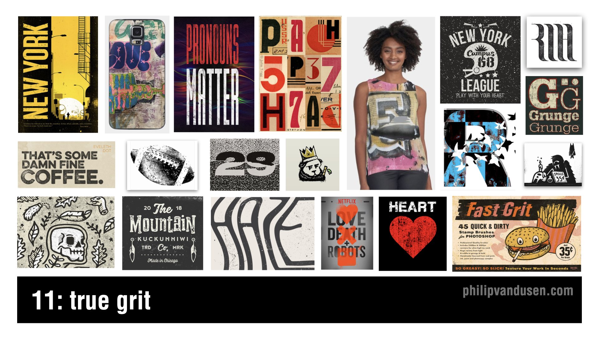
Trend #11: True Grit
True Grit isn't so much of a design style per se as it is a treatment. This trend is recognized by the usage of rough, distressed textures and textural overlays that make images and text look like it's weathered or partially destroyed. It's a reaction against the clean type and stripe design of modular geo or Bauhaus or Swiss Design.
This trend shows up across a broad range of design genres and it's used to add a level of visual interest to a design by aging it, by giving it provenance or history, by adding character.
True Grit shows up in t-shirt design, print and posters, in the music industry, in motion graphics, and also in broadcast entertainment.
Trend #12: Very Peri
Pantone's color of the year for 2022 is called Very Peri, it's basically the color periwinkle. It's not a graphic design trend in and of itself, it's a color story trend. Last year in 2021, Pantone named “Illuminating Yellow” and”Ultimate Gray” as the colors of the year.
But the popular zeitgeist in society has moved towards embracing colors that are more calming and muted like trend #4, Muted Tones, featured above.
Because of the ongoing collective psychological stress of the COVID pandemic, Pantone is forecasting and encouraging a more comforting look for 2022.
This color trend is already being heavily adopted, and you can see it being used everywhere in product design, website design, sports apparel, editorial print, promotional marketing, travel, entertainment, even the financial industry.

I hope you liked this article and the linked YouTube video “12 Trends in Graphic Design for 2022”.
If you were somehow inspired by this trend review, do me a favor and forward it to a colleague or share it on social media! Share the inspiration! I'd really appreciate it and your colleagues will too.
How Can We Can Help Your Business?
Is your brand rockin' like nobody elses? Or is it a little tired? Maybe it's just being born. You want to do it right. That's where we come in.
We create new brands from scratch. We fix broken ones. We have all the brainpower, creative chops and marketing magic you’ll ever need and a ton of loyal clients to prove it.
You want nimble? We're the new agency paradigm. We scale up and down depending on your needs so you never pay for resources you aren’t using.
We’ll put the power of brand strategy, design and the most contemporary marketing techniques to work for you. Let’s talk.

First Off the Starting Line
Bike races are a lot like marketing. I’d started first and finished dead last.

When I was growing up a local newspaper sponsored an amateur bike race to engage the community.
At 13, I had just gotten a new Schwinn 10-speed bike which were the new thing. It was a serious move up from my Schwinn Stingray. Although I have to admit I missed the racing slick, banana seat and sissy bar.
My Dad encouraged me to put my new bike to the test and sign-up for the race. I thought, “Why not, I have a 10- speed now. It’s a piece of cake.”
The race was taking place in a hilly industrial park. There were no age groups. It was mostly adults, I was one of the few kids.
They blew the whistle. I sprinted off the starting line. I left the whole group in the dust.
Everything went great until I hit a hill at about mile 2. My legs were burning. I was sucking air.
And then one by one, over the next 3 miles, every other racer passed me by. Even the other kids.
I’d started first and finished dead last.
I suddenly realized all those other riders had one thing I didn’t have.
It’s something I carry with me to every client meeting and every project I work on today. Whether it’s branding, marketing, product development, competitive positioning or innovation.
To come in first you have to have a strategy.
Then winning is a piece of cake.

Good luck ignoring the alligator
In trying to win in todays market, many brands focus their time and energy trying to create better products or deliver deeper functional benefits or more meaningful emotional experiences.

In 1933 a German psychiatrist named Hedwig von Restorff did a study.
She presented human subjects with a list of categorically similar items, with one distinctive, isolated item on the list.
When their memory was tested about the list of items, the memory of the distinctive item as always better than the rest.
The phenomenon became known as the “Von Restorff effect”.
For example, if you have a list where one item stands out against the others, for example: desk, chair, lamp, table, rug, bed, alligator, couch, dresser, armchair.
“Alligator” will be remembered the most.
It also turned out that the effect happens when you alter things like size, shape, color, spacing, fonts and underlining.
In this case, let’s say you have a shopping list with 20 items on it including: eggs, milk, bread, apples, chicken, lettuce, onions and cheese, etc. Then you color the word “apples” with a yellow highlighter.
Almost everyone who reads the list will remember that the list had apples on it.
In trying to win in todays market, many brands focus their time and energy trying to create better products or deliver deeper functional benefits or more meaningful emotional experiences.
But the fact is - that in the war for consumer attention, the most powerful method of establishing brand recall is to be different.
Just somehow noticeably - different.
We are now all doing business in an “Attention Economy”.
So, if you can just stand out in a sea of sameness…
You win.
Wish You Were Here
So if you - or your clients - are getting some rough reviews or less than glowing comments on your content, products or services, take heart:
There are many, many more people who loved it than will ever make the time to write about how happy it made them.

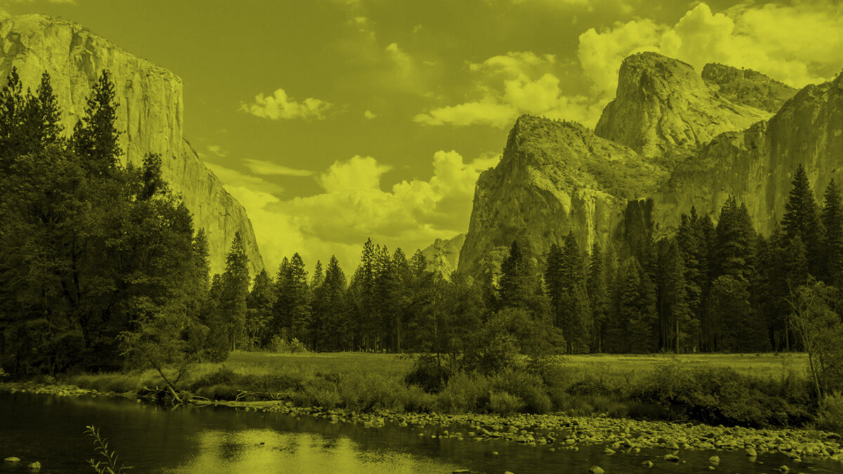
Our national parks are a treasure. They are some of the most beautiful and awe inspiring places in our country.
Yosemite, Yellowstone, Zion, Grand Canyon, Arches, Sequoia, Grand Teton. The names alone spark visions of splendor in almost everyone who has visited one.
Almost everyone.
With more and more people’s travel limited by Covid - our national parks are experiencing massive surges in visitor volume.
Now, if I know one thing about marketing, it’s that people write more product reviews when they hated something than when they loved it.
When people love something, the last thing they usually think about doing is going back and a writing a glowing review. They’re too busy being happy.
But, when people didn’t have such a great experience, the chances are pretty good they will look for a way to vent their displeasure.
Here are some reviews from our national park websites:
Sequoia National Park: “Terrible. There are bugs - and they will bite you on the face.”
Grand Teton National Park: “All I saw was a lake, some mountains and some trees. That’s it.”
Yosemite: “Trees block the view and there are too many rocks.”
…and my personal favorite:
Grand Canyon National Park: “A hole. A very, very large hole.”
So if you - or your clients - are getting some rough reviews or less than glowing comments on your content, products or services, take heart:
There are many, many more people who loved it than will ever make the time to write about how happy it made them.

You Think it’s a Mistake but it’s Actually Perfect
We should all remember Wabi-sabi when we go about our marketing work, design work, project work, our conversations with clients.
Because perfection isn’t the goal, it’s the enemy.

At the beginning of my entrepreneurial journey perfection was my goal.
I wanted to create perfect logos and websites. Upload perfect videos. Publish perfect blog posts. Send perfect emails.
But it was paralyzing.
And because of that, nothing was getting done.
Five years ago this month, when my finger was finally hovering over the “send” button for the very first issue of this newsletter, I was sweating.
What if I made some grammatical error? What if one of the links goes to the wrong page?
What if something is inaccurate and makes someone, somewhere, somehow irritated at me?
But it turns out I had it wrong all.
Since the 16th century, the Japanese have practiced an aesthetic concept that they call “Wabi-sabi”. It celebrates the slightly flawed, the not-quite symmetrical, the unrefined.
It can be seen in pottery with rough uneven edges or intentional chips, in architecture with off-center roofs, in the patchwork robes worn by Buddhist monks.
It embraces the idea is that imperfections are where the beauty lies.
That the true value resides in the flaws.
We should all remember Wabi-sabi when we go about our marketing work, design work, project work, our conversations with clients.
Because perfection isn’t the goal, it’s the enemy.
It’s the imperfections that make us relatable, interesting and authentic.
And they also help us get things done.

Shedding Some Light
As marketers and creatives we do this stuff all the time.
We produce creative work, content, media, share valuable information. Then we post it out there in cyberspace.

There’s a star at the very tip of the handle of The Little Dipper.
Its astronomical name is Polaris. But, we call it The North Star.
The North Star sheds a lot of light. In fact, it’s 4000 times brighter than our sun.
The really cool thing is that when you look at it, the light you are seeing was actually generated in 1587.
Its light has traveled for 434 years to reach us.
To fill us with wonder and to help travelers navigate.
When I was reading about the North Star I was reminded of a video I did 4 years ago called “9 Things Your Brand Design Must Have”.
When I shared that video on YouTube I didn’t really know what would happen.
I just posted it and hoped it would help someone.
Time passed...
Then someone watched it. Then another and another.
Now, 4 years later it has 382,000 views. And it still gets about 7,000 views a month.
That video sheds light on a topic that has helped a lot of people navigate brand design.
As marketers and creatives we do this stuff all the time.
We produce creative work, content, media, share valuable information. Then we post it out there in cyberspace.
We don’t know who it’s going to help. Or when it will reach them.
But we have to remember that providing value takes time.
And that it will continue to shed light for years to come.

The Wrong Ingredients
Building a successful brand is like building something out of concrete.
You need to use the right recipe.
You need a solid brand strategy, a stunning brand design and to create an impeccable brand experience

There is a marina in Lahaina, a small town on the western coast of Maui, Hawaii and it's home to one of the best scuba diving sites on the island, Mala Wharf.
Mala Wharf is a collapsed pier that extends hundreds of feet into the marina. The submerged slabs and pillars of concrete create an artificial reef teeming with tropical fish, eels, rays, lobster and octopus.
The wharf didn’t collapse with age. It didn’t collapse because of a hurricane or some natural disaster. The wharf’s demise was the result of a bad recipe.
You see, when you make concrete with fresh water the material essentially becomes stone and will last for decades.
But when you cut corners and use salt water instead, the concrete seems OK for a few years, but then it begins to crumble.
Unfortunately, they used the salt water recipe for Mala Wharf.
After the wharf collapsed it was going to be far too expensive to clean it up. So they just left it there - and let the marine life take over.
Building a successful brand is like building something out of concrete.
You need to use the right recipe.
You need a solid brand strategy, a stunning brand design and to create an impeccable brand experience.
If you cut corners, before you know it things will start to crumble and cleaning up the mess gets expensive fast.
But if you use the right ingredients and a proven recipe, that brand will last for decades.

Create Your Wonder Wall
Fast forwarding to today. Many of us are creating content to communicate, to build authority, to make our presence known.
We need to take a lesson from these Amazonians.

A couple years ago they made an amazing discovery in the Colombian Amazon. They call it Serranía La Lindosa.
It’s an 8-mile-long rock wall. A “canvas” completely covered with ice age drawings of mastodons, giant sloths, geometric designs, human figures in hunting scenes and nurturing plants and trees.
The ochre pigment has lasted for over 12,000 years telling the story of the indigenous people who painted it.
Now let’s be clear...
These people didn’t paint an 8-mile mural in a day.
It started with a single drawing. Then the first tiny scene. Then, over hundreds of years it became a vast panorama of images crowded together, mile after mile.
But what if they’d decided after the first mile that it was enough. That it had all been said. The wall was already so crowded. Who would see their pictures? Why bother adding to it?
We’re glad now that they resisted that impulse.
The stories they used to document, to educate and even possibly to entertain, are still informing us now.
Fast forwarding to today. Many of us are creating content to communicate, to build authority, to make our presence known.
We need to take a lesson from these Amazonians.
Don’t be intimidated by the vast crowded canvas of the internet.
Don’t think that your story is just adding to the noise.
Make your mark. Build upon it. Invest time, effort and intellectual capital.
Build a body of work that speaks for you. That works to tell your story.

You Need a Megaphone
You wouldn’t think tree crickets have a lot to do with marketing, but they do.

You wouldn’t think tree crickets have a lot to do with marketing, but they do.
You see, female tree crickets like two things in their mates: size and loudness. If you’re big male tree cricket with a really loud song, you’ve got it made. You get all the attention.
But the curious thing is there are a lot of smaller, quieter male tree crickets out there too. You’d think that their stature would have doomed them in the cricket gene pool long ago.
But if you thought that, you’d be wrong.
That’s because these smaller dudes figured out that if you find a cone-shaped leaf, chew a hole in it, stick your body through and sing your cricket song it’s like using a big-ass megaphone.
In fact, scientists have recorded song volume increases of up to 3x.
Which tends to get the attention of their target audience.
So if you’re a small player and you can’t compete with the marketing the big guys are doing what can you do?
You just take a lesson from the crickets. You find the right amplifier.
The good news is that there are plenty to choose from: LinkedIn, Twitter, Clubhouse, Instagram stories, YouTube.
Megaphones just waiting to make you seem bigger and sound louder than you actually are.
You just have to chew a hole and start singing your song.

14 Trends in Graphic Design for 2021
I want to share with you 14 trends that I've seen in graphic design moving into 2021 that are exhibiting themselves in the marketplace.
I want to share with you 14 trends that I've seen in graphic design moving into 2021 that are exhibiting themselves in the marketplace.
The thing you want to remember about trends is that trends aren't seeing into the future, they're not some sort of crystal ball. They are movements in design that have gained enough traction and enough usage to actually be recognized as something that is “trending”.
Trends aren't always brand new, in fact, very little has never been done before. I recommend you use trends to stay inspired, take them and make them your own. Take them to a different place in your creative work, or you can consciously react completely against them if that's what you choose to do. But knowing what is trending is critical either way.
#1: A.I. Design
Everything you're going to see on this slide was actually designed by a computer. This is machine learning. This is artificial intelligence designed, created by computers. Now it's not great design, but it's important because even though it's clunky and it's primitive, so was Microsoft Paint back in the day, so were the first Macintosh's right. It will only get better. It will only get more sophisticated over time. Yes, these look kind of surreal and deconstructivist, but they are something that you have to pay attention to.

#2 Electric Fade
Electric Fade has been around for a while, but it just keeps getting deeper. Electric Fade is characterized by electric turquoise and cyans and purples and magentas, being used in curvilinear blends. It's being used in tech and in sportswear and in print and in environments, it's even being used in political ads. Two of the graphics on the right side of this slide are from the Biden-Harris campaign. It used to be really cutting edge, but now in many ways it's going much more mainstream. This is a classic definition of a trend. It is something that's been around for a little while and gaining momentum and used to be a little low on guard, but now it's definitely getting mass usage.

#3 Environ-mental
This is topography that's being used in physical environments. It's used in wayfinding and interior design, art installations, retail stores, and museum display. These are single letters or blocks of text or numbers that are much like a trend that's going to come later in this presentation called singularity. It's stacked topography, it's often in all caps. Often it's wrapping around three-dimensional objects or surfaces or around corners. And it uses elements of force perspective, that's optical illusions that are making elements feel closer or farther away than they are now.

#4 Figure isolation
These are human figures where the background has been removed and they've been placed on open, airy, or blank environments. This creates a juxtaposition between the 3D of the figure and the flatness of the design element's colors and texts that surround them. There are graphic elements, texts, shapes wrapping around through and over the figures. This gives it the design of focal point or an anchor to these more abstract elements. The figure kind of grounds in the abstract composition in reality, and it gives the eye a place to rest and orient itself in terms of the picture plane.

#5 Redline
Red line is characterized by red, black, and white compositions. Red, black, and white are one of the most striking color combinations. It's an emotional spectrum. Color red is angry and powerful environment. In fact, when psychiatric patients are given colors to work with in art therapy, red and black always run out first. This color combination is often used with black and white photography, and it shows up in outdoor advertising, active wear apparel, print, packaging, transportation, and even retail. There's almost no way to go wrong with black, white, and red.

#6 Sliver of Light
Sliver of light isn't as much of a trend as it is a graphic technique to draw the eye into a composition. It's mainly used in illustration and text layouts where the illustration is the primary storytelling device. It's characterized by a Ray of light that acts as a visual pathway to pull the eye into the composition. It's often used with a human figure as the focal point of that light. It's used in things like movie posters and book covers and editorial illustration, and it really creates an intense sense of drama and mystery in the composition.

#7 Architext
This trend is characterized by text blocks that are used as the main design elements. They're used as whimsical shapes, circles, curves, asymmetrical building blocks. These can be paired with photography and illustration, but generally text is the primary focus. Headlines and subheads can sometimes be put at right angles to each other. In this trend, the legibility or the ability to navigate the reading order of these paragraphs is of very little importance. This trend is arty, it's pretentious, and in it topography becomes the main design element in and of itself.

#8 Decontextualize
This trend is characterized by topography in a state of mid destruction. It's traditional elements of designs, topography, graphics, photos, shapes, and elements that are put into a kind of a visual blender. The result is abstract design, design for design's sake. It's used in design publications, in the music industry, in print and magazine work, and in event announcement posters. It's reminiscent of David Carson and Raygun magazine. It breaks all of the rules of design, graphic design that skirts the edges of fine art. Communication in this trend is of very little importance at all.

#9 Bright Geo
This trend is very similar to the Geo Max trend of last year, except the difference lies in the icon and the block shapes. It's characterized by Tetris-like building block shapes that are bisected and quartered circles, simple color palettes of reds, blues, oranges, and greens, also muted tones of gray, and they're all grounded in black or dark navy. Bright Geo is used in brand ID systems and web icons and editorial. It's even used in Google's G Suite icons. It's usually used in flat color compositions only, but it can be used in combination with photography and natural textural elements.

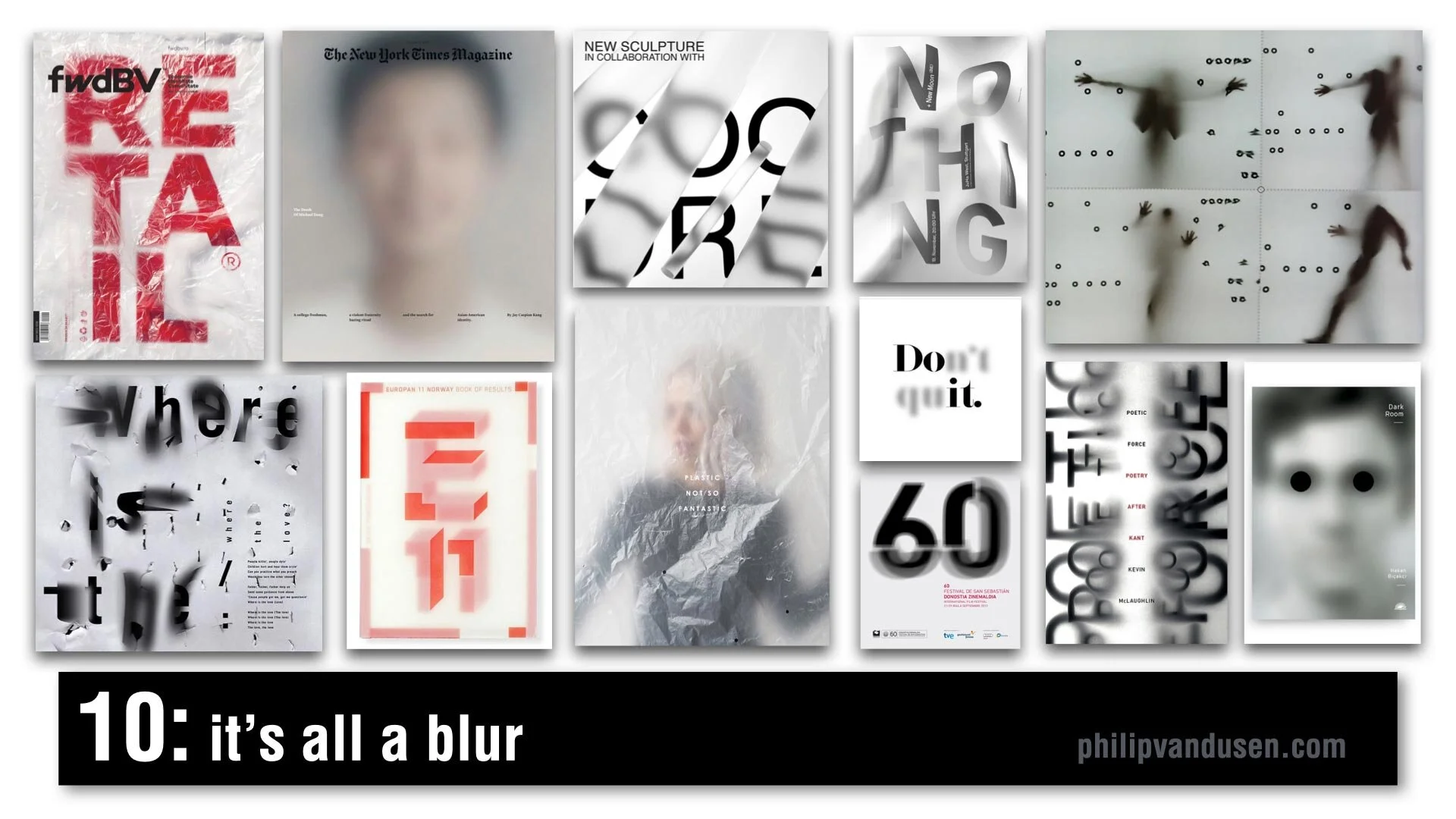
#10 It's All a Blur
One of my favorite trends for 2021, It's All a Blur is a very popular trend and it's characterized by kind of an overlaid scrim of plastic or Mylar or just elements that are plain out of focus. We're seeing it everywhere, it's in video media, in animation, in signage, in editorial, in print. It's being used with figurative elements, typography, numerals, photography, and it creates a depth, a sense of mystery. It sparks curiosity and creates a level of visual movement that brings a real level of interest to a flat graphic picture plane.
#11 Chiseled Type
Chiseled Type is retro typography that's really historically anchored in the sign painting industry. It's a subset of the Sign Painters trend from my 2020 Graphic Design Trend video on YouTube. It's been adopted by art, graffiti, street culture, tattoo culture, and modern sign painters. This trend is characterized by fonts that are crafted to look 3D, as if they were carved out of or into stone or wood. Type designers have really adopted this style and are putting really interesting new twists on it. Single letter forms take on a monolithic life of their own and really become sculptures in their own right.

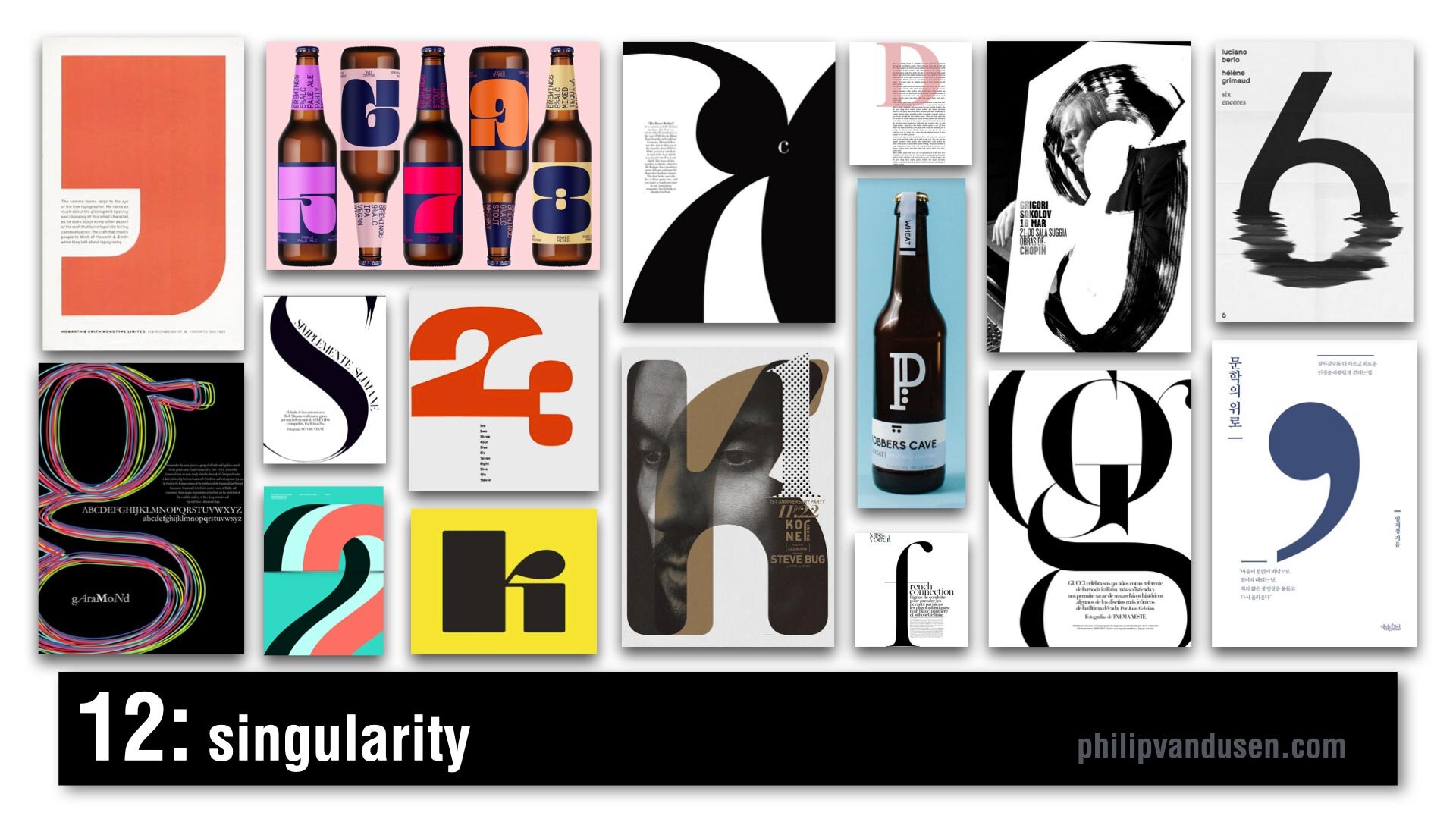
#12 Singularity
Singularity is characterized by composition that uses a single letter or number or a symbol as the main abstract anchor of the composition. It's a celebration of the abstract beauty of a single letter or number and its forms and shapes. It's often dramatically cropped and often used as an abstract element to wrap text around or intertwined with other forms, or it can be treated texturally in brushstrokes or in patterns. It's being used everywhere from editorial print to packaging, to illustration, and promotional posters.
#13 Wavy Gravy
Wavy Gravy is an offshoot of a trend from my 2019 Graphic Design Trend video on YouTube that I called Warp Speed. In this trend, topography is warped to create a wave shape. Sometimes they're regular waves, like an optical illusion to impede legibility of the text. Sometimes it's visually faithful to the text, but it's printed like it's on a waving fabric, like a flag or a banner. It's often used in black and white, but not exclusively. It's used mainly in print, and animation, and posters.

#14 Bee Yellow
Pantone announced its Colors for 2021. The colors are Illuminating Yellow and Ultimate Gray. This is not a graphic design trend in and of itself, it's really more like a dominant color story trend of yellow, black, white, and an injection of gray. I feel it's a psychological reaction against the difficult year that we've had in 2020 with the political upheaval and the Covid-19 pandemic, all of our financial struggles and the negativity overall in the world. It's kind of forecasting or encouraging a brighter outlook for 2021 and it's already being heavily adopted and used everywhere. It's showing up in product design and web design, sports apparel, editorial, print, the financial industry, promotional marketing, travel, and even entertainment.

How Can We Help Your Business Succeed?
Is your brand rockin' like nobody elses? Or is it a little tired? Maybe it's just being born. You want to do it right. That's where we come in.
We create new brands from scratch. We fix broken ones. We have all the brainpower, creative chops and marketing magic you’ll ever need and a ton of loyal clients to prove it.
You want nimble? We're the new agency paradigm. We scale up and down depending on your needs so you never pay for resources you aren’t using.
We’ll put the power of brand strategy, design and the most contemporary marketing techniques to work for you. Let’s talk.

So You Want To Go Viral?
People only see the end product and think how profitable creating is. But it's not that easy.

When I was in college I worked on an archeological dig on an island off the coast of Crete, drawing the ruins of Minoan buildings built in 1450 B.C.
It sounds very exciting and exotic when you talk about it back in the States at a cocktail party.
But the thing I learned about archeology is that what sounds exciting and exotic is actually a shit-ton of monotonous work.
Hours spent in 105 degree heat dripping sweat/mud onto your drawings because you’re downwind from the dirt sifting guys.
Days hunched over a table sorting through buckets of gravel with a tiny paintbrush looking for 3500 year-old mouse turds and fish bones.
People just think of archeology as the spectacular tiled floors we discovered. The frescos. The bowls adorned with octopuses. The drawings in the Library of Congress.
The same thing happens when clients want to be YouTubers, podcasters and bloggers.
People only see the end product and think how profitable creating content can be.
All the site traffic they’ll get when their stuff goes viral.
What they don’t see are the days that must be spent brainstorming ideas, writing, revising, shooting, recording, editing, documenting, promoting and analyzing data.
So if your clients want to publish content, have an impact on social media, get thousands of subscribers. Just make sure they are prepared to go the distance.
Because it’s not all exciting and exotic.
And they’re going to have to sift through a shit-ton of mouse turds to get there.

We Have Lift-off
Things might not go as planned. We might not get into orbit on the first try.

It was 1960 and we were in a race with the Russians to put a man into orbit.
Project Mercury was the name of our program that was eventually going to do it.
The operative word here is “eventually”.
The first Altas-type rocket exploded. So NASA switched to the Redstone rocket that had taken our first satellite into orbit.
The test flight of the new spacecraft and its recovery systems was scheduled. They wheeled the rocket onto the launch pad...3, 2, 1. Ignition!
There was an incredible roar, the rocket disappeared behind a huge plume of smoke. The technicians thought the rocket had accelerated so quickly they didn’t even see it go.
That’s because it didn’t go.
It lifted off a full 4 inches and then dropped back down on the platform. Thankfully, still upright.
But then the escape rocket did take off. It shot up 4000 feet then fell to earth. Then the re-entry parachutes deployed and fluttered down beside the fizzling rocket.
It was a comical failure. But it was a start.
As marketers, entrepreneurs and business partners, whenever we have out-sized dreams fueled by a desire to surpass strong competition, we have to start. We have to pick the best rocket we have and begin testing.
Things might not go as planned. We might not get into orbit on the first try.
But a four inch flight is better than standing still.
Because eventually we’ll accelerate so quickly they won’t even see us go.