The Wipe Out
As entrepreneurs and creative professionals we may start a project, a product, a business that gets wiped out. Clients lost. Customers vanish. What happens next?
When I was in art school, I had a drawing instructor who had this one exercise that I never forgot. He would instruct you to draw a model for 90 minutes in soft charcoal. You would work slavishly, perfecting every curve and shadow. Then when time was up, he’d say “OK, take your chamois cloth and wipe it all out”.
Some students would gasp, others were incredulous. But I’ll lose all my work!
Once the drawings were erased he said, “OK, now you have three minutes to draw the entire thing again.”
Inevitably, the resulting drawings would be amazing. More full of life than the over-worked 90 minute versions. Why? Because we hadn’t really wiped out the drawing. The previous 90 minutes was visually engrained and in our muscle memory.
As entrepreneurs and creative professionals we may start a project, a product, a business that gets wiped out. Clients lost. Customers vanish. But what we have to remember is that the work we put in, the brain power we invested isn’t gone. It is in our muscle memory, ready to be released, full of life. Refined. Essential. The next one will be amazing.
photo: Shalom Jacobovitz
The Brand from the Black Lagoon
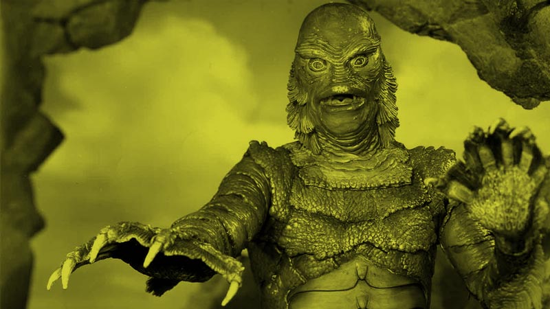
Brands can learn something by observing how Hollywood approaches classic films. What’s the difference between classic and dated? Is there an aspect of your brand that is due for a remake?
When the film The Shape of Water was released my first response was disbelief. One of my favorite films as a kid was The Creature from the Black Lagoon, a black and white classic that was terrifying and yet somehow comforting in memory. How could they remake it?
But when I saw the new version I was stunned by its beauty and poetry and thankfully it was a lot less scary. I guess I wasn’t alone. It just received the Oscar for Best Picture.
Last week I was contacted by a prospective client who wants me to revise their brand identity. In doing my research I checked out their website. The site was like looking at a faded postcard from 1991. Unresponsive, a clunky columned layout, low resolution photographs.
The client had no idea how dated it had become. They remembered it as classic and comfortable.
Is there an aspect of your brand that is due for a remake? Something you might revise to reach a level of beauty, poetry and performance that you hadn’t thought possible? And maybe at the same time make a little less scary?
photo: ©Universal Pictures
That Sinking Feeling
A brand that isn’t built on a solid foundation is sacrificing the ability to grow brand equity over time. Don’t let it happen to you.
The Millennium Tower in San Francisco is sinking. Instead of using supports driven 200 feet down into bedrock, the 58 story structure was built on 950 “friction piles” in the sandy soil.
Now, 7 years after completion it’s sunk 15 inches and is leaning 2 inches to the northeast. The tower sits on a massive fault line in the earthquake-prone city, so having a stable foundation would probably be a good idea.
I thought of the Millennium Tower last week when talking with a client who has built a large online presence. They lamented that they had never invested in a full brand identity system when they launched and instead tacked on bits and pieces as they grew.
Now they find their brand aesthetic is inconsistent across a huge range of visual assets. The brand equity they have tried to build is sinking.
We’re going to fix it, but in the earthquake zone that is today’s marketplace, it pays to build your brand foundation on bedrock.
photo credit: SFGATE
You're Making Too Much Noise
The amount of noise that we have to filter today is ridiculous. The signal that we want to hear, that holds a meaningful message, is getting harder to discern.
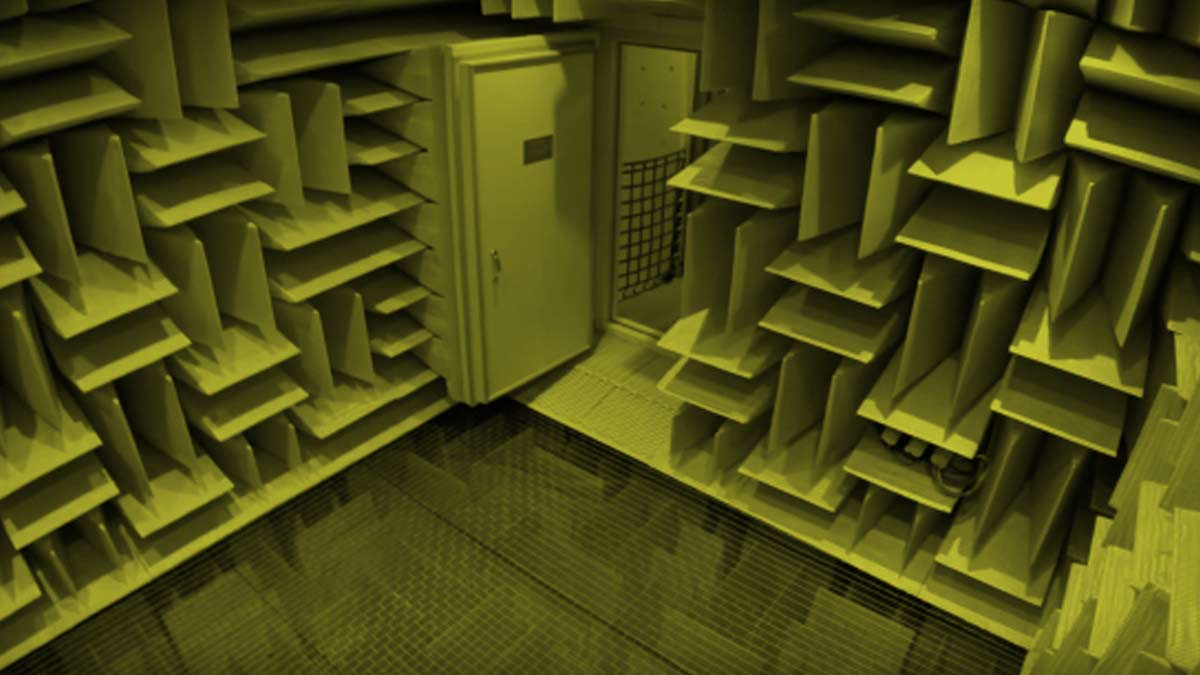
At Orfield Labs in Minneapolis there is something called an anechoic chamber. Also known as the world’s quietest room. The sound level inside it is -9 decibels. There is literally less than zero ambient noise. When you are in it, the only signal you hear is the sound your own ears make (yes, they actually produce a little noise). That, and your own heart beating.
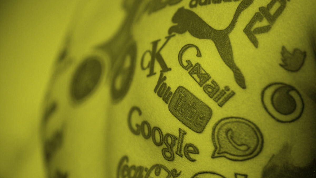
The amount of noise that we have to filter today is ridiculous. The signal that we want to hear, that holds a meaningful message, is getting harder to discern. Unfortunately, sometimes we are responsible for creating this noise ourselves. Trying to be on too many social platforms at once, reflecting and bouncing too much content around. You can drown yourself out.
This is why I left Twitter last year (for the most part). My analytics revealed the promotions for my agency were mainly reaching the feeds of other marketers - who were all busy reverberating their own noise. Everyone was talking, but no one was really listening.
How quiet is the room you’ve chosen to be in? Is your customer there with you? They need to be able to hear the heartbeat of your message.
The Shark and the Chumsicle
When feeding off new trends you have to strategize where you want to play. Do you want to be the first to sink your teeth in? Do you know where are you are in the food chain?
Sharks are trendy. There is a shark feeding dive I do in the Bahamas where they use a 3ft. ball of frozen fish chum (yum!) suspended from a float in 40 feet of water. They rev the boat engines like a dinner bell. In a blink of an eye there are 60 sharks milling around.
The sharks start circling the “chumsicle” in a wide rotating arc. You get to join in and swim along side them. They don’t even notice. The sharks are busy strategizing.
Soon the most ambitious peel off and attack the bait. But they have a hard time because the chumcicle is still frozen. Later, it begins to thaw and the action gives new meaning to the word “frenzy”. At the end, when the ball is dwindling, the remaining sharks fill up on what’s fallen to the sandy bottom.
When feeding off new trends you have to strategize where you want to play. Do you want to be the first to try to sink your teeth in? Do you want to join when it’s a frenzy, the food is flying and the competition is the fiercest? Or do you exercise patience and benefit from the work of others? There is no one correct answer. You just have to commit to where you want to be in the food chain.
photo credit: where2wander.com
Simply Genius
There was a mansion just across street from my studio. I always was curious how they got so rich. So, one day I decided to ask one of their gardeners.
When I was in art school there was a mansion just across street from the printmaking studio. Looking out of the window at night I would often see a man hosting opulent parties. Waiters. Tuxedos. The house had a full-time gardening staff even though the house sat on only about a quarter of an acre of land.
I was always curious how he got so rich. So one day I decided to ask one of the gardeners.
The owner of the house had the patent on the twist tie. A little piece of wire covered in plastic. Whenever anyone used a twist tie, a few cents would end up in this guy’s pocket. I couldn’t be jealous because this guy was obviously a genius.
Innovation is born of necessity. He had a lot of bags. And damn it if stuff wasn’t always falling out of them. What to do? The solution was incredibly simple.
Design is a process of subtraction. Good design becomes great design when there is nothing left to take away. When it offers the solution to the problem in the simplest possible way. Has your brand’s design become overcomplicated? Is it time to simplify?
The Secret
In a world of failing small town main street businesses, this little soft-serve stand is rock solid. Why?
Soft-serve ice cream is simple. Chocolate, vanilla, chocolate-dipped, sprinkles. Like I said, simple. No secrets.
Last weekend my wife and I were biking on a rail trail in the Delaware River Valley. It was hot, so we stopped at a little Mom and Pop soft-serve stand. I mean, why work off the calories if you can’t put a few back on?
They had 21 flavors of soft-serve. Twenty. One. Every flavor you usually find at a regular scoop ice cream parlor, rum raisin, pistachio, rocky road, they had it, but in soft-serve. I’d never heard of such a thing.
So I got butter pecan and it was…amazing. What kind of soft-serve innovation voodoo magic have these people stumbled upon? Why does the entire world not know about this?
I’ll tell you why. They don’t tell anyone. Oh sure, everyone for 25 miles around knows about them. In a world of failing small town main street businesses, this little soft-serve stand is rock solid. Why? Because they have a complete lock on the market. No competition. Anywhere.
A wildly successfully business isn’t always about scale or marketing. It’s about having a secret. Inside every business there is at least one secret that is magic.
Let’s uncover yours.
Video Is The New Black
It's estimated that 80% of all content consumed on the web will be video by 2020. To the entrepreneur, brand owner or creative professional, “video is the new black”. The once nice-to-have is now a requirement to remain competitive.
When I was 11, I filmed an epic disaster movie in my basement on a Super 8mm camera. It was called “Ball!”, and told the story of a Godzilla-sized Nerf basketball that destroyed an entire town, which consisted of my slot car race track, HO gauge train set and a lot of plastic army men. I used a lot of lighter fluid. Let’s just say it’s a good thing there weren’t smoke detectors in those days.
At the time, my friends and I were drawing lots of robots and war scenes on paper and sharing them with each other. Needless to say the screening of “Ball!” for my buds put me in a class of my own in the storytelling department. Because my story was moving.
It's estimated that 80% of all content consumed on the web will be video by 2020. Gulp. Facebook, YouTube, Snapchat, Netflix, Hulu, Amazon, Instagram and their mother are now starting to stream original programming. Not happy with being merely platforms, they are jumping into being content creators.
Video is the new black. The nice-to-have is now a requirement to remain competitive. For the entrepreneur, brand owner or creative professional the important question is: Are you moving yet?
photo credit: Philip VanDusen
A Hamster Wheel In The Forest
If you take a proven concept and place it in a new context, you may find out things about your audience that you didn’t know. What actually motivates them. What they are really thinking. Why they are responding the way they do.
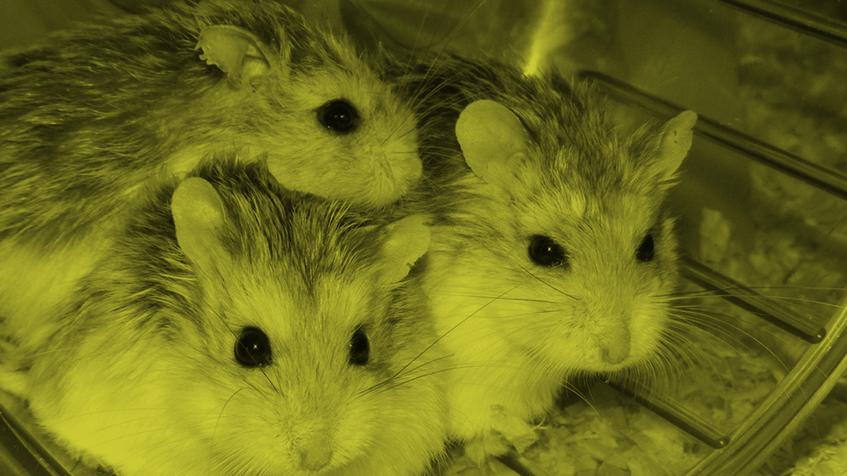
Scientists recently did an experiment. What would happen if you put a hamster wheel out in the forest? No food. No red button to press to get a treat. Just the wheel, an open door and a motion activated cam.
Mice, rats, shrews, voles, lots of little guys who were obviously not getting enough exercise showed up. They ran. They came back again and again. It turns out hamster wheels aren’t just for the incarcerated. When the scientists took it away, they all kept showing up wondering why the gym had closed.
If you take a proven concept and place it in a new context, you may find out things about your audience that you didn’t know. What actually motivates them. What they are really thinking. Why they are responding the way they do.
Contextual awareness is the next major hurdle in marketing. The goal is being aware of your customers changes in location, behavior, interests and needs at any given moment, as those moments change. Do you truly understand what makes your customers tick?
photo credit: Philip Roberts @flickr.com
Under Your Skin
Branding is a lot like tattooing. It’s far better to think it through and make the investment than to cobble it together bit by bit.
My wife Beth has some tattoos, a few different styles, added at different times, and scattered about. One cluster she wasn't happy with anymore. She decided to join them together into a single design that was unified and had continuity.
In the tattoo world, they call this a “cover-up”. But obviously you can’t just start over with a clean slate. You have to incorporate the old designs into the new one in order to hide them.
It’s complicated, expensive and it takes far longer to do than the original. Meaning even more time under the needle. Ouch.
I’ve been working with a entrepreneur who realized the brand presence they have is a bit of a mess. They had developed it piecemeal, designing new elements as they were needed. But as it became larger, the brand became scattered.
As we worked to clarify his brand strategy and create an cohesive design system, it struck me that branding is a lot like tattooing. It’s far better to think it through and make the investment than to cobble it together bit by bit.
Because doing a brand cover-up hurts.
A Better Mousetrap
Peanut butter is the ticket with mice. The trick is to put the trap out without setting it and let them get used to eating from it. Then one day you set it. Brands do the same thing with us.
My next door neighbor has mice. It was a cold winter here in the Northeast and I guess their basement was a little more cozy than the woodpile outside. Their cat, historically a great mouser, has been slacking. It's not healthy to have mice around when you have kids, so they had to set some traps.
Peanut butter is the ticket with mice. The trick is to put the trap out without setting it and let them get used to eating from it. Then one day you set it.
Brands do the same thing with us. Nestle is doing it with their chocolate. We like Nestle's chocolate. We've gotten used to eating it.
So when Nestle announced that they’re going to cut the sugar in their chocolate, they set the trap.
We all know eating less sugar is a good idea. We’ve been packing away a little too much of it for the last few decades. So Nestle is betting that if we know there is less sugar in their chocolate, we will feel better about buying and eating more of it.
Some of us may be smarter, or have more willpower than that. But this mouse likes the cozy warmth of the idea of more chocolate. More chocolate is always better. Snap.
Let's Co-Everything
The cost and risk of opening a retail presence has always been a significant barrier for brands just getting started. You used to have to go it alone. But now you don’t have to.
From co-working to bike-sharing to millennials co-habitating with their parents, it looks like owning something yourself is just getting too hard.
Going it alone in retail is hard, too. Just ask American Apparel. One of the fastest growing US companies only a decade ago, they are now closing their doors. They hadn’t made a profit since 2009.
The cost and risk of opening a retail presence has always been a significant barrier for brands just getting started. You used to have to go it alone. But now you don’t have to.
There is a co-retailing startup called Bulletin. It helps smaller brands merchandise their products without having to have a brick and mortar store of their own. They divide up a single retail location into smaller sections, from a shelf to half a store, that you can rent month-to-month. It’s brilliant and is smashing the barrier to entry into physical retail.
The new co-economy is giving rise to this kind of innovation every day. Is there a barrier to entry that is standing in the way of you growing your business or creative practice? Take a step back and ask, “How can I co-it?”
photo credit: Sebastien Wiertz @flickr.com
"Design ROI"-Rob Wallace
Rob Wallace's guest-post article on "Design ROI" represents the culmination of five years of independent research on empirically calculating design’s value and provides ground-breaking thought leadership on quantifying design’s return on investment.
[The following article is a guest post from my good friend Rob Wallace of Best of Breed Branding. Posted with permission from the author.]
DESIGN ROI
Age of Accountability
While we live in the design age, we also live in the age of information and accountability. Today every business decision is supported by accurate and timely data. Every effort is scrutinized for its direct impact on the bottom line. The new corporate mantra is, ”if you can’t measure it, you can’t manage it.” In the vernacular, management is asking, “show me the money”. If you are a design manager, my goal is to help you do just that.
The Proof
I wrote an article for the Design Management Journal that has been described as providing “ground breaking thought leadership” on quantifying design’s return on investment. Please email me for a copy at Rob@wallacechurch.com
This article represented the culmination of five years of independent research on empirically calculating design’s value. It was built on an ROI methodology created by statisticians and used data from Wallace Church’s brand identity/package design assignments plus a handful of additional case studies supplied by major cpg corporate package design departments. The methodology is outlined in Don E. Schulz and Jeffrey Walters’s book, “Measuring Brand Communications ROI” which is available on Amazon.
This article concluded that, on average, every dollar invested in advertising and package design resulted in over $7 in incremental value for the brand. Great news! But even more interesting is the data from case studies where there was no advertising and package design was the only element that changed. In these cases every dollar spent in brand identity/package design generated over $400 of incremental profit.
New Insights From the Forefront of Design ROI
It has been several years since this article’s first publication, and I’m happy to report that the additional data we have garnished further supports design’s paramount ROI. I’m also happy to report that, independent of this article, the greater business community has begun to recognize design’s paramount value in brand building. I am however, disappointed to report that we as an industry have yet to embrace a standardized method to measure design’s direct financial impact. And as a result, many design managers still have to fight hard to justify the resources required to fund and manage the design process.
ROI Roadblocks: Reluctance, Fear, and Disbelief
While most design managers believe that proving our value would greatly benefit the design process, many remain skeptical. To some, it’s wrong to extract design from all the other tools that drive purchase behavior. One individual articulately commented, “I have spent so much of my energy convincing marketing to consider design as an integral part of a synthesized branding effort, why would I want to separate it now? Even if we can, we shouldn’t measure design in a vacuum, but as part of an integrated whole”.
There are those who consider the $400+ ROI result shockingly high and therefore not believable. This result seems hyperbolic, and therefore, is an easy target for “too good to be true” skepticism.
To those concerned, I say, try it. Prove or disprove it to yourself before abandoning the notion. Until we can segment each marketing effort’s specific impact on the bottom line, we’ll never know how to best dedicate limited resources.
There are a number of prominent design practitioners who are simply reluctant to be quantified. I well remember a discussion with design evangelist Tom Peters, and how he emphatically emphasized that design must never be “relegated to the providence of the bean counter”. I understand his point. Still, I’m convinced that senior management will no longer allow design to fly below the accountability radar screen. To those who are reluctant to being quantified, I suggest that we designers initiate our own accountability process. We need to set our own standards and develop our own best practices. For if we don’t, surly a process will be thrust upon us.
There are those who are concerned about setting the bar and having to continually raise it. “Congrats! Our last design project resulted in a $400 ROI. Tomorrow I expect $500, then $750 and then $1,000.” To those who fear this upward spiral of expectations, I suggest that we first establish our own base standard and then embrace a process of constant improvement. We need to continually hone our best practices until we determine design’s ultimate profit potential.
Then there are those who are concerned that the methodology is not universally extendable to all design disciplines. Most, if not all, design disciplines result in a “before and after” that can be measured and compared against costs. Disciplines such as product design, merchandising and promotion all have measurable variables. Some design disciplines have success criteria built into them such as web design “click throughs”. Even “soft measure” design disciplines such as corporate identity or environment design, can be analyzed against perceived stock price or worker productivity. While there may be no one “magic bullet”, I am passionately convinced that all design initiatives can and should be quantified in financial terms.
Lastly, and perhaps the largest group of naysayers are those who flatly respond, “It simply can’t be done.” These folks ask, how can you pin point design’s specific impact? How can you control the competition or the market dynamics, or Wall Street, or the rainy Tuesday that discourages shoppers from leaving home? Until we can isolate design from all of these uncontrollable elements we simply can’t measure it.
The Moment of Truth
In the last several years, we have discovered that there is a moment in time where all of these ancillary influences can be metered out and package design can be isolated as the only variable. This golden opportunity occurs when launching a major brand redesign effort.
During a redesign initiative, there is always a transitional phase where the new design architecture is “phased-in” to the existing shelf set. New design gradually replaces the old as the product is sold through. This transition often takes a number of months and can be a critical time to measure design’s impact. Here’s how to take advantage of this moment of truth.
Select one retailer to sponsor the new design. Launch the new identity in its entirety into selected stores in a specific geographic market. Divert the old packaging to the same retailer’s stores in a near-by geographic area with the same consumer dynamics. Keep the pricing and merchandising efforts identical. And then simply measure sales between the test and control stores for a period of several weeks.
During this test period, the brand’s offerings are consistent, the ad campaign and its frequency are the same, and all of the intangible and uncontrollable social and economic aspects are all identical. The same Wall Street dynamics and the same rainy Tuesdays preside. Design is the only variable, and the incremental sales that it generates are irrefutable.
The Good and Bad News
These research results have been remarkably higher than expected. New data shows an average of more than $500 of incremental sales for each dollar invested in design. In one recent case study for a leading national cpg brand, design’s ROI was nearly twice that. So what’s the bad news? The results are almost too high to be believed. The results might be more acceptable if they were more like 10 or even 50 to one, but at literally twenty times this rate, they seem “too good to be true”.
Proving the Impossible
The numbers may seem overbalanced because the cost of a package design assignment is so small when compared to other marketing initiatives. The investment in a new identity for a multi-SKU major cpg brand might require a couple hundred thousand dollars in design fees while this same brand might commonly invest millions or tens of millions of dollars in advertising. If done well, package design architecture can out live two to three ad campaigns. Imagine the media cost if you were required to run an ad that would be seen by all of your possible consumers. In the cases studied, research indicated that only 7% of consumers see an ad before experiencing the product at shelf. Now consider how many possible consumers see your package design. Virtually 100% of your current and potential consumers see your brand’s identity at retail. With up to 70% of brands in high turn selling environments purchased on impulse, design is the last and most critical opportunity to influence the sale. Considering all these factors certainly design’s unsurpassed ROI can be justified.
A New Design Advocacy
If we as an industry are going to prove design’s ROI, then this message cannot come from design consultants, but from corporate design management and independent, impartial and credible associations. Organizations like the Design Management Institute and the American Marketing Association need to take up the cause. In the UK, the British Design Council has maintained a well-respected program called the Design Effectiveness Awards where design is awarded merit based not on arbitrary aesthetics but on marketplace performance. We need its compliment here in the US.
I am calling for a new breed of design advocates to join the fray. I’m looking for a number of passionate professionals to build upon the initial data. I am seeking new advocates to apply this or other methodologies across the entire spectrum of design disciplines. From these ROI results and the processes that drive them, I see best practices emerging, industry-wide adopted standards around the appropriate time and resources dedicated to design so as to generate its highest ROI. This will be the day that design’s golden age will truly be actualized.
Interested? Drop me an email and I’ll forward you the methodology and engage you in an ongoing dialogue with other industry thought leaders. Email me at rob@bestofbreedbranding.com and let's together speed the process to empirically proving design’s value.
photo credit: Anthony Albright@flickr.com
Open Doors
In branding and design you have to understand what people do in order to fulfill their desires. The challenge is getting the truth.
Just out of college I had a job painting the front doors of 400 apartments in a huge complex. You have to have the door open to paint it, so I got to peer inside 400 families lives. From the outside, all those apartments looked cookie-cutter-same. But when you looked inside they were…
In branding and design you have to understand what people do in order to fulfill their desires. The challenge is getting the truth. What people say they do and what they actually do is often very different. That’s why direct observation is the best way to uncover a consumer need. Seeing is always more accurate than hearing.
Today, people are photographing and posting every waking moment online, essentially opening their apartment doors for anyone to peer in. The Selfie Era. Some call it narcissistic folly. But those of us who leverage consumer insights for a living are having a field day.
photo credit: Hernán Piñera @ flickr.com
A Happy Ending
What are these, “Mom jeans” for men? How could it be that a giant in denim, one with 50 years of experience in making jeans be so off the mark?
I like the way these jeans fit. So I decided to order another pair online. Same brand, same fit, waist, length, copied right off of the label. So when the order came… whoa, I was in for a big loose baggy surprise! Does this story sound familiar?
What are these, “Mom jeans” for men? How could it be that a giant in denim, one with 50 years of experience in making jeans was so off the mark? I couldn’t help but see it as a concrete illustration of the market share shrinkage this brand has been experiencing in recent years.
By focusing on winning back it’s customers through advertising, social media, email promotional campaigns and a parade of celebrity spokespeople, they took their eye off the ball. They forgot about the product.
All truly iconic brands deliver one thing: a consistent product experience. Without that, any other investment you make in winning customers is wasted. Get the product right. Give the story a happy ending.
photo credit: Robert Sheie @ Flickr.com
Make Your Mark
So often we want to create something new. Something out of nothing. Like a business, or a brand, or a blog. But we are paralyzed.
Long before I entered the design and branding arena, I was a painter. I worked on a large scale, usually about 5' x 6'. I’d sit in my studio and contemplate the expanse of white canvas in front of me. What do I do first? What if I blow it? It could be paralyzing.
Over time I discovered the key to unlock this limbo. You just make a mark. Any mark. You just have to disrupt the white of the canvas. Because after you've made that first mark, you have something to react to. To build upon.
So often we want to create something new. Something out of nothing. Like a business, or a brand, or a blog. But we are paralyzed. The answer is the one I found painting. Make a mark. It doesn't matter if it sucks. Because you're going to keep making marks and over time those first marks will be replaced with something better. Something approaching your vision.
I can't tell you that starting isn't the hardest part. It is. But you just have to make one mark and then the journey of creation begins.
photo credit: Anders Lejczak @ Flickr
The Moment Brands Dream Of
A few weeks ago, I attended the Virtual Reality Summit in NYC. I was struck, not with how advanced the technology is - but rather with how no one really knows what to do with it.
A few weeks ago, I attended the Virtual Reality Summit in NYC. I was struck, not with how advanced the technology is - but rather with how no one really knows what to do with it.
There is a saying in Silicon Valley, “It’s a technology looking for a problem.” They don’t really know how to use it, or what to use it for. They just know that when someone puts on a VR headset, they don’t want to take it off. And when they do take it off, they all say the same thing, “Wow.”
I’m reminded of a day eons ago when I took a box-shaped Apple mouse in my hand and clicked around in Mac Paint for the first time. At that moment, I knew I was witnessing a watershed moment in art, design and communication. I knew everything was about to change. This is where we are with VR. It will be huge. For entertainment, education, medicine, design, science, communication, all of it.
This is the kind of moment brands dream of. The opportunity exists for brands to design immersive sensory worlds and architect experiences of unimaginable scope. But amazingly, brands are sitting on the sidelines. They need to get in there and start imagining, experimenting, and pushing pixels around. Because everything is about to change.
The Un-Sexy Solution
Sometimes the best solution isn't the sexiest. Sometimes sexy can distract you from actually getting the job done.
If you ever want evidence why our species has survived so long, Google Images for the phrase "There, I fixed it." You'll find thousands of pictures of hilarious solutions to some of life's challenges. And a lot of duct tape.
Those pictures always reminds me of my days at Gap. I was amazed when I realized that the $16B goliath ran entirely on Excel spreadsheets being emailed around the globe. Unsexy, but it got the job done.
The tech explosion has introduced myriad apps, sites and hardware that are really sexy - with more features than you could explore in a lifetime. You can get lost in the sea of functionality, interfaces and connectedness. Last week I saw a cutting board that has wifi. Really.
But, sometimes the best solution isn't the sexiest. Sometimes sexy can distract you from actually getting the job done. Sometimes a scuffed shoe doesn't need a rechargeable handheld oscillating brush with a touchscreen. Sometimes it just needs some spit and a rub on the back of your pant leg.
Curiosity Not Passion
Curiosity invites exploration and experimentation. Following fascinations can lead you into new worlds.
I was sitting in a lime green room with a drop ceiling. My guidance counselor said, “You should follow your passion”. I thought, OK, great! The only problem was I didn’t have one.
Passion is a word that carries the weight of certainty. Passion burns with a lot of heat. But passion can also run out of fuel before the destination is reached.
If she had asked me instead, “What are you curious about”? That was a question I knew the answer to. I had a bunch of answers to that one.
Curiosity is evergreen and self-perpetuating. Curiosity invites exploration and experimentation. Following fascinations can lead you into new worlds. One interest fuels another and they expand into the realm of possibility.
Even now, we are prodded from every angle to follow our passion. The media says it. The business book authors say it. They say it on Shark Tank. I am certain that there are thousands of brilliant businesses, products and careers that were never launched because someone hit the “passion” wall.
I'll bet curiosity has launched thousands more.
Idea Muscles
Get that idea muscle to the gym. Lift some. Inspiration isn’t magic, you have to put in the work.
It’s been a while since I worked out. Things are starting to get a little soft. I know when it's time to get back at it because it gets progressively harder to entertain the thought of actually doing anything physical. A body in motion…
I found that coming up with creative ideas works the same way. The more I don’t do it, the harder it becomes. Creative thinking is like a muscle. Just like lifting weights, there are exercises I do that make it stronger. When I don’t do them, my creativity sits on the couch and orders in pizza.
Inspiration doesn’t pop in your head like a lightbulb. You have to go out and hunt it down. I feed myself with graphic design on Pinterest, branding trend on Medium, hit my retail go-tos in Manhattan. Whenever I get a thought, any thought, I click to my Google Sheets tab and write that sucker down. I brain dump. I have to get 5 ideas down before I can take a breather.
If you’re stuck, if you are feeling a little vacant, get that idea muscle to the gym. Lift some. Inspiration isn’t magic, you have to put in the work.


